
Welcome to our curated list of the “40 Best Homepage Website Design Examples”! We aim to provide a comprehensive collection of some of the most aesthetically pleasing, user-friendly, and highly functional website designs. We understand that a website’s homepage is your audience’s first contact point, and it sets the tone for the rest of their experience on your website. That’s why we’ve scoured the internet to provide various website design examples representing multiple industries, styles, and functionalities. We’ve covered you from bold and bright to sleek and modern! So, let’s dive in and explore these impressive designs.
How to Analyze Homepage Design?
We are reviewing the homepage design of ulceratesport.com, an online sports inventory store. But before we start our review, please make sure you subscribe to our channel so you will receive our next video. So, let’s begin our review.
Top companies analyze the website’s home page to reduce the bounce rate and improve its usability. To do this, they use a Plerdy heatmap and video session.
What is the Difference Between Cool and Bad Website Designs for Homepages?
Homepage web design plays a vital role in making your website successful. Users increasingly demand website design, and homepage design trends are continuously evolving. Below, we’ve gathered some examples of bad homepage designs and included successful cases for contrast to help you notice the difference. Here are six differences between good and bad homepage web design.
- Distractions: Avoid elements that could irritate or distract the user, such as background music, overused Flash, too-bright colors, distracting gifs, and annoying animations.
- Animations: Avoid using animations if unnecessary, but if you must use them, ensure there is one bolding homepage element on the page.
- Typography and Text: Good typography is essential on the homepage. Avoid too-big or too-small font sizes, never-ending paragraphs, non-matching typefaces, and silly fonts.
- Navigation: Poor navigation on a homepage can lead to a frustrating user experience (UX). Provide a clear menu and structure so users can quickly find what they want.
- Mobile Optimization: Your homepage web page must be optimized for mobile use. Users will likely leave if they need help navigating your site on their mobile devices.
- Speed: A slow-loading homepage page can lead to a loss of income. Retailers lose up to $2 billion per year due to slow-loading websites. Ensure your website speed is fast enough to retain users.

Your website’s visual homepage design affects the user’s first impression, and it takes approximately 50 milliseconds for a user to make a judgment about a website. Therefore, ensure that your website is visually appealing, fits your company style, and is not distracting. A well-designed website is crucial to the success of your business, as users’ opinions influence conversions.
15 Engaging Website Homepage Design Trends for 2024
As we move into 2024, there are several new homepage website design trends to be aware of. Whether you’re a web designer or interested in the latest trends, staying up-to-date is important. So, here are ten engaging website homepage design trends for 2024 without further ado.
| Design Trend | Description | Source |
|---|---|---|
| Increased Web Accessibility | Ensuring websites are easy to use for all, including those with disabilities. | Web Accessibility Guidelines |
| Nostalgia | Using elements from the past to create an emotional connection with users. | Design Trend Report |
| Artificial Intelligence | Implementing AI for better, faster design decisions. | Tech News |
| Minimalism | Simplifying design with fewer colors and elements. | Design Trends |
| Microinteractions | Adding small animations to enhance user experience. | UX Magazine |
| Responsive Design | Optimizing websites for all device screens. | Mobile Web Statistics |
| Bold Typography | Using large, striking fonts to make key points stand out. | Typography Trends |
| Vibrant Colors | Utilizing bright colors to create memorable designs. | Color Trends |
| Video Headers | Featuring videos at the top of pages to convey messages quickly. | Web Design Best Practices |
| Personalization | Tailoring user experience based on data to engage customers. | Personalization Report |
| Dark Mode | Offering a dark theme to reduce eye strain and save battery life. | Tech Insights |
| 3D Elements | Incorporating 3D graphics for a more immersive experience. | Design Innovations |
| Voice User Interface (VUI) | Integrating voice commands to navigate websites. | Future of Web Design |
| Sustainability | Focusing on eco-friendly designs and reducing digital carbon footprint. | Green Web Design |
| Interactive Content | Creating content that users can interact with, such as quizzes and polls. | Content Marketing Trends |
Some interesting developments in homepage website design are expected in 2024. Hence, keep these in mind while you explore the world of web design, whether you’re a designer or just interested in the current trends.
1. Plerdy
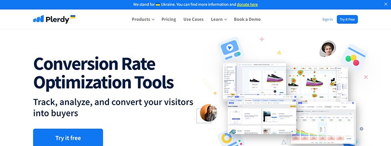
Plerdy is an all-in-one conversion rate optimization platform that provides visitors with various behavior analysis tools for website pages. On the homepage, a message asks you to stand with Ukraine, and a free trial is available with a prominent blue button. The first screen shows the main message, and to the right, there’s a set of pretty cool-looking screenshots that showcase the analytics. The second screen features eight products, partner logos, and G2 reviews. In contrast, the next screen lists customer logos and reviews in video and text formats.
Further down, you can find nine advantages of using Plerdy, and a block of questions adequately describes how these tools can help your business. Then, at the bottom, there’s a blue block with a yellow call-to-action button that says ‘Book a Demo.’ Finally, the footer contains numerous links, including competitor comparisons, advice, free tools, browser extensions, and language selection.
2. Lemonade – Homepage
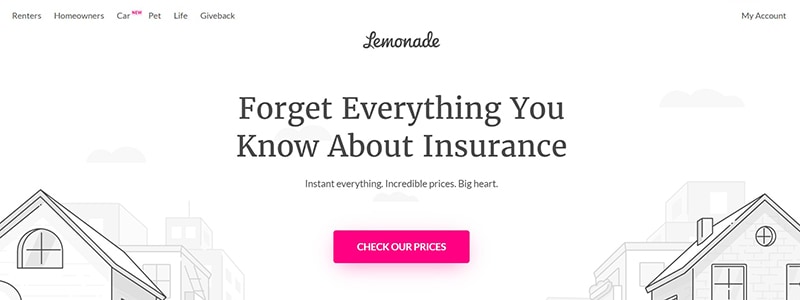
Lemonade is revolutionizing the insurance industry with a creative and user-friendly website design that is easy to navigate. The homepage features a colorful cartoon video that depicts a car on the left side and a dog with a boy on the right. A large pink button in the center urges users to check the website’s prices. The second screen is a review section, where clients leave feedback using a star rating system and an automatic slider. The third screen also contains large pink buttons urging users to check prices for various types of insurance, such as pet, car, renters, and homeowners. The bottom part of the page displays Lemonade’s customer satisfaction percentage, allowing users to choose their region and download the app from Apple and Google Play. Finally, the footer contains legal information. The website’s intuitive and playful design sets the tone for the user experience (UX). The reviews of Lemonade’s customers speak volumes about the company’s top-notch service.
3. New York City Ballet – Homepage
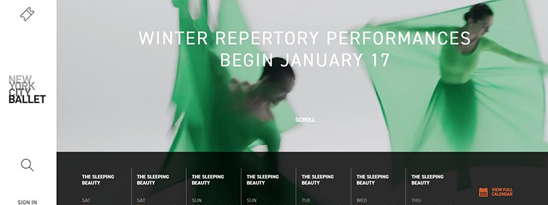
The homepage of the New York City Ballet website is very appealing. On the page, a captivating animation shows girls dressed in green dancing elegantly. This exciting video teases a forthcoming event. The upcoming events are graphed and displayed by dates and timings on the top screen. By using the offered button, you may quickly get to the calendar. The “purchase tickets” area of the second screen allows you to select from various tickets and learn more by clicking the orange call-to-action button. A hamburger menu is located on the left fixed portion. The middle logo resembles the website of a bar. A sign-in button, a search icon, and details about donations, interviews, and subscriptions are all in the lower portion. The webpage is attractively made, easily appealing, and attention-grabbing.
4. Adopt a Love Story – Homepage
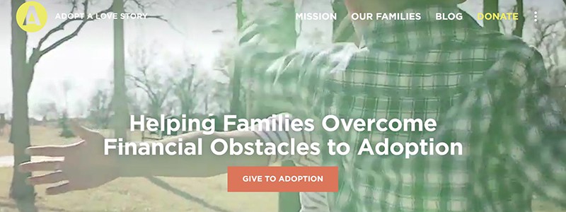
Adopt a Love Story is a non-profit organization that aims to help families overcome financial obstacles to adoption. When visiting their website, you will notice a clean, simple homepage design with an eye-catching pink and orange donation button. The second screen features important information against a white background, with a photo in the background that encourages visitors to learn more about the cause. The banner on this page provides information on the percentage of American Christians considering adoption versus those who adopt, which is an eye-opening statistic. The website provides several examples of love stories from families who have successfully adopted children, and visitors can join in the 100 campaign to bring 100 children home to forever families. Adopt a Love Story’s goal is to change the lives of millions of children, and their website design and content effectively convey their message.
5. Revlon – Homepage
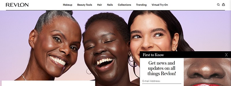
Revlon is one of the leading brands in the beauty industry. When visiting its website, the homepage design can captivate customers, making them feel welcome and enticed to explore further. On the first screen of the homepage, a pop-up to subscribe to their newsletter appears, prompting the customer to enter their email address and birthdate. No promotional code or discount is offered for the first purchase, but it provides exciting beauty news and updates. The next screen showcases a banner of happy women. Though the banner has no message, the arrow can be clickable to direct the customer to more details. On the next screen, new product offerings and deals are visible. When hovering over the items, the product photo effects are noticeable. It’s a clever marketing strategy that appeals to the customer’s senses.
Additionally, the homepage has a “Virtual Try-On” feature that allows customers to try different makeup products virtually. Finally, an impressive footer with an email subscription option could be improved for a better appearance. Overall, Revlon’s website design provides an excellent example of an enticing and appealing homepage for beauty enthusiasts.
6. Jean-François Bury – Homepage
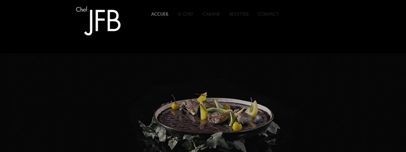
A video on Jean-François Bury’s cuisine caught my attention as soon as I arrived on the homepage of his website. Nonetheless, I had difficulty navigating the website and figuring out where I was because of its bad design. The next screen featured a difficult-to-understand description, and the black background’s dark menu was not user-friendly. A man who appeared to be a chef was shown beside the image of the French man with a carrot. The text on the following screen was opaque with a transparent background, making it difficult to read. Due to the plain, translucent background, viewing the contact information at the bottom was challenging. While intended to highlight Bury’s restaurant, the website had a poor user experience (UX) and was difficult to navigate. A UX analysis based on Plerdy data and user behavior would help find elements where the website may be improved.
7. Four Seasons – Homepage
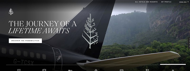
The user is welcomed when they first arrive at the Four Seasons homepage by a dynamic film highlighting the great aspects of their brand, along with a slightly perplexing pop-up. Undoubtedly appealing and well-designed, this video gives a great first impression of Four Seasons. Users can find their chosen search words using the main search bar, which is a clear focal point. The second page features city-specific options, including Paris, Costa Rica, and Bora Bora. A contrasting black button serves as the page’s call to action. Also, there are obvious navigation arrows, so visitors can easily explore various alternatives. A thorough list of data is displayed on the third page in three blocks, keeping with the website’s overall dark design. The website’s footer has a language selection option and a sizable “Leave a Review” call to action button. The website is attractively made, and the content is organized to be educational, interesting, and interactive.
8. Pep Guardiola – Homepage
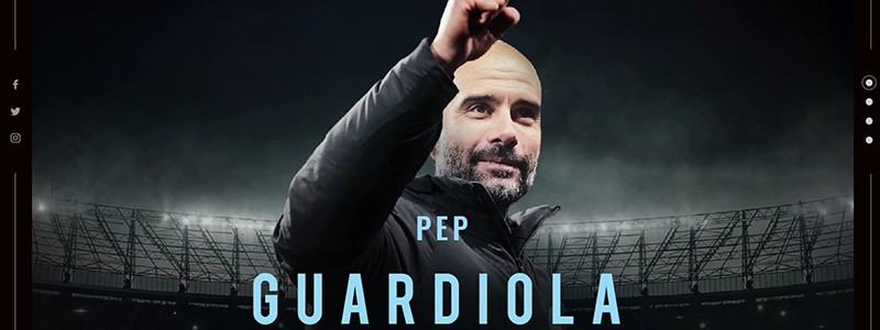
Welcome to the homepage of Pep Guardiola, one of the world’s greatest football managers. The design of his website is a prime example of how a website should be designed – it’s sleek, visually stunning, and user-friendly. On the first screen, we see his photograph with his hand raised, positioned in the left corner of the hamburger menu. Clicking the menu reveals large buttons for Instagram, About, and statistics. Moving to the second screen, we see a slider in the right corner, displaying our section, a short title, a description, and a call to action with a button to learn more. Finally, the lower part of the screen lists his trophies, divided into three blocks, with the option to switch languages and links to his social media accounts. In short, it’s an elegantly designed website that is professional and user-friendly, much like the man himself. Pep Guardiola is a quick-thinking strategist with a common-sense approach who remains humble, even in the face of intense victory. Off the pitch, he’s a loving husband, a devoted father of three children, and an avid golfer.
9. Welly Homepage
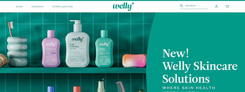
I stumbled upon an interesting and colorful website called Welly. The first thing I noticed on its homepage was a large banner with a Call to Action button that prompted me to explore the website. The website’s header emphasized the search bar, but it could have been more noticeable. The dropdown menu buttons were also essential links for further product exploration. As I continued to scroll down, I noticed that the recommended products were curated without the involvement of sellers, which was a nice touch. The recommended products had great photos, and the scrolling effect pleased the eye. The homepage had two banners with promotional offers, and both banners had a CTA button.
Further down the page, I saw three icons – free shipping, easy 30-day returns, and a bacon-inspired loyalty program. Moving on to the reviews, it would have been better if the website placed the reviews section higher on the homepage because reviews add value to potential customers. Welly should consider moving the review section above the logo carousel, which showcases its clients. The website had a block dedicated to the company’s certification, which was interesting. The block had a link they could have placed higher on the page for better visibility. I last noticed the Instagram section with images of satisfied customers with their products. The footer of the homepage had a subscription field, and it was relatively high up on the page. However, a better way to increase leads would be using Plerdy popup forms.
10. Jomor Design Homepage
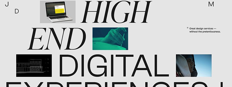
A creative design company called Jomor Design creates remarkable digital experiences. The business, run by Jonathan Morin, is devoted to developing original solutions to problems, reflected in its specialized services. The company’s website, for instance, has a stylish layout, big lettering on the initial screen, fun blinking effects, and strong photo-switching capabilities. The company’s attractiveness is increased by creating intriguing designs by combining text and video overlays. Following the completion of the project, the business offers details about its services, links to pertinent social media, and other contact information. Leading design journals and organizations, including Awwwards, CSS Design Awards, and Communication Arts, have honored Jomor Design’s branding and digital experiences.
11. Precision Run Homepage
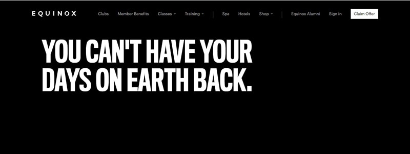
Precision Run’s website homepage is an excellent example of modern website design. The homepage features a black background with bold white letters displaying the main message on the first screen. The first screen has a call-to-action with a white “Join Now” button. Scrolling down, we see a large photo with a white block and a specific call to action. The third screen is a white video format photo with a similar white block and call to action. The next screen has three blocks with an interesting effect, such as a slider showing various athlete photos. The website also features a mobile app and a black “Find a Location” button at the bottom of the homepage. The menu points are straightforward: Equinox, Clubs, Member Benefits, Classes, Training, Spa, Hotels, Shop, Equinox Alumni, Sign in, and a “Claim Offer” button. The text is concise, with idiomatic expressions, active voice, and phrasal verbs used efficiently.
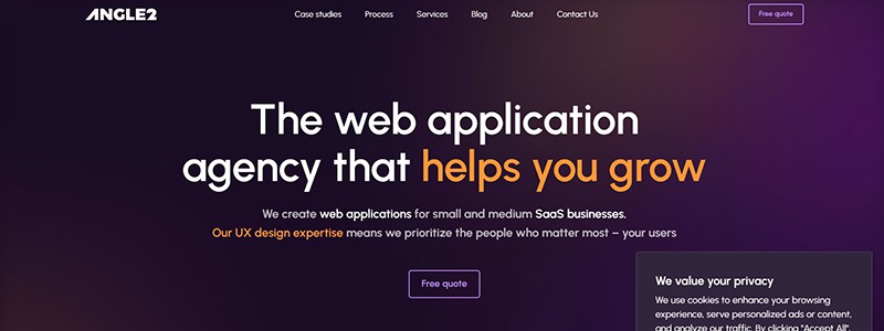
12. Angle2 Agency Homepage
Welcome to Angle2 Agency, a web application agency that helps small and medium-sized SaaS businesses solve their web app challenges. Specialize in creating web applications that prioritize your users, and do this through our UX design expertise. They help you make development decisions based on real research, data, and testing. We offer a full development cycle, from planning and designing to building a growth-ready web app. They work with industries like healthcare, education, legal tech, accounting, and recruitment. They’ve helped many businesses achieve their goals through our services. We also have a Design System service that can help redesign your app and make future changes less painful.
13. Planetary Homepage
Meet Planetary – a digital studio specializing in product development. Founded in NYC in 2013, they work with designers, developers, and product experts worldwide to build better products for their clients. Their latest work with Prudential 4.01K showcases their approach to building an experience that is not just useful but educational as well. For example, the runner time check component they developed for the benefit race and festival in California allowed runners to search for their bib number, check their run time, and learn how saving just a little bit more each year can significantly impact them on their retirement savings. Their design approach focused on simplicity, intuitiveness, subtle interaction and motion design to create a fluid and efficient experience. Contact them today to work on building better products for your company.
14. This Is Sleep Homepage
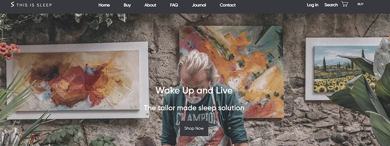
The This Is Sleep website’s homepage features several banners with calls to action. The black button will stand out if the banner’s background is white. On the other hand, the black button makes it challenging to see if the banner’s background is darker. As no arrows or bullets exist, it is impossible to determine the precise number of sliders present. The “Home” button on the menu is extra, as we are already on the homepage.
Nevertheless, this button must be underlined, as people still depend on it. The second screen’s white background and lack of product photographs make reading the product names and pricing difficult. There should be an increased size of the text if the 1440-pixel size. Certain perks, including free shipping and returns, are visible on the third screen. There is a subscription field in the footer, but it is ineffective.
15. Won Hundred Homepage
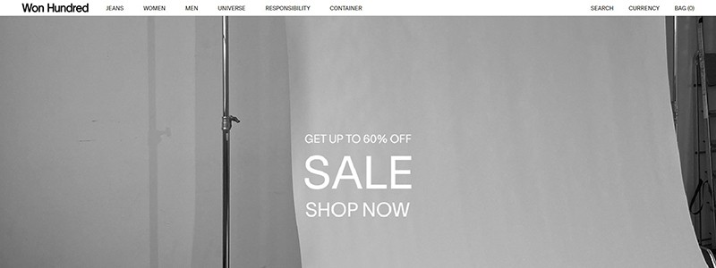
Upon landing on the homepage of the Won Hundred website, a first-time visitor is greeted with a pop-up offering a 10% discount on their first purchase and the option to choose between Men’s, Women’s, or Universe fashion lines. The banner featuring a promotion with a 60% discount needs better emphasis as it looks like text rather than a call-to-action button. The following screen displays two pictures of a man and woman without any clear purpose. The cursor that appears when hovering over an item should be replaced with a more mobile-friendly solution. Two more photos of a girl and boy follow without any calls to action. At the same time, the product selection’s pricing and name appear when a customer hovers over the product with the mouse. This could be better for user experience. The deadstock collection from Won Hundred consists of unisex styles, including relaxed shirts, denim-inspired jackets, and pants. The fabrics are sourced from trusted partners in Portugal and assembled in Bulgaria, offering new and deconstructed designs thanks to the limited use of leftover materials.
16. Max Colt Homepage
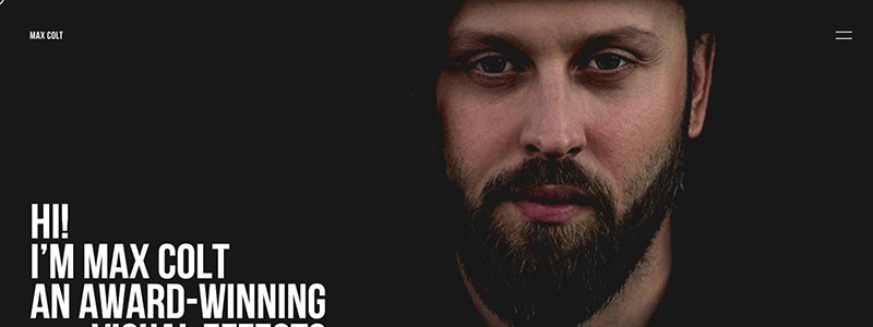
The Ukrainian Advanced. Team Studio shared with the Awwwards audience the result of working on a portfolio for Max Colt, the prestigious award-winning visual effects developer who worked with Lil Wayne, Coldplay, Nicky Minaj, Kanye West, and Imagine Dragons.
The portfolio’s theme set the tone for the homepage website’s features: animated fonts and images were supplemented with interactive content. Clicking and holding the left mouse button was everything needed to launch the website. Such intrigue holds a fascination for the visitors. Further work, producing the necessary wow effect, was done by the author’s works.
17. True Ventures Homepage
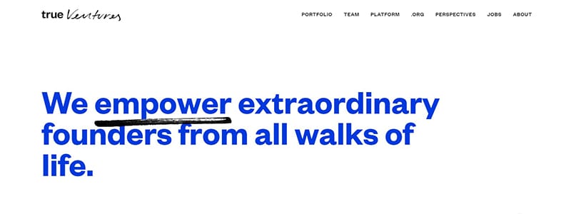
The Ueno studio had already been in the TOP 25 studios according to Awwwards-2018 and had won 29 awards, 13 of which were in the “Site of the Day” category.
On the homepage, a simple white background, a black-and-white gamut of promo videos, and a minimum of color accents. “Nothing in excess” is an accurate description of the website. Only an animated detail in the form of a marker pointing to the accents — just like a business person would do when making notes in their daily planner — creates a catchy effect of the user’s involvement in what the platform is doing, that is, finding people capable of solving important business problems.
18. Animal Homepage
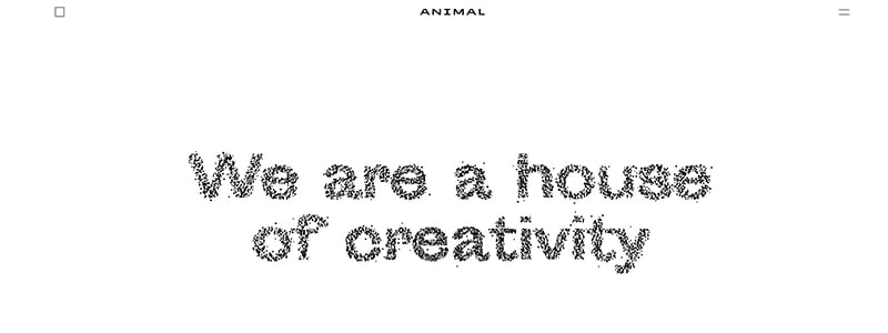
Another corporate website for the Animal Design Studio (Stockholm). Without further ado, the studio’s specialists used a transparent white background and simple fonts. But the magic begins during the interaction of the slogans that fall apart on the initial page when hovered over by your mouse, the portfolio that flips through when clicking, and the features section labels that change. Thus, a simple, at-first-sight homepage website becomes a fascinating “sticky” one, in which the user is involved in a game with interactive elements of the page for a long.
19. Ferro Homepage
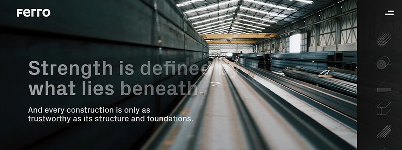
Another studio that participated in rating the best developers of 2018, according to Awwwards, is Bürocratik from the city of Coimbra in Portugal. They developed a corporate website for Ferro, an international manufacturer of carbon steel products.
A simple idea — a promo video on the initial screen, a darkened “industrial” background, and bright accents for targeted actions on the homepage. Mixing simple things is carried out at a professional, high-quality level. The clean design is complemented by high technical website optimization, making the website convenient. This is what contributed to winning over the jury. The optimization parameter for mobile devices received the highest average score of 7.6. This proves the convenience foremost, and only then — the design details.
20. LARGO Inc. Rebranding Homepage
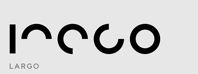
The opposite approach to creating the look and feel of a design agency website is restrained minimalism and animated typography on the homepage, which highlights the photos of works with bright accents. This is exactly what the specialists of the ShiftBrain studio in Japan did with the website for the LARGO agency, which is engaged in the design of beauty salons, restaurants, and offices. Among all the endless particolored web pages, this agency’s website will be bright and memorable, precise thanks to its, at first glance, simplicity and inconspicuousness.
21. EvaGher Makeup Homepage
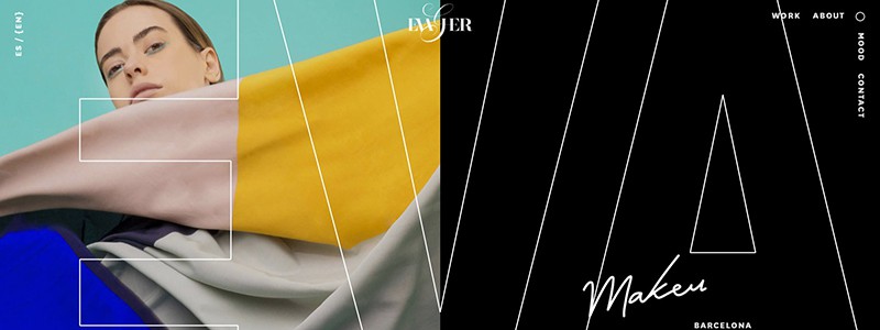
Would you like to see a Spanish approach to web design? With great passion and enthusiasm, the specialists of the Burundanga Studio approached the development of a web portfolio for EvaGher, a makeup artist. Homepage the use of saturation and contrasts in fashion photos, mega-captions in the spirit of glossy magazines, as if made passionately with a brush by a Spanish artist — these techniques managed to become a worthy argument for the Awwwards jury and bring the “Site of the Day” title to the project.
22. Union Homepage
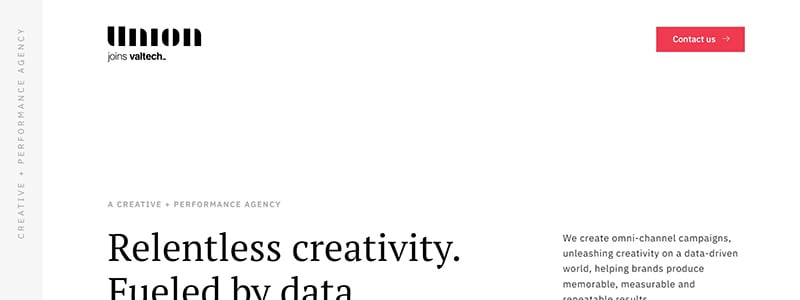
The digital agency from Charlotte, an American city, has created a corporate website with a clean white background, against which a typography play is effectively noticeable. The homepage has animated advertising slogans conveniently and with an optimal font size arranged on a very simple grid. Such predictability is a joy and an impetus to studying the website. Furthermore, the play of fonts distinguishes the main menu: the main items, such as portfolio, services, and “About the Agency” section, are highlighted with an enlarged font. Moreover, the menu icon itself is subtly located in the lower-left corner. Such a solution adds the shadow of extravagance to the usual grid, thus making the menu location the most memorable on the website.
23. Vincent Saïsset — Portfolio Homepage
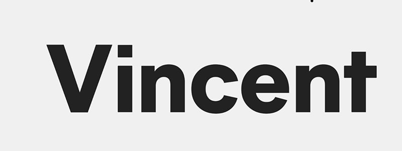
In cooperation with the designer Ludmilla Maury, Vincent Saïsset, the French interactive developer (in Paris), developed the website to become his portfolio. In this homepage, the developers used the power of modern typography, multiplied by creative interactions of a mouse, clicks, and transitions.
24. Kühl&Han Homepage
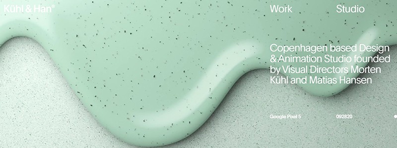
Danish animation design studio Kühl&Han ordered the development of a corporate website for the Program agency. This homepage was also nominated for the “Site of the Day.” The developers used all the beauty of close-up photography and 3D visualization in their design by putting animated 3D videos on the initial screen. Typically, the page consists of a single screen. Nevertheless, it contains all the information that may be needed, such as contacts, a link to the portfolio, and a studio description. All these points are played out by modern typography and located in “hot” places without attracting all the visitor’s attention or getting lost in the dynamic background.
25. Few and Far Homepage
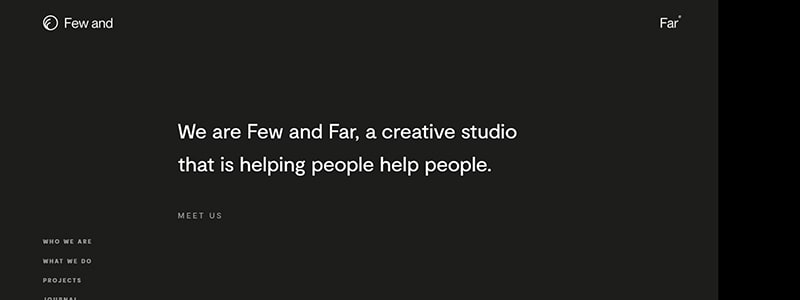
When you look at the British Design & Engineering studio’s Few and Far homepage websites for the first time, there may be something wrong with the layout, but this is just a trick that prompts you to scroll down the website. As you move down, the page blocks come to life, change their size, and an extra dark bar on the right side of the screen turns out to be a portfolio block. Such a subtle approach is indicative of a non-standard approach to user involvement. Furthermore, it testifies to high professionalism and experience in understanding the user experience. The website uses no extra wow effects but rather the psychology of web surfing and a convenient little typography.
26. Finding Ctrl Homepage
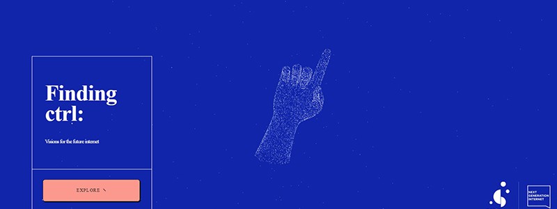
A creative project of the Manchester studio ToyFight (UK) offers to reflect on the history of the Internet, which reached 50 years old in October 2019. This is the sixth time the studio has appeared in the “Site of the Day” category of the Awwwards rating.
The developers offered the website’s visitors an interesting idea and informative content with a bit of humor. The homepage has information played out with interactive graphics, using material colors for the background. For the initial screen, the experts chose an idea with an interactive 3D model of the familiar “pointing hand,” which rotates depending on which side is hovered over.
27. Anoukia — in Pink Homepage
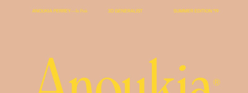
With 3D designer Anoukia Perrey, the American studio Saint Roman developed her portfolio, which included a summer set of her works combined into the “Anoukia in Pink” collection.
The homepage website’s design reminded me of the popular Instagram trend of publishing all photos in a single color gamma. Such profiles are well remembered against the background of particolored and disordered photo galleries.
Borrowing user experience from social networks has already become a reliable way to make your website memorable. Such a source of inspiration is proven by a multi-thousand audience. Besides, it offers some extra bonuses in audience information, which can develop a marketing strategy for the website.
28. Fabio Fantolino Homepage
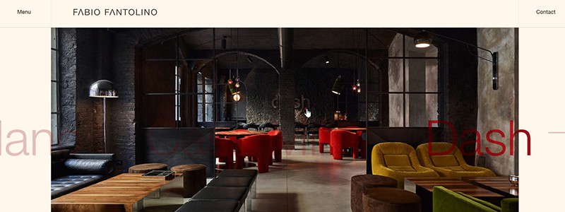
Design agency Adoratorio, based in Brescia (Italy), is another nominee for the “Studio of the Year 2018” title according to the Awwwards ranking. This time, it presented the website of the day—the portfolio of the Turin architect Fabio Fantolino. The project is a single-screen version of the homepage, gradually gaining popularity. You can quickly go to other important sections, such as services, about the author, contacts, etc.
29. Design in Motion Festival Homepage
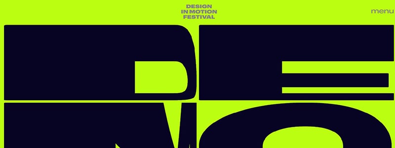
An unprecedented bold stroke is using advertising posters and brochures as a source of inspiration for web design. In developing the design of the same events’ websites, though, such a bold move takes on the shades of an optimistic question: “Why not?”
An online event poster represents the DEMO Festival (Netherlands) website, developed by the Dept agency (Amsterdam). The brightness and saturation of colors, pretentiousness and hyper-dimensions of typography precisely reveal the website’s subject, that is, advertising a mass event. However, even such a move enables you to position the event at first glance. If this happens, the matter will depend on the facilities and informative content on the homepage.
30. Oui Will Agency Homepage
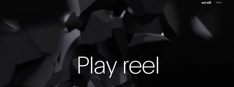
Another agency, known for its place in the design studios rating 2018, is Oui Will from San Diego (USA). This time, the studio presented its updated homepage, placing a premium on the Parallax effect, spectacular sizzle reels, and thin, smooth typography. Everything is divided by screens. Thus, each slogan, video, or news has its screen, no neighborhood. The website is richly flavored with relevant animation and, where possible, conversational interaction with users while preserving a spirit of minimalism and restraint. The proficiency of combining the opposites once again brought the studio a place in the Awwwards ratings.
31. Alacran Group Homepage
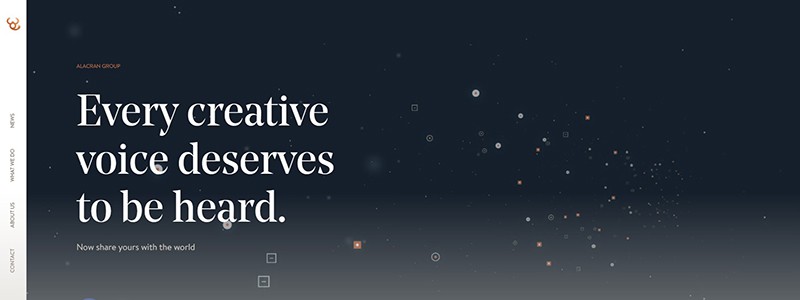
Even if a user visits this homepage design accidentally, it will take them a long time to leave. Together with the creative group Alacran, the Jam3 Design&Development studio, based in Toronto (Canada), developed a homepage offering the user a chance to compose their melody from electronic samples. One can create a mix of sounds by clicking on different points. It can be shared with friends or left on the website so other users can listen to the result.
The website features minimalistic iconography, infographics, an unusual horizontal page layout, and material colors.
32. Getz Homepage
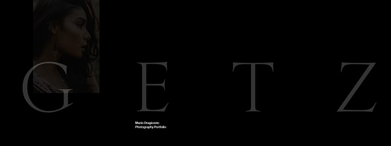
The Bornfight studio from Zagreb (Croatia) has developed an online portfolio for photographer Mario Dragicevic. In such a homepage, it is important for the website not to overshadow the artist’s talent but to emphasize it favorably. The developers got the hang of this by creating a clean black design, magazine typography, and inconspicuous animation of the photographer’s work.
33. Versett Homepage
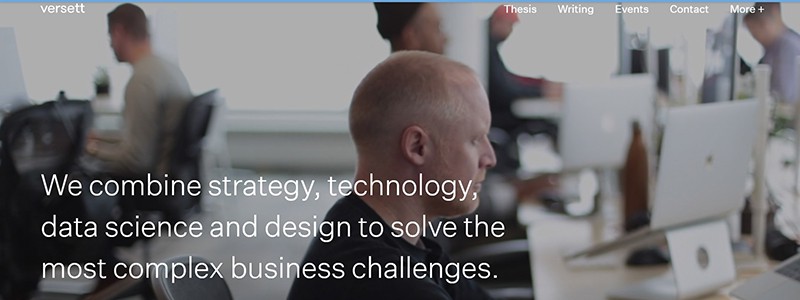
The Versett agency from Calgary (Canada) presented their corporate website to the Awwwards audience. As a result, the website’s jury granted it the “Website of the Day” award.
The studio’s video presentation on the first screen of the homepage is responsible for the wow effect. In addition, animation, strict typography, and interactivity for functional zones support the created mood.
34. Green Chameleon Homepage
The development studio Green Chameleon from Bristol (UK) responsibly approached even such a website as a temporary parked page displayed to visitors. At the same time, the full corporate website, including the homepage, is being redesigned. A simple idea — a clean black background, against which an appealing impact is caused by the color scheme with spreading watercolor paint and the website’s slogan.
35. White Square Homepage
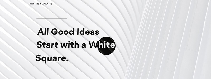
White Square is an investment company website developed by the Italian Studio Adoratorio, which appeared in our rating. The design of the homepage is on the verge of art since it is developed using only white colors and shadows. Beautiful textures of the same color alternate with each other. A flat design, smooth fonts, a light grid of page layout, and subtle typography provide information in portions. The website encourages interaction, convenience, and comfort.
36. Baunfire Homepage
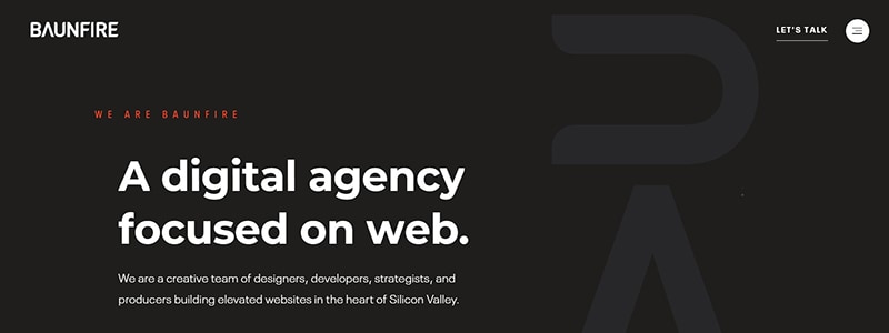
A fresh look at design by residents of Silicon Valley Baunfire (San Jose, USA). The homepage has no large-scale photos or pretentious promo videos. Instead, this is the realm of design implying simple symbols that resemble ASCII Art, drawing with symbols brought to professionalism. We got a nominee website for the day’s events by contributing a beautiful color combination, conversational interaction with the user, and soft animation effects of functional objects and design elements.
37. LOOP Homepage
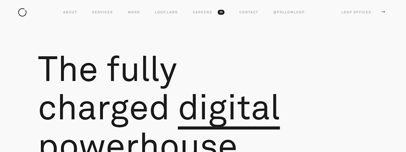
If you want to be distinguished, you can still attract attention with details. For example, you can thoroughly work on the footer homepage design by using the typography and bringing the font ratio to the masterpiece level. This is what the developers of the LOOP studio did to their website and the clean design of the main sections, which may not even surprise the conversant Awwwards jury. But with attention to detail, you’ll amaze them.
38. RALLY Homepage
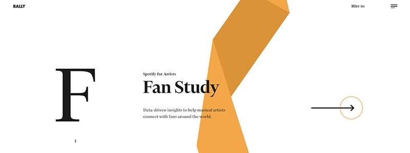
From fantasy violations of the rules — to their traditional compliance. The developers of the Rally studio from the USA proved by the example of their new corporate website that Google’s design guidelines are indeed very useful. A simple abidance by the rules of typography, rules of clean homepage design and white background, together with the addition of some animated geometric shapes and interactive resizing of labels and changing the colors of the backing — these all contribute to obtaining a sleek design, worthy of the title “Site of the Day.”
This example will inspire novice designers who are inexperienced in playing with templates but have a good knowledge of the theory. Such a simple observation of the rules can also bring recognition, although a spoonful of creativity in a barrel of standards will make the design tastier.
39. Dapper Foundation Homepage
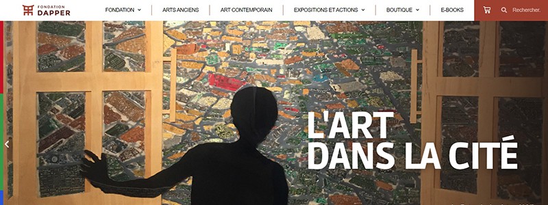
Here’s the recipe for a successful design from the creative Studio VIENS-LÀ (France), exemplified by the Cultural Dapper Foundation homepage website. Naturally, every Internet user’s innate drive for harmony and beauty will take over the remaining work.
40. Lasse Pedersen Homepage
The Danes confidently aimed to take over the palm of victory in terms of creativity from the French. The hairdresser and stylist Lasse Pedersen’s portfolio is the project the designers of KASPER LAIGAARD STUDIO presented to the audience and the Awwwards jury.
The website’s homepage design meets all minimalist requirements and exclusively presents the stylist’s works. However, everything is designed in the spirit of a glossy magazine, which is expected from a figure in the field of fashion: character photos, strict typography, following a clear grid in the best traditions of printed publications.
Summary
Let’s wrap up our discussion on the 40 Best Homepage Website Design Examples. First, we’ve reviewed some of the coolest and most unique homepage designs. Each website thoughtfully designed the perfect homepage to represent its brand and make a great first impression.
From the highest-rated websites to the great examples of portfolio and personal websites, we’ve seen that the banner, headline, and personal touch are some of the primary things to consider when designing a homepage. Including the right functionality, like using Hubspot software, can help increase engagement and lead to more sales.
When designing a perfect homepage, you should always remember to explain your value proposition and provide proof of what you can offer. This is where analytics comes in handy. You can use analytics software like Plerdy to analyze your homepage and understand your audience’s behavior.
If you’re looking for more tips and expert practices to improve your homepage, try checking out how other brilliant websites use their homepage to answer visitors’ questions and provide a great user experience. And remember to try out Plerdy for homepage management and analysis.
So that’s our guide to the 40 Best Homepage Website Design Examples. This article has been a great resource and has provided some inspiration for your website design. Remember, the perfect homepage is out there; you can make it happen with creativity and hard work.