
I’m glad you’re here to read about website usability’s importance. In the current digital era, a company’s website may make or break its success. This article intends to assist you in better understanding website usability’s objectives and tasks and how it can enhance your online presence.
The usability of a website refers to how simple it is for people to use and navigate. There is a chance of losing money and low conversion rates (CR) if a website design needs to be optimized for a positive user experience (UX). Therefore, it is crucial to examine its usability and the behavior of its users. Studies have shown that consumers are likelier to quit a website if it takes longer than three seconds to load, underscoring the significance of website design usability in today’s quick-paced world. Regular website usability research helps identify website usability issues early to keep the user experience smooth.

Watch this space for additional advice on website usability and how it may help your company ? succeed!
Why is Website Usability Important?
The very question of the importance of usability is the first on the agenda for commercial websites. Users don’t care about how interesting and complicated the solutions you used for making a website were. Even a super fancy design may not impress them. So, what do users want? They want websites with good usability. They want websites to be convenient, easy, clear, and interesting. These features will make users return to a website and move from random visitors to regular clients. Therefore, a basic web usability standard is also important nowadays. Understanding the importance of usability in web design is crucial for creating sites that meet user expectations.
A bad experience of users’ interactions with a website design is an enemy of eCommerce. Poor web usability causes an online store to lose 50% of its customers. The reasons are different: it’s difficult to register, impossible to find a necessary product, long loading, a design is difficult to perceive, etc. Unfortunately, no one will learn instructions for usage, even if you make them. Applying strong website usability principles ensures users find key functions immediately. Website design functionality should be clear for a user just right after they quickly scan your website for the first time. You should follow the main website usability standards to provide a good user experience (UX). Ignoring web design usability can cause severe drops in user engagement and sales.
Modern users don’t like doing different actions. Therefore, the final result of sales in an online store depends on the logical sequence of steps for making an order and how you follow the web usability principles.
- A user doesn’t find information about contacts? — They close the tab.
- A client doesn’t see a delivery policy? — They close the tab.
- A complicated form of order? — Goodbye!
- Grammar mistakes in texts? — A bad impression.
- Ads attacking? — Nobody needs that! It’s easier to leave the page.
- Is a page loading for more than 5 seconds? — You’re kidding! A visitor goes away.
Such mistakes are very easy to come across. I can easily list the top worth ones during developing and designing a website. All of it can be seen in the process of website usability testing.
The Main Goal of a Good Website Usability
The usability of website depends not only on looks but also on how intuitive and fast users can achieve their goals. Usability experts keep repeating: “A user needs a clear and convenient website.” But website owners still make this widespread mistake – substitute what’s practical with what’s aesthetic. As a result, the concept of convenience, logic, and simplicity of usage is changed for extraordinariness, creative novelty, and design solutions which, due to being so unusual, are almost insane.
Is the term “usability” similar to “ergonomics”? Partially, yes. Ergonomics means minimizing efforts to do something. Usability is a bit wider notion that includes a general degree of convenience, correlation of intellectual efforts when using a website and its qualitative features, and speed of achieving the necessary result while browsing a website. The main task is simplifying the interaction between a user and a website’s design. Its successful solution can effectively promote the website in search engines and, as a result, increase visitors and potential clients.
Top 9 Terrible Mistakes of Website Usability

Upon reviewing the list of “Top 9 Terrible Mistakes of Website Usability,” it is clear that neglecting usability can be a nail in the coffin for any online business. The importance of website usability cannot be overstated, as it directly affects user engagement and, ultimately, the business’s success. From poor navigation design to confusing layouts, these mistakes can cost businesses dearly and should be avoided at all costs. As an expert in web design, I highly recommend prioritizing usability in every aspect of website design development to ensure a seamless user experience and maximum business potential. Poor site usability often stems from ignoring core website usability design factors.
- Intrusive banners. Almost every online store (popular entertainment websites) has different banners, pop-up windows asking you to subscribe for news, and online consultants chat windows covering some necessary buttons.
- Redundant animation when there’s no optimization. Specialists who design usability sometimes miss that many users do not use the most modern devices. It will be quite difficult for a small weak laptop to handle all the super-animation. The result is sad: a page hangs, and information is displayed incorrectly, leading to closing the website’s bad-working design tab.
- Distracting and deceiving elements. There is plenty of such examples. The most widespread are underlined links and buttons that work like checkboxes.
- Overloading text information. If a seller wants to tell a customer everything about their services, products, and advantages simultaneously, they get quite the opposite effect: the customer sees it all but understands nothing. They can’t quickly figure out what this all is about and make a decision. Thus, the website isn’t effective. It’s necessary to determine the sequence of actions and put priorities properly at the website development stage.
- A creative design and a dead-end scenario. Relying on extraordinariness and creativity without clues for a user is a mistake. And it occurs quite often. How should a user figure out what’s what? How can they find tools if they’re not in regular spots? Such an approach won’t let you count on customer loyalty.
Website usability specialists are already tired of discussing “clear navigation,” but modern companies keep stepping on the same rake. Balancing usability website design with creativity is key to user retention. It even happens that websites win awards for the best design while their web usability is very low. Unfortunately, cases of good graphic design in online stores happen quite rarely. What’s important here is to keep a balance and not fall into extremes. Excessive navigation harms a website design as much as a lack of it. - No brilliant simplicity. No possibility of purchasing in one click or ordering without registration. Forms of registration or order with unnecessary fields to fill are a proven way of losing a potential customer. On the other hand, the minimum of actions for making an order is a serious competitive advantage. And it can improve the website’s design and user experience.
- Non-anticipative search. If a customer looks for a product but makes a typo, will the search still give them the right results?
- Contact information and delivery policy details are hidden. Contacts, payment, and delivery policies of an online store should always be on visible spot. You should pay as much attention to them as to the “Buy” button. That information should have free access from any page.
- Incomprehensible terminology. It may seem to you that every person understands such things as “product available,” “product on order,” “in stock of a supplier,” “transit,” etc. Unfortunately, it isn’t so. A potential client may not know all of this. They might not even know how to log in. Showing real-time deliveries and using simple and clear terminology will be better. A good example of violating basic web usability principles is the “Next” button when ordering. A customer doesn’t know what actions it leads to. Instead, it is better to give specific instructions, like “Proceed to payment” or “Choose a way of delivery.”
Websites with good usability avoid such mistakes. Analyzing user behavior on website pages is relevant for most niches and website designs. Moreover, it’s important for businesses, too. Otherwise, you risk losing customers or gaining low profits.
Main Requirements for Website Usability
An expert analysis of website usability, a search for mistakes, and their correction will let you increase conversion on your website design. Moreover, it can be done based on the main factors impacting web usability. Effective web site usability depends on many factors, including navigation, content, and loading speed.
- Navigation. Minimum of actions, intuitively clear structure.
- Design. One style is a complete picture of all elements on a page.
- Design of products’ e-catalog. Complete information, quality images and videos.
- The simplified order form. Minimum fields for filling up.
- Integrated search. The most relevant search and an option of customizing filters.
- Speed of loading. The higher the speed, the better. Nothing much to add.
- Regular web usability testing allows developers to see the site as users do and fix any website usability issues.
- Quality content. Is Not only the quality of texts important but also their quantity and regular information updates.
When planning a website design from a usability perspective, the most difficult moment for developers is to see the website the way visitors do. Everything may seem clear and understandable to an experienced developer. Still, a checkup shows that a person “from the other side of the screen” doesn’t have their experience and view, so website navigation may appear as a difficult puzzle to that user. That’s why it is reasonable to conduct website usability testing. A test will show whether your website design can be successful or whether any defects can harm users’ trust in your company. Numerous types of research confirm that websites made according to web usability requirements statistically have the highest attendance rate. For online stores, the popularity of a website’s design directly impacts an increase in sales.
Is Usability Audit Important for Your Website?
Usability analysis or website design usability audit is a set of actions and measures taken to determine issues that cause interaction difficulties between users and websites. Yes, a usability audit is very important for any website design. A comprehensive audit examines all aspects of usability website performance to optimize conversion. However, finding existing problems is one of many things usability experts do. They also suggest possible solutions.
Website usability audit relies on specific actions:
- studying users’ behavior on a website;
- Conducting site usability evaluations to find friction points.
- analyzing heatmaps;
- studying the main ways of entering and leaving a website.
Web usability audit tasks are also clearly determined and coincide with the client’s demands:
- increasing website conversions;
- dropping the price for engaging a client to a website;
- increasing an average check’s value;
- cutting expenses on clients support;
- ensuring an increase in orders from 1 client.
Who needs a usability audit? First and foremost, they are websites of companies based on eCommerce. An increase in conversion is their important goal. But website usability testing, audit, and corrections of mistakes should be conducted for every website design that cares about its image. Among all kinds of ways, improving web usability is the simplest and the most effective one for achieving visitors’ loyalty. Knowing how to improve usability of a website is a competitive advantage for any online business. There were many examples when a conversion rate increased from 0.8% to 2%, which doubled sales without spending more on an advertisement.
Importance of Analyzing Website Usability Elements with an Example
Website usability experts dive into all client business processes, taking into account the specifics of their clientele. Interacting with a client allows for determining a list of goals necessary. An example of such a work may include the following steps:
- Analysis of the potential audience outlining the main categories of visitors and customers.
- Usability study.
- Search for barriers decreasing conversion.
- Researching conversion ways during the interaction – from entering to order.
- Analysis of how to clean up information for decision-making.
- Analysis of loading time, a search for mistakes (defects of page making, broken links).
- Analysis of website search’s convenience and presence of distracting factors during conversion.
- This step is crucial for assessing overall web site usability.
- Analysis of design: adequacy of icons, the sharp contrast of fonts and backgrounds, quality of images, etc.
- Giving specific recommendations regarding fixing defects and eliminating mistakes for every step.
- Giving a ready document for making corrections on a website.
- Control of mistakes’ correction.
- Analysis of a cart and the convenience of purchasing control unnecessary fields or steps for ordering.
As a result of such work, following web usability standards, you may see quality changes in a website, which can improve conversion, convert visitors into customers, and raise a company’s income without increasing marketing expenses.
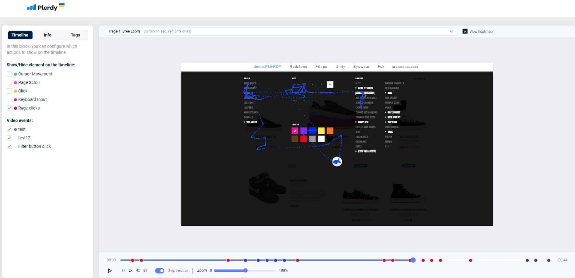
I suggest watching this video case to understand better what’s been said. It illustrates the common steps of a website usability audit based on the analysis of the daybydaycrm.com website. Guided by Martha, a marketing manager at Plerdy, you will see how to practically conduct a website usability audit and boost usability using popular Plerdy tools: heatmaps, user session replays, pop-up forms & feedback, and an SEO-checker.
FAQ: Importance of Website Usability
What is website usability and why does it matter?
Website usability refers to how easy and intuitive it is for users to navigate and interact with a website. A well-optimized website enhances user experience, increases engagement, and boosts conversion rates. If a site is slow, confusing, or difficult to use, visitors will leave quickly, leading to lost potential customers. Understanding website usability design helps businesses create sites that keep visitors engaged longer.
How does poor usability affect business websites?
Bad usability can severely impact an online business. If users struggle to find information, face slow loading times, or encounter complicated checkout processes, they are likely to abandon the site. Studies show that eCommerce stores lose 50% of potential customers due to usability issues. Improving usability ensures a seamless experience, keeping visitors engaged and increasing sales.
What are the most common website usability mistakes?
Some of the worst usability mistakes include slow page loading times, intrusive pop-ups, unclear navigation, excessive text, and hidden contact or delivery information. Additionally, overly creative designs that sacrifice clarity can confuse users. Avoiding these pitfalls ensures a smoother user experience and higher conversion rates.
How can Plerdy help improve website usability?
Plerdy offers usability analysis tools like heatmaps, session recordings, and SEO checkers to help businesses identify weak spots in their website design. These tools reveal user behavior patterns, allowing site owners to make informed improvements that enhance navigation, readability, and overall user satisfaction.
Why is usability testing essential for website success?
Usability testing helps identify barriers that prevent users from completing desired actions, such as making a purchase or signing up. By analyzing user interactions, businesses can optimize their website’s structure and content to ensure a frictionless experience. Implementing usability improvements based on testing results can significantly boost engagement and conversions.
Conclusion
Website usability is essential to creating a successful online presence for any business, whether a startup or an established brand. Although the focus may be on designing an attractive website interface and menu, personal satisfaction for each visitor ultimately matters. A well-designed website can lead to high customer satisfaction, increased traffic, and a positive impact on your business. You can easily achieve your goals and build a local and global presence by implementing effective usability management and analytics tools.
Suppose you’re exploring the importance of website usability and how to create a seamless user experience for your visitors. In that case, I recommend trying out the Plerdy tools for usability analysis. These tools offer great inspiration and capabilities for creating a website interface that keeps visitors engaged and satisfied. So don’t hesitate to try them today and see how to improve your website’s usability!