
SaaS teams often celebrate organic traffic a little too early. The SEO graph moves up, blog pages get more clicks, maybe a few feature pages start ranking, and everyone feels that growth is finally working. Then the signup numbers stay almost the same. Annoying, but common.
The problem is not always traffic quality. Many SaaS websites get the right visitors but lose them because the page does not explain the product fast enough, the CTA feels vague, pricing creates doubt, or signup asks for too much too soon. SEO brings the visit. UX helps that visit become a decision. For SaaS websites, ranking pages only matter when users understand the product, trust the offer, and can move toward signup without friction.
Why SaaS SEO Alone Does Not Create Product Signups
SaaS SEO can bring organic traffic, but traffic is only the start of the SaaS funnel. A user can land on a blog post, read half of it, agree with the advice, and still leave without knowing what your product does. That is not a keyword problem. That is a UX and conversion problem.
The gap usually starts with search intent mismatch. A SaaS team ranks for an informational keyword, but the page behaves like a sales page. Or the opposite happens: a commercial visitor lands on a vague educational page with no product path. In both cases, the user feels a small disconnect. They came for one thing, the page gives them another, and signup conversion drops.
Weak landing page clarity creates another leak. SaaS products often explain themselves through internal language: dashboards, workflows, modules, engines, hubs, and other words that make sense to the team but not to a new visitor. A SaaS landing page has a few seconds to answer three simple questions: what is this, who is it for, and why should I care?
CTA placement also matters. Many SaaS pages hide the main signup or demo CTA after long copy, mixed messages, or too many secondary links. Some pages use generic labels like “Get Started” without explaining what happens next. Do users start a free trial? Book a demo? Create an account? Talk to sales? That uncertainty slows action.
Pricing uncertainty is even worse because it appears late in the funnel. A visitor may read the blog, click a feature page, check the SaaS pricing page, and then stop because plan limits are unclear or the annual discount feels confusing. Signup friction adds the final hit: too many fields, no product preview, strict password rules, or forced email verification before value appears.
A simple example: a visitor searches “how to improve signup conversion,” lands on a helpful guide, clicks a feature page, then reaches a signup form asking for company size, phone number, job title, and password before showing anything useful. The SEO worked. The SaaS UX did not.
How SEO And UX Work Together In A SaaS Funnel
A SaaS website is not a collection of separate pages. It is a path. Users may not follow that path perfectly, of course. They jump around, open pricing in a new tab, return to the blog, check an alternatives page, compare screenshots, and only then decide whether the product deserves their email address.
Still, most SaaS website funnels follow a rough pattern: blog page, feature page, comparison page, pricing page, then signup or demo request. SEO helps the right visitor enter the funnel. UX helps that visitor understand the next step without feeling pushed too hard.
A blog post should not only rank. It should connect the problem to a useful product path. A feature page should not read like documentation. It should show what the user can do and why it matters. A comparison page should not pretend every competitor is bad. It should help a serious buyer compare use cases, limitations, workflows, pricing notes, and product fit. A pricing page should reduce doubt, not create it. A signup page should help the user reach first value as quickly as possible.
This is where SEO and UX become one system. Search intent decides what the page should promise. UX decides how quickly the visitor can understand that promise and act on it. SaaS conversion rate optimization sits between those two jobs.
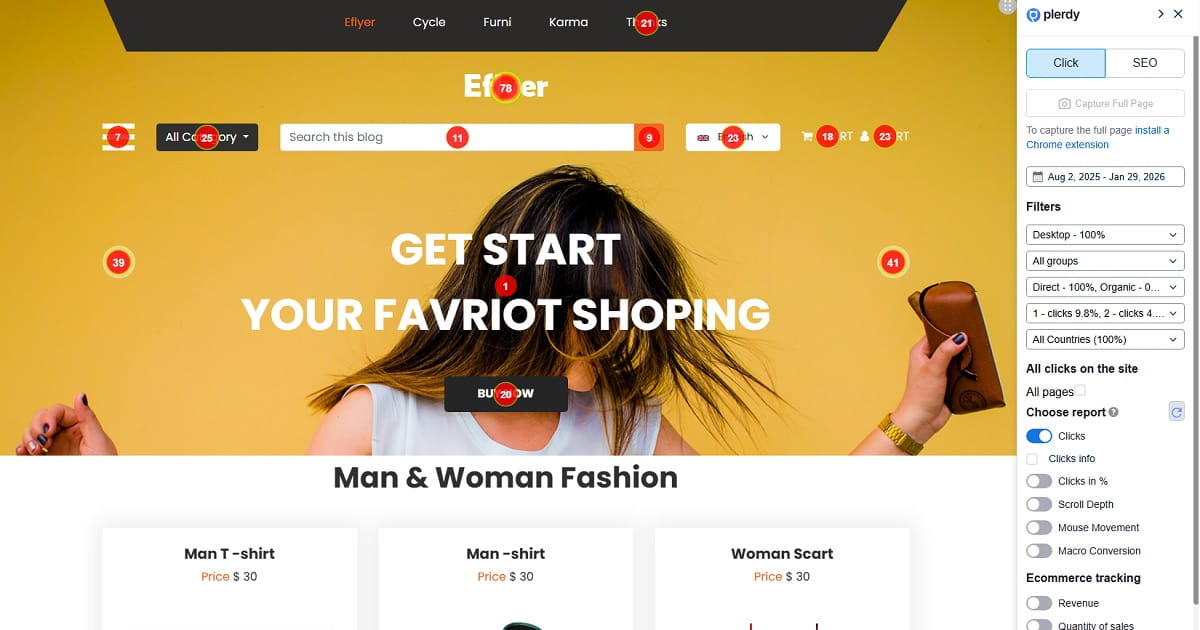
Plerdy fits naturally into this type of SaaS website optimization because it helps teams see what users actually do after organic traffic lands. For example, a SaaS marketer can check whether blog readers click from a guide to a feature page, whether pricing visitors scroll far enough to see plan details, or whether a demo CTA gets ignored because it appears too late. Heatmaps, session replay, event tracking, and funnel analysis can turn “we think users are confused” into something more concrete.
Without that behavior layer, teams often optimize blind. They rewrite headings because traffic is flat, but the real issue is a hidden CTA. They add more content to a feature page, but users already stop above the fold. They redesign pricing, but the biggest problem is a signup form after pricing. SEO shows where users came from. UX analysis shows where they got stuck.
Start With Search Intent, Not Just Keywords
Many SaaS SEO strategies still begin with keyword volume. That is useful, but not enough. A keyword can bring traffic and still be a poor signup opportunity if the intent does not match the page type. SaaS SEO works better when every keyword is connected to a user state: learning, comparing, choosing, testing, or buying.
Informational Intent
Informational intent means the user is trying to understand a problem. They may not be ready to compare tools yet. A query like “how to reduce churn” should probably lead to a guide, checklist, template, or educational blog post. The UX goal is not to force a demo CTA in the first screen. It is to build trust, explain the problem clearly, and offer a relevant next step.
For SaaS content strategy, this means the blog should include product paths without turning every paragraph into a pitch. A churn article might link to a customer analytics feature page, a retention dashboard example, or a template. The visitor gets help first, then a path to the product.
Commercial Intent
Commercial intent means the user is comparing options. A query like “best user behavior analytics tools” needs comparison content, not a generic blog post with random advice. The user expects categories, differences, use cases, screenshots, pricing notes, and practical reasons to choose one tool over another.
These pages are important for SaaS SEO because commercial visitors are closer to action. But the UX must respect their mindset. They are skeptical. They do not want empty claims. They want quick comparison, honest trade-offs, and a CTA that fits the buying stage, such as “Compare Features,” “View Pricing,” or “Start Free Analysis.”
Product-Led Intent
Product-led intent appears when the query already points toward a product category, a feature, or a competitor. Searches like “Plerdy alternative,” “Hotjar alternative,” “website heatmap tool,” or “signup funnel analysis software” need pages that connect the pain directly to a workflow.
For this intent, the page should show how the product works. Not in a heavy manual style, but through short examples. A visitor searching for a competitor alternative may want to know what Plerdy does differently, how heatmaps and session replay support SaaS UX analysis, what the setup feels like, and whether the product fits their team.
The practical rule is simple: do not send every keyword to the same type of page. Informational intent needs useful education. Commercial intent needs comparison and proof. Product-led intent needs workflow clarity and a short path to signup, demo, or pricing.
Build SaaS Landing Pages That Explain Fast
A SaaS landing page should not make visitors work hard to understand the offer. That sounds obvious, but many SaaS pages still open with broad promises that could fit fifty products. “Improve team productivity” can mean project management, analytics, HR software, automation, reporting, or something else entirely. The visitor has to translate. That is bad SaaS UX.
A stronger SaaS landing page structure starts with a clear headline. The headline should name the product category or the main outcome. The supporting text should add who it is for and what changes after using the product. A short product promise usually beats a clever line. Clever can work, but only after clarity is already there.
Visual proof should come early. SaaS buyers want to see the product, not just read adjectives. Screenshots, short interface previews, workflow images, or small product clips can help users understand what they are signing up for. Even a simple annotated screenshot can reduce doubt. In SaaS audits, it is common to see users scroll past abstract hero sections and stop only when the actual dashboard appears.
Feature blocks should explain benefits through tasks, not just names. Instead of listing “Heatmaps,” “Session Replay,” and “Funnels,” show what a SaaS marketer can do with them: find ignored CTAs, watch form hesitation, or track movement from organic landing page to free trial signup. Use cases help because they connect features to the user’s job.
A good SaaS landing page should also include trust signals near decision points. These can be customer examples, short testimonials, security notes, integration logos, review snippets, or usage context. The FAQ should sit close to the moment where doubt appears. For example, if pricing is mentioned, answer plan and trial questions nearby. If the CTA asks users to book a demo, explain what happens after they click.
The CTA path should be visible without becoming noisy. A SaaS landing page can use one primary action and one secondary action. For example, “Start Free UX Analysis” can be the main CTA, while “View Pricing” or “Watch Product Tour” supports users who are not ready yet.
Plerdy heatmaps and scroll depth reports can help SaaS teams check whether visitors actually see the important parts of the landing page. If users never reach trust proof, the section may be too low. If CTA clicks cluster around a secondary link, the main CTA may not match intent. If users pause on a feature block, that block may need a clearer product example or a stronger next step.
Demo CTA UX: Make The Next Step Obvious

A demo CTA looks small, but it carries a lot of SaaS conversion weight. The user is not just clicking a button. They are agreeing to spend time, share contact details, maybe talk to sales, and expose a business problem. If the CTA is vague, hidden, or badly matched to intent, many users quietly avoid it.
One common mistake is using too many CTAs on the same page. A SaaS homepage might ask visitors to “Get Started,” “Book Demo,” “Explore Features,” “Contact Sales,” “Watch Video,” and “Download Guide” all within the first few screens. More options can feel helpful to the team, but to the visitor it can feel like work.
Another issue is vague labels. “Submit” is weak. “Get Started” is better but still unclear. “Book a 15-minute SaaS funnel review” tells the user what will happen. “See how Plerdy tracks signup behavior” connects the action to a specific outcome. “Start free UX analysis” works when the product can offer quick self-serve value.
CTA context matters too. A demo CTA placed before the product is explained may feel premature. A pricing CTA placed after a vague feature section may feel risky. A free trial CTA on an enterprise page may attract the wrong action, while a demo CTA on a self-serve page may slow down users who wanted to test immediately.
Use a demo CTA when the product is complex, expensive, requires sales help, or needs custom setup. Use a free trial signup CTA when users can reach product value without a call. Use a product tour CTA when visitors need to understand the workflow before creating an account. Use a pricing CTA when commercial intent is high and the user is clearly comparing costs.
Small wording changes can make a real difference in SaaS UX. “Book Demo” is fine, but “Book a 15-minute SaaS funnel review” reduces uncertainty. “Start Free Trial” is clear, but “Start Free UX Analysis” gives the user a reason. The best CTA is not always the shortest one. It is the one that makes the next step obvious.
Pricing Page UX Can Quietly Kill SaaS Signups
The SaaS pricing page is where interest turns into judgment. A visitor may like the product, understand the features, and trust the brand, but pricing can still stop them. Not always because the price is too high. Often because the page creates doubt too late in the funnel.
Plan comparison clarity is the first issue. SaaS pricing pages often use plan names that sound nice but explain little: Starter, Growth, Pro, Scale, Business. That is fine if the comparison table makes the difference clear. But when feature limits, seats, usage caps, credits, history length, integrations, or support levels are hidden, the user has to guess. Guessing slows signup conversion.
Feature naming can also create friction. Internal product names might be familiar to your team, but new users need plain language. A plan that includes “Advanced Behavioral Layer” may sound impressive. “Session replay for form and CTA issues” is easier to understand. Pricing page UX should reduce cognitive load, not show every internal label.
The monthly versus annual toggle needs care. Annual discounts can improve revenue, but they can also confuse users if the default price looks lower than the real monthly cost. Make the billing model clear. If the displayed price is billed annually, say it close to the number, not in small text far below the table.
Hidden limits are another conversion killer. If a user signs up and later discovers that reports, seats, projects, events, or data history are more limited than expected, trust drops. Better to explain limits in simple language near the plan. SaaS buyers usually tolerate limits better than surprises.
Trust signals should appear on the pricing page, not only on the homepage. Add short proof near the CTA: security note, support promise, refund or trial details, customer quote, or setup explanation. FAQ near pricing is also useful because questions appear right there: Can I cancel? Is there a free trial? What happens if I exceed limits? Do I need a developer? Is the demo required?
CTA consistency matters. If the homepage says “Start Free Trial,” the pricing page should not suddenly say “Contact Us” for the same plan unless there is a clear reason. Enterprise plans may need a demo path, but self-serve plans should keep the signup route simple.
Plerdy session replay and click tracking can help reveal pricing hesitation. Users may hover over plan limits, open FAQ items repeatedly, click unavailable features, or move back and forth between pricing and feature pages. Those behaviors show where the pricing page creates doubt. The fix may be a clearer label, a better FAQ answer, or a different CTA, not a full redesign.
Reduce Onboarding Friction Before It Damages SEO ROI
SEO ROI does not stop at the signup click. A free trial signup that never reaches value is not real growth. It is just a new account in the database. For SaaS websites, the first product experience is part of the organic traffic conversion path.
Many SaaS teams lose users after they already did the hard part. The visitor found the page through organic search, understood the offer, clicked the CTA, and started signup. Then the form asks for too much. Full name, company name, role, phone, team size, industry, country, password, newsletter consent, and sometimes even a mandatory call booking. Every extra field needs a reason.
Password rules create another small but painful problem. Users do not mind security, but they dislike guessing rules after failing. Show password requirements before the error. Keep the error message plain. Do not make users retry three times before they even see the product.
Email verification can also slow first value. Sometimes it is required, but the timing matters. If users must verify before seeing anything, many will stop. A better flow may allow a limited product preview, then request verification before saving data, exporting reports, or inviting teammates.
The empty dashboard problem is especially common in SaaS onboarding. A new user signs up, enters the product, and sees a blank screen because no data exists yet. That moment feels dead. Product-led onboarding should guide the user toward a first useful action: connect a website, create a project, upload a file, run a scan, invite a teammate, or view sample data.
Slow first value damages trial conversion because the user does not feel progress. Organic users often arrive with a specific problem. They searched for something, clicked a page, and expected a solution. If onboarding asks them to configure ten things before showing value, the momentum disappears.
Plerdy can help SaaS teams watch where users drop off or struggle before completing signup. Session replay can show form hesitation, repeated clicks, confusing fields, or users returning to pricing before finishing account creation. Funnel analysis can show whether organic traffic starts signup but fails before activation. That is where SaaS CRO becomes more honest. The issue may not be the landing page. It may be the first five minutes after signup.
Product-Led Content Turns Readers Into Users
Product-led content is not a blog post with a product banner pasted near the end. It is content that teaches through the product’s real workflow. The reader learns something useful, and the product becomes part of the solution naturally.
For SaaS SEO, this matters because educational traffic is often far from purchase. A user searching “how to analyze a landing page” may not be ready to buy website analytics software. But they may be ready to see a practical workflow: check scroll depth, find ignored CTA blocks, review session recordings, compare behavior on mobile and desktop, then adjust the page. That is useful content, and it shows why the product exists.
A Plerdy example fits well here. In an article about landing page analysis, the content can show how a marketer uses a heatmap to see whether visitors reach the pricing block, then checks session replay to understand hesitation around a form, then uses funnel analysis to track movement from landing page to signup. The product appears because it helps complete the task.
Product-led content also works for signup conversion topics. An article about improving SaaS signups can show how to inspect CTA clicks, compare blog-to-feature paths, find form drop-off, and test clearer CTA copy. Plerdy heatmaps and session replay can be mentioned as part of that workflow, not as a random advertisement.
Screenshots, short examples, templates, and checklists make product-led SEO stronger. Readers do not need a huge product tour inside every article. They need enough context to imagine themselves using the product. A screenshot with two labels can sometimes do more than four paragraphs of feature copy.
Use-case pages also support product-led content. Instead of building only generic feature pages, SaaS teams can create pages around jobs: improve signup conversion, analyze pricing page clicks, reduce onboarding friction, track demo CTA performance, or audit SaaS landing page UX. These pages match organic search traffic with real product workflows.
The key is to build content around pain, not only keywords. Keywords tell you how users search. Pain tells you why they care. A SaaS content strategy that combines both can turn readers into users without making every article feel like a sales pitch.
Comparison Pages And Alternatives Pages Need Better UX
Comparison pages and alternatives pages often rank well because they match commercial intent. Users who search for “best SaaS analytics tools,” “Plerdy alternative,” or “Hotjar alternatives” are not just reading casually. They are narrowing options. That makes these pages valuable for SaaS SEO and SaaS UX.
The problem is that many comparison pages feel fake. They pretend to be neutral, but every section quietly says the same thing: our product wins at everything. Users notice this. SaaS buyers are used to marketing pages. If the comparison has no real differences, no pricing notes, no use cases, and no honest trade-offs, trust drops.
Good comparison UX starts with clear structure. Show who each product is best for. Explain the main differences in features, setup, reporting, integrations, support, pricing approach, and team fit. Screenshots help because they show the workflow instead of only describing it. Honest pros and cons make the page feel more credible, even when you are clearly positioning your own product.
Alternatives pages should also respect user intent. A visitor searching for a competitor alternative may be frustrated with price, complexity, missing features, limited reports, setup time, or support. The page should address those reasons directly. Not aggressively, just clearly.
For example, a Plerdy alternatives page can position Plerdy through real use cases: checking CTA clicks on SaaS landing pages, watching session replay to find signup friction, using SEO Checker to detect page issues, and tracking conversion movement from feature pages to pricing and signup. That is more useful than saying “Plerdy is the best choice” five times.
CTA placement on comparison pages needs care. Put a CTA after the user has enough context. A button at the top is fine for returning visitors, but serious buyers often need proof before action. After the comparison table, use a CTA that matches the page: “Compare Plerdy Features,” “Start Free UX Analysis,” or “See How Plerdy Tracks Signup Behavior.”
Comparison pages can support internal linking too. Link from blog posts to relevant comparisons when the reader is likely moving from education to evaluation. Link from alternatives pages to pricing, feature pages, case studies, and signup. The goal is not to trap the user. It is to remove the next question before it becomes a reason to leave.
Internal Linking Should Guide Users Toward Signup
Internal linking is often treated as an SEO task: add links, pass authority, help crawling. Fine. But on a SaaS website, internal linking is also UX. It tells users where to go next when they are ready for the next level of detail.
A blog post about reducing onboarding friction should not end with a generic “learn more” link to the homepage. It should link to a feature page about session replay, a use-case page about signup funnel analysis, or a checklist for SaaS onboarding UX. The link should match the reader’s current problem.
Feature pages should link to pricing when the visitor understands value. They can also link to use cases, integrations, and related product workflows. A feature page about heatmaps might link to “analyze SaaS landing page CTAs,” “track pricing page clicks,” or “find ignored signup buttons.” That is useful for both search engines and humans because the anchor text explains the destination.
Comparison pages should guide users toward demo or signup, but also to proof. A visitor comparing tools may need pricing details, product screenshots, a setup explanation, or a case study. Link those naturally. Do not make them hunt in the header menu.
Pricing pages should link to FAQ answers and risk reducers near the plans. If users wonder about cancellation, support, limits, trial length, or setup, the answer should be close. A case study can link to signup when it shows a problem similar to the visitor’s situation.
Practical SaaS internal linking examples:
- From “how to improve signup conversion” to a session replay feature page.
- From “SaaS landing page checklist” to a heatmap workflow page.
- From “best user behavior analytics tools” to a comparison page and pricing page.
- From a pricing FAQ about setup to a product tour or onboarding guide.
- From a case study about demo conversion to a demo CTA page.
Clear anchor text matters. “See how heatmaps show CTA clicks” is better than “click here.” It sets expectation and helps the user feel in control.
Measure The Full Path From Organic Traffic To Signup
Rankings alone are not enough. Organic traffic can grow while SaaS signups stay flat. That usually means the measurement system is too shallow. A team sees sessions, impressions, average position, and maybe conversions, but not the actual path between landing and signup.
Start with the organic landing page. Which pages bring users into the site? Blog posts, feature pages, comparison pages, alternatives pages, pricing pages, or help content? Each entry point has a different job. A blog page may need to move users to a feature page. A comparison page may need to move users to pricing or demo. A pricing page may need to move users directly to free trial signup or enterprise contact.
Then measure scroll depth. If visitors do not reach the product example, trust proof, pricing details, or CTA section, those blocks are not helping. They exist on the page, but not in the user experience.
CTA clicks are the next signal. Track which buttons users click and which they ignore. Sometimes the main CTA gets fewer clicks than a small text link because the text link better matches intent. That is not always bad. It may show that the main CTA is too aggressive for that page.
Measure feature page visits after organic entry. If blog readers never visit a feature page, your product-led content may be weak. If they visit feature pages but do not check pricing, the feature page may fail to create enough buying interest. If they reach pricing but do not start signup, pricing page UX may be the leak.
Signup starts and signup completions should be separated. A user who clicks “Start Free Trial” is not the same as a user who completes account creation. Track demo requests, trial activation, and first product actions too. SaaS growth depends on movement, not only clicks.
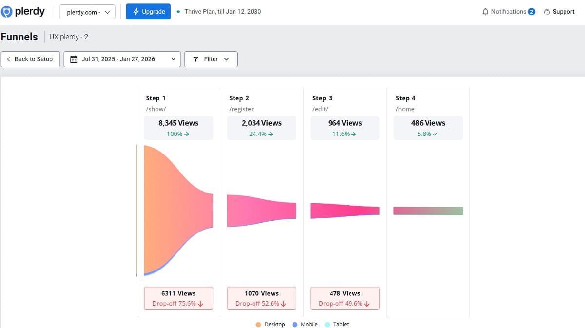
Plerdy can help SaaS teams inspect this full path. Heatmaps show attention and CTA clicks. Session replay shows hesitation, rage clicks, confusing forms, and navigation loops. Event tracking and conversion funnel analysis show how users move from organic traffic to feature pages, pricing, signup starts, and completions. This gives marketers and UX teams a shared view of the SaaS website funnel.
The point is not to collect more dashboards. It is to find the exact moment where intent fades. Once you know that, SaaS website optimization becomes more practical: rewrite a CTA, move proof higher, simplify a form, clarify a plan limit, add a product example, or change the internal link path.
Common SaaS SEO And UX Mistakes That Block Signups
Most SaaS websites do not lose signups because of one dramatic mistake. It is usually a set of small leaks. Each one feels minor in isolation, but together they weaken SEO traffic conversion. Here are common issues worth checking.
- Ranking blog posts with no product path. The article gets organic traffic, but there is no clear link to a feature, use case, comparison page, or signup path. Readers leave smarter, but not closer to using the product.
- Feature pages written like documentation. A feature page should explain value, use cases, and outcomes. If it only lists technical details, new visitors may not understand why the feature matters.
- Pricing page hiding key details. Hidden limits, unclear billing, vague plan differences, and missing FAQ answers create doubt when the user is close to action.
- Generic demo CTA. “Book Demo” can work, but it often feels empty. A stronger demo CTA explains the meeting, the outcome, or the reason to click.
- No comparison pages. Commercial-intent visitors often search for tool comparisons and alternatives. If your SaaS website has no useful comparison content, competitors may own that decision moment.
- Weak internal links. Blog posts, feature pages, pricing pages, and case studies should guide users through the SaaS funnel. Random links to the homepage rarely help.
- Too many signup fields. Every required field adds effort. Ask only for what is needed to create value or qualify the account at that stage.
- Slow page speed. SaaS buyers may forgive a complex product, but they rarely forgive a slow first impression. Slow pages weaken both SEO performance and UX.
- No trust proof near decision points. Testimonials, security notes, customer examples, integration logos, and support details should appear where users feel risk, not only at the bottom of the homepage.
- Poor mobile UX. Many SaaS teams design for desktop buyers, then forget that research often happens on mobile. Broken tables, cramped pricing cards, and hidden CTAs can damage mobile signup conversion.
- Unclear product category. If users cannot quickly tell whether the product is analytics software, CRO software, SEO software, onboarding software, or something else, they will not work hard to classify it.
- No FAQ near decision points. FAQ content should answer real friction: trial length, cancellation, setup, integrations, plan limits, security, and what happens after demo request.
- Same CTA for every intent. Informational visitors, comparison visitors, pricing visitors, and returning users may need different next steps. One CTA label across the whole site often ignores user intent.
- Product screenshots that show too little. A beautiful graphic can support design, but SaaS visitors often need to see the actual interface before trusting the offer.
These problems are fixable. The hard part is noticing them before blaming traffic quality. That is why SaaS CRO should include behavior analysis, not only keyword tracking and page edits.
A Practical SaaS SEO And UX Checklist
This checklist is designed for SaaS marketers, SEO managers, CRO specialists, and UX teams who want useful actions this week. Not a six-month rebuild. Start with the pages that already get organic search traffic and already sit close to signup.
- List your top organic landing pages. Separate blog posts, feature pages, comparison pages, alternatives pages, pricing pages, and help content. Each page type should have a different conversion job.
- Map the next best action for every high-traffic page. A blog post may need a feature link. A comparison page may need pricing. A pricing page may need signup or demo. Do not send everyone to the homepage.
- Check search intent manually. Look at the keyword and ask what the user really wants: education, comparison, product details, pricing, or signup help.
- Rewrite unclear hero sections. The first screen should explain the product category, audience, value, and next step without forcing users to scroll.
- Add real product context to educational content. Use short workflows, screenshots, checklists, or examples. Product-led content should help readers understand how the product solves the problem.
- Use Plerdy heatmaps on key SaaS landing pages. Check whether users see the CTA, pricing teaser, trust proof, product screenshots, and FAQ blocks.
- Review CTA labels by intent. Replace vague labels with clearer actions, such as “Start Free UX Analysis,” “View SaaS Pricing,” or “Book a 15-minute Funnel Review.”
- Simplify the pricing page. Make plan differences, limits, billing periods, trial rules, and enterprise paths easy to understand without opening five extra pages.
- Place FAQ content near friction. Add answers about cancellation, setup, integrations, limits, support, security, and demo steps close to the CTA or pricing table.
- Use Plerdy session replay to inspect signup behavior. Watch for form hesitation, repeated clicks, field errors, mobile issues, and users returning to pricing before finishing signup.
- Track signup starts separately from signup completions. This shows whether the landing page gets users interested or whether the form and onboarding flow lose them.
- Strengthen internal links from blog to product pages. Use descriptive anchor text that explains what the user will get after clicking.
- Create or improve comparison and alternatives pages. Include clear differences, honest pros and cons, use cases, screenshots, pricing notes, and a CTA after the comparison.
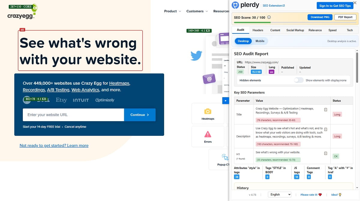
- Use Plerdy SEO Checker on important SaaS pages. Fix missing metadata, duplicate titles, thin page sections, broken links, and technical SEO issues that weaken organic visibility.
- Audit onboarding for first value. Remove unnecessary fields, explain password rules, avoid blank dashboards, and guide users to one useful action after signup.
- Review mobile behavior. Check pricing tables, CTA visibility, form fields, screenshots, menus, and scroll depth on mobile traffic, not only desktop.
The best SaaS website optimization work often starts with pages that already have traffic. You do not need to wait for more rankings before improving signup conversion. You can make the existing organic traffic work harder by removing friction from the path.
Final Thoughts: Traffic Is Only The First Half Of SaaS Growth
Organic traffic feels good, but it is only the first half of SaaS growth. SEO creates the visit. UX creates the decision. The real win happens when content, landing pages, feature pages, comparison pages, pricing, demo CTAs, onboarding, and signup flows feel connected.
A SaaS website should help users move from problem to product without confusion. That means matching search intent, explaining value fast, showing real product workflows, reducing pricing doubt, and making signup feel easy enough to start.
Plerdy can help SaaS teams find where visitors hesitate before signup by showing clicks, scroll depth, session behavior, SEO issues, and funnel drop-offs. Sometimes the fix is not more traffic. Sometimes it is simply making the next step easier to trust.
FAQ
How Do SEO And UX Work Together For SaaS Websites?
SEO helps SaaS websites attract the right organic traffic from search engines. UX helps those visitors understand the product, trust the offer, and take the next step, such as viewing pricing, starting a free trial, or booking a demo. When SEO and UX work together, every page has a clear intent, useful content, and a logical path toward product signup.
How Can SaaS Websites Turn Organic Traffic Into Product Signups?
SaaS websites can turn organic traffic into product signups by matching search intent with the right page type, using clear landing page copy, adding product-led examples, improving CTA labels, reducing pricing doubt, and simplifying signup forms. The goal is to move users from the page they landed on to the next helpful action without confusion.
What Pages Matter Most For SaaS SEO And UX?
The most important pages usually include blog posts, feature pages, use-case pages, comparison pages, alternatives pages, pricing pages, signup pages, and demo request pages. Blog posts attract informational traffic, while comparison, pricing, and feature pages often support stronger signup intent. Each page should guide users toward a relevant next step.
How Can SaaS Teams Improve Pricing Page UX?
SaaS teams can improve pricing page UX by making plan differences clear, explaining feature limits, showing monthly and annual billing honestly, adding FAQ answers near pricing, using consistent CTAs, and including trust signals close to decision points. Session replay and click tracking can also show where users hesitate before signup or demo request.
Why Does Onboarding Friction Hurt SaaS Conversion?
Onboarding friction hurts SaaS conversion because users may sign up but fail to reach value. Too many fields, unclear password rules, forced verification, empty dashboards, and slow setup can stop users before they understand the product. Product-led onboarding should help new users complete one useful action as quickly as possible.
How Does Plerdy Help Analyze SaaS Signup Funnels?
Plerdy helps SaaS teams analyze signup funnels with heatmaps, session replay, SEO checks, event tracking, and conversion funnel analysis. Teams can see CTA clicks, scroll depth, form hesitation, confusing page sections, signup drop-offs, and movement from organic landing pages to feature pages, pricing pages, and free trial signup.