
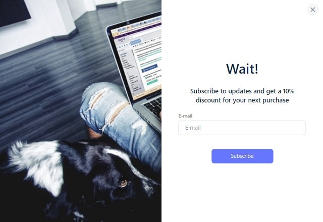
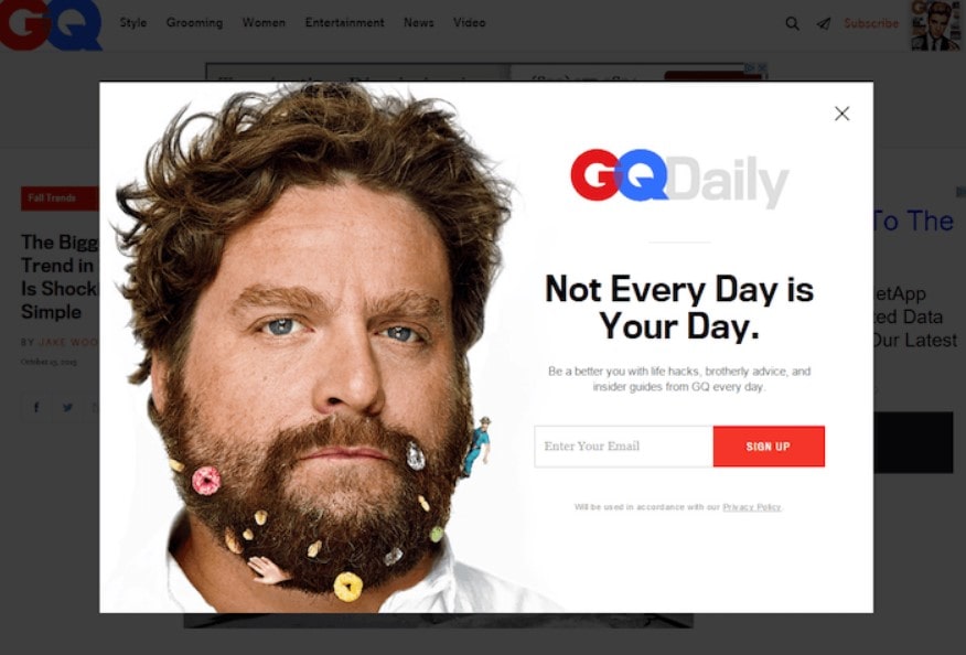
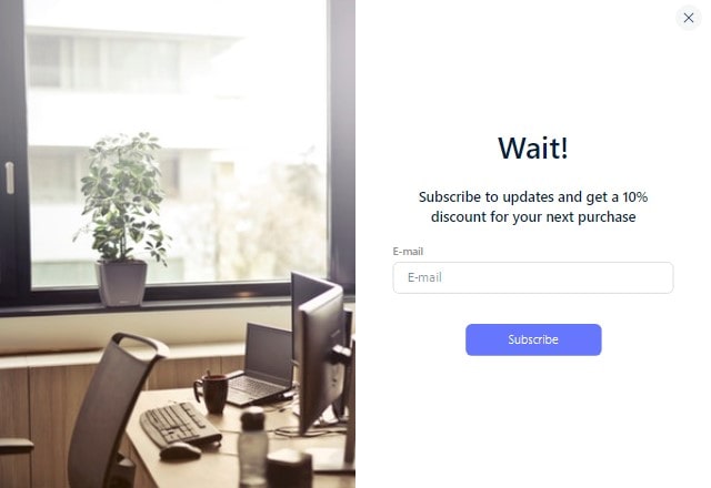
In the bustling digital marketplace, a squeeze page is vital for funneling potential leads into a solid email list. This landing page swiftly and accurately collects email addresses. Its excellent conversion rate is due to appealing content and few interruptions.
In the health and wellness industry, a squeeze page may offer a free nutrition eBook for an email address. Here’s how it works:
- An enticing headline that promises a specific benefit
- Short, persuasive copy highlighting the offer’s value
- A straightforward form for email submission
- A strong call-to-action (CTA) button

Leveraging such a page boosts your email marketing efforts and enhances your SEO strategy by keeping visitors engaged and reducing bounce rates. Consider Plerdy’s user behavior analysis tool to take this further. This can increase squeeze page conversion rates, usability, and A/B testing insights, which are crucial to a successful online business strategy.
Definition of a Squeeze Page

A squeeze page is a specialized web page that collects email addresses from visitors and potential customers. Its main goal is to get visitors’ email addresses in exchange for valuable material or a special offer. For example:
- In the health niche, a squeeze page might offer a free eBook on weight loss tips.
- For tech enthusiasts, it could provide a guide on maximizing gadget performance.
- Hobbyists might find an exclusive video tutorial on a squeeze page.
Utilizing a squeeze page effectively helps marketers cultivate a robust email list, enabling targeted campaigns and fostering lasting customer relationships.
Fundamental Components
A squeeze page thrives on its ability to capture email addresses, serving as a vital tool in digital marketing. At its core, a successful squeeze page encompasses several fundamental components:
- Attention-Grabbing Headline: Like a travel blog offering “Top 10 Undiscovered Beach Getaways”, it pulls visitors in.
- Engaging Content: Catered to the audience – say, a teaser video for DIY enthusiasts.
- Streamlined Design: Keeping distractions minimal ensures the squeeze objective remains front and center.
- Compelling Call-to-Action (CTA): A button or form prompting an email submission, such as “Get My Free Recipe eBook Now.”
- Trust Elements: Testimonials or endorsements that boost credibility.
Meticulously weaving these components into your squeeze page enhances its efficacy, turning casual browsers into dedicated email subscribers and amplifying your marketing reach.
Key Differences Between a Squeeze Page and Other Web Pages
Squeeze pages stand out in the digital landscape, honed with precision to garner email addresses. Their distinction from other web pages is evident through:
- Singular Focus: A squeeze page zeros in on collecting email data. In contrast, a home page is a gateway to diverse website sections.
- Brevity in Content: Unlike a blog page diving deep into “Gardening Tips for Spring,” a squeeze page keeps content concise, pushing for that email sign-up.
- Minimalistic Navigation: Landing pages for varied actions – from buying products to reading testimonials – offer multiple navigational paths. Squeeze pages, however, cut back on such options to avoid distracting from the primary email objective.
- Clear CTA: The call-to-action on a squeeze page revolves solely around email capture, while a product page might prompt visitors to “Add to Cart.”
Understanding these nuances ensures marketers harness the power of squeeze pages optimally, driving email list growth and forging stronger connections with their audience.
Why Use a Squeeze Page?
Implementing a squeeze page can significantly boost your marketing efforts. By centering on email acquisition, it streamlines the user journey. Consider:
- Direct Engagement: A fashion brand can send tailored promotions directly to an email.
- Nurtured Relationships: Businesses keep subscribers updated through emails, as a gardening brand might share seasonal planting guides.
- Higher Conversion Rates: With a focused CTA, squeeze pages drive users to act swiftly.
- Targeted Campaigns: A tech brand can segment its email list, ensuring the right audience gets product updates.
Optimizing your squeeze page ensures you tap into a goldmine of dedicated subscribers, elevating your brand’s impact.
Lead Generation
Squeeze pages generate leads in the digital economy. When someone lands on this page, the prime directive is clear: to gather the visitor’s email address. This straightforward approach offers several advantages:
- Direct Communication Channel: After acquiring an email via the squeeze page, a fitness brand can send workout plans straight to subscribers’ inboxes.
- Tailored Marketing Efforts: A book store can segment email lists, sending thriller novel recommendations to specific readers.
- Feedback Loop Creation: Brands get insights on which email campaigns resonate, adjusting strategies accordingly.
- Boosted Engagement: An exclusive webinar link sent through email keeps subscribers hooked and awaiting more.
Harnessing the power of the squeeze page, businesses break through the noise, ensuring their messages don’t get drowned out but instead reach the right ears, fostering genuine brand-customer relationships.
Increasing Conversion Rates
In digital marketing, squeeze pages act as strategic pit stops, turning passing visitors into committed subscribers or loyal customers. Their streamlined design and laser-focused content amplify the potential to achieve high conversion rates. Here’s how:
- Targeted Offers: A squeeze page in the beauty niche might promise a personalized skincare regimen in exchange for an email, enticing readers to subscribe.
- Immediate Value Proposition: Offering an exclusive discount code upon email sign-up ensures immediate gratification.
- Minimal Distractions: By stripping away excess information, squeeze pages keep the visitor’s gaze on the email submission box.
- Built-in Trust: Showcasing genuine testimonials or endorsements enhances the offer’s credibility.
When executed precisely, squeeze pages can be the catalyst, transforming fleeting page visits into lasting engagements, making them invaluable tools in the marketer’s toolkit.
Directing User Focus
In the vast landscape of digital marketing, squeeze pages serve as a magnifying glass, zeroing in on user focus. By stripping down to essentials, these pages effectively guide visitors to take a single, desired action – usually, an email sign-up. Here’s the magic they weave:
- Simplicity is Key: A squeeze page for a gourmet coffee brand might spotlight a free e-book on artisan brewing methods sans the frills.
- Immediate Call to Action: With a bold, clear CTA, there’s no second-guessing. “Grab your guide” becomes an irresistible nudge.
- Zero Sidebar Distractions: Users won’t get sidetracked by flashy ads or unrelated links; the page’s mission stays front and center.
- Unified Visuals and Text: Graphics and copy align perfectly, ensuring the user’s journey from headline to CTA button feels seamless.
By laser-targeting the user’s attention, squeeze pages sidestep the hustle and bustle of the internet, presenting a clear path that both businesses and audiences can benefit from.
Tips for Creating an Effective Squeeze Page
Crafting a compelling squeeze page hinges on understanding your audience and serving what they crave. Here’s a breakdown:
- High-Quality Imagery: Employ vibrant visuals that resonate – think a yoga enthusiast’s squeeze page using serene poses to gather email sign-ups.
- Snappy Headlines: Capture attention fast with bold, benefit-driven headers.
- Tailored Content: Ensure your message aligns with your fitness or artisanal chocolates niche.
- Transparent CTA: Make what users stand to gain crystal clear, whether expert insights or exclusive deals.
With these elements in place, your page will seize attention and drive those coveted email sign-ups.
Keep It Simple
In the bustling digital landscape, the power of simplicity in a squeeze page cannot be overstated. An uncluttered design is a beacon, guiding users seamlessly to your email sign-up. Let’s dive into why pared-down aesthetics matter:
- Swift Navigation: Clean designs reduce cognitive load, ensuring visitors zero in on your call-to-action without distractions.
- Enhanced User Experience: Users appreciate smooth sailing. A straightforward page layout fosters a positive association with your brand.
- Elevated Conversion: With fewer elements competing for attention, your email collection strategy, ramping up sign-ups, stands out.
Imagine a gourmet chef’s squeeze page, which features only an appealing image of their signature dish and a compelling request to join their email list for exclusive recipes. Such precision eliminates excess noise, ensuring the squeeze page’s core message shines brilliantly. Embrace simplicity and let your squeeze page’s true intent come to the forefront.
Offer Value
At the heart of every successful squeeze page lies an irresistible offer that resonates with visitors. Without a compelling incentive, enticing someone to part with their email might seem like climbing Everest. Yet, craft the right bait, and you’ll draw them in effortlessly. Why’s that?
- Tangible Benefits: When your offer aligns with user interests, they’ll naturally gravitate toward your email list. Suppose it’s a fitness enthusiast’s squeeze page—offering a free 5-day workout challenge can ignite interest.
- Trust Building: A high-value proposition signals that you understand and value your audience, setting the stage for future engagements.
- Higher Engagement: With a compelling offer, visitors are likelier to engage, share, and champion your page, amplifying its reach.
For instance, an author could woo readers with an exclusive sneak peek into their upcoming novel—exclusively for those who sign up. By strategically showcasing value, you turn your squeeze page into a magnet, pulling users into your email ecosystem. Remember, it’s not just about collecting emails—it’s about lasting connections.
Use Compelling Call-to-Action (CTA)
Crafting an irresistible CTA on your squeeze page isn’t about a button; the crescendo convinces visitors to dive into your email universe. A powerful CTA goes beyond “Submit” or “Sign Up”; it speaks directly to user aspirations and urges immediate action. Here’s how to nail it:
- Personalize the Prompt: Instead of generic prompts, try “Grab My Ebook!” for authors or “Start My Fitness Journey” for health sites.
- Color Contrast: Ensure your CTA button pops off the page, compelling users to click without second-guessing.
- Positioning Matters: Strategically place the CTA in your squeeze page’s hotspot, typically above the fold, ensuring maximum visibility.
For instance, “Snag My Discount Now!” on an e-commerce site emphasizes urgency and value. Travel bloggers can use “Embark on Adventure!” on their squeeze pages to attract travelers. From wording to design, everything should work together to move visitors from interest to action. Get the CTA right, and your squeeze page will be an email powerhouse.
Prioritize Mobile Responsiveness
In today’s digital era, prioritizing mobile responsiveness isn’t a luxury—it’s a necessity. With many users accessing content online, ensuring your squeeze page shines on mobile devices can make or break your email capture rate. Dive into these strategies to enhance mobile responsiveness:
- Optimize Load Times: A squeeze page that lags on mobile can send potential email subscribers bouncing elsewhere.
- Streamlined Design: Clutter-free aesthetics are paramount. On a smaller screen, every pixel counts—keep it sleek and user-centric.
- Touch-friendly CTAs: Buttons and links should cater to fingertips, not just mouse clicks.
For instance, a musician promoting their latest album might incorporate a tactile play button on their squeeze page, seamlessly inviting mobile users to sample a track before dropping their email for more. Meanwhile, a digital marketer can strip back excessive graphics, focusing instead on punchy, concise content that gets straight to the point. By ensuring mobile users have an experience as smooth and engaging as desktop visitors, you elevate your squeeze page from merely functional to flawlessly efficient. Remember: every mobile user represents a potential addition to your email list—don’t let them slip through subpar design.
Test and Optimize
In the dynamic landscape of digital marketing, there are other options besides resting on laurels. To maximize the potential of your squeeze page and boost email sign-ups, ongoing optimization backed by A/B testing is the road to success.
Consider an e-commerce brand aiming to expand its email subscribers. They can discern which resonates most with their audience by experimenting with different headline variants or color schemes on their squeeze page.
Here’s a breakdown to optimize your efforts:
- Diverse Headlines: Test varied taglines to pinpoint what captures attention.
- Visual Tweaks: Alternate images or graphics can yield distinct reactions.
- CTA Adjustments: Play with button colors, shapes, and text to uncover the most enticing combination.
A travel blogger may find that an image of a serene beach garners more email sign-ups than a bustling cityscape. Or a finance consultancy may identify that a bolder CTA drives more engagement than a subtler approach.
Diving into these details, analyzing the results, and implementing changes can drastically enhance your page’s performance. Elevate your squeeze page game by keeping it fluid—test, learn, optimize, and test again. The journey to perfection is continuous, ensuring you always put your best foot forward.
Common Mistakes to Avoid
Crafting a top-tier squeeze page demands more than eye-catching design and persuasive copy—it’s about sidestepping pitfalls that can tank your email acquisition. Dive into these blunders that often trip up even seasoned marketers:
- Overloading Information: A fitness guru’s squeeze page drowns users in workout regimens instead of spotlighting one stellar program.
- Weak CTAs: An artisanal bakery’s page uses the generic “Sign Up” instead of the tempting “Grab Your Gourmet Guide Now!”
- Ignoring Mobile: An emerging tech brand’s squeeze page glitches out on smartphones, turning away potential email subscribers.
By steering clear of these snags, ensure your page works seamlessly to rake in those invaluable email leads.
Overloading with Information
The temptation to jam-pack a squeeze page with details can be strong in the bustling digital landscape. Yet, doing so might deter visitors instead of pulling them into your email list. Take a budding travel blogger’s squeeze page—it overflowed with destinations, travel tips, and diary entries, causing readers to bounce off before giving their email.
Key takeaways to ensure your page stays streamlined:
- Stay on Target: Highlight one main offer or incentive. A beauty brand might focus on a single product launch, not the entire range.
- Trim the Excess: Refined, persuasive copy wins over verbose narratives. A musician’s squeeze page succeeded by spotlighting a single album release.
- Utilize Whitespace: It makes the page breathe, ensuring visitors aren’t overwhelmed.
Remember, a squeeze page’s primary aim is capturing emails, not overwhelming visitors with a barrage of information.
Weak or Unclear CTA
A weak or ambiguous CTA on a squeeze page is like hosting a party but forgetting to send out invitations. Imagine an online boutique launching a limited-edition line, but the squeeze page merely says, “See what’s happening.” Visitors might scratch their heads, unsure of the next steps. Such obscurity compromises the goal of collecting email addresses.
Hazards of a feeble CTA:
- Loss of Potential Leads: Visitors need to engage more. An artisanal coffee brand found a dip in sign-ups until they tweaked their CTA to “Get your brew guide!”
- Reduced Conversion Rate: A vague CTA can deter even genuinely interested visitors. A fitness instructor’s squeeze page thrived only after she replaced “Join us” with “Start your transformation journey.”
- Wasted Efforts: All the energy poured into setting up the page and driving traffic goes down the drain without a punchy CTA. A tech reviewer realized this when his sleek squeeze page with a lukewarm “Here’s something for you” fetched dismal email sign-ups.
Squeeze page CTAs must be perfect. The linchpin turns a fleeting visit into a potential business opportunity.
Neglecting Page Speed
When a squeeze page crawls, potential leads bounce. Imagine an organic skincare brand unveiling a major discount, but their squeeze page takes ages to load. Before the email sign-up even appears, visitors have already clicked away. Slow page speed acts as a roadblock, hampering the main goal of an effective squeeze page: capturing email addresses.
Dangers of lagging page speed:
- Dwindling Engagement: If a travel blogger’s squeeze page dawdles, wanderlust-driven readers might navigate away before subscribing to exciting tales.
- Eroded Trust: Gourmet chefs’ squeeze pages with slow load speeds may make visitors doubt the recipes.
- Missed Opportunities: Every second a tech gadget’s squeeze page lags, it risks losing potential email subscribers eager for the latest reviews.
Prioritizing swift load times for squeeze pages isn’t just good practice—it’s essential for ensuring maximum conversions.
Conclusion
Finally, a squeeze page is an email marketing powerhouse. This page strategically transforms visitors into email subscribers. Imagine a funnel that funnels prospects, gathers email addresses, and turns them into devoted customers. From ecommerce to content creators, every niche can leverage a squeeze page to skyrocket their email list.
Remember:
- A squeeze page focuses on capturing emails – it’s simple yet powerful.
- Success depends on squeeze page design and copy.
- Emails gathered through this page are goldmines for targeted marketing.
If you’re ready to take your squeeze page to the next level, consider Plerdy’s SEO & UX analysis tool.
It helps you improve your page to capture emails and provide a great user experience. Plerdy gives marketers real-time data on how visitors interact with their website, which helps them optimize their squeezing approach. Make your page more than just a page – make it a conversion machine!