
In marketing, a prospect’s behavior is considered within the AIDA (Attention-Interest-Desire-Action) framework. It includes the stages that one passes before making a decision. A call to action (CTA) is a key element in this framework. Its organization determines its efficiency. For example, you can not just place a contrast color button with a call to subscribe or purchase something.
The call to action should be bright, eye-catching, and set the required stance. A simple example – you write an article with tips on career building and leaving the comfort bubble. At first, you allow the reader to read part of it and then place a call to action with an offer to read further. This can be designed in two following ways:
- read a neutral phrase like “read the full version below” or “read below”;
- design a more creative call to action – “start changing your life for the better” sounds much better!
It seems this is a trifle, but a properly designed Call to action improves the conversion rate.
Stages of creating a call to action
A call to action is just a button. After clicking it, the visitor is forwarded to the required page. But when creating a call to action, several issues should be solved – starting from the style of writing the text and ending with the hue of the button field.
Let us briefly discuss the stages of creating a call to action:
- Make up a call-to-action text. At this stage, we recommend avoiding impersonal, neutral phrases – додати make up a call to action text. At this stage, we recommend avoiding impersonal, neutral phrases. You can create up to 50 powerful call-to-action phrases or have several good call-to-action phrases. The critical point is to brainstorm and select the most suitable call-to-action wording. For example, a catchy CTA in finance must be more official than a corporate call to action on a website that sells clothing;
- design the button and select its color. According to Hubspot research, red color provides a conversion rate higher by 21% if compared with green. However, the color should match the common page color set. The main requirement is the maximum contrast. E.g., white color is used in Evernote that is well noticeable on a green background;
- determine the button size. Keep the golden mean to make a call to action questions noticeable, and everything will be OK;
- determine the place where the call to action will be located. If the text is long, the call to action can be duplicated. You will save the reader’s time (s/he would not have to scroll to the text’s beginning or end) and will remind him about your offer.
When creating a call to action, you must balance between two requirements – the call to action should be noticeable but not intrusive.
How to create a call to action
There are several recommendations suitable for any case. When designing a call to action, follow the recommendations below:
Maximum informative value. The call to action text should show what would happen after pressing the button. Do not use unclear wordings. For example, if you offer to download freeware, write “Download for Windows”; if a visitor needs to fill in a form, write a corresponding text;
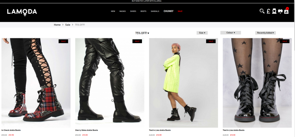
If you offer any bonuses, focus on this. This is usually made before the call to action so that the visitor would not forget about the profit. Sometimes the information (e.g., about a discount) is placed on the call to action. E.g., lamoda.ua has a call to action button that forwards the user to the page with promotional products that can be purchased with a 15% discount;
Story-telling – show the advantage of your offer with a few phrases (why should the user choose you). After this, place the call to action button;
- when you design the call-to-action text, put yourself in the prospect’s shoes. E.g., a CTA, “I want to take my website to the TOP” sounds better than “Make an order” or “Buy”;
- use the same font as for the website design;
- the images on the page should be related to the call to action. E.g., if a man is pointing somewhere on the image, make it so that s/he would point to the CTA button;
- experiment with the changeable call to action button design. E.g., it can change color when scrolling. This attracts more attention;
- if you are using two adjacent call-to-action buttons, they should have a different color.

Good creativity is welcome.
Errors when creating and placing the call to action
Sometimes it is impossible to create a perfect call to action on the first try. It is better to learn from the mistakes of others, so try avoiding the most common errors:
- Use of “cold” words that give a vague notion about the result of clicking the button;
- A large gap between the call to action and the text of the offer. If the offer is described in detail, you may duplicate the same call to action; this will not harm;
- a lot of different CTAs in a small space. Remember that you need not make the visitor annoyed or angry but lead them to a target action. First of all, consider the feelings of the page visitor;
- improperly selected button color. There should be a contrast with the general color set used in the website design;
- CTA is designed as a picture. In the mobile website version, the visitor may disable the image display to save traffic and will not see the call to action;
- CTA contains a broken link; the information or the offer is outdated.
All these errors have a cumulative effect. If you make several errors, your call to action will have near-zero efficiency.
Which of the following is an example of a call to action on a website?
Let’s discuss several call-to-action sentence examples to double-check how you understood the rules. These are calls to action for financial services and insurance call-to-action examples. Choose the most suitable one out of the following:
- Submit
- Get a free estimate
- Buy our insurance now.
Which call-to-action template would you choose? The correct answer is the second option. “Get a free estimate” is the best one. It explains why to click the CTA and offers free services, which is always encouraging.
Where to use the call to action
If you analyze the popular websites, you will see that CTA can be located on the top side, behind the bend line, at the end of long reads, and on the side of the page. These methods are reasonable, but you need to understand when they are applicable:
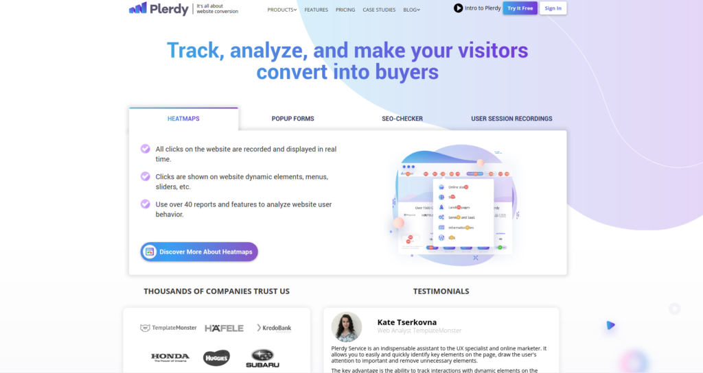
The upper part of the page (before the bend line) is a win-win solution. The visitor will see your message for sure. Look at how this has been implemented on plerdy.com – the heatmap advantages are described, and an offer to find out more is placed. The upper part contains an offer to try out the service functionality for free;
Suppose the visitor has got interested in the proposal and continues scrolling the page. Continue telling about the advantages of your product below the bend line and place another CTA. Please note that the upper part menu is pinned and does not disappear when the user scrolls the page. It contains another call to action (to try out the service for free);
If the visitor gets interested in the material, this provides a maximum scroll depth. Therefore, placing the call to action in the lower part of the page is reasonable. Blog posts (many large online businesses manage them) are a great example. CTA buttons (e.g., for subscribing to social media) are always used at the end. In this case, you can place the buttons alongside and design them in one style.
Have another look at the above-given examples. Of course, they are all different, but the above-given rules were followed – contrast colors were used, and the product advantages were described properly.
20 call-to-action examples
We have dealt with theory. Now let’s move to practice. All examples below use call-to-action elements.
ExxonMobil.com
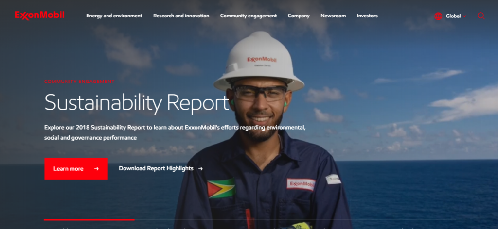
The website of one of the largest oil companies uses several types of calls to action:
- The homepage contains an offer to check out the company’s activity and download a pdf-document with information about the company. Please note that both CTAs are located alongside and contrast;
- below the bend line of the page call to action redirects the user to the section with the news for investors and important events related to the company;
- the lower part of the page contains the standard links to social media.
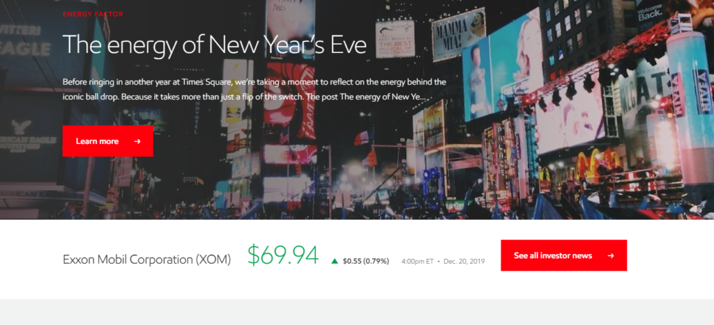
The call to action field is red – an appropriate solution as the buttons are noticeable both on the dark and light backgrounds.
Amerisourcebergen.com

AmerisourceBergen’s website contains calls to action mainly intended to stimulate the reader to learn more about the company’s activity.
Calls to action:
- find out new ideas;
- read articles about pharmacy and medicine;
- contact the company. A contact form appears after clicking the button.
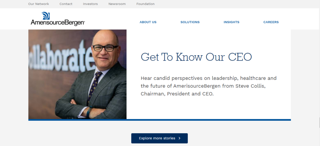
Storytelling should be pointed out. The first call to action sounds like “Learn more about our role in the supply chain.” Then, the company activity becomes clear.
Chevron.com
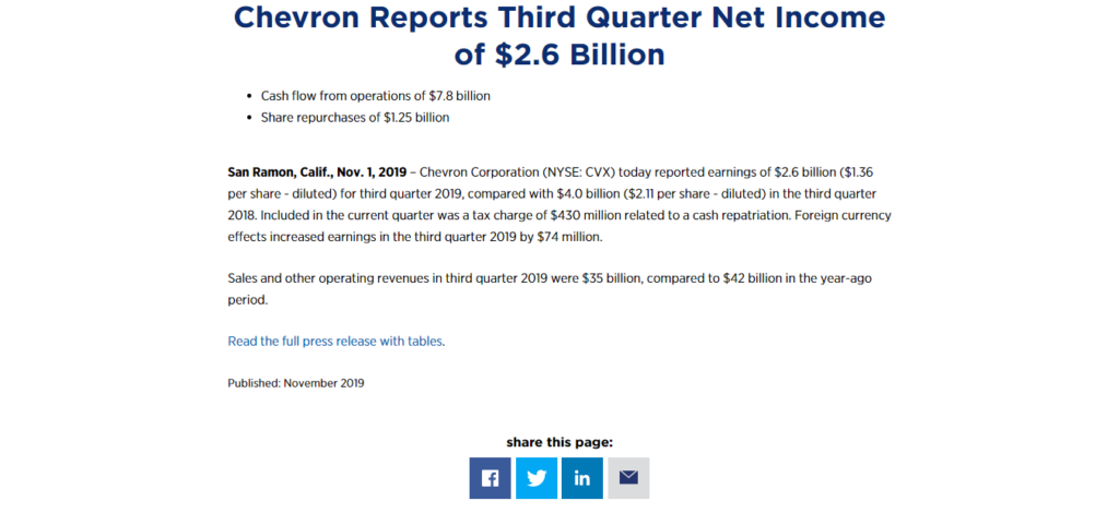
On the website of one of the largest energetics companies, most CTAs include an offer to find out more about Chevron’s activity and its environmental contribution.
Calls to action:
- To find out more about the company, and its history, watch a corresponding video;
- in articles, CTAs stimulate the readers to follow their social media profiles.
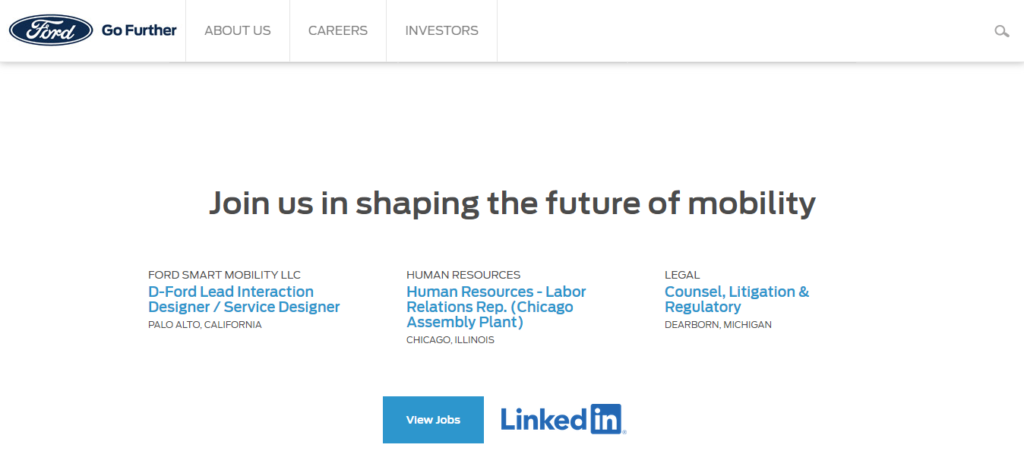
Ford.com

The auto major does not require additional advertising. There are no flashy ads for new cars or discounts before the CTAs on ford.com; the calls to action are mostly used to stimulate the visitors to read more about the company’s activity.
Types of CTAs on the website:
- find out more about the company and its spheres of activity;
- buy tickets to Ford events;
- visiting the section with Ford job offerings.
Gm.com

Cardinalhealth.com
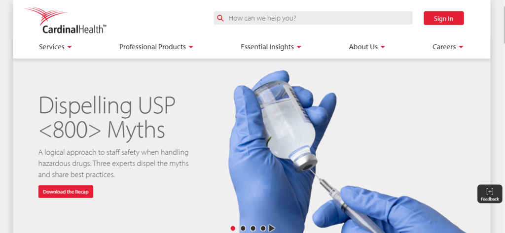
The following calls to action are used on the website:
- traditional “find out more” about Cardinal health;
- load the research results and reports;
- study the details of the offered programs;
- subscribe to the mailout with new Cardinal health publications.
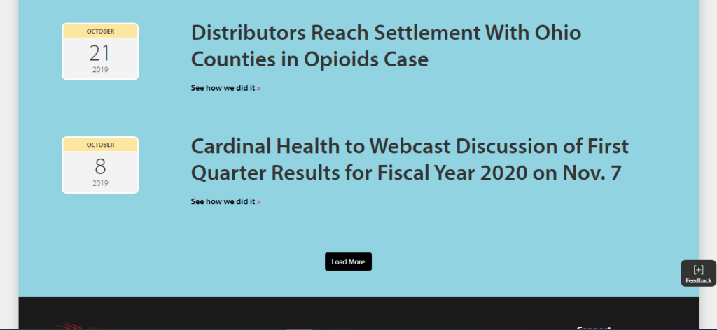
Most CTAs are designed in the form of buttons that stand out on the page background. Some calls to action can be distinguished from the main text by color only.
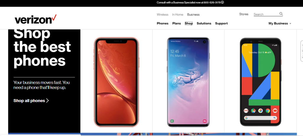
Verizonwireless.com
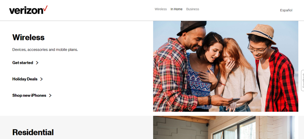
The following CTAs can be distinguished on the website:
- CTAs offering to check out the rates for businesses and individuals;
- call to action to read about the company’s activity, its offers, and new technologies;
- pdf-material about the advantages of working with Verizon can be downloaded in the business section;
- contacting technical support;
- redirecting to the store section. Verizon offers contracts with significant discounts on smartphones.
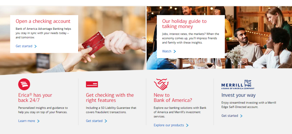
Bankofamerica.com
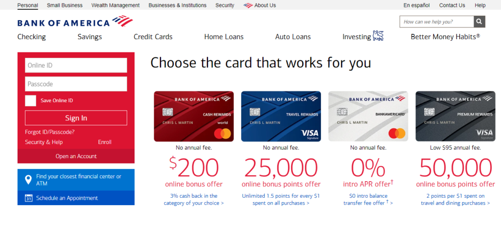
Different CTAs saturate the homepage of the Bank of America website:
- there are links to service plans for cards;
- seasonal offers (e.g., a guide on Christmas shopping);
- standard “Check out our products” и “Learn more”;
- call to action to check out the apps developed by BoA.
Microsoft.com

The Microsoft website contains the following CTAs:
- Order the products with a discount, in particular, a subscription for Xbox game pass, Office 365 and other company products is offered;
- CTAs to leave feedback about the website and ask the experts a question are pinned in the lower part.
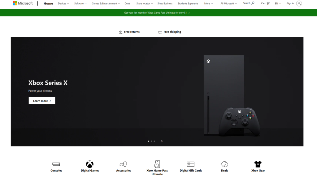
The buttons are interactive and respond to hovering. There are no motivation problems.
Delltechologies.com
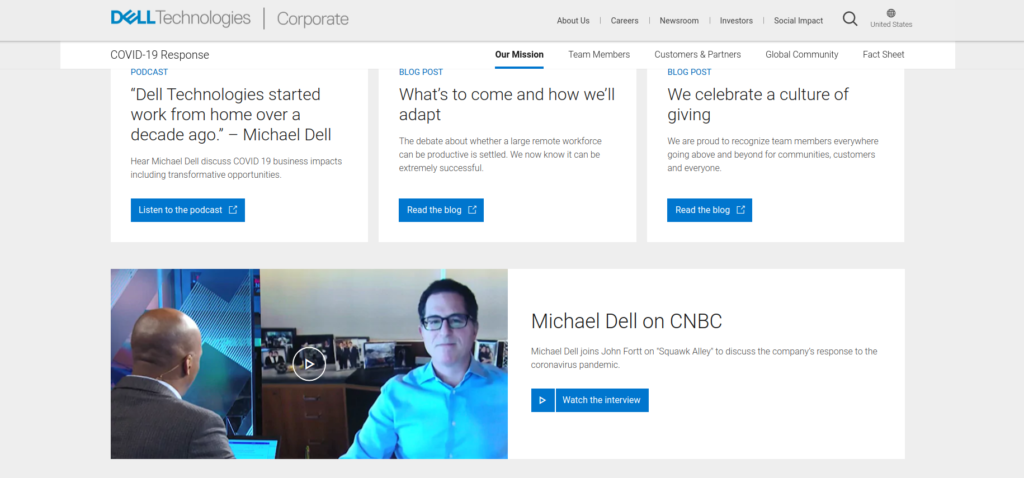
The website contains calls to action of several types:
- learn more about the products or current promo campaigns;
- watch the videos;
- purchase the items – the user is redirected to the page with the list of products;
- get support – download drivers and manuals;
- check out the specialized solutions of the company for developing IT products.

The design should be noted as on some pages, the call to action elements are interactive, and the button is shaded with color when hovering them. So even if the visitor occasionally hovers over the button, the shading will draw their attention.
Dupont.com
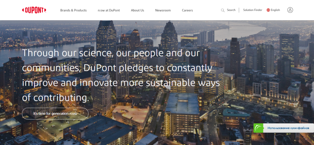
The website of the US chemical giant contains a lot of CTAs. They offer the following to the visitors:
- check out Dupont’s representations;
- study the product ranges;
- study the scientific activity of Dupont.

The call to action element text is well-written. Of course, there is some standard “Read more” and “Learn more,” but the clearest calls to action are designed more creatively.
Statefarm.com
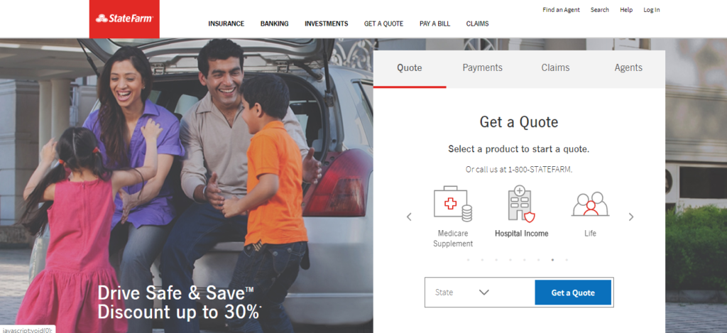
Three types of CTAs are applied on the website of the US insurer:
- for seeking advice from the company;
- a call to action to start using StateFarm services;
- find a local company representative.
In general, the calls to action are designed not badly. But some CTAs can hardly be distinguished on the background (e.g., “Get started” is not separated from the text), so it is not clear that it is not a string but a link.
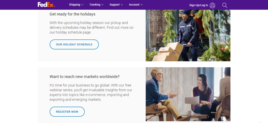
Fedex.com
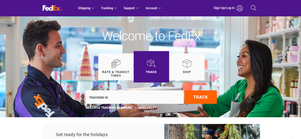
Calls to action on the website of the globally known transport operator are used for:
- tracking parcels – the first call to action to see when opening the website;
- checking out the work schedule for holidays.
The most important CTAs are orange. Other call-to-action buttons are not colored; they have a contour or are given as plain text.
Pepsico.com
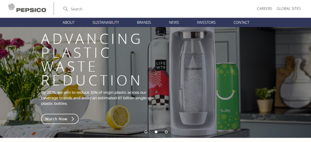
On the website of this transnational US corporation CTAs are used for:
- Learning more about the peculiarities of their activity;
- Pepsico social development endeavors;
- learning about sale points and product composition.
The design is standard – call to action text + contrast button contour.
Sysco.com
The home page includes the following CTAs:
- redirecting to the section with the annual statement;
- call to action to become a customer;
- check out the Sysco representation network;
- the product pages contain recipes, table settings, and other culinary subtleties.
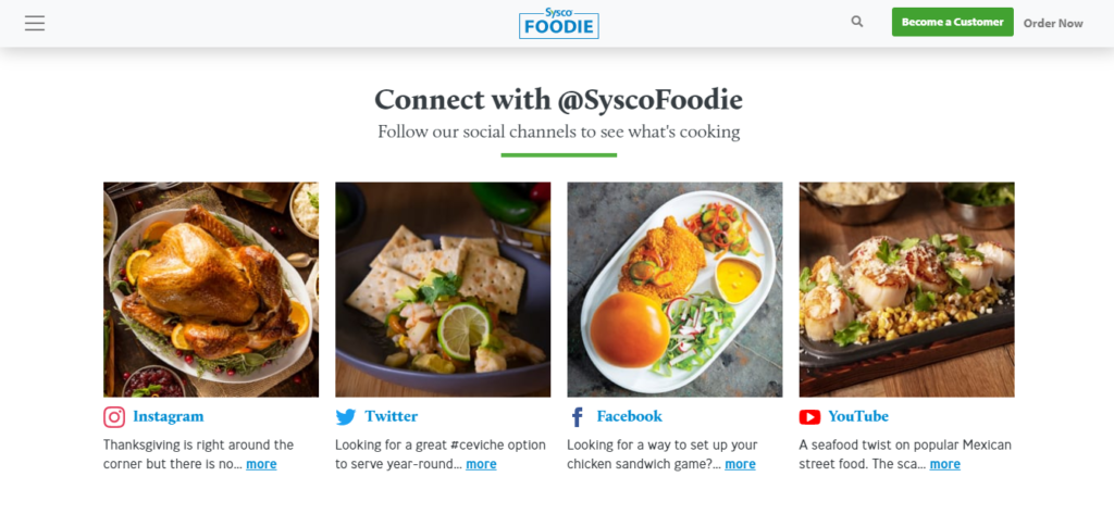
The call to action to follow social media profiles is great. Bright photos and offers to see a recipe on Twitter or Facebook draw attention.
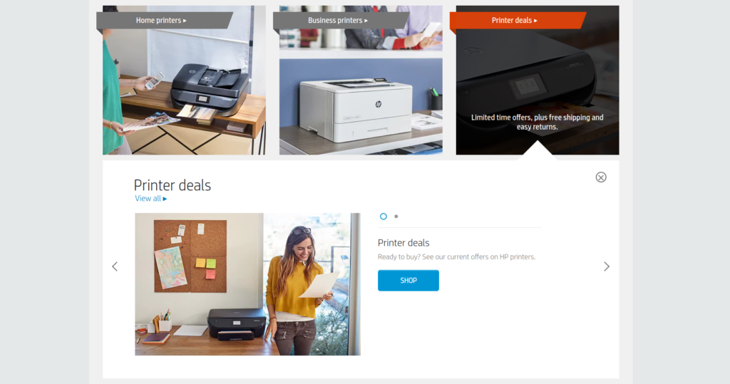
Hp.com
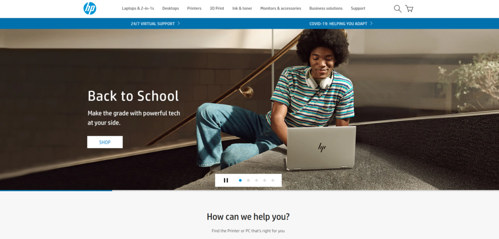
The Hewlett-Packard website includes the following CTAs:
- “Learn more” – the visitor is redirected to the corresponding page and finds outs about the product s/he is interested in;
- “Keep in touch” – link to the HP social media profile;
- “Search” – an offer to select the most suitable variant considering the buyer’s requirements on the product pages;
Pfizer.com
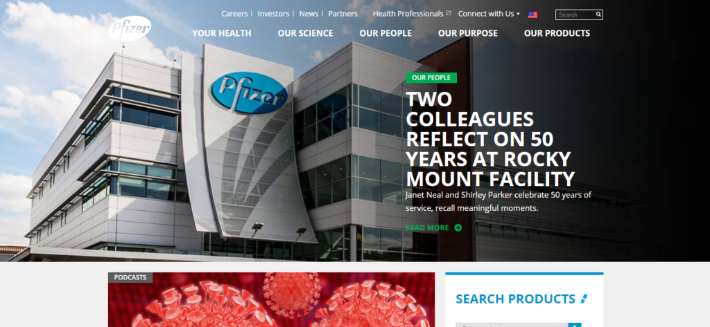
This pharmaceutical giant uses the following CTAs:
- listen to a podcast and subscribe to the Pfizer notification mailout;
- search and advanced search;
- check out Pfizer’s research;
- read Pfizer testimonials.

Some website sections have small markers pointing that the story is continued instead of full-scale CTAs. As for the rest, a standard approach to the call-to-action elements is applied.
Goldmansachs.com
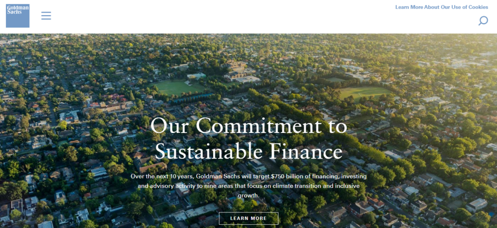
The website of one of the largest investment banks uses the following call-to-action elements:
- check out the infographics, text materials and videos about the investment bank operation;
- subscribe to the notifications from the bank.

Cigna.com
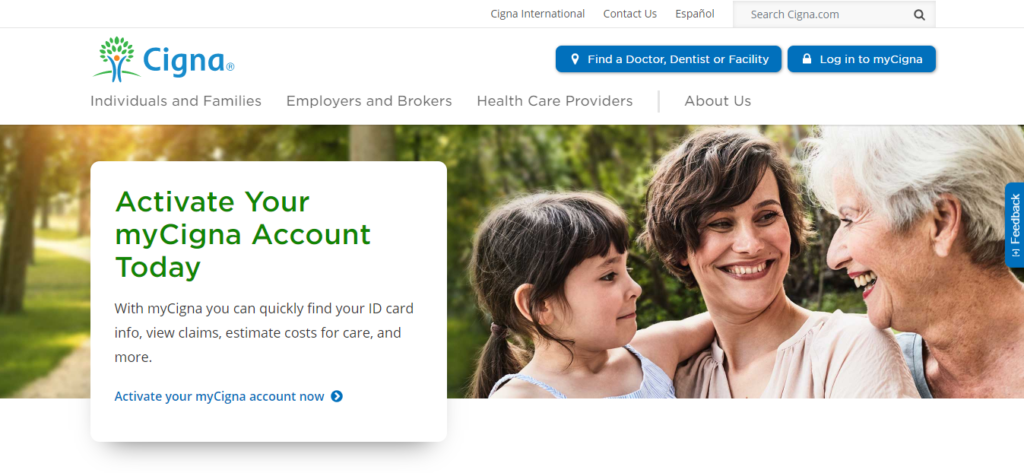
There are a lot of CTAs on the website:
- The call to action before the bend lines offers to find a doctor, sign in or sign up;
- CTAs offer to learn more about the company, important schedule changes, and various programs;
CTAs are designed in the form of buttons and as colored text. Although the page contains many call-to-action elements, they do not hinder the information perception.
Americanexpress.com
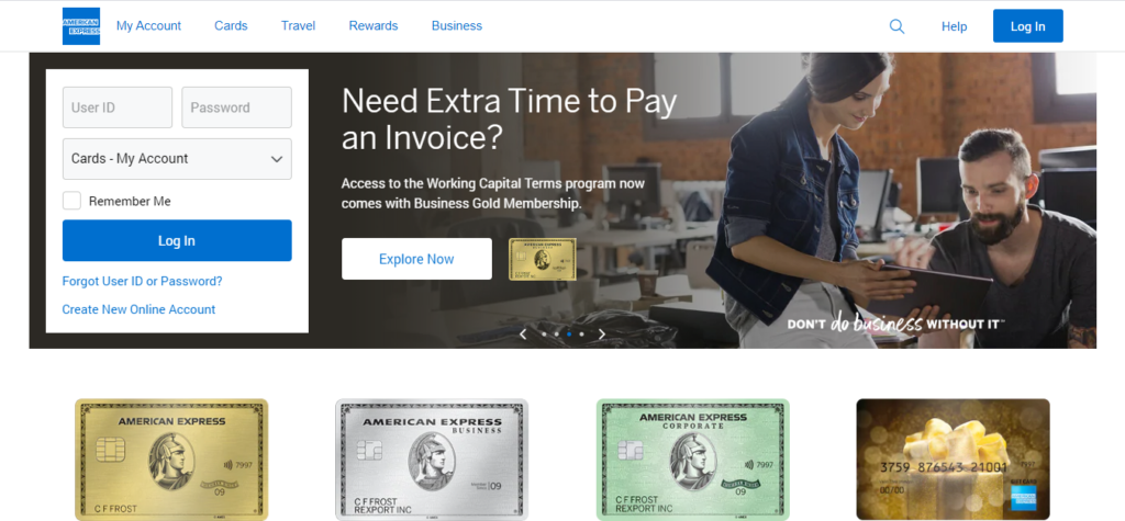
The following CTAs are used on the website:
- redirecting the visitor to the page with information about the company and its activity;
- displaying the local American Express offices;
- Checking out the company offers. In addition, CTA elements on the website pages allow for finding out more about the products and comparing them.
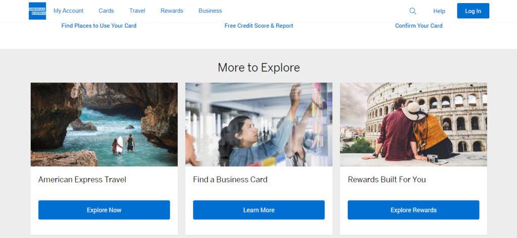
The homepage lacks texts leading to a call to action. Instead, offers to contain the product name and the call to action immediately. As for the rest, there are no comments.
Conclusion
The analysis of the above-listed websites shows that it is worth using a call to action element notwithstanding the sphere of the company’s work. It is a universal tool for fast redirecting the user to the required page. When used properly, call-to-action elements reduce the path between visiting the website and ordering the item or the service.
As for the call to action design, we recommend the following:
- The most important thing is that CTAs should be designed as buttons. It is recommended to make some responsive to hovering (change color or maximize);
- Call to action may be in the form of text. In this case, make it colored or slightly offset it from the text block. A marker underlining that it is not just a text but a CTA can be placed on the right.
Following the above-given recommendations makes calls to action efficient. The websites above can be used as an example of calls to action.