
Welcome to the best reference on heatmap analysis. Knowing heatmaps is the health check you were unaware you needed, like checking the pulse of your website.
This book will enable you to:
- Interpret the color-coded puzzles of your heatmap.
- Discover user behavior.
- Harness heatmaps to improve UX and conversion rate on your website.
Explore the field of heatmap analyze closely and you will understand the performance of your website.
Our not-so-secret weapon Plerdy is the instrument for turning unprocessed data into insightful analysis. The cornerstone in your toolkit, it increases the heat on your rivals. Don’t miss the Plerdy edge, your pass to successful websites.
What is Heat Map Analysis?
Real game-changer in the digital sphere, heatmap analyze is your magic mirror to the soul of your website. It’s about highlighting the performance of your website, thereby turning the abstract dance of user interaction into a vivid, graphic story.
Your Sherlock Holmes, heatmap analysis helps you to interpret the cryptic hints left behind by your website users. It helps you to: .
- Emphasize the red-hot areas of user interface.
- Track the frigidly chilly areas requiring some warmth.
- Show the user’s path from entrance to exit.
Representing clicks, scrolls, and movement as a spectrum of warm and cool hues, this technique gives data life. Users linger in the bright reds, vivid oranges, and cheerful yellows; the cold blues indicate less interaction.
Examining a heat map is like setting off an exciting treasure quest to find hidden jewels of knowledge that might greatly enhance the way your website is optimized. It’s not about dark night shooting; rather, it’s about adopting a guided technique to uncover the narrative behind every click.
So fast-forward to let’s negotiate the maze of user behavior, ready? Use heatmap analysis’s ability to swing the tide in your advantage. In the digital era, knowledge is not only power; it’s the key to opening the treasure box of user involvement and website success.
When You Should Use a Heatmap
In terms of website optimization, a heatmap is your Swiss Army knife—a multipurpose tool you ought to constantly carry in your digital knapsack. When should you, however, pull it out?
- Heatmaps analyze let you identify hot and cold areas of user interaction when you’re keen to liven up the UX of your website. They guarantee a flawless travel from beginning to end and help you roll out the red carpet for your guests.
- If your ultimate goal is conversion rate optimization, heatmap analysis reveals the hidden formula of clicks and scrolls that result in effective conversion. It’s the secret ingredient to liven up your approach of conversion.
- Heatmaps analyze help keep your audience on board when you’re trying to reduce bounce rate by stressing the pain issues forcing customers to jump ship.
Basically, when you want to flip the script on your website’s performance, employ a heatmap. It’s about grabbing control and guiding your website toward a user-centric paradise that begs clicks and holds them utilizing statistics. So, let your heatmap sizzle and transform your website into a user magnet; keep it off the rear burner.
What Does a Heatmap Show?
Imagine a magic lamp on your website revealing the latent activity. A heat map performs just that. Turning the abstract tale of user interaction into an engaging, color-coded narrative, it is a visual storyteller.
Heatmaps reveal:
- Click hotspots: Areas drawing most user involvement glow up in warmer colors, therefore exposing where users click most.
- Cooler hues show sections of your website unoccupied by users, the ghost towns.
- User journey: Showcasing their trip from arrival to departure, users most often follow.
A heat map is a mirror reflecting the narrative underlying every mouse movement, scroll, or click. It’s the X-ray view of the performance of your website, exposing the core of user behavior.
Examining a heat map is like putting on the detective’s hat and assembling the hints left behind by user engagement. It enables you to view your website from the user’s perspective, including likes and dislikes as well as everything else. So turn on your magic lamp, follow the heat map, and turn your website into a masterwork users will love to explore.
How Does a Heatmap Work?
Consider a heatmap as your website’s symphony conductor arranging the user behavior. It tracks and translates user actions into a color-coded extravaganza. Here is the game strategy:
- logs every click, scroll, and mouse movement user behavior.
- converts data into images: The logged data is converted into a color spectrum from fiery reds to cold blues.
- Creates a visual narrative with colors denoting the frequency of actions on the last heatmap, therefore reflecting user interaction.
Like a thermal camera, a heatmap gathers user interaction heat across your website. It’s the link between unprocessed facts and useful insights, a visual translator converting figures into stories.
Thus, rely on heatmap analysis; it’s time to allow the colors of user activity lead you to a clicked-on optimal website.
Heatmap Analysis Framework
This is the appropriate moment to define how one should analyze a heatmap. Usually at Plerdy, we employ a heatmap to follow a set process for monitoring visitor behavior on a given website:
- We start by brainstorming what we ought to investigate on the heatmap.
- We next develop assumptions regarding what and how, depending on the heatmap analyze data, we should enhance.
- Seeking anomalies that stop users from continuing to the next page, we page by page on the heatmap—home, product, cart, payment page, and so on. We also analyze and grasp the reasons for the user’s lack of a mini-conversion. For instance, including something into the cart, sorting items, applying the search tool, etc.
After that, we analyze the heatmap’s findings and base them on which it is clear how to enhance UX.
How to Analyze Heatmaps: Best Cases From Plerdy
Fom installing a heat map from Plerdy, you may analyze user behavior on your website quite thoroughly. I’m providing some best scenarios of its application below together along with running explanations of this study.
Pro-Street.dk Heatmap Analyze
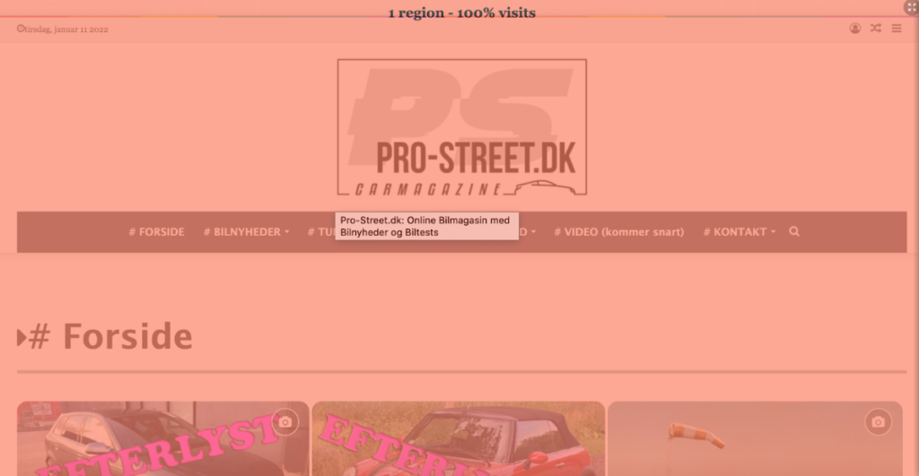
A low scroll depth was revealed via heatmap analysis on pro-street.dk. Given the heatmap, the initial screen seems to be defective if only 25% of people scroll down the website. We analyze that the primary problem is the large logo and partner’s ad consuming much of the page area. How would one approach it? It might be better to make them smaller and center something more striking in the middle instead.
Overall, depending on the heatmap’s acquired findings, I have advised how to address the issue:
- re-sizing—that is, reducing—large elements—including the logos and commercials;
- cutting off superfluous icons;
- main attention should be on their service instead of creating advertisements for their partners;
- including better CTAs and content.
- Including subheadings, internal connections to similar material, and a quick scrolling button helps to improve navigation.
Following the suggested steps will help the usability of the website much more and lower the bounce rate.
How to Analyze Heatmap Data on 3das.com
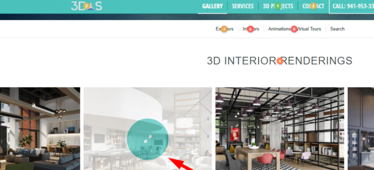
The heatmap put on 3das.com shows that the website features repeating sections such the “Search” and “Contact us” forms. The heatmap advises leaving them used once and moving the social networking icons to a footer.
Furthermore shown on the heatmap are missing pagination and a FAQ section on the website. Including these would ease user interface.
The website content is not fit for mobile devices as the heatmap analyze indicates, which influences the bounce rate. How would one address it? Change your material to fit desktop and mobile consumers so they will remain on your page and convert. And I also suggest including image zoom capabilities.
The heat map reveals that although the text lacked links, readers attempted to click on some areas. Should these elements appeal to consumers, making them clickable would only be beneficial.
Besides, 3das.com needs consistent typefaces and adding appealing CTAs to boost conversions based on analyze of the heatmap.
Results of the Alseresport.com Heatmap Analyze
The heatmap analysis of Alseresport.com shows very good outcomes. Especially, the heat map we analyzed shows how safe and aesthetically pleasing the cart and checkout pages look. Regarding the home page, the heatmap reveals that the login button and search bar are regularly clicked. Still, there’s room for work.
Based on the heatmap, I have two practical suggestions for its simplification:
- to let the user view the password you now type;
- to let login using a social media account.
The heat map also shows that not all users view the 5-euro discount offer at the bottom of the page due of a very limited scroll depth. I thus advise showing this offer on a pop-up, say, 15 seconds after a user loads the page.
Following our heat map analyze, we discovered that the photos on the website need to be upgraded in quality and united under one style.
The heatmap and 65 footer “Contact” button clicks cause visitors to lack some knowledge. Thus, the material should be structured and enlarged:
- give specifics on delivery strategies, for example;
- display the tables with the product descriptions;
- Emphasize headings for improved viewing.
Furthermore, the relevant button could be more easily seen even though the heatmap indicates a decent FAQ section.
Examining the heatmap, I also advise ignoring the page on “no results found”. To enhance the heatmap, instead we should present choices that closely match the user’s demand. Furthermore improving the UX and user behavior would be letting people filter the products. And the heat map will prove it.
Analyze UX with a Heatmap on Animalessalvajes.world
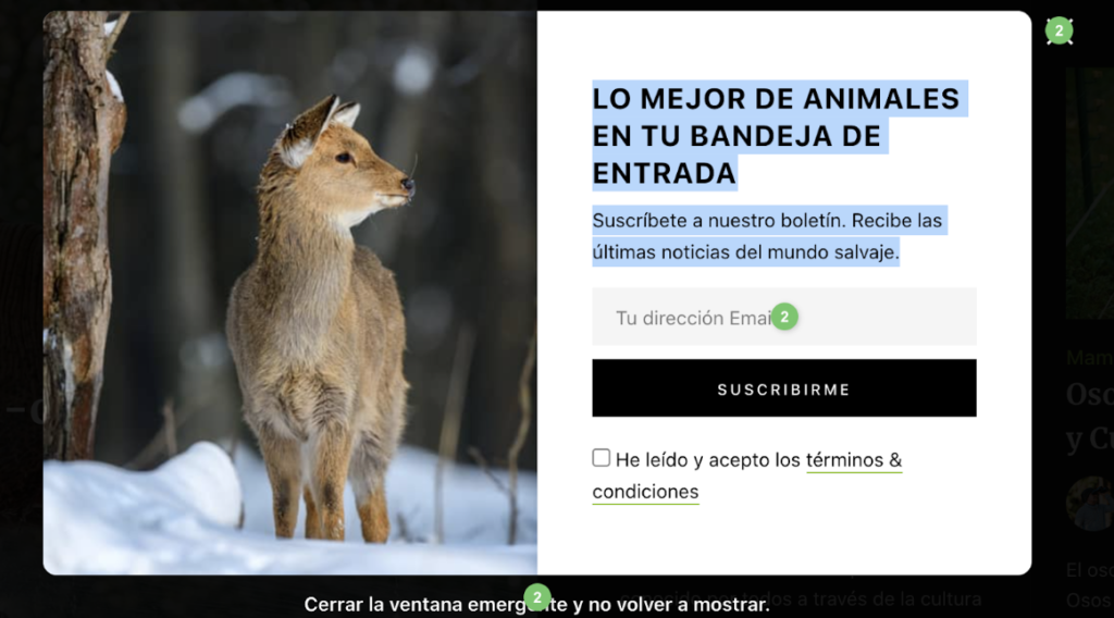
Five seconds after the user views the website, a pop-up on the heatmap catches first notice. Five seconds is sadly insufficient for a visitor to completely grasp the page. This is why, following heat map analysis, I advise altering the display rule for this pop-up to show it in 15 seconds, or at a 30% page scroll, for example.
Subsequently, repeated elements. Examining the menu’s categories, the main bar, and the search bar, we find consistency. Either we can eliminate them or modify them to enhance the heatmap. Furthermore visible twice on the home page is the search bar. One will plenty.
When I analyze the heatmap in the right portion of the screen, I find a large blank white space useless but detrimental for UX.
Once more, the heatmap reveals that the search bar does not really stand out in design amid social networking icons. Still, it is more crucial; so, it should be more obvious.
On the homepage, I have seen far too many articles. Better still, add pagination and leave the most prized on here.
I would also make the term “Discover more” clickable to guide readers to the specialized category pages. Alternatively, I would suggest to consumers where they should click by adding the buttons with CTA on those categories. The heat map would show notable progress.
The place of the subscription form. The heat map indicates that just 24% of visitors scroll to this location; so, it should be positioned somewhat above or re-designed. The neutral style makes the subscription form hardly obvious. How can one find the solution? Complementing it with a banner and altering the style or wording will help to make it more appealing. Including some imagination into the phrases for the website will increase the heatmap and get more conversions.
Once more, if the elements in the fourth zone contribute value, they could be positioned upper on the page due to a somewhat low scroll depth.
How to Analyze Gothombi.com Heatmap

The first item on the heatmap that catches my eye is the large banner covering practically the whole first screen. How can one find a solution? Resizing it is more crucial to provide here valuable information than only displaying an image. Apart from that, the “Learn more” button likewise guides viewers to the first screen displaying no information since the heat map indicates.
Calculating the scroll depth on the heatmap, I see that just 47% of users reached the third section and 53% of users only saw a decent image. Thus, generally, we should downsize photos to improve the load performance since today the load speed is pretty low.
Although the heat map on the site reveals no significant information, the footer provides it. But since the links there lack a “a” tag, they seem to be texts rather than links.
Although the subscription form with Covid information is an excellent concept, it may be strengthened to attract more attention as we observe no clicks here. Not surprisingly because consumers hardly often scroll down to access another subscription form in the footer, it shows no clicks on how to subscribe. To raise its awareness, we may show the form via a pop-up including strict display guidelines.
The heat map indicates that the button reappears after we fill in the subscription form and click ” Subscribe,” sending us to another page. UX would suffer from this. The user should be very confident their search has been sent. Moving the ReCaptcha to the previous page without visiting another page will help to enhance the look of the spam check page. Furthermore included a note that the form was delivered without a spam check.
Daybydaycrm.com Heatmap Analyze
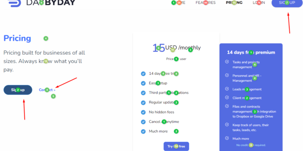
Our first view on the heatmap upon visiting dailybydaycrm.com is an instant pop-up. Based on the heat map and the 124 “Hide” button clicks and just three responses, something seems off. The pop-up probes users on what keeps them from registering. Had we just launched the webpage, we lacked time to become acquainted with its contents. We cannot so respond. I thus advise changing the display rule to allow consumers more time to browse the page.
According the heat map, the most often clicked buttons are Features and Pricing buttons. It would be advisable to add an arrow to suggest that this part consists of more tabs.
Generally speaking, I really advise the following for improved UX:
- rendering the menu bar float-like;
- adding an arrow for a fast return to the page’s top;
- allowing picture zoom-in options;
- allowing consumers to view the password they are entering into log-in;
- simplifying registration by letting social network profiles be logged in from;
- adding CTAs buttons following the stated rates;
- building a “About Us” page to inform consumers further on the business and its agents.
When I analyze the heat map, another thing that catches my eye is that the “Learn more” button gets more clicks than the “Get started free” button most likely due to design. We might thus make the later button stick out to get clicks.
Eliminating repeating items is another crucial piece of guidance on the heatmap. For example, we will arrive on the identical page by following the “Support” and “Contact” buttons in the footer.
FAQ: Heatmap Analytics – Practical Guide
What is heatmap analysis, and how does it help improve my website?
Heatmap analysis is a visual representation of user behavior on your website. It highlights areas of high and low interaction using a color-coded system. By analyzing heatmaps, you can identify which sections attract the most clicks, where users drop off, and what elements need optimization. Plerdy’s heatmap tool provides deep insights into how users engage with your website, helping you refine UX and increase conversions.
How can I analyze a heatmap to optimize my website’s performance?
To effectively analyze a heatmap, start by identifying high-engagement zones (hotspots) and areas with little interaction. Look for patterns in user behavior, such as where they click most or where they stop scrolling. If users are not interacting with key CTAs, consider repositioning or redesigning them. Plerdy allows you to analyze heatmaps in detail, ensuring every website adjustment is backed by real user data.
When should I use a heatmap for website analysis?
Heatmaps are essential when you need to:
- Understand user engagement and optimize website design.
- Improve conversion rates by analyzing click behavior.
- Reduce bounce rates by identifying pain points in user navigation.
- Test A/B variations of page layouts to see which performs better.
By integrating Plerdy’s heatmap analysis, you can track user behavior consistently and make data-driven improvements.
What types of user actions can a heatmap track?
Heatmaps track various user actions, including:
- Clicks: Identifying the most and least clicked elements.
- Scroll depth: Showing how far users scroll down the page.
- Mouse movements: Revealing areas where users hover but don’t click.
By analyzing these insights with Plerdy, you can refine content placement and enhance website usability.
How do I know if my heatmap analysis is successful?
A successful heatmap analysis results in tangible improvements, such as increased user engagement, better conversion rates, and reduced bounce rates. If your website changes lead to higher click-through rates on key elements, improved scrolling behavior, or more conversions, your analysis is working. With Plerdy’s heatmap tools, you can continuously refine your website’s performance based on real user data.
Conclusions: Mastering Heatmap Analysis
Every hue in the vivid field of heatmap analysis speaks a different song. You now quickly decode clicks and user behaviors, like a maestro. There are no secrets from you about the concert of colors, which spans scorching red to cold blue. You have descended into the depths of Fullstory’s records, used Hotjar’s tools to leverage their power, and mapped your road to success.
- Seeing is believing, and a well-analyzed heatmap is the most obvious indication of user interaction.
- These days, it goes beyond numbers. Your data is creating a picture and you are narrating a story.
- Plerdy’s array of heatmap tools will help you to naturally get insights.
Allow no blind spot on your website. Design it as a canvas. Heatmaps will help you find places requiring a fresh paint coat. Correct mistakes, improve user interface, and observe traffic movement.
Therefore, what comes next? Your court contains the ball.
About ready to move forward? Start with Plerdy right now and let the colors of your website come through.
Recall: a good heat map is worth a thousand clicks. Thus, make the numbers count, not only pursue them.