
Get ready to dive into a pool of nostalgia as we revisit the hallmark designs that characterized the early 2000s internet landscape. This era brought a unique fusion of creativity and simplicity in website design – a style that continues to inspire digital architects today. Let’s cruise back to those vibrant days of old and delve into a detailed account of the 2000s’ top website designs.
- In the entertainment niche, Myspace stood out with its personalized page designs, catapulting the notion of individuality into cyberspace.
- E-commerce took a stylish leap forward with eBay, setting standards with its intuitive, user-friendly layout.
- Educational portals like National Geographic offered a blend of visual richness and informative content that elevated learning to a whole new experience.
These paragons of 2000s web design might just spark your creativity! ⚡ Embrace the past’s influence, sprinkle in modern UX principles, and see your site captivate audiences once again. Don’t forget, for the best in SEO & UX, Plerdy’s suite of tools can make the difference. With Plerdy, it’s not about reinventing the wheel, but refining it to near perfection. So, let’s roll back the years and remix the 2000s design magic! ⚡
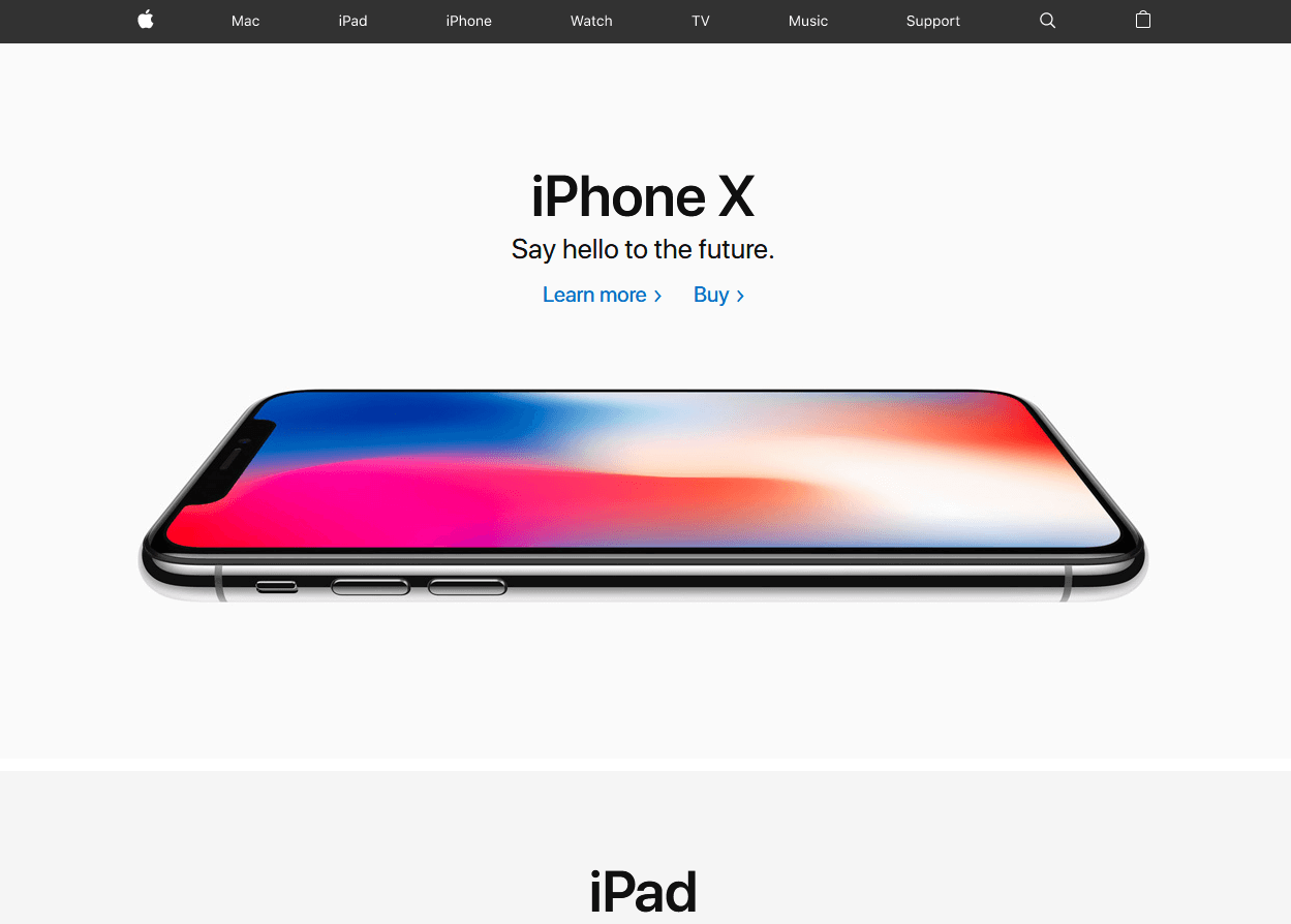
Apple. Clearness and bright colors
The website of Apple is filled with high-quality widescreen images of modern products and fancy novelties. The information on the elegant pages designed in light colors is easy to perceive and perfectly contrasting.
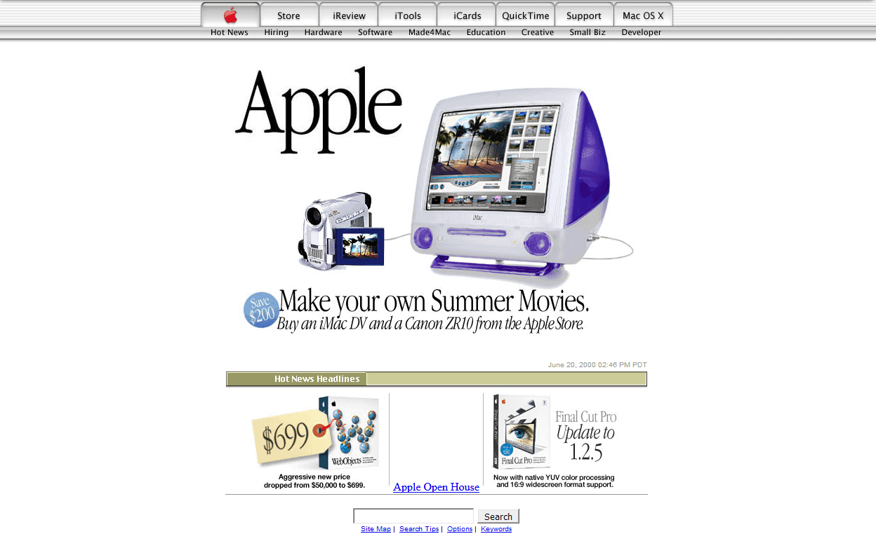
The company takes care of its reputation and develops in all directions. As far back as 2000, when only the HTML layout was used, Apple’s website didn’t even have high-quality graphics, not to say animation or various special effects.
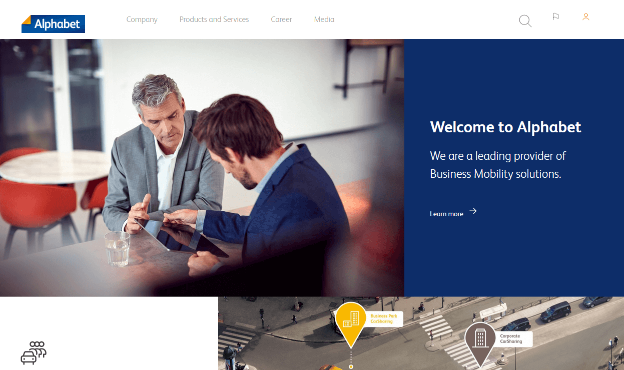
Alphabet. Personal approach and a well-known style
The page of the conglomerate Alphabet that unites several companies is also impressive. The alphabet was founded by the owners of Google, Larry Page and Sergey Brin. The website has a simple and easy-to-use design, actually as everything made by Google. The company sticks to its style and tries to provide a personal experience to every visitor. The website owners share their company’s story and provide some unique details that will definitely get you excited.
Obviously, Alphabet didn’t exist as a holding company back in 2000, but Google did. It took them a lot of time to create their own style and implement it in their products. Google always opted for the white background, a perfect solution for the search engine and other services developed to assist people using the web. It looks like they really knew what they were doing already twenty years ago. Even the selection of colors and button labels have remained unchanged, isn’t that striking?
Microsoft. Simplicity and uniqueness
Microsoft Corporation is the world leader in the development and sale of software for computers and mobile devices. It goes next in our TOP of the most successful and rich companies. Yet not only are their achievements prominent, but Microsoft’s official website will also interest design lovers. Your attention will be attracted to an appealing widescreen slider below the top menu on the main page. The interface is pretty simple and intuitive. The website may lack dynamics, but its structure is just great.
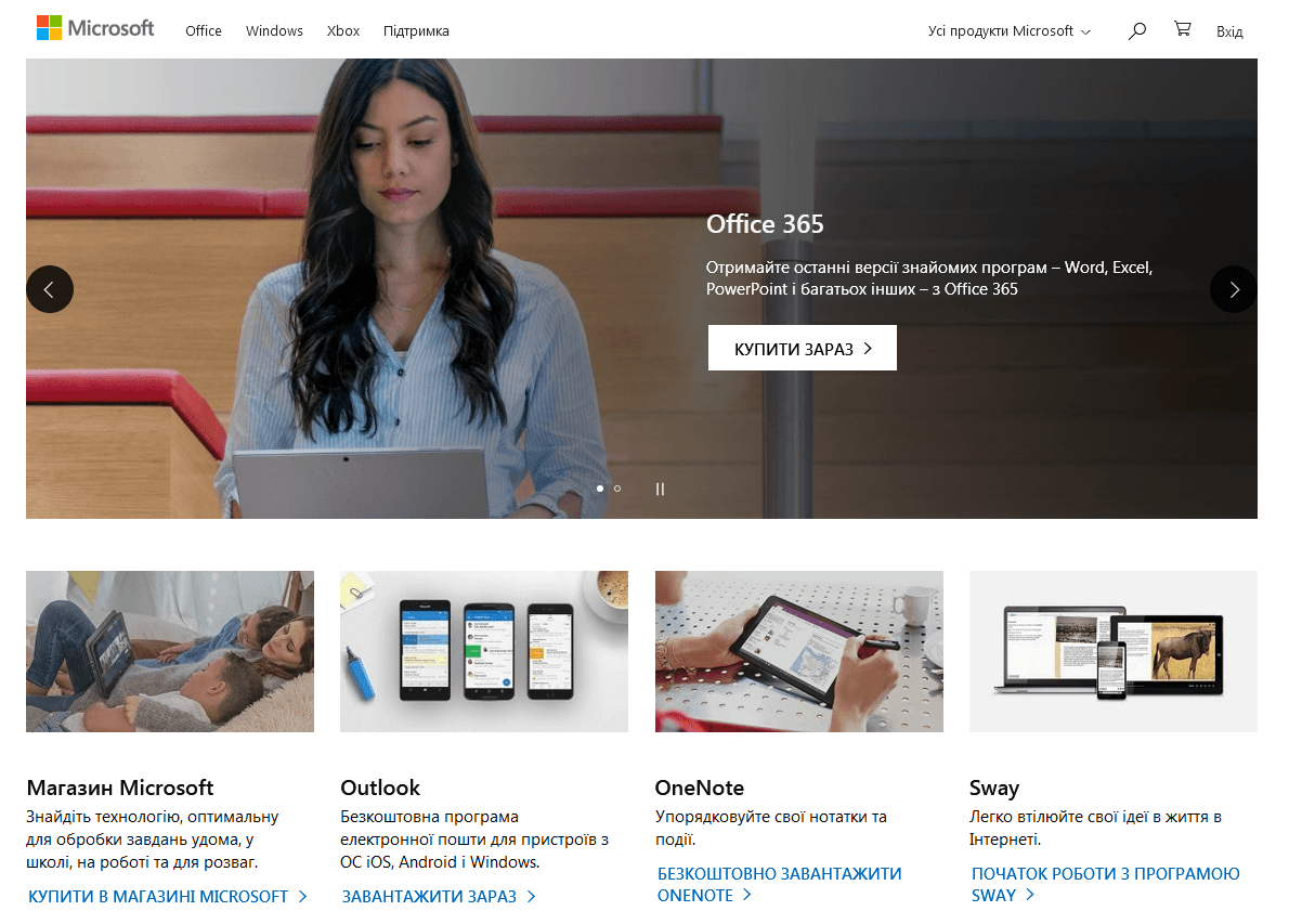
It’s really difficult to recognize modern Microsoft’s design in its website of 2000. There are no block elements, the fonts are way too plain, the text is hardly legible, and the menu is simple. But let’s forgive this, the past is the past.
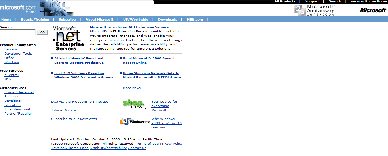
Anyway, back in 2000, they couldn’t create interesting web projects using HTML5, CSS3, and jQuery capabilities. Now websites have a more appealing design and brand new functionality, including attention-getting effects activated when users complete certain actions.
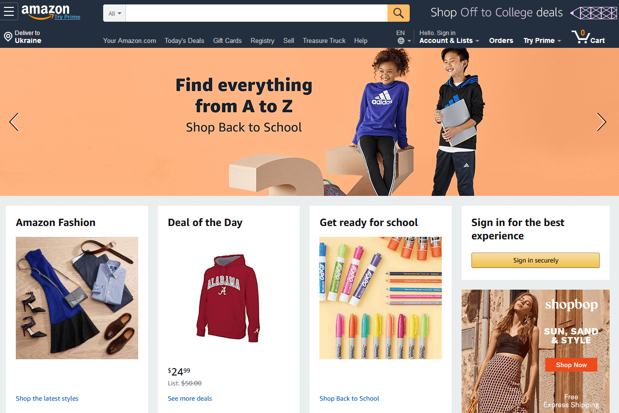
Amazon. Vivid design also can increase sales
Such a website as Amazon also deserves your attention. This is one of the first platforms on the Internet that initially focused on selling goods online. This giant of online stores takes fourth place on our rating.
On the website of Amazon, you will find a bunch of goods for everything you may need. The design is bright and colorful. Numerous high-quality graphic elements make the website vivid and modern. You will only need one or two clicks to go to the necessary product. There are no banal left menu and sidebar. All elements on the main page are arranged horizontally, one below the other. The header shows off a wide slider with colorful images of special offers or novelties.
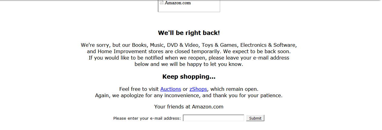
Initially, the website of Amazon looked like a web page with a small logo, some text, and a field for collecting user emails. However, the image you see below doesn’t really look like a website.
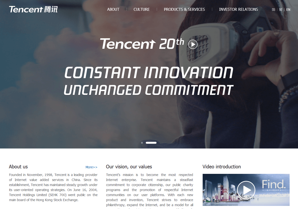
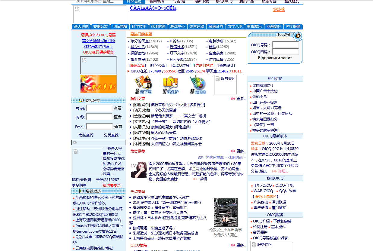
Tencent. Minimalism is still popular
This website has an elegant minimalist style. It belongs to the Chinese company Tencent that maintains the QQ network for instant messaging. This holding also owns WeChat (text and voice messaging system) and Qzone (one of the largest social networks in the world).
Once users land on the website, they see a large banner with smoothly changing animation elements. Such design solutions were unavailable before. Nowadays, they make online pages much more appealing and grab the attention of users.
Only eighteen years ago, this was a very crude website with minimal graphics, dynamic elements, and special effects but with many Chinese characters.
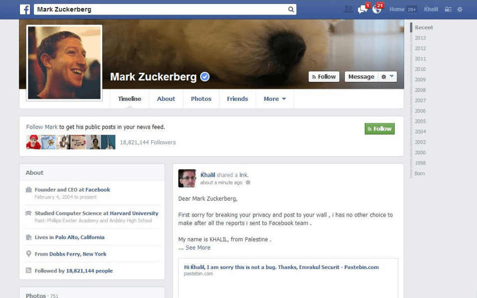
Facebook. Focus on functionality, not design
Mark Zuckerberg started his business in 2004 while still studying at Harvard. Back then, he created the most popular world’s social network – Facebook. This website has never been very fancy since, first and foremost, its founders strived to develop powerful functionality. Yet, it is worth noting that in this social network, users can individually change some design elements and modify the look of their page.
Of course, since 2004, Facebook has been trying to find its unique design. So let’s hope they will continue to experiment and perfect themselves. However, generally, the style of their design template hasn’t changed a lot.
Alibaba. Balance is the key
When it comes to global commercial projects, we just have to mention this well-known Chinese web-portal. Alibaba facilitates trade between various companies and specializes in retail. Its website has bright colors, a well-organized block structure and is correctly displayed on different screen resolutions and mobile devices.
A small slider looks really nice here. It allows visitors to check new arrivals and other useful information.

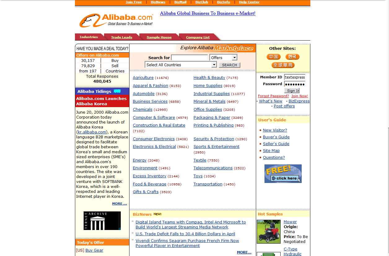
In 2000, Alibaba was a small web project that looked like a modern catalog of websites or a bulletin board. Its bright orange color scheme is the only thing that has remained almost unchanged since then.
Johnson & Johnson. A modern sample of classical design
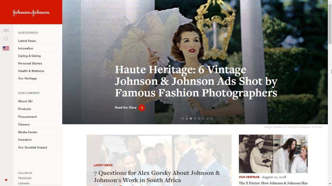
Probably every person who watches or used to watch TV has seen a commercial with various sanitary products by Johnson & Johnson at least once in their life. This holding group comprises more than two hundred subsidiaries. The official website of Johnson & Johnson has no special features. It’s just a nice website with many dynamic elements. After opening it, you see a standard template with a drop-down menu and a widescreen slider with graphic links to categories below.
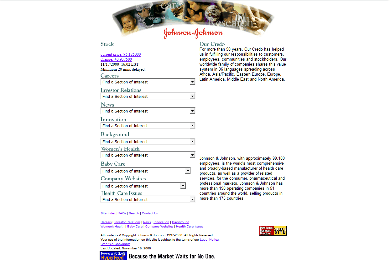
Over a decade ago, the website had a poor image in the header and a menu looking like a form with drop-down fields. All content of the web page was placed in the center. Users probably had problems perceiving the information because of the small and difficult-to-read font. Since then, only the logo of the trademark has remained unchanged.
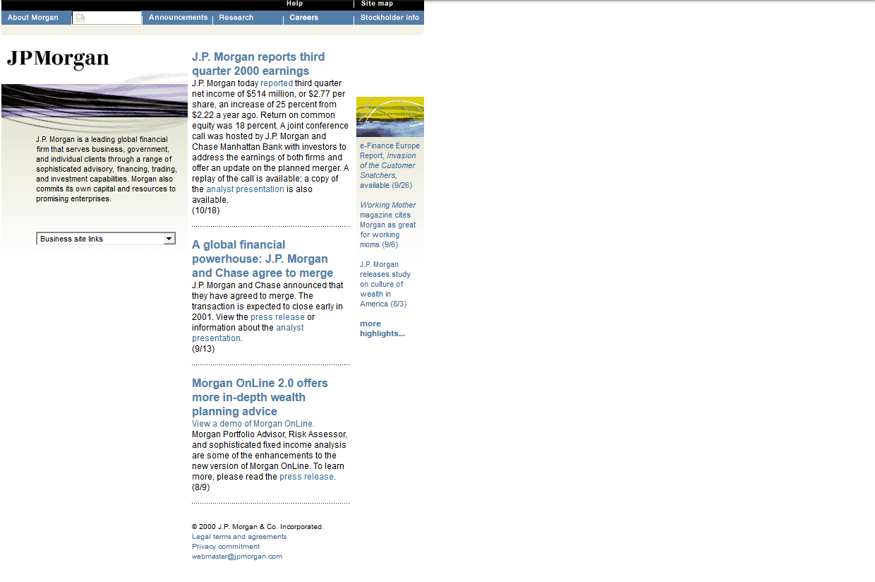
JPMorgan Chase. Simple corporate design
JPMorgan Chase is the last position in our brief overview of the online resources of top world’s companies. This is a major financial holding in the United States which ranks among the four largest US banks. They provide investment and other financial services.
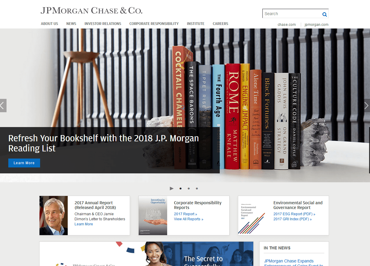
Many business websites, especially corporate ones, usually don’t have a distinctive design with many animation effects. This isn’t surprising since the field they are working in has absolutely different needs. JPMorgan Chase’s website is simple but elegant. It consists of separate blocks placed on a light background. The website has a slider with scrolling images, high-quality graphics, and readable fonts. This is really a good sample of web design that deserves your attention.
Many years ago, this project had an absolutely different appearance. If to assess it based on modern standards, it looks like a set of posts in a web design newbie’s blog rather than a website.
Instead of a postscript
Journeying through the early 2000s webdev artistry has offered an aesthetic blast from the past. We’ve relived the vibrant, sometimes chaotic, yet utterly iconic designs that characterized that era. With a nostalgic feeling, we’ve revisited platform giants like MySpace and eBay, alongside many others, all oozing with y2k vibes. ⚡
With profile customizations and flash animations, websites were the playgrounds of creativity, essentially freedom without reins. Internet users painted their digital canvas with their personalities – a trend that, although toned down, still exists today. Websites were a blend of anime, video games, music, and more, a cacophony of colors and patterns that feels quintessentially 2000s.
While the late 2000s saw a shift towards cleaner, more whitespace-dominated designs, the essence of the 2000s – that ‘anything goes’ spirit – still influences the web design of today. ⚡
So, as you step forward into your next redesign, carry with you the nostalgic flair of the 2000s. Try integrating a dash of this iconic era with the latest front-end and back-end technologies, giving your website an edge that resonates with customers and stands the test of time.
Don’t forget to run your design past Plerdy’s SEO & UX analysis tool to ensure it’s at its best. Let’s bring the early 2000s back into the 2020s, shall we? ⚡