
Discover the revolutionary journey of web design from 2000 to 2023. This in-depth piece unpacks how the Internet’s aesthetic transitioned from the clunky, table-based sites of Y2K to today’s dynamic, mobile-first designs. Our detailed analysis includes:
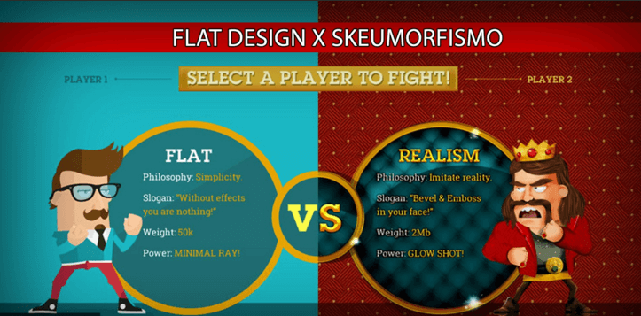
- From Skeuomorphism to Flat Design: Understanding how shifts in design philosophies reflected evolving user expectations.
- Responsive Revolution: The game-changing introduction of fluid grids and media queries sparks a mobile-friendly design era.
- Rise of User Experience (UX): Examining how sites have become more intuitive, thanks to the integration of UX principles.
- Plerdy’s UX & SEO Analysis: A spotlight on how insightful tools like Plerdy revolutionized web optimization.
In this rich exploration, we delve into niche examples such as ‘CSS Zen Garden,’ exemplifying the power of cascading style sheets in the early 2000s, and ‘Airbnb’s’ pioneering use of responsive design. Don’t just observe – engage in a visual odyssey that charts web design’s transformative years.
2000-2002: Visual breakthrough, the development of directories and navigation elements
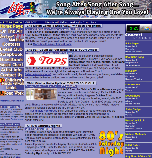
This was a great era when smart web design was born, yet there was still a long way to UX/UI. About 56% of users of that time browsed on huge monitors with 800×600 screen resolution. Cartoonish visuals were typical for most websites. Developers already used PHP3, HTML4, and CSS2. Also, website pages started to become more dynamic and contain less text.
Distinctive trends: small text, non-scrolling, gradients, dark backgrounds, acid fonts, and highlighted/underlined menu links. The designs included minimum images. The appearance of a search box on the main page and thought-out menus on most websites was a real breakthrough.
Since late 2001, Internet speed has been continuously growing. This has allowed developers and web designers to shift from purely textual content and readability as the only characteristic of website usability.
The next period was the time to experiment with the simplest flash animations and video content.
2003-2005: Flash, splash, and 17 million colors

From the beginning of 2003 to 2004, many popular social networks appeared, including Facebook, LinkedIn, and MySpace. Pages with integrated flash animations were at their peak. Web designers focused on website readability and convenient navigation, whereas visual elements, style, color and font combinations got little attention.
In 2004-2005, many users bought high-resolution monitors (1024х768). For the first time, they got access to computers with 17 million colors. This marked the beginning of visual or picture design. The appearance of Youtube in 2005 nudged designers to use videos as a means of content presentation.
2006-2008: The start of skeuomorphism and mobile design
We cannot state that the period of skeuomorphism started right in 2006. This will disregard a smooth transition from a flash design to a “caramel” style with glare, characteristic glossy shine, and round shapes.
Let’s be honest; today, you won’t find typical websites of the 90s, but you still can sometimes come across caramel pages on par with semi-flats. The slow stagnation of another always accompanied the rise of one tendency.
However, in 2006, the first signs of skeuomorphism and naturalism in web design started to appear. The main tendencies: are stock pictures, long scrolling pages, and realistic shadows. From this moment, realistic elements began to displace cartoonish awkward pictures.
The release of the first iPhone in 2007 marked two important events at once: the emergence of adaptive web design (due to the necessity of full-fledged layouts for mobile and tablet devices) and the formation of the caramel style of web design (Do you remember Job’s icons which looked so sweet and glamorous that you wanted to touch or even lick them?). Realism goes hand in hand with gloss.
2009-2010: Web 2.0. and HTML5
Some companies already had primitive glossy websites back in 2003. But the tendency was called by the popular designer Jay Elliot web 2.0. reached its peak in 2009-2010. The popularity of such design solutions was due in no small part to the release of the first iPhone.
Among the main characteristics of the web design of that period: contrasting colors, virtual stickers, glossy icons and illustrations, rounded corners and buttons, diagonal patterns, and gradients. Developers could create such complex layout websites thanks to the appearance of HTML5. This programming language is equally understandable to both people and search engines. The rise of the advanced programming language gave new life to many old multimedia trends.
2011-2012: Skeuomorphism rules, flat design appears
The years of formation and active development, and voila– in 2011, skeuomorphism started to rule almost everywhere. In other words, hail realism in all of its aspects, including:
- Calm color palette;
- Use of natural textures (wood, leather, grass, and cloth);
- 3-D, embossed typography, ribbons, curls, and antique stamps.
Realism in web design made designers draw every icon and object to the tiniest detail to make them as similar to real objects as possible. Textures, light, shadows, and colors added unique depth turning the web into a new reality. Apple’s backgrounds are one of that time’s brightest examples of skeuomorphism.
It is worth noting that it took designers a lot of time to shift from realism since they considered it a role model for web design. Don’t even try to count all the arguments on whether to follow or not to follow fashion trends, stick to realism or discover minimalism…they are countless! Yet progress is unstoppable. The first distinct characteristic of flat design became noticeable in 2011 when Microsoft and Twitter attracted much attention using card-based design. Simplicity, focus on solid colors, readable text, the minimum number of lines and objects, and much space couldn’t be left unnoticed.
Minimalism appealed to designers and users who were now more focused on the idea and content of websites. The look of the web changed similarly to its textual component. In the 90s, websites were content-focused and unappealing to users. From the beginning of 2000 to 2010, the emphasis was put on glossy elements that greatly distracted the text. However, after skeuomorphism peaked, designers realized that usability is not one thing but a well-thought-out composition.
Flat design polished the understanding of what should be highlighted in a good layout. This is the style in which typography is accentuated with simple visual elements. Websites don’t hurt your eye or distract users from target actions and look simple.
2013-2014: Flat against skeuomorphism, the appearance of Google Material Design
So flat design became a leading trend. But it had to tie for first place in design tops and the hearts of users with skeuomorphism. Even today, this naturalistic style can be noticed in the layouts of famous trendsetting designers. If Yves Saint Laurent had designed websites, he would have said: “Trends fade; skeuomorphism is eternal.” And this wasn’t far from the truth!
It’s necessary to distinguish between realism and minimalism in design clearly. Realistic is only sometimes minimalist. For example, realism can look like fancy arches, classic columns, and light and artificial colors when discussing interior design. It allows no emptiness, no air. Free space must be filled to the maximum. In contrast, simple and minimalist design has these features:
- a minimum amount of text and graphics;
- no shadows or depth, the transition to two-dimensionality;
- readability, large fonts;
- parallax effects, GIFs, simple java-animations;
- bright colors, large photos, and background videos.
Meanwhile, visual programming languages were also forging ahead, even during the heated confrontation between flat and skeuomorphism.
In 2014, Google rolled out style guides that got the name “Material Design.” Google developers wanted to return to realistic design but created something more similar to flat. So what was the result? Textural realism, detailed minimalism. Displays turned into sheets of paper – an absolutely real objects from this world. However, they were complemented with easy-to-read and unusual typography, bright icons, illustrations, shades, and animations.
It was Google Material Design that gave rise to semi-flat. This is currently a popular style that combines flat and naturalistic design characteristics.
2015-2018: The appearance of semi-flat UX/UI, the time of animation and interactive elements, large typography, and multidimensional shadows
The formation of a mobile-first approach marks this period. Flat design is slowly but surely transitioning to semi-flat, which stops the fight between realists and minimalists to a certain extent. In this case, the popular design is airy, has minimum elements and bright typography, and preserves realism with animations, dynamic pictures, and multidimensional shadows.
Main characteristics:
- Elements accord with an existing or created design system (patterns, typography, colors, icons, graphics, sounds, content);
- Polygonal and geometric shapes, thick contrasting lines used to attract extra attention;
- no boundaries, multilayeredness, and interactivity (or haptics);
- highly detailed images, animation, and full motion.
Today everything boils down to a stylish look and the maximum convenience of use. UX/UI has become a generic name and is now inseparable from web design. An effective and appealing design is created based on user experience. A high-quality modern website should involve users with a certain interface to the greatest extent possible.
Web design trends 2019-2021 years
Let’s dive into the transformative realm of web design, an arena continually reinventing itself. With the turn of the decade, 2019 to 2021 saw a new wave of design trends, sweeping the industry off its feet.
On the horizon, 2021 beckoned with a shift towards minimalism and realistic designs stemming from a surge in mobile web access. These minimalist designs, stripped down to essential elements – crisp text, ample space, monochrome or duo-chrome color palettes, and straightforward graphics – kept viewers hooked, urging them to delve deeper into the sites.
Intriguing trends cropped up:
- Minimalism
- Subtle yet intentional parallax scrolling
- Non-traditional scrolling
- Interactive landing pages
- Dark mode
- 3D visuals
- Custom illustrated graphics
- Gradients
- Exciting multimedia
- A focus on functionality, usability, and accessibility.
The allure of parallax scrolling, offering depth and movement to the browsing experience, spruced up the otherwise static scrolling. This and the break from traditional norms through non-traditional scrolling methods created a refreshing vibe.
Interactive landing pages played a crucial role in turning visitors into customers. Adobe’s MyCreativeType site, for instance, offered a fun quiz, enhancing user engagement and retention.
A standout trend, dark mode, gained popularity for its reduced eye strain and improved battery usage, with big names like Facebook, Instagram, and Twitter integrating it into their design options.
Web design trends 2022-2023 years
Web design in 2022-2023 is a landscape of innovation and reminiscence. It’s a thrilling journey where design collides with technology, art, and user experience. Let’s dive into the top trends:
- Increased Web Accessibility: Websites now cater more than ever to individuals with disabilities, offering features such as captions for embedded videos to facilitate comprehension.
- Nostalgia: There’s a fond return to the ’80s and ’90s aesthetics, with classic color schemes and imagery creating powerful connections with users.
- Artificial Intelligence: AI drives engagement, particularly in chatbot design, helping brands connect with their audience effectively and efficiently.
- Minimalism: Stripped-back aesthetics are in, emphasizing balance and purposeful use of white space.
- Mobile-Friendly Designs: The emphasis on responsive websites continues, ensuring a positive user experience across all device types.
- Augmented Reality: Brands like Amazon and IKEA use AR to enhance user engagement and facilitate decision-making processes.
- Dark Mode: Dark backgrounds are becoming increasingly popular, with many websites offering a dark mode option for users who prefer it.
Microinteractions: Small, impactful design elements like progress indicators improve user experience and increase engagement.
Keeping pace with these trends is paramount. Designers must remember – in web design, it’s all about balancing the new with the familiar, the bold with the subtle, and the cutting-edge with the accessible.
Bottom Line
It’s been quite a voyage, exploring the evolution of web design from the nostalgic early 2000s to 2023. We’ve seen monumental shifts – from the table-dominated structures of 2002 to the responsive, fluid designs that dominated the 2010s and beyond.
Web development isn’t just about coding anymore. The color palette, digital animations, and frame structures are part of the user experience. Remember when we first encountered cookie consent forms? And then they became an integral part of every website you visit.
This rich exploration should inspire all web dev enthusiasts to delve into the past to better shape the future. The community is here to support, learn, and evolve – with tools like Plerdy leading the charge. From its analytics capabilities to its UX and SEO analysis, Plerdy remains crucial to any digital marketer’s toolkit.
As we launch into the future, we encourage you to stay dedicated to enriching the online landscape. Don’t just browse – be a part of the change! As we close the curtain on our retrospective, let’s not simply leave it in the archives – use this exploration to inspire your next web masterpiece. Ready to start? Signup for Plerdy today and take your website design to the next level.