

A website conversion happens every time a visitor completes an action you actually care about — a purchase, a demo request, a form submission, a phone call, a signup. It is the one metric that ties traffic directly to revenue: double your website conversion rate and you get twice the sales from the same ad budget, the same SEO work, and the same audience. That is why every marketing team tracks it, and also why so many of them track it wrong — some divide by sessions, some by users, and most compare themselves against an “industry average” pulled from an article nobody sourced.
This guide fixes that. You will get the definition, the formula with worked examples, real 2026 benchmark data with links to the primary research, a five-layer diagnostic for finding where conversions leak, fifteen fixes that hold up in practice, and an honest tool comparison. Throughout, we show the workflow in Plerdy — a conversion optimization platform that combines heatmaps, session replay, funnel analysis, and A/B testing in a single account with a free tier. We also flag three tools that popular listicles still recommend even though they have shut down or been absorbed into another product.
Table Of Contents
- What Is Website Conversion?
- The 10 Types Of Website Conversions
- How To Calculate Website Conversion Rate
- What Is A Good Website Conversion Rate? 2026 Benchmarks
- Why Website Conversions Leak: A Five-Layer Diagnostic
- How To Measure Website Conversion Without Fooling Yourself
- 15 Proven Ways To Improve Website Conversion
- Best Tools To Measure And Improve Website Conversion
- Conversion Tools To Avoid In 2026
- Nine Website Conversion Mistakes That Cost Money
- A 90-Day Website Conversion Roadmap
- Frequently Asked Questions About Website Conversion
What Is Website Conversion?
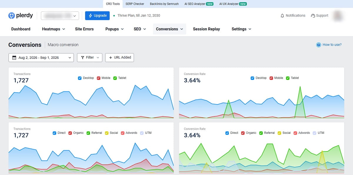
A website conversion is a single completed instance of a goal action on your site. If your goal is a purchase, one order is one conversion. If your goal is a booked demo, one submitted booking form is one conversion. The action is defined by you, not by the analytics tool — which is exactly why two companies with identical traffic can report wildly different numbers.
Three terms get mixed up constantly, so it is worth separating them before anything else:
- Conversion — one completed goal action. A count.
- Conversion rate — conversions divided by the traffic that had the chance to convert, expressed as a percentage.
- Conversion rate optimization (CRO) — the ongoing practice of researching, testing, and shipping changes that raise that percentage.
Macro Versus Micro Conversions
Macro conversions are the outcomes the business is paid for: a sale, a signed contract, a qualified lead. Micro conversions are the smaller commitments that reliably precede them: an email signup, a pricing page visit, a saved cart, a downloaded spec sheet, a video watched to the end.
Micro conversions matter for a practical reason that has nothing to do with theory. Most sites do not generate enough macro conversions per week to detect a small improvement statistically. Micro conversions happen ten to fifty times more often, so they give you a readable signal in days rather than months — as long as you have verified that the micro conversion actually correlates with the macro one on your site. Plerdy’s event and goal tracking lets you register both layers without writing custom code for each one, so the correlation is something you can check rather than assume.
Why Website Conversion Is The Metric That Connects Traffic To Revenue
Traffic growth costs money and takes time. Conversion growth compounds against traffic you have already paid for. A site with 50,000 monthly visitors converting at 1.6% produces 800 conversions; the same site at 2.4% produces 1,200 — a 50% revenue increase with zero additional acquisition spend. That arithmetic is why conversion work usually has a better return than another traffic channel, and why it is the first place to look when acquisition costs rise.
The 10 Types Of Website Conversions
Naming your conversion types precisely is the difference between a dashboard that drives decisions and one that just decorates a wall. Here are the ten that cover the overwhelming majority of business models.
| Conversion Type | Class | Typical Trigger | How To Track It |
|---|---|---|---|
| Purchase / transaction | Macro | Order confirmation page or event | Ecommerce event with revenue value |
| Lead form submission | Macro | Contact, quote, or demo form | Form submit event plus thank-you page |
| Free trial or account signup | Macro | Account created | Server-side event, deduplicated by user |
| Phone call or click-to-call | Macro | Tap on a tel: link | Outbound click event or call tracking |
| Booked meeting | Macro | Scheduler confirmation | Callback from the booking tool |
| Newsletter or email opt-in | Micro | Subscribe form or pop-up | Form event segmented by placement |
| Content download | Micro | Ebook, spec sheet, template | File download event |
| Add to cart / add to wishlist | Micro | Product page interaction | Ecommerce event with product ID |
| Pricing page view | Micro | Navigation to pricing | Page view marked as a key event |
| Video or demo engagement | Micro | 75%+ of a product video watched | Video progress event |
Two rules keep this list useful. First, every site should have one primary macro conversion — the one the business is judged on. Second, no more than five or six micro conversions should be actively monitored, or the dashboard becomes noise. If you want a deeper breakdown of the two classes, our guide to micro and macro conversions goes further into how to pick them.
How To Calculate Website Conversion Rate
The formula is simple. The denominator is where teams go wrong.
Website conversion rate = (Conversions ÷ Traffic in the same period) × 100
Worked example: a B2B site records 18,400 sessions in October and 322 submitted demo requests. The session-based conversion rate is (322 ÷ 18,400) × 100 = 1.75%. If those 18,400 sessions came from 11,900 unique users, the user-based rate is (322 ÷ 11,900) × 100 = 2.71% — the same performance, reported 55% higher. Neither number is wrong. Only one of them is comparable to whatever benchmark you are about to quote.
Sessions Versus Users: The Denominator Trap
Pick one denominator, document it, and never silently switch. As a default:
- Sessions — best for ecommerce and any funnel where one person can legitimately convert more than once. Most published benchmarks, including Contentsquare’s, are session-based.
- Users — best for SaaS signups, account creation, and lead generation, where one person converting twice is a data problem rather than a second sale.
- Unique visitors to a specific page — the only fair denominator for landing page and page-level conversion rates.
Site-Level, Page-Level, And Funnel-Level Conversion
A single site-wide number hides almost everything you need. Three levels are worth reporting separately:
- Site level — the health check. Useful for trend lines, useless for diagnosis.
- Page level — conversion rate for visitors who landed on or reached a specific page. This is where you find the one product page dragging the category down.
- Funnel level — step-to-step completion rates. This is where the actual leak becomes visible, because it shows you which transition loses people.
Funnel-level measurement is the highest-value of the three and the one most often skipped, because it requires defining the steps in advance. Plerdy’s conversion funnel tool supports up to seven steps and reports the drop-off percentage at each one, which turns “our conversion rate is low” into “we lose 61% of people between shipping and payment.” For the full arithmetic including weighted and segmented variants, see our walkthrough on how to calculate conversion rate.
What Is A Good Website Conversion Rate? 2026 Benchmarks
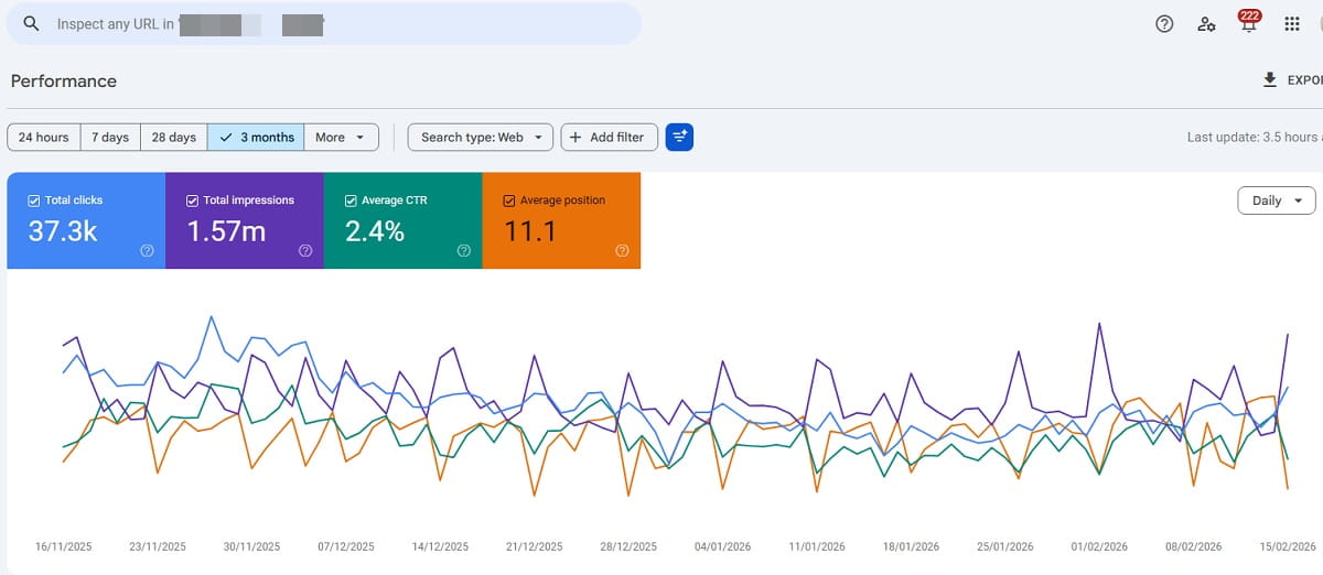
Most articles still quote “2 to 3%” from studies published years ago. The most current large-scale dataset is the 2026 Digital Experience Benchmark from Contentsquare, published in March 2026 and built on 99 billion web and app sessions across more than 6,000 sites. Here is what it actually reports.
| Segment | 2026 Benchmark | What It Means For You |
|---|---|---|
| Desktop versus mobile | Desktop converts 74% higher than mobile | A blended site-wide number is dominated by whichever device sends more traffic |
| Mobile share of traffic | 69.9% of all sessions | Two thirds of your traffic sits on the weaker-converting device |
| Year-over-year change | Conversion rates fell across devices; desktop down 7.9% | A flat conversion rate in 2026 is a relative gain, not stagnation |
| Returning versus new visitors | 2.9% versus 1.7% | Return traffic converts roughly 70% better — retention is a conversion lever |
| Return visit share | 52.8% of traffic | More than half your audience has seen the site before |
| Paid search | 2.8% — the highest-converting channel | Intent, not volume, drives channel conversion rate |
| Organic social | 0.7% | Judge social on assisted conversions, not last click |
| AI-referred traffic | 1.3%, up 55% year over year; volume up 632% | A small but fast-maturing channel that most sites have not instrumented |
Two more numbers are worth having in your head. Baymard Institute puts the documented average online shopping cart abandonment rate at 70.22%, calculated across 50 separate studies and last updated in September 2025. And the “Milliseconds Make Millions” study by Deloitte and 55, commissioned by Google, found that a 0.1-second improvement in mobile site speed lifted retail conversions by 8.4% and average order value by 9.2%, based on 30 million user sessions across 37 brands.
The caveat that matters more than the numbers. A benchmark tells you whether your result is unusual. It does not tell you what your result should be. Your traffic mix, price point, purchase cycle, and market maturity move the achievable rate more than any tactic on this page. Use the benchmark to sanity-check the direction of travel, then set your target against your own trailing twelve months. If you want the wider statistical picture, we maintain a running collection of conversion rate optimization statistics with sources attached.
Why Website Conversions Leak: A Five-Layer Diagnostic
Most conversion advice is a pile of tactics with no diagnostic step in front of it, which is why so much of it fails — the tactic was fine, it just addressed a layer that was not broken. Work through these five layers in order, because a fix at layer four is worthless if the problem is at layer one.
| Layer | The Question | Symptom In The Data | What To Look At |
|---|---|---|---|
| 1. Traffic quality | Are the right people arriving? | High bounce, very short sessions, one channel far below the rest | Channel and campaign segmentation, search query reports |
| 2. Message match | Does the page deliver what the ad or snippet promised? | People arrive, scroll a little, leave without interacting | Scroll depth heatmaps, first-screen engagement |
| 3. Friction | Is the path to the goal unnecessarily hard? | High funnel drop-off at one specific step | Funnel step reports, form field analysis, session replay |
| 4. Trust | Do people believe you can deliver? | Deep engagement, repeated pricing views, no completion | Click maps on proof elements, exit surveys |
| 5. Technical | Is something actually broken? | Sudden drop, device- or browser-specific collapse | Error tracking, Core Web Vitals, replay of failed sessions |
In practice, layers three and five account for the fastest wins because they are objective — a form that throws a validation error on iOS Safari is not a matter of opinion. The workflow that surfaces them quickest is: funnel report to find the step that loses people, heatmaps to see what visitors on that step actually engage with, then session replay filtered to sessions that reached the step and failed, to watch what went wrong. Plerdy’s error tracking closes layer five by logging the JavaScript failures that quietly break checkouts on specific devices.
How To Measure Website Conversion Without Fooling Yourself
The most expensive conversion mistakes are measurement mistakes, because they send real budget after imaginary results.
Define Key Events Before You Touch A Tool
Write down, in plain language, what counts as a conversion, what the denominator is, what the attribution window is, and which events are excluded (internal traffic, bots, test orders). Only then configure it. In Google Analytics 4 this means marking specific events as key events rather than counting everything. Anything you skip here becomes an argument three months later about whose number is right.
Respect Sample Size And Significance
A conversion rate calculated on 40 conversions moves several percentage points on random noise alone. Before you act on a difference between two numbers, check whether the difference is larger than the uncertainty in either one. Before you call an A/B test, check that it reached the sample size you planned before starting — peeking and stopping at the first favorable moment is the single most common way teams ship changes that do nothing. Plerdy publishes a free A/B testing significance calculator and a test duration calculator for exactly this check.
Segment Before You Conclude
A site-wide conversion rate that holds steady while mobile falls and desktop rises reports “no change.” Always break the number down by device, channel, new versus returning, and — increasingly — by AI-referred versus traditional search traffic. Given that mobile now carries 69.9% of sessions while converting far below desktop, a blended figure is close to meaningless as a diagnostic.
Pair Every Number With A Reason
Quantitative tools tell you where people leave. They cannot tell you why. Session replay, on-page surveys, and exit-intent questions supply the why, and a single well-placed question — “What almost stopped you from completing this?” — routinely produces more actionable insight than a month of dashboard staring. Plerdy’s website feedback tool and smart pop-up forms handle this without a separate subscription.
15 Proven Ways To Improve Website Conversion

These are ordered roughly by expected impact per hour of work. Run the diagnostic above first so you know which ones apply to you.
1. Match The Page To The Promise That Brought The Visitor
If the ad said “free 30-day trial” and the landing page leads with “book a demo,” the visitor has to reconcile the mismatch themselves, and most will not. Audit your top ten entry pages against the ad copy, meta description, or snippet that sends traffic to them. This costs nothing and frequently moves the number more than any redesign.
2. Give Each Page One Primary Call To Action
Pages with a single dominant action outperform pages offering three equal choices, because choice creates hesitation. Keep secondary paths available but visually subordinate — one filled button, everything else as text or outline.
3. Cut Form Fields To What Sales Actually Uses
Baymard’s research found the average US checkout contains 11.3 form fields while most sites need only 8. The same logic applies to lead forms: every field is a small tax on completion. Ask your sales team which fields they genuinely use to qualify, and delete the rest.
4. Fix Mobile First, Because That Is Where The Traffic Is
With mobile at 69.9% of sessions and converting 74% below desktop, the mobile experience is where the largest absolute number of conversions is being lost. Test every fix on a real device, not a resized desktop browser.
5. Shave Load Time, Even By A Tenth Of A Second
The Deloitte and Google study measured an 8.4% retail conversion lift from a 0.1-second mobile speed improvement. Start with Core Web Vitals, and prioritize Largest Contentful Paint on your highest-traffic template.
6. Place Proof At The Moment Of Doubt
Testimonials in a footer carousel do nothing. The same testimonial next to the price, or next to the field people abandon, does work. Use click and scroll maps to find where attention stalls, then put the proof there.
7. Remove Surprise Costs Before Checkout
Unexpected shipping, taxes, or fees revealed late in checkout are consistently among the top documented reasons for cart abandonment. Show the total, or a reliable estimate, on the product page.
8. Offer A Guest Checkout Path
Forced account creation converts a purchase decision into a commitment decision. Offer the account at the confirmation step instead, when the visitor already has a reason to want one.
9. Make Pricing Legible In Under Ten Seconds
If a visitor cannot work out roughly what they will pay without contacting sales, a meaningful share of them will leave and check a competitor who told them. Publish a range if you cannot publish a price.
10. Use Exit Intent Only When You Have Something Worth Offering
Exit-intent pop-ups work when they carry a genuine offer — a discount, a saved cart, a comparison guide. They damage trust when they interrupt with a newsletter signup. Target them to specific pages and specific segments rather than site-wide.
11. Answer Objections On The Page, Not In The Chat Queue
Every question your support team answers more than twice a week is an objection your page failed to address. Mine your chat transcripts and add the top five answers directly to the page.
12. Segment Your Funnel Before You Optimize It
A checkout that works on desktop and fails on Android is one problem, not a general “checkout problem.” Break every funnel report by device and browser before you write a single ticket.
13. Test One Change At A Time, And Let It Finish
Bundled changes tell you the bundle worked, not which part. Calculate the sample size in advance, run to it, and resist stopping early. If you cannot reach the sample size in four weeks, test something with a bigger expected effect instead.
14. Rebuild The Path For AI-Referred Visitors
AI-referred traffic grew 632% year over year and now converts at 1.3%, up 55%. These visitors arrive mid-decision, already briefed by a summary, and often land deep in the site rather than on the homepage. Make sure deep pages carry the full context and the primary call to action, and tag the channel so you can measure it separately.
15. Instrument Micro Conversions So You Can Read Small Wins
If your macro conversion happens 30 times a month, you cannot detect a 10% improvement in any reasonable timeframe. Track the micro conversions that precede it, validate that they correlate, and use them as your fast feedback loop.
For a longer catalog of tactics organized by page type, see our list of ways to increase website conversion rate.
Best Tools To Measure And Improve Website Conversion
No single tool covers the whole job. Measurement, behavior analysis, and experimentation are three different capabilities, and the practical question is how many accounts you want to run to get all three. The table below compares the nine platforms that are actively sold and maintained as of September 2026 — pricing verified against each vendor’s own pricing page.
| # | Tool | Core Capability | Free Plan | Entry Price | Best For |
|---|---|---|---|---|---|
| 1 | Plerdy | All-in-one: heatmaps, replay, funnels, pop-ups, A/B tests, SEO | Yes | $21/mo annual | Teams that want the whole CRO loop in one account |
| 2 | Google Analytics 4 | Traffic and key-event measurement | Yes | Free | The baseline measurement layer every site needs |
| 3 | Microsoft Clarity | Heatmaps and session recordings | Yes, unlimited traffic | Free | Zero-budget behavior analysis at any traffic volume |
| 4 | Contentsquare | Enterprise experience analytics (now includes Hotjar) | Yes | Quote | Large sites needing journey-level analysis |
| 5 | VWO | A/B testing, personalization, insights | Limited | Quote | Structured experimentation programs |
| 6 | Optimizely | Enterprise experimentation and content | No | Quote | Enterprises running tests across web and product |
| 7 | Mouseflow | Friction scoring, funnels, form analytics | Yes, 500 sessions | $25/mo | Pinpointing friction in a specific flow |
| 8 | Crazy Egg | Snapshots, heatmaps, simple A/B testing | Trial only | $29/mo annual | Small teams that want visual reports fast |
| 9 | FullStory | Session replay plus product analytics | Yes, 30k sessions | Quote | Product teams analyzing in-app behavior |
1. Plerdy
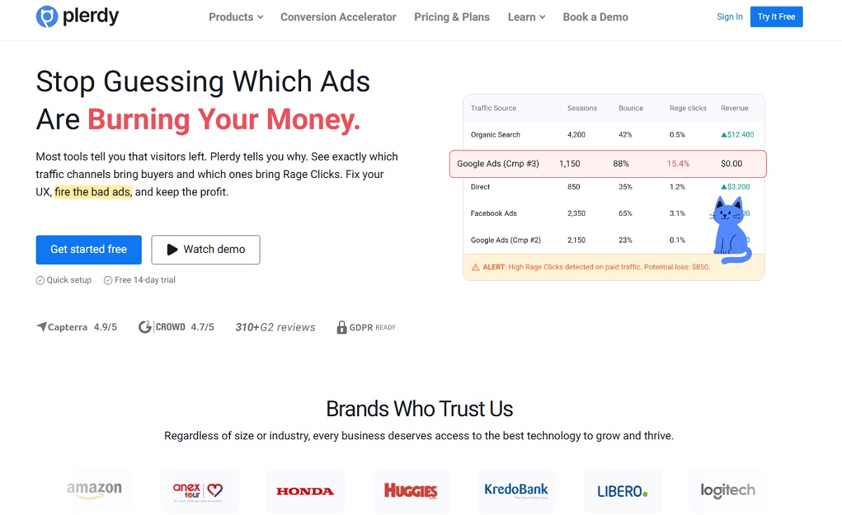
Plerdy is a conversion rate optimization platform that puts the full diagnostic loop — see the drop-off, watch why it happens, test a fix, measure the result — inside one account. That matters practically: the alternative is stitching a heatmap tool, a replay tool, a funnel report, a pop-up builder, and a testing tool together, paying five subscriptions, and reconciling five different definitions of a session. Plerdy also folds in an SEO checker and JavaScript error tracking, which cover the message-match and technical layers of the diagnostic that most CRO suites leave out entirely.
Key Features
- Click, scroll, and hover heatmaps, including maps for dynamic elements and pop-ups
- Session replay with filtering by device, source, page, and completed goal
- Conversion funnel analysis with up to seven steps and per-step drop-off percentages
- A/B testing with no cap on the number of tests, on every plan including free
- Smart pop-up forms and NPS or feedback surveys triggered by behavior
- Event and goal tracking for micro and macro conversions
- Ecommerce sales performance reporting tied to on-page behavior
- JavaScript error tracking and SEO checker with alerts
Use Cases
- Finding the exact checkout or form step where an ecommerce funnel loses buyers
- Validating that a redesign actually improved conversion instead of assuming it did
- Running exit-intent and behavior-triggered offers without a separate pop-up subscription
- Diagnosing device-specific breakage that a blended analytics report hides
Pros
- Heatmaps, replay, funnels, pop-ups, and A/B testing under one login and one session definition
- Unlimited A/B tests on every tier, including the free plan
- Genuinely usable free plan — 100 heatmaps, 500 video sessions, 100 pop-ups, 100 conversions
- Entry pricing well below the equivalent stack assembled from separate vendors
- SEO and error monitoring included, covering diagnostic layers most CRO tools ignore
Cons
- Not an enterprise journey-analytics platform — very large sites with dedicated analytics teams may still need one
- Data retention on lower tiers is 1–3 months, so long historical comparisons need a higher plan
Pricing — Free plan at $0. Startup $21/month billed annually ($32 monthly), Scale $42/month annually ($64 monthly), Thrive $70/month annually ($108 monthly), with three Enterprise tiers from $97/month annually. Annual billing saves 35%. Current rates on the Plerdy pricing page.
Best For — small and mid-sized teams that need the entire measure-diagnose-test loop without running five subscriptions.
2. Google Analytics 4
GA4 is the measurement floor rather than an optimization tool. It answers how many, from where, and at what rate — and it is the source most benchmark comparisons implicitly assume. It will not show you why anyone left, so treat it as the layer that tells you a problem exists and hand the diagnosis to a behavior tool.
Key Features
- Event-based model with key events replacing the old goal system
- Funnel exploration and path exploration reports
- Audience segmentation by device, channel, geography, and behavior
- Native BigQuery export for custom analysis
Use Cases — establishing the baseline conversion rate, comparing channels, and detecting when a number moves.
Pros — free at nearly any volume, universally supported by integrations, the common language across agencies and vendors.
Cons — steep learning curve, no qualitative layer at all, sampling and thresholding on large properties, and no built-in experimentation since Google Optimize was retired.
Pricing — free; GA4 360 is enterprise quote-based.
Best For — every site, as the measurement baseline that everything else is checked against.
3. Microsoft Clarity
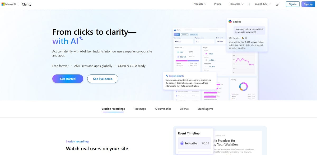
Clarity gives away heatmaps and session recordings with no traffic ceiling, which makes it the obvious first behavior tool for any site with no budget. The trade-off is that it stops at observation: there is no experimentation, no funnel builder in the CRO sense, and no way to act on what you find inside the same product.
Key Features
- Click and scroll heatmaps with no traffic limits
- Session recordings with rage-click and dead-click detection
- AI summaries and conversational querying of session data
- GDPR and CCPA ready, with a GA4 integration
Use Cases — spotting rage clicks on a broken element, watching how mobile users handle a form, and validating a hypothesis before paying for a testing tool.
Pros — genuinely free with no traffic cap, fast to install, strong friction detection.
Cons — no A/B testing, no pop-ups or surveys, limited segmentation compared with paid suites, and your behavioral data sits with Microsoft.
Pricing — free, described by Microsoft as free forever with no limits on traffic.
Best For — teams with zero tooling budget that need to see behavior today.
4. Contentsquare (Including Hotjar)
Contentsquare is the enterprise end of experience analytics, built around journey and zone-level analysis rather than single-page heatmaps. Important status change: Hotjar is no longer sold as a standalone product. Contentsquare states that “Hotjar is now part of Contentsquare” and that the two platforms have merged, with hotjar.com now redirecting new signups to Contentsquare. If an article still lists Hotjar and Contentsquare as two independent options, it has not been updated.
Key Features
- Zone-based analysis showing revenue attribution per page element
- Session replay, heatmaps, and journey analysis at enterprise scale
- Impact quantification that estimates the revenue cost of a friction point
- Surveys and feedback carried over from Hotjar
Use Cases — large ecommerce and financial services sites that need to justify UX work in revenue terms.
Pros — deepest journey analytics in the category, expanded free tier after the merger, strong benchmark data behind the product.
Cons — quote-based enterprise pricing, heavier implementation, and existing Hotjar customers face a migration rather than a renewal.
Pricing — free tier available; paid plans are quote-based via the Contentsquare pricing page.
Best For — enterprise sites with a dedicated analytics function.
5. VWO
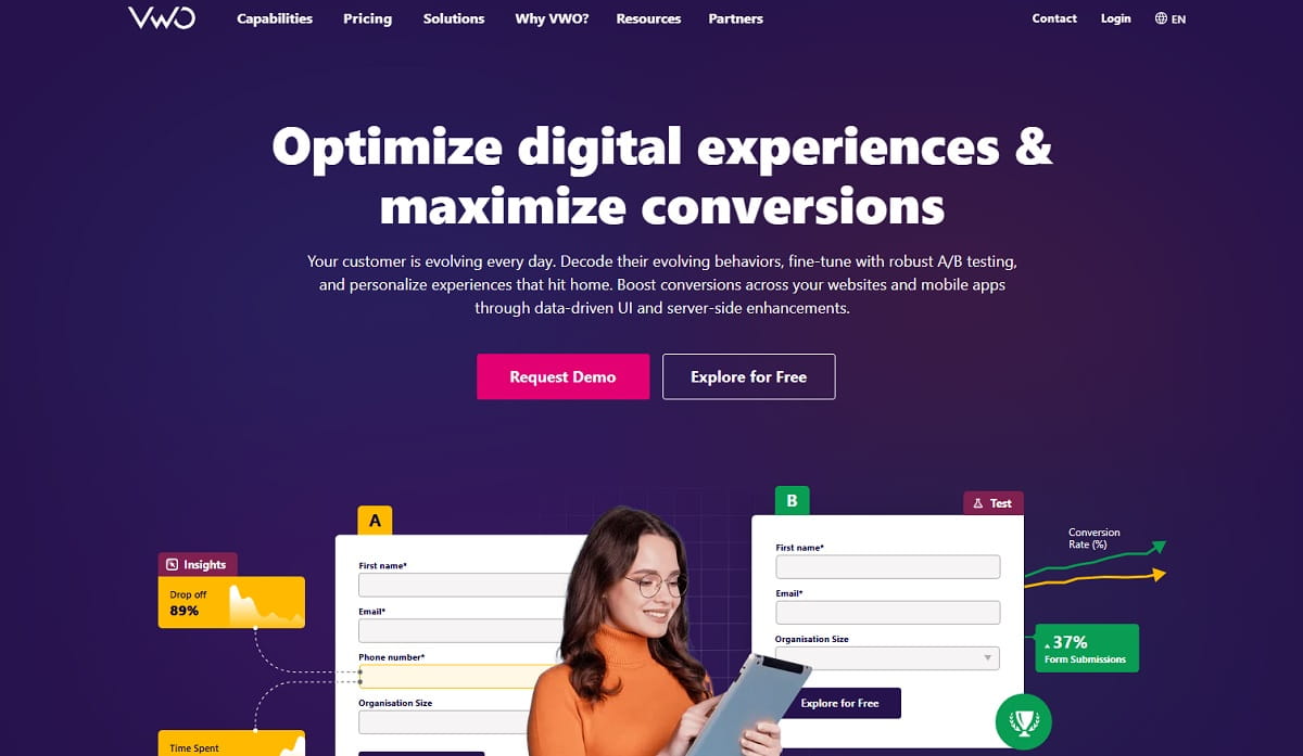
VWO is built around the experimentation program rather than the individual test: hypothesis tracking, a test backlog, server-side and client-side execution, and reporting designed to survive scrutiny. If your organization runs tests continuously rather than occasionally, that structure is the reason to pay for it.
Key Features
- Visual editor plus code-level A/B, split URL, and multivariate testing
- Bayesian statistics engine with a documented stopping rule
- Heatmaps, recordings, and surveys in the Insights module
- Server-side and feature-flag testing on higher tiers
Use Cases — running a governed experimentation roadmap where results feed a documented backlog.
Pros — mature statistics, strong multivariate support, program-level workflow rather than ad-hoc tests.
Cons — no published prices, cost rises quickly with traffic, and the full platform is more than a small team needs.
Pricing — Growth, Pro, and Enterprise tiers; VWO does not publish figures and directs buyers to a demo or the free explore option.
Best For — mid-market and enterprise teams with an ongoing testing program.
6. Optimizely
Optimizely sits at the top of the experimentation market and became the default recommendation for many teams after Google Optimize was retired. Experimentation is now one module inside a wider digital experience platform, which is a strength if you need content management and personalization in the same stack and overkill if you only want to test a headline.
Key Features
- Web and feature experimentation with a shared stats engine
- Sequential testing that allows valid continuous monitoring
- Personalization and audience targeting
- Integration with the wider Optimizely content and commerce platform
Use Cases — enterprises running high volumes of concurrent tests across marketing site and product.
Pros — rigorous statistics, scales to very high test volume, deep enterprise integrations.
Cons — expensive, quote-only pricing, and it needs engineering support to run well.
Pricing — quote-based; no public price list.
Best For — enterprises where experimentation is a funded, staffed program.
7. Mouseflow
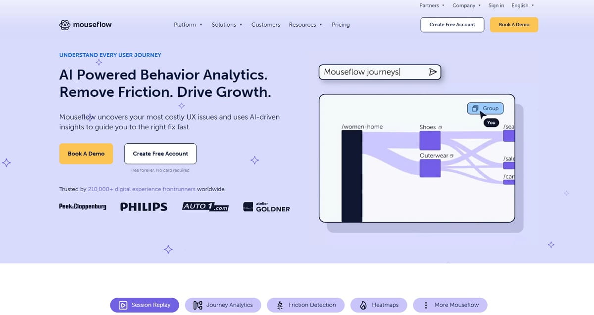
Mouseflow’s distinguishing feature is friction scoring — it ranks sessions by how much trouble the visitor appeared to have, so you watch the twenty worst sessions instead of twenty random ones. Combined with form analytics that report per-field drop-off, it is a focused instrument for one job: finding where a specific flow breaks.
Key Features
- Friction score ranking of recorded sessions
- Six heatmap types including movement and attention
- Form analytics with per-field abandonment
- Funnel reports with automatic drop-off detection
Use Cases — diagnosing a long checkout or a lead form that loses people mid-way.
Pros — friction scoring saves real analyst time, strong form analytics, workable free tier.
Cons — no A/B testing, session limits are tight at the lower tiers, and price climbs steeply with volume.
Pricing — Free (500 sessions), Essential $25/month, Advanced $109/month, Premium $319/month, Enterprise custom, per Mouseflow’s pricing page.
Best For — teams with one high-value flow they need to fix precisely.
8. Crazy Egg
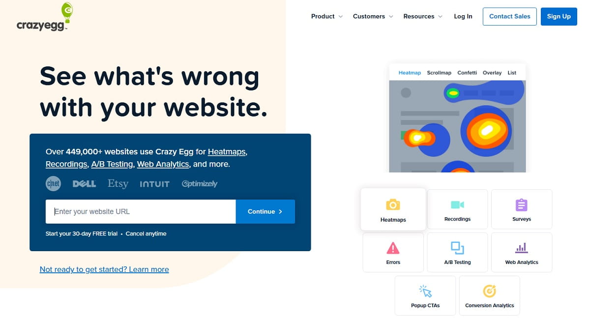
One of the original heatmap products, Crazy Egg has kept its main advantage: reports that a non-analyst can read and act on within an hour of installing the script. It now bundles simple A/B testing and surveys, which makes it a reasonable single purchase for a small marketing team without a data specialist.
Key Features
- Snapshots, click, scroll, and confetti heatmaps segmented by source
- Session recordings and error tracking
- Built-in A/B testing and on-site surveys
- Pageview-based plans with no overage charges
Use Cases — quick visual audits of landing pages and simple headline or layout tests.
Pros — very easy to read, confetti reports segment clicks by traffic source, no overage billing.
Cons — no free plan, pageview limits are low on the entry tier, and the testing module is basic next to VWO or Optimizely.
Pricing — Starter $29/month, Plus $99/month, Pro $249/month, Enterprise $599/month, all billed annually with a free trial, per Crazy Egg’s pricing page.
Best For — small marketing teams that want readable visual reports without training.
9. FullStory
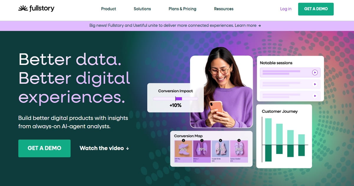
FullStory sits between session replay and product analytics: it captures interactions retroactively, so you can define a funnel today and analyze it against data already collected. For product-led businesses where the conversion happens inside the application rather than on the marketing site, that retroactive capability is the differentiator.
Key Features
- Autocapture, allowing retroactive funnel and segment definition
- Session replay with frustration signals and heatmaps
- Product analytics: funnels, retention, journeys, and dashboards
- Mobile analytics and AI-assisted session summaries as add-ons
Use Cases — product teams analyzing in-app activation and onboarding conversion.
Pros — permanent free tier at 30,000 sessions per month with 12 months of retention, retroactive analysis, strong replay quality.
Cons — quote-only paid pricing, oriented to product rather than marketing conversion, and key capabilities sit behind paid add-ons.
Pricing — free tier at 30,000 sessions per month; Business, Advanced, and Enterprise plans are quote-based.
Best For — product teams whose conversion event happens after login.
Conversion Tools To Avoid In 2026
Three products still appear in current “best conversion tools” lists despite being discontinued, absorbed, or closed to new customers. Checking this before you shortlist saves a wasted procurement cycle.
| Tool | Status | What Happened | What To Use Instead |
|---|---|---|---|
| Google Optimize | Discontinued | Sunset on 30 September 2023; Google chose to invest in third-party A/B testing integrations for GA4 rather than build a replacement | VWO, Optimizely, or Plerdy’s built-in A/B testing |
| Smartlook | End of life | Acquired by Cisco in 2023; end of sale 31 May 2026, end of renewals 31 August 2026, support ends 31 August 2027 | Microsoft Clarity, Plerdy, or Mouseflow |
| Hotjar (standalone) | Merged | Folded into Contentsquare; hotjar.com now redirects and new signups go to Contentsquare | Contentsquare, or Plerdy for a lighter all-in-one |
Sources for the above: the Cisco end-of-sale and end-of-life announcement for Smartlook, Optimizely’s Google Optimize sunset page, and Contentsquare’s own Hotjar transition page. We also maintain a detailed comparison of Google Optimize alternatives for teams still running on the old setup.
Nine Website Conversion Mistakes That Cost Money
- Treating a benchmark as a target. “The average is 2.4%” tells you nothing about what your site can achieve with your traffic mix and price point.
- Calling a test early. Stopping at the first favorable moment produces a positive result roughly as often as a coin flip.
- Measuring sessions and reporting users. Or the reverse, in different meetings, to different people.
- Optimizing the page with the least traffic. A 20% lift on a page with 400 monthly visitors is not worth the sprint.
- Testing button colors instead of offers. Presentation changes produce small effects; offer, price, and guarantee changes produce large ones.
- Ignoring mobile because desktop converts better. Desktop converting 74% higher is precisely why the mobile deficit is the larger absolute opportunity.
- Removing friction that was doing a job. Some form fields qualify leads. Deleting them raises conversion rate and lowers lead quality — track both.
- Changing five things at once. You learn the bundle worked. You never learn which part, so you cannot repeat it.
- Not recording what you already tried. Without a test log, teams re-run losing experiments every eighteen months as people change roles.
A 90-Day Website Conversion Roadmap
If you are starting from nothing, this sequence gets you from no visibility to a running test program in one quarter without needing headcount.
| Phase | Focus | What You Do | What You Have At The End |
|---|---|---|---|
| Days 1–30 | Measure | Define the primary macro conversion and 3–5 micro conversions; configure key events; install a behavior tool; record a clean baseline by device and channel | A defended baseline number you can compare against later |
| Days 31–60 | Diagnose | Build the funnel report; run the five-layer diagnostic; watch 20 failed sessions on the worst step; ship the obvious technical fixes | A ranked list of hypotheses with evidence behind each one |
| Days 61–90 | Test | Calculate the sample size; run the two highest-expected-impact tests one at a time to completion; log the outcome either way | Two decided experiments and a repeatable process |
The single most common failure in this plan is skipping the first thirty days. Without a documented baseline, every result afterwards is arguable, and arguable results do not get funded.
Frequently Asked Questions About Website Conversion
What Is A Website Conversion In Simple Terms?
A website conversion is one completed instance of the action you want visitors to take — a purchase, a form submission, a signup, a phone call, or a download. The action is defined by you, so the same visit can be a conversion on one site and not on another.
What Is A Good Website Conversion Rate In 2026?
There is no single good number, and any article giving you one is guessing. The 2026 Contentsquare Digital Experience Benchmark, based on 99 billion sessions across 6,000-plus sites, reports returning visitors converting at 2.9% and new visitors at 1.7%, with paid search the strongest channel at 2.8% and organic social the weakest at 0.7%. Desktop converts about 74% higher than mobile. Use those figures to check whether your result is unusual, then set your actual target against your own trailing twelve months.
How Do You Calculate Website Conversion Rate?
Divide the number of conversions by the traffic in the same period and multiply by 100. For example, 322 demo requests from 18,400 sessions gives (322 ÷ 18,400) × 100 = 1.75%. The critical decision is the denominator: sessions, users, or unique visitors to a specific page. Pick one, document it, and never switch silently, because the same performance can look 55% better or worse depending on which you choose.
What Is The Difference Between Micro And Macro Conversions?
Macro conversions are the outcomes the business is paid for — a sale, a qualified lead, a signed contract. Micro conversions are smaller commitments that precede them, such as an email opt-in, a pricing page view, or an add to cart. Micro conversions matter because they happen far more often, which lets you detect improvements statistically in days rather than months.
Why Is My Website Conversion Rate Dropping?
Work through five layers in order: traffic quality, message match, friction, trust, and technical breakage. A sudden drop confined to one device or browser is almost always technical. A gradual drop across all segments usually means the traffic mix shifted — a channel with lower intent grew. Note also that conversion rates declined industry-wide year over year in the 2026 benchmark data, with desktop down 7.9%, so a flat rate may actually be a relative gain.
How Much Traffic Do I Need To Run An A/B Test?
It depends on your current conversion rate and the size of the effect you want to detect — smaller effects need dramatically more traffic. Calculate the required sample size before you start rather than after, using a duration and significance calculator, and commit to running to that number. If the calculation says four months, test something with a larger expected effect instead.
Is Hotjar Still Available In 2026?
Not as a standalone product. Contentsquare, which acquired Hotjar, states that the two platforms have merged into a single experience intelligence platform, and hotjar.com now redirects new signups to Contentsquare. Existing Hotjar customers are being transitioned rather than renewed. Any 2026 tool list presenting Hotjar and Contentsquare as two independent choices is out of date.
What Is The Best Free Tool To Improve Website Conversion?
For pure observation with no traffic cap, Microsoft Clarity is unmatched at zero cost. If you also need to act on what you find — run a test, launch a pop-up, track a funnel — Plerdy’s free plan covers heatmaps, session recordings, pop-ups, conversion tracking and unlimited A/B tests in one account, which Clarity does not offer. Most teams end up running GA4 for measurement plus one behavior tool that can also test.
Key Takeaways
- A website conversion is one completed goal action; the conversion rate is that count divided by a denominator you must define and never silently change.
- Report at three levels — site, page, and funnel. Only the funnel level shows you where the loss actually happens.
- Current benchmarks: desktop converts 74% above mobile, returning visitors 2.9% versus 1.7% for new, paid search 2.8%, organic social 0.7%, and AI-referred traffic 1.3% and rising fast.
- Diagnose in five layers — traffic quality, message match, friction, trust, technical — before applying any tactic.
- Speed is a conversion lever with measured evidence behind it: 0.1 seconds was worth 8.4% in retail conversions in the Deloitte and Google study.
- Verify tool status before shortlisting. Google Optimize is gone, Smartlook is at end of life, and Hotjar now lives inside Contentsquare.
- Instrument micro conversions so small improvements become measurable in weeks rather than quarters.
If you want the whole loop — heatmaps, session replay, funnel analysis, pop-ups, and unlimited A/B tests — in one place, start on the Plerdy free plan and run the 90-day roadmap above against your own numbers.