
Any marketer knows how important it is to create a unique and, most importantly, effective logo that won’t be ranked as one of the worst logos. What’s more, it must be up-to-date. To ensure this, one should follow logo design trends. Designers consider past trends and tend to push the envelope. For example, in 2021, a premium was placed on color, story completeness, and experiments. Today, many designers are looking for answers to the next questions:
- What makes a bad logo?
- What are the world’s worst logos?
- What are examples of the most inappropriate logos?
- What are examples of bad logos funny?
- What are logos that went wrong?
- What are examples of the most complicated logos?
- What are examples of messed-up logos?
- What are the worst logo redesigns?
- What are the best TV logos?
- What are the coolest logos ever?
- What are the best product logos?
- bright colors have been one of the leading trends in graphic design over the past few years, and by now;
- multi-color gradients are also one of the trends used by many famous designers today to build a strong brand for cool companies;
- metallic logos are hardly a novelty. However, it was in 2021 that they took a quantum leap. Besides, they are primarily associated with top-class and high-quality things, so the metallic effect can become a zest of any design and prevent one from getting to the Top of the worst logos;
- geometric figures + originality are a perfect combination for logo design. After all, logos should be symbolic. Otherwise, they are bad logos. And what is a better way to convey the meaning than geometry? At the same time, it was lofty with bright colors, as mentioned above, and softer shapes in 2021;
- minimalistic illustrations. In recent years, minimalism has been one of the most popular trends since, thanks to it, logos are simple and clear but not boring. Many companies and designers prefer this style. In addition, such simplified logos are easily combined with any marketing material. If you also combine minimalism with geometry, you’ll get splendid conceptual logos that will never be included in a list of worst logos;
- minimalist typography. We’ve already noted that illustrations feature minimalism, but it’s smoothly becoming a characteristic of typography, as well. Typographic logos are created using letters or brand names, and they often include the full commercial name;
- creative logos always remain on-trend since they attract attention and shock in a good way. They are specially developed, creative, unique, and recognizable;
- an illustration replacing a part of a word or some words is another latest trend in logo design. Creative logos often include illustrations to replace a part of a word. In most cases, it will be a letter or two. Certainly, the illustration replacing a letter should remind us of the letter itself and make good sense. Otherwise, it’ll be another example of bad logos;
- artistic logos and illustrations. Many designers are genuine artists deep inside. It is amazing that in 2021, they can safely express their artistic views in logos, as this is one of the year’s trends.
- use Image Manipulation Services. If you want to get a great photo and not waste time, then you should turn to professionals.
Naturally, large brands, recognizable and popular logos, are sometimes reluctant to change them, but this is a wrong decision that might already become bad logos. Instead, one should adjust to the demands of times to always remain on-trend. Therefore, the logo should not necessarily be completely changed. Instead, the rebranding will make your logo more modern and effective with small changes.
Bright and colorful logos with modern design significantly expand the opportunities of brands. Minimalistic and simplified logos are meant for those who want to stay repressed but still impress with elegant styles. Typography in various forms and creative illustrations bring a special artistic atmosphere to the overall logo design. Don’t be afraid of moving with the times, not missing a chance to develop. Remaining behindhand with the world, your logo will likely get to the Top of bad logos.
Five unique and effective logos
1. Fish food
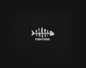
This logo is a prime example of a unique and catchy design. It is created by the latest techniques that worked well in favor of the company. This is how artistic logos should look like in 2021, not to be ranked as bad logos.
2. Loveclip
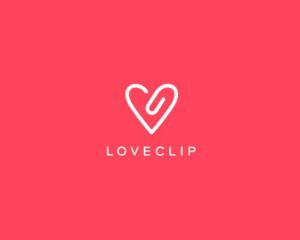
This is a creative logo in a minimalistic style, rather relevant in 2021. By cutting away all the fat and bloat, using the actual color and a little imagination, the designer managed to create a true masterpiece, which definitely cannot be referred to as the Top of the worst logos.
3. Fence

We’ve told you how cool logos with the illustration replacing a part of a word look. Look at this logo, where the whole world is an illustration. A great idea! It was worth choosing a proper font for the limited liability company to get an excellent logo far from getting into the list of bad logos.
4. Giant Owl
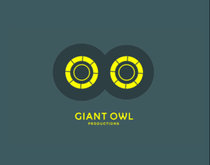
The London-based production company engaged in TV program creation has received a creative, animated logo that cannot be referred to as a list of bad logos. The illustrations, bright color schemes, and a beautiful font perfectly combine.
5. Turn
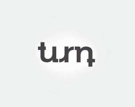
Nowadays, minimalistic typographic logos are very relevant. On Top of that, if they are made with a creative approach, they will attract much attention. This logo, designed by Marco Garcia, definitely deserves a place in any TOP, not of the worst logos, but rather of the best ones.
40 worst logos
Below are not well-known logos with ugly branding created by maybe inexperienced designers. Now we suggest that you look carefully at the list of 40 worst logos so that you know what is not worth doing not to end up with bad logos:
1. NYC Taxi
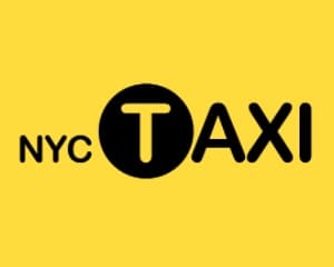
This is a shitty logo. Considering that New York is one of the world’s cultural centers with an outstanding artistic and design community, it’s hard to imagine why they chose such a bad logo for their taxi company. The first place in the Top of worst logos.
2. Kraft Foods
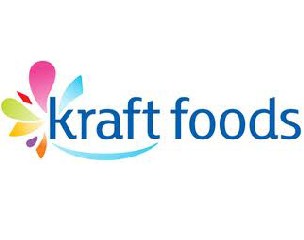
A shining example of bad logos. Why those tasteless flowers? After all, Kraft Foods is going to hold no carnival. Moreover, the small red font under the title looks incongruous. Remember this lame logo, and don’t repeat the same mistakes.
3. Bing

Microsoft’s logo is completely unattractive. This is one of the boring, ill-favored, and simply bad logos. The good thing is that the company has taken the trends on board and replaced them with a more pleasing look by now.
4. A-Style
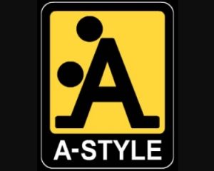
Believe it or not, this logo had appeared long before the products under the A-Style brand were launched. It gets fantasy excited (if putting it so mildly is acceptable) and has gained worldwide attention, in addition to the place in the list of the worst logos. Nevertheless, this is probably what the creators strived for, except for the latter. A great example of awful logos.
5. Locum

It is among the worse logos. Locum is a Swedish property management company, judging by such a bad logo, but not even close. Could they not know what “cum” actually means in English? This is a clear example of what is worth doing to be ranked as one of the worst logos.
6. Verizon
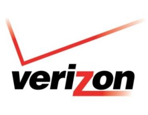
This is the logo of a major telecommunication company. At the same time, users would see a bad logo with a red, little-understood V-shaped antenna and incurious text. It is a problematic logo.
7. NSW Government
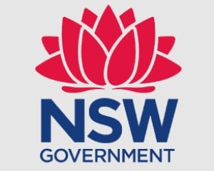
The New South Wales state government contributed several thousand dollars to create a logo with the symbol of this Australian state, namely the waratah flower. However, they got something resembling the Indian lotus as a result. It is still being discussed today as one of the bad logos.
8. MSN
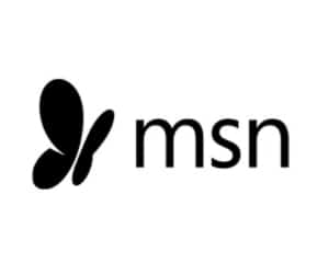
Despite being a bright butterfly, this logo didn’t induce much emotion. Today, the company has decolorized it and changed the font. Thus, they’ve created a much more distinctive logo, but still recognizable.
9. Comprehensive Health Care

No doubt, the logo designers didn’t intend to “undress” the health care complex building, but this is what they ended up having created a logo that fits the Top of bad logos. As a result, it is among the top ten logos that offer the worst brand identities. What a shame to appear “naked” in front of such an audience!
10. London Olympics 2012
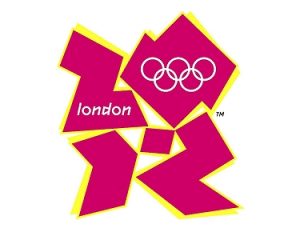
This logo costs the earth. Nevertheless, it has been included in almost all ratings of the worst logos worldwide. Everyone sees something different in it. However, we’ve noticed someone sitting at their computer and developing a new logo which, hopefully, will not be ranked as one of the bad logos.
11. PathMark

It is a great example of stupid company logos. Their food may be delicious, but the logo is just horrible. What’s its message? And who chose those terrible fonts? The unclear points led them to the Top of the worst logos.
12. Aldershot & Farnborough Twins & Triplets Club
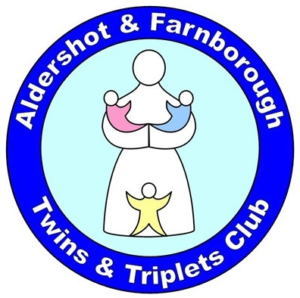
This Top of bad logos contains one of the communities of twins and triplets. However, the third child is doubtlessly placed in the wrong place on the logo. The creators themselves don’t see the inappropriateness of this image, do they?
13. Pepsi
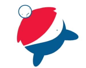
The Pepsi logo is undoubtedly one of the most recognizable worldwide, but this fact doesn’t make it cool. The manufacturer seems to immediately alert you to the consequences of drinking too much soda. It is a disgusting logo.
14. Bureau of Health Promotions
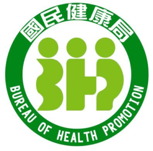
A very unique logo was chosen for this bureau of health promotion. It is maybe the best example of confusing logos. By looking at it, it doesn’t become clear what kind of health they will strengthen. Or is it what the creators planned?
15. GAP 2010
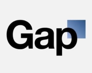
Once, GAP decided to completely change its logo, turning it into something stylish and modern. Unfortunately, this decision resulted in a mediocre company logo that can be easily seen in any supermarket. Plus, the logo is regarded as one of the bad logos.
16. ENDRUN

Paul Rand, a famous designer, designed this logo. But even celebrities can screw up, as we can see. It is one of the dumbest logos.
17. American Pediatric Center

It is our the most hated logo on this list. The American Pediatric Center hardly planned to get into this TOP of bad logos, even more so with such a message. Still, what the developers and those who approved this logo were thinking of is a difficult-to-answer question.
18. Office of Government Commerce
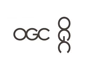
A government organization, the Office of Government Commerce (OGC), is also included in our not-so-pleasant TOP of the worst logos. It is a great example of logos that don’t make sense.
19. Dough Boys
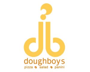
It is a crap logo. Did they expect such a bad logo to make customers buy more of their food? Far from everyone will want to eat after looking at it. We’ve decided rather include it at the Top of the worst logos.
20. Kudawara Pharmacy
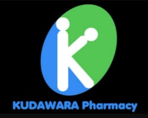
A rather provocative logo for a drugstore. As a matter of curiosity, what do they offer there? There might be special promotions. It definitely can’t be considered as one of the best logotypes.
21. Clinica Dental

It is an unethical logo. This logo provides a clear allusion to what is waiting for you in the dental clinic except for a standard oral hygiene procedure. A very striking example of the disappointing use of illustrations, resulting in a bad logo.
22. Hilton Worldwide
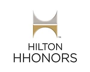
It is a poor logo. The creators of this logo probably have never heard of adjustment. Hardly anyone considers such a slanting in the logo design palatable.
23. The Detail Doctor
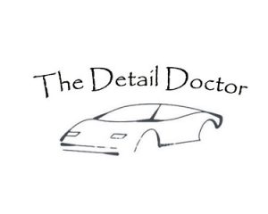
This doctor scarcely knows that even small details do matter. Judging by the sketch of this car, he neglects even the big ones. It is a weak logo.
24. Portland Trail Blazers

Does this logo look like a blazer? The creators seem to have overplayed their hands and not distinguish themselves by originality. A result is a place in the Top bad logos.
25. Mont-Sat

If you think it looks like… Apparently, so it is, because we think so, too. It seems only the creators themselves don’t think so. It is definitely an unhealthy logo for any firm.
26. KIDS EXCHANGE
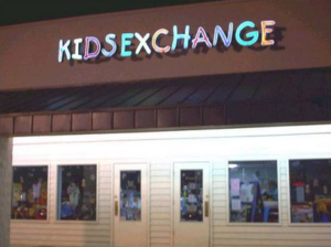
It is an example of failed logos. Kids exchange strikes with its logo. Do you think parents are willing to let their children take that step? Or haven’t the creators ever heard of gaps?
27. Catholic Church’s Archdiocesan Youth Commission

The Catholic Church’s Archdiocesan Youth Commission hardly hints at the stereotypes associated with the attitude of ministers to young children with its logo. But the creators missed out. It is a super bad logo.
28. The Computer Doctors
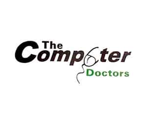
This logo is among the ugliest logos. It is a scary thought about what these computer doctors may do to your computer. This logo hardly can be included in any other list, except for our Top of bad logos.
29. Institute of Oriental Studies

Experts in the East may regard this logo from the other side, but ordinary people most likely don’t associate this image with the knowledge of Eastern culture. It is the baddest logo.
30. The Cleveland Browns
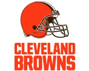
How could one think that an image of a standard helmet would become a successful logo for a cool team? Maybe they’re not so cool, just like this logo is.
31. Kostelecke Uzeniny

One of the largest sausage producers in the Czech Republic has overdone the expression of love for their products. This logo rather depicts a person far from eating sausages.
32. Sherwin Williams’
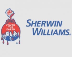
Over the years, the Sherwin Williams’ logo demonstrates the world is covered with an ominous blood-red paint. This idea is not to everyone’s liking.
33. Maple syrup straight from the tap
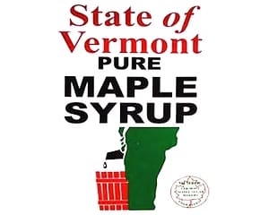
In Vermont, they decided that the Canadian fame of maple syrup should have been surpassed long ago. Thus, they offered people the syrup directly from the tree. However, this illustration looks not mouth-watering enough, to put it mildly. It is an unsafe logo for the company.
34. Seattle’s Best Coffee
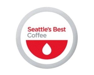
This logo of the Starbucks subsidiary company drew controversy. Some perceive it as a smiley-face emoji with its tongue out, others – as bloody coffee. Whatever you see, it’s still harmless.
35. Cats wear
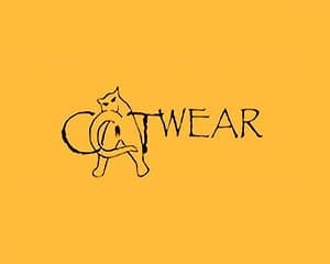
The company’s motto is “Clothing for independent women.” Using a cat could be appropriate for this brand if they did not show it with such a “bizarre” back to us. It is a bad influence logo.
36. Junior Jazz Dance Classes

The dance studio owners might have wanted to attract more boys to the classes with their logo. It’s difficult to explain it any other way. We think it is a good example of controversial logos.
37. Mama’s baking
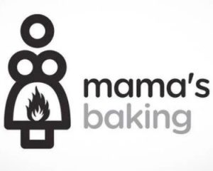
Sorry for the awkward question, but are you advertising baking or the hot mama-san? Сhildren will hardly pay attention to this bad logo.
38. Mega Flicks

Here’s a clear example demonstrating the importance of minding fonts. The thing is that it’s not enough to attract attention and make everyone laugh. In this case, two letters just merged, but the result, alack, brings no joy.
39. Massage parlor

This massage therapist no more needs to be told about the significance of minding the proper fonts and the presence or absence (as in this case) of spaces between letters. It is an example of the most ineffective logos.
40. Khabarovsk airport

This Top 40 bad logos list ends up with the logo that seems to have been created by woozy designers. Or we know nothing about bears.
Creating an original logo is necessary to attract the attention of customers. It should be easy to remember and arouse interest, so it is important to know what mistakes in its creation can negatively affect its ranking.
Logo design standards change every year, but the tendencies that make it possible to avoid mistakes in their design remain unchanged: clear lines, bright colors, simple shapes, etc. To avoid getting into the list of top 40 bad logos, you should avoid complex designs.
Frequently Asked Questions
What are bad logos?
Plagiarism is not the best design solution for increasing the popularity of a company. A bad logo is also considered too colorful, incomprehensible to the consumer, or a picture. In addition, options with many small, barely distinguishable details are unsuccessful.
What is a bad logo?
An unfortunate sign can be considered one, the design of which has nothing to do with the company’s activities. A badly designed logo not only makes a negative impression but can also downgrade the company’s rating.
What should you not do when creating a logo?
A design that is too complex to perceive is bad. Also, do not bother with small details that are barely noticeable to ordinary users. An outdated color palette or one that lacks the necessary contrast will negatively impact the design. Choosing bleak and cold shades when developing a logo is not recommended to depress people subconsciously.
Why are logos with small details bad?
Clients are more interested in the overall picture than the designer spends a lot of time and effort on the little things. By putting in many small details, you may create a unique but bad logo that is incomprehensible. In some cases, it is sufficient to use the brand name – for example, Coca-Cola, Disney, and others.
How do you recognize a bad logo?
An unsuccessful logo can be recognized by the discrepancy between the tone of the inscription and the sign. An outdated color palette and many small elements make a logo bad. Excessive creativity should be avoided as it is often incomprehensible to the consumer. In addition, an overly intricate logo can harm a company’s rating.
How do you fix a bad logo?
A more “readable” brand mark is easier for customers to perceive. If the palette is dirty, it is recommended to dilute it with several neutral colors, placing them in the center. Detailed work on the composition will make the logo more attractive and stylish. When correcting a bad logo, it is recommended to use color theory to get an image with perfect color matching.
How should you not create a logo?
Using outdated techniques (shadow, glow, and embossing) is not a good idea. It looks cheap. You should not choose incongruous colors that are difficult to perceive. Overly saturated, contrasting, or dirty gradients are not good for the corporate identity.
Conclusion
As you have seen for yourself by the examples in the Top 40 bad logos, it is very important to follow the trends in logo design. It is the logo that should become the face of your company. There’s hardly anyone planning their “face” to be made fun of or added to the Tops of the worst logos. In 2021, it was important to adhere to minimalism and simplified forms, use beautiful color schemes, and mind typography in its various forms. On Top of that, creative illustrations remain relevant, as always. The logo is not a decisive criterion in developing a business, but an unsuccessful design can discourage consumer interest. Following fashion, using simplistic shapes and bright accents effectively creates a memorable company logo. The main thing is not to overdo it.