Do you ever feel like you’re walking through a minefield every time you use a website? That’s because bad user experience (UX) design is everywhere—even when you least expect it in your search for relevant information. To prove our point, here are 27 examples of absolutely poor UX for your enjoyment. From navigation menus that confuse even the most seasoned adventurer to buttons designed to get users stuck, these UX failures will make you laugh ? and cry ? at the same time.
FAQs About Bad UX Design
Design and user experience mistakes are the flaws that make clients criticize the website’s usability, refuse purchase or subscription, or even go to competitor websites. These errors are often related to technical issues, website logic, navigation, design, marketing materials, or content problems. Such usability issues affect conversion rates and undermine the effectiveness of your website user experience (UX) design.
The following are frequently asked questions from marketers and usability specialists:
- What are examples of bad UX design on a website?
- How do you make websites better for user experience examples?
- How does chaos monkey improve user experience examples?
- Gives an insight into how effectively the user experience (UX) is meeting strategic goals.
- When to use which user-experience research methods?
- What do pressure points mean in user experience (UX) research?
- How does SEO affect the user experience (UX) of a web page?
For effective analysis of user behavior on-site pages and search for anomalies in website design, you can use Plerdy’s heatmap and video session recordings. Use the pop-up form to improve the conversion rate on the website pages.
UX Design: in Detail
Instead of creating things based on what the designer likes, UX design principles reshuffle cards in favor of consumers to develop a customer experience around previously recovered customer data. Nevertheless, some ignore UX design, which leads to bad UX examples and various user experience (UX) bugs.
So remember, above all, that user experience (UX) is what someone thinks about interacting with a website, mobile application, software, or other systems. How many websites fail at UX? A lot of them. We’ll take a look at the worst user experience (UX) websites later.
UX designers aim to understand how users interact with a single or multichannel system and focus on usability. The effectiveness and opinions of users are most important. What do you think makes a bad user interface? Examples of usability defects are too slow, difficult to understand, etc. Unresponsiveness is also a bad user experience synonym. What sorts of things are you looking for? Easy-to-understand interface, high responsiveness, high speed? These are one of the most important qualities and user experience (UX) impact factors. Beautiful products with poor usability will not satisfy anybody. Plenty of companies with bad UX design have at least one UX issue.
In UX design, the customer is king; thus, flaws in the website map to customers, different bad UX writing examples, and other issues will leave the king unsatisfied. Of course, the customer must always be satisfied with what your company offers, but above all, he must feel free from any frustrations.
What are the main ways of improving your mobile site’s user experience (UX)? Choose three answers: using images correctly, adding a search option, adapting the design to different devices, and simplifying navigation. All these answers are correct, and we will give you some more later. However, there are many ways to improve UX.
What’s an example of a user experience (UX) that you think is broken? For example, imagine you find an issue where the total price of products in a basket is incorrect: what would you do? What issue type would you grade this? What are UX best practices for websites? What are bad UX apps examples? Is there a need to list which parts of the website a user doesn’t like? What are the steps of web application user experience (UX) troubleshooting?
Keep reading, and we’ll show you the answers.
Want to save your conversion and improve usability? We know how.
Here are several common website design and usability problems that may harm your online business. However, the conversion rate will likely skyrocket as soon as you fix them. Remember that website design and conversion rates are always intertwined.
To make the learning process easier, we offer you to start with a story of John. It tells how an online store lost a loyal buyer and suffered a conversion decline because of one usability mistake. Besides, you will be able to find answers to the following questions related to design, user experience (UX), and conversion. For example:
- How do low download speeds impact conversion rates and user experience?
- What other technical user experience (UX) issues may affect conversion, including 404 pages, links, responsive layout, and other features?
- Why is logical design so important for website conversion and user experience (UX)?
- How to make your website design more logical and use design elements to facilitate conversion?
- How can navigation approaches enhance your website design and user experience (UX)?
- What design and navigation solutions make users leave your website without completing conversion?
- How do colors, inconvenient text structure, and other website design issues impact conversion rates?
- What are the design approaches most recommended for good user experience (UX) and conversion?
- How can marketing techniques help you boost usability and conversion?
- How do you structure and design your content right?
Are you trying to make your UI easier for your users but don’t know where to start? We know what you’re going through, and we have the answer!
User onboarding is key when attempting to increase conversion rates and improve user experience. But what if users don’t even know how to use your website in the first place? That’s where user testing comes in handy. User testing can provide valuable insights into how users interact with your webpage, giving you the information needed to make improvements in UI.
Not sure how it works? Don’t worry – we’ve got you covered! With our step-by-step guide, user testing has never been easier. So why not give it a try Plerdy and see what kind of amazing results it can bring for both you and your users!
John, his catastrophic e-shopping experience, and what usability has to do with it
Meet John. John’s a budding YouTube star who decided to buy a good microphone to voice his videos. He needs a mike that meets the following requirements: a reasonable price, clear sound, and a good Amazon sales ranking. The last criterion is particularly important as John expects to recover most of his expenses if his streaming career doesn’t work out. So now, when John knows what he wants, he prowls for a microphone in a popular online store.
Thanks to well-thought-out website navigation, John did not take long to find the “Microphones” category.
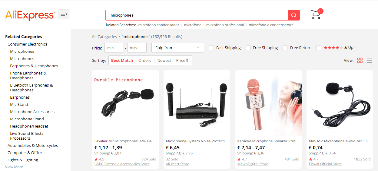
As soon as John clicks on the “Microphones” category, he encounters the first user experience problem – the poorly designed rubric filter. Unfortunately, this filter is rather inconvenient for amateur users because it requires a more in-depth understanding of the topic.
| Rubric | John’s thoughts |
| Interest-free credit | I haven’t chosen anything yet. I’ll think about this later |
| Purpose | Need to voice my YouTube videos |
| Manufacturer | No idea. Perhaps anything produced in the USA would do |
| Slots | Any, I don’t care |
| Supplied with/without a cord | Better with a cord |
| Industry | Don’t know. Need to voice my YouTube videos. That’s it |
| Country manufacturer | Any |
| Brand registration country | Why do I need that? |
Since the filters don’t provide any hints, John has chosen studio microphones because he believes studios use is equal to high quality. All the other criteria seemed too vague and unimportant.
In the “Microphones” category, John encounters a complex filter challenging for a complete amateur in sound recording. If you are not well-versed in the topic, you won’t select a suitable product here; Some user experience (UX) and usability problems are apparent at this stage.
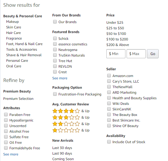
In the “Studio microphones” category, John sorts the products by price and chooses the Superlux HO8 microphone, priced at $50. According to the customer reviews, this microphone offers the best value for money among affordable studio microphones.
In other words, this seems to be the best option for a YouTube streaming beginner. John proceeded to the checkout and arranged the first video’s voicing with a client.
John’s choice: Superlux HO8 for $50.

John waits for the delivery, unpacks his mike, plugs it into his computer, and gets puzzled by an awful sound. The thing is that his hardware doesn’t support phantom power. Without it, the Superlux HO8 cannot function properly. Unfortunately, the product card said very little about this, and John was not experienced enough to pay attention to such details.
The source of phantom power is an essential element that must be bought separately. Otherwise, Superlux HO8 won’t produce quality sound. Unfortunately, the product card doesn’t stress this, so an inexperienced user will likely overlook phantom power requirements.
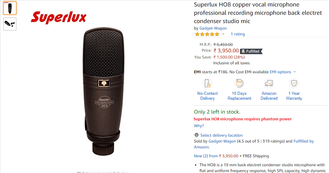
John starts searching for the information about the purchased microphone and finds out that:
- The cheapest phantom power supply, ZEEPIN 48V, available on this website costs $37 and must be preordered. The prices of more expensive supplies start at $65.
- Apart from phantom power, the microphone requires a stand and a pop filter, which should be bought separately. It would also be good to buy an external sound card and a noise reduction screen. Together these add-ons would cost John over $100.
- Instead of all the appliances mentioned earlier, John could have bought an affordable USB microphone, which would meet his requirements as a wannabe Youtuber. For example, Trust GXT 232 for $50 or Blue Microphones Snowball iCE for $85.
As a result, John has thrown a good sum of money on a microphone he cannot use, while the online store has lost its long-time client.
To avoid losing clients, the online store owner should see their website user experience (UX) design, usability, and products through the eyes of an inexperienced buyer. They should pay more attention to educational content by adding product tips and posting useful articles and videos. For example, if John had learned about phantom power at the right time, he wouldn’t have bought a useless product. Instead, he would have clicked on the Superlux HO8 product card, → learned about phantom power from pop-up tips, → followed the link to the detailed article about phantom power supplies, → learned about different types of microphones, → gotten back to the list of microphones, and chosen a more suitable option with a USB port. In this case, he would have got what he needed and wouldn’t have left for competitors.
The lack of educational content is one of the numerous usability mistakes made by online store owners. As a result, they adversely affect conversion rates and sales. Below, we will discuss other user experience (UX), design, and website usability issues.
Website Technical Problems
Technical issues not only impact your website performance, but also harm the user experience (UX). For example, website visitors cannot complete the desired actions as quickly as expected and may bounce.
Slow website harms conversion
Approximately 40% of your potential clients won’t complete the conversion if your website user experience design doesn’t load within the first three seconds. Another 40% will bounce if the website design freezes again after clicking a section. To maintain good conversion, conduct regular technical and usability tests, optimize heavy images, check the download speed of fonts, etc. If you cannot avoid using videos, take steps to improve your website user experience (UX). Yet, if possible, it’s better to replace videos with images and text. Website speed and user experience (UX) are more important than the type of content.
Conversion and user experience (UX) testing – The website download speed is low:
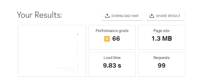
As you can see, the website user experience design takes 9.83 s to load. This harms usability and must be fixed since website visitors are unlikely to wait longer than 3 seconds.
Conversion and usability testing – Heavy images:
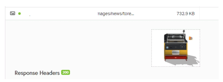
Heavy images are one of the main factors slowing down your website and affecting conversion. Thus, you will need to replace the existing image designs with more optimized options to increase the speed.
Usability testing – Too many page load requests:
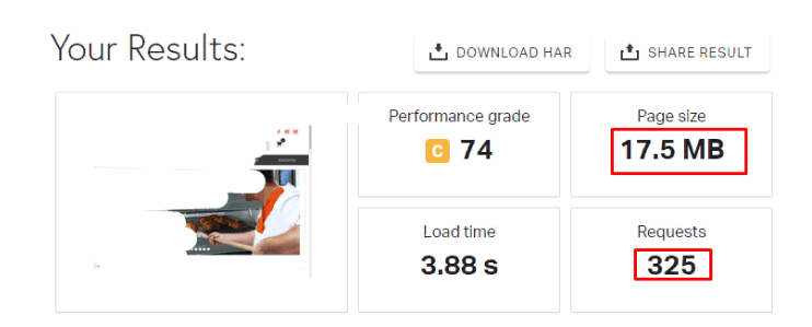
Research by Amazon has shown that when the page load time increases by at least 100 ms, the conversion rate immediately drops by 1%. To avoid that, website owners should perform two types of speed tests. The first test should take real-time to identify slow pages immediately. The second type should be done periodically (once per week or month) to detect and fix all slow elements. This will help you better control conversion rates and ensure they don’t drop because of poor website speed.
Broken or invalid links
If users have made their way to your website, they must have been interested in some information it contains. Make sure to provide this information. If they see a broken link instead, they will just leave the website, blacklist it, and prefer your competitors in the future. Broken links are a very serious user experience problem that severely affects conversion.
Web search robots also don’t welcome broken links. When a web crawler finds an invalid link, it registers an “empty” page that doesn’t provide any fresh content → consequently; the website design isn’t updated or developed → it should be placed lower on the SERP.
Usability and conversion issues. Broken links in the program code.
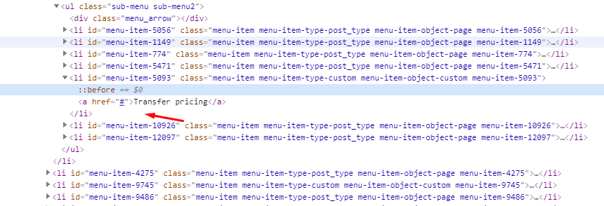
Continuous monitoring and regular usability audits are the only way to spot and eliminate broken and poorly functioning links. Make sure to fix the program code as soon as you identify any flaws.
Usability and conversion issues – 404 error returned when the page is opened in a new tab:

You need to check the links for websites with 100,000 pages and run a website usability analysis at least once per month. If a website user experience design has more pages, audit it more frequently (ideally, every week).
The lack of a responsive layout impairs the website user experience (UX).
In 2019, smartphone and tablet users generated more than half of all internet traffic. In the future, the proportion may change, or smartphones and tablets may be replaced with other devices. Responsive design makes you independent from such trends and helps to keep your conversion rates regardless of user preferences. In other words, a responsive layout is a website’s ability to adjust to any screen width and be displayed correctly on laptops, tablets, smartphones, and other modern gadgets.
Usability and conversion issues – A website without responsive design:
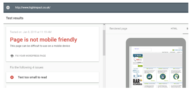
If your budget is limited and you cannot afford a fully responsive layout, ensure that your website user experience (UX) design is partially adaptable. Partial adaptability implies that your website can adjust to the most frequently used devices. In most cases, these will include various smartphones.
Broken search bar
The use of a search box mostly depends on the type of website (for example, SaaS). Information websites rarely have it, while in online stores, it can replace the rubric filter. If a search bar is important for conversion rate optimization (CRO) and website usability in your case, make sure it always works right. Otherwise, users won’t be able to find the requested product or information quickly. They will just leave the website and buy from competitors that weed out usability mistakes. As if it wasn’t enough, these customers will probably never come back.
Bad user experience examples and conversion issues. Wrong priority in search results
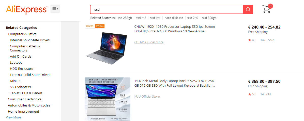
While configuring the search bar, remember that people often make typos. Therefore, prepare your website for such mistakes to avoid unexpected usability issues. For example, in a hurry, a user may type “laptop” instead of “laptop.” However, this shouldn’t make your website search stumble – it must recognize the query and generate the necessary result: “laptop” → “laptop” → list of available laptop models.
Unconfigured cart autosave
All selected products should be correctly displayed in the cart. For example, if a user adds three blankets from the product page, they must immediately appear in the cart. If not, it’s a huge usability mistake that undermines your conversion.
The problem is less noticeable when a user buys several units of the same product.
| Selected on the product card | Displayed in the cart | Additional action the user needs to take |
| 3 blankets | 0 blankets | Change 0 to 3 in the cart |
| ↓ | ||
| It’s easy! | ||
Everything takes a different turn when a user wants to purchase multiple products. In this case, cart usability issues can make them leave.
| Selected on the product card | Displayed in the cart | Additional action the user needs to take |
| 3 blankets | 0 blankets | Ok. I need to recall the number of units and indicate them again for each product |
| Ten pillows | 0 pillows | ↓ |
| 20 duvet covers | 0 duvet covers | It’s difficult because I haven’t made notes and don’t remember |
| Five kid’s clothes units | 0 kid’s clothes units | ↓ |
| Eight bottom sheets | 0 bottom sheets | What a poor design and usability… I’ve wasted so much time. Why don’t they fix the cart? |
| Two mattresses | 0 mattresses | ↓ |
| N products | 0 units of N products | Enough. I’ll go to another store and buy it there. |
For conversion rate optimization, be sure to configure the shopping cart autosave. Don’t prompt your customers to double their work – you’ll risk losing them.
Bad usability examples and conversion issues. [0] is set as the default number of products in the cart. As a result, users need to take an additional step. They add a product to the cart and select the number of units.
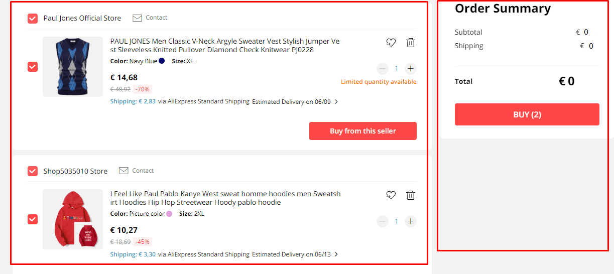
Even if the shopping cart autosave works smoothly, your support team always calls customers back to confirm the order. Sometimes they mistakenly click the Buy button several times, don’t check the cart, and order the wrong number of products. It’s also one of the bad usability examples that undermine customer loyalty.
Layout issues with website pages
Here is the golden rule of conversion rate optimization: Your website must look equally good in all browsers. Users will have difficulty completing the target action when a layout falls apart and may doubt your website’s credibility. Imagine a customer who wants to place an order but fails because of the poor layout. If you are lucky, they will reload the page and try again. If not, they will just stop using your services. Always remember website usability analysis and fine-tune your user experience (UX) to avoid this.
Bad usability examples and conversion issues – Since the layout is broken, the screen automatically slides up when you click the field:
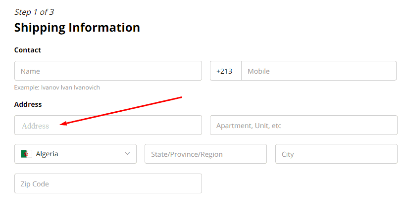
When the screen slides, it feels like a bump on the user conversion path. In case such layout issues persist, the customer will very likely leave.
Poor user experience (UX) examples and conversion issues. Social media icons overlap the text on the page.
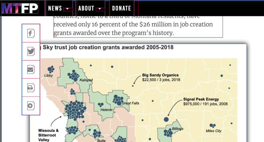
When social share buttons are out of place, it looks strange and makes users distrust your company. Moreover, they may accidentally click on one of the buttons and open their social media account. It’s annoying.
Poor user experience (UX) examples and design issues. Text is incorrectly displayed on the responsive website.
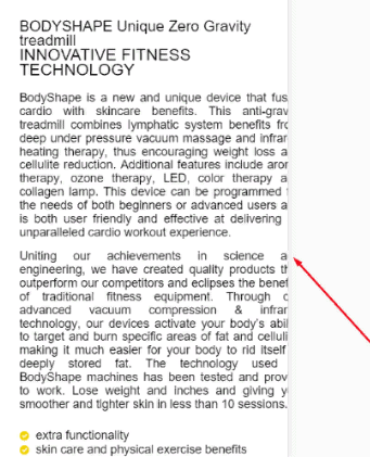
Text is the main type of content on most websites. This is because it gives users what they are looking for on the web – information. Therefore, nobody will want to stay on such a website if your content is inconvenient to read.
Bad user experience examples. Bread crumbs overlap the title because of the broken layout, and the article doesn’t start below the main picture. We’ve provided just some of the poor user experience (UX) examples caused by layout issues. Nevertheless, they have one thing in common. The website looks strange and is inconvenient to use. In case you notice similar UX problems, immediately fix them.
Non-clickable buttons
A website button is a way to sign an agreement between a business owner and a customer. By clicking it, users state that they want to buy a product.
No button, no purchase.
For decent conversion rates, run regular usability testing of all website buttons.
Bad usability examples and conversion issues. The “Buy in 1 click” and “Buy on credit” buttons don’t work.

After users click the “Buy on credit” button, they should see a window with the schedule of monthly payments and credit terms. They won’t bother with calling your manager to clarify the details. It’s always easier to close the tab and find another website. The “Buy in 1 click” button is handy for returning customers who regularly buy from you and value their time. You should always be proactive with such conversion and UX issues.
Poor user experience examples – The filters and color selection buttons don’t work:
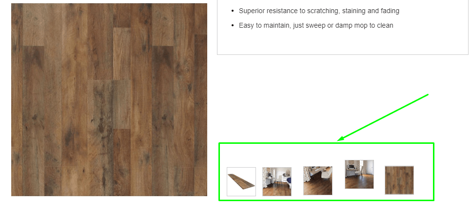
If colors matter, customers should be able to check the product in different colors. If they cannot do this, users will search for the picture on other websites and place an order elsewhere.
Poor usability examples and conversion issues – When users click on the star rating, they are taken back to the header, and nothing happens. Consequently, they cannot leave a review.
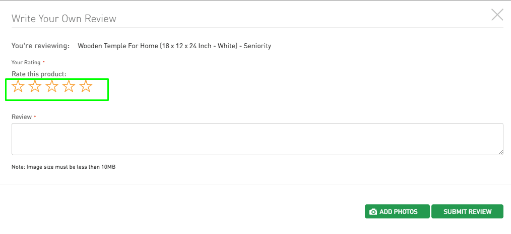
The broken rating and review functionality can make users think that website owners disregard their opinion. This causes distrust and a negative attitude towards the website.
Bad user experience examples – Non-clickable banner on the main page:

Apart from being non-clickable, the analyzed banner has no calls to action. Fortunately, website owners can easily fix this UX flaw. First, they need to add a working “Learn more” or “Visi” button.
Non-clickable shopping cart

A shopping cart is a must-visit place before order confirmation. However, if the cart icon is non-clickable, many users won’t waste time on the unusual functionality and buy from another online store. Hence, you’d better avoid experiments with the shopping cart and always make it clickable. And one more thing. Don’t substitute the shopping cart with creative synonyms, like trolley, basket, carriage, etc. Such names can confuse users and affect conversion rates.
Poor Website Logic Ruins Conversion
To ensure high conversion rates, you must make every sales funnel stage easy and predictable. When website visitors take many unnecessary actions, they get irritated and leave. Such user experience (UX) will never generate sales.
Hamburger button on the main version of the site
The hamburger button is three horizontal bars that open the website menu when clicked. Intended for a responsive layout, this UX design element simplifies website navigation on narrow-screen devices.
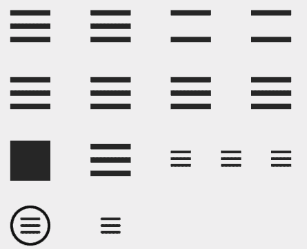
If you choose the same design solution for the main version of the website, its usability will suffer. Visitors will need to complete a useless additional action to find the necessary information. This increases the risk that they will opt for a more convenient website with better usability next time.
| No burger menu | Burger menu |
| Users visit a website → select the necessary menu section → to complete their goal. | Users visit a website → click the hamburger button → select the necessary menu section, → complete their goal. |
Use the hamburger button only for responsive website user experience (UX) design. The main version should have a simple linear menu.
Slider on the main page
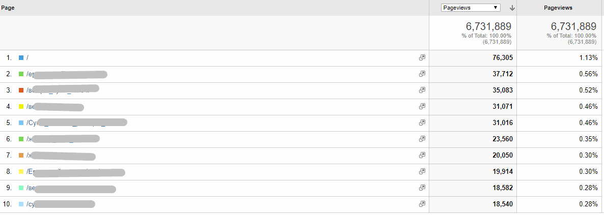
Banners are largely placed on the main pages. But you need to note that only 1-5% of traffic goes there. Besides, many sliders don’t display on mobile devices properly and cause usability issues such as horizontal scroll websites. Finally, quality sliders are often pricey, whereas cheap alternatives spoil your website user experience design: users go to the website → to see inconvenient sliders → leave the page or hate your user experience (UX).
Non-highlighted links
Links help to keep visitors within the website. A user reads an interesting article → sees an additional useful link → clicks on it, and remains on the site. If a link is hard to notice, people won’t follow it and will leave your website sooner. So make sure to highlight all links.
| No | Yes |
| Non-highlighted links harm conversion. (learn more here). | Non-highlighted links harm conversion. |
To nudge customers into the following links, you can repeat them at the end of the article. This will make users more likely to visit related articles.
Pop-ups with the Close button

Perceive a website visitor as your guest. They should be free in all their choices and interactions. A pop-up design without the close button kills this freedom and makes users feel uncomfortable on your website. Next time, they will go straight to your competitors.
Annoying captcha
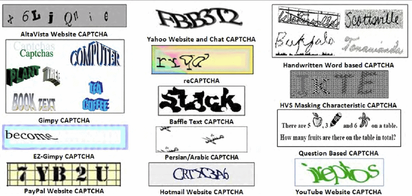
CAPTCHA is a useful tool that protects pages from the influx of robots. In this respect, it’s quite beneficial. However, everything goes wrong when the captcha is incorrectly configured and treats every new visitor as a bot. For example, a user opens the website to read an article but wastes time typing in random letters and numbers. When the captcha is damaged or too long, the situation gets even worse.
If you don’t want to lose your target audience and conversion rates, run a website usability analysis and check your captcha. It must be compact, discreet, and well-configured to better distinguish a real user from a robot. reCAPTCHA is a recommended option.
Obtrusive pop-ups
A pop-up is a banner that urges users to complete a specific action/conversion (e.g., subscribe to the newsletter, provide a phone number, or follow the link). Mainly used for advertising, pop-ups often annoy website visitors when they are irrelevant:
| What a developer thinks | What a user thinks |
| We need to show ads to new customers | This website seems to have interesting content |
| ↓ | ↓Let’s |
| s add a pop-up | I haven’t read anything, but they are already offering something irrelevant. |
| ↓ | ↓ |
| For better CRO, pop-ups should include a lot of interesting offers | Should read about this on another website without adds |

Pop-ups can help you with conversion rate optimization (CRO) if you do it right. Just be sure to make them useful and display them when a user has already checked a portion of the content.
Mandatory registration to place an order
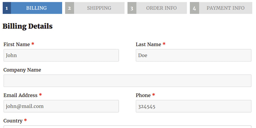
If your online store design has mandatory registration, get ready for low conversion rates.
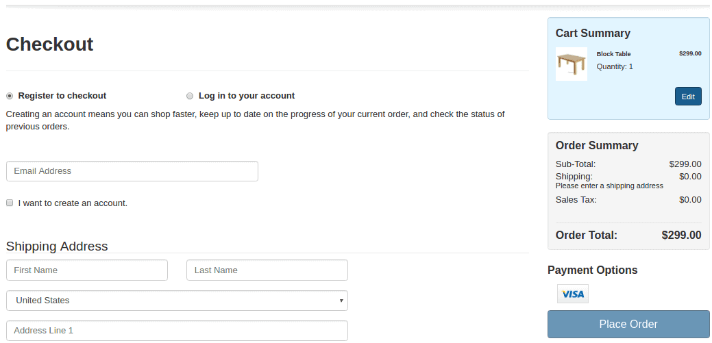
To safely collect user data, explain the benefits of registration and automatically register customers after the first purchase. Then, email the newly registered customers their passwords and offer to change them.
| No | Yes |
| Users cannot purchase products without registration. | After users register, they can purchase all products in one click. They will also regularly receive email updates on discounts, special offers, and bonuses. |
Losing customers is always easier than collecting their contact details. Don’t forget about regular website usability analysis and detect anything that confuses or upsets users. Don’t be too pushy. And finally, don’t send spam and useless ads. Promised bonuses? Great! Start with the information about the bonuses and only then process with some ads. That’s the only way it works and improves conversion.
Navigation
Smooth navigation and positive user experience (UX) are the secret weapons of websites with low bounce rates. Navigation bottlenecks, contrarily, prevent users from finding what they want and harm conversion. Find out more about common website navigation issues and eliminate them to reduce your bounce rate.
Unconfigured pagination
Pagination is the process of dividing a product catalog into pages. Search bots check these pages right after the main page. Thus, an online store with poor pagination usually has a bad ranking, low sales, and poor usability and conversion.
| Main page | Pagination pages |
| Tells what customers can buy in the online store | Include the assortment of products |
| Pagination page #1. Products 1-30 | |
| Pagination page #2. Products 31-60 | |
| Pagination page #3. Products 61-90 |
To configure pagination, you must add a unique title, description, and H1 header. Also, ensure the main page’s text isn’t duplicated on the pagination pages.
Poorly thought-out user paths
Browsing a website, users should always know what actions they can take and what will happen next. If not, they easily get confused. Such usability issues result in conversion decline and must be immediately fixed after usability testing.
Usability error. The number of selected units isn’t displayed on the product page, and there is no way to change anything. As a result, even when users proceed to the next step, they cannot select the number of goods. Don’t use confusing features and show clarification tips at each stage of the customer conversion path. It’s an easy way to avoid usability and conversion issues.
Incorrect website-level navigation
The key purpose of website navigation is to create an order. If the navigation is complicated or unclear, users won’t manage to explore your website fully. They will leave too early without completing the conversion (e.g. placing an order, leaving a phone number, or subscribing to updates).
Design and usability issue example: The menu has the wrong order of categories. It’s unclear which section is the main and which is secondary.
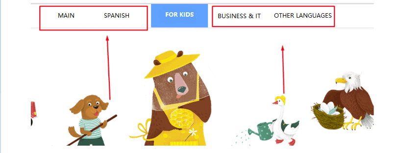
Duplication is another common website-level navigation mistake. For example, the Accessories section includes a subcategory that may puzzle website visitors. Because of the poor usability, potential buyers will have trouble finding the desired product.
Run website usability analysis to implement flawless navigation. Think like a new visitor who has just landed on your website. Is it easy to find the necessary information with the current menu? If not, consider changing the navigation path.
Website Design and User Experience (UX)
Design elements can make users love your website or hate it. Thus, design issues directly impact user experience (UX) and repel people from browsing your website. Low conversion rates are the inevitable result of such problems.
Low-quality website design
Web design should attract new visitors and make every user interaction smoother. Decent design always boosts conversion. Poorly thought-out, outdated, or too creative design harms conversion rate and needs to be fixed immediately.
Poor design example: The website looks like a jumble of elements on a red background.

Creative designs pose a true challenge. They require a lot of experience, skills, and delicate taste. Thus, if you have doubts about your idea, opting for simple and classic design solutions is better.
Design and usability mistake example. These unusual website filters don’t look like filters.

The beauty of the complex design is often visible only to the website owner who pays for it. Users prefer not too bright and well-structured pages that are easy to use. As long as they have good UX and perform their functions.
Design and usability mistakes example: A rubricator is more similar to a quiz.
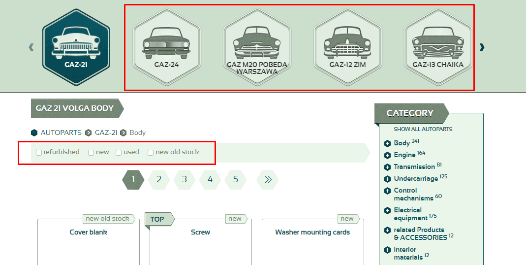
Quality design doesn’t have to be expensive and bulky. Powering a simple minimalist website with a flawless customer experience will be enough to attract loyal customers. Satisfied customers → increased sales → investment in website user experience (UX) design.
Disproportionate Images
All website visuals should have the same style. Of course, you can use some bright accents, but they must match the overall design and don’t confuse users. For example, an article with a product description can include images with different proportions and scales. Users will understand that these pictures are necessary to show several properties of one product.
Bad usability examples. The elements on this mobile website version aren’t proportional. The first image is much larger than the other.
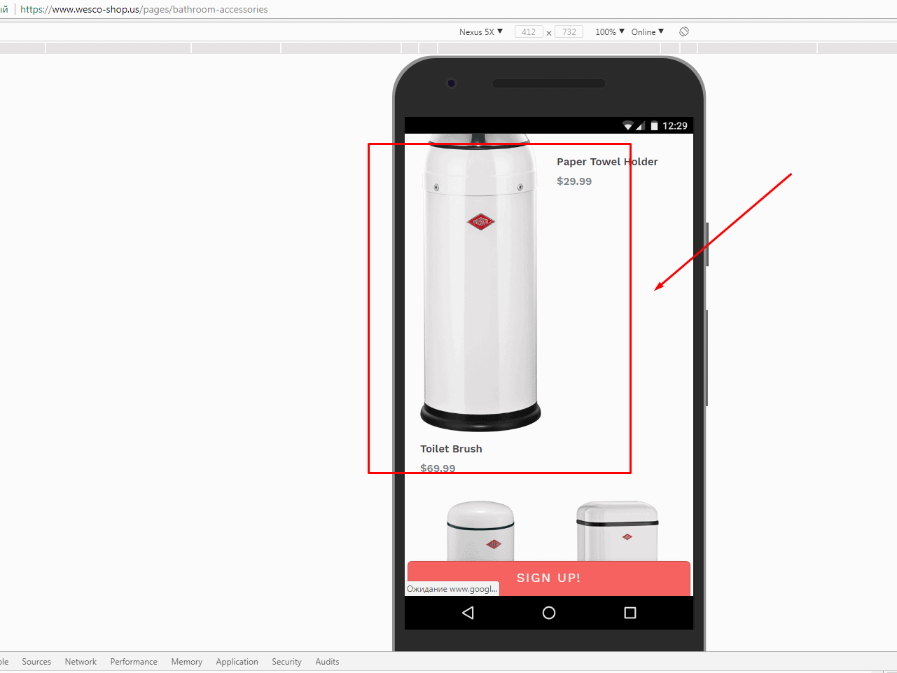
Disproportionate images make your website look messy and unprofessional. If a user notices this, which is likely, they may opt for a website with a better design next time. Unfortunately, when someone leaves your website because of poor user experience design, you lose the conversion rate.
Wrong text and background combination
Black text on a white background is a perfect design choice, as well as white text on a black background. Of course, you can combine other colors as long as they don’t merge or affect readability. To understand whether the text and background are suitable, ensure users can easily read all content at a glance. Dark UX is used in some examples like Apple.
| Black text and white background | White text and black background |
| Blue text and light blue background | Red text and dark blue background |
If you aren’t pursuing a special design goal, pick black text on a white background—no need to experiment with colors purely for an aesthetic effect. Instead, you’d better invest your effort in content. Users will appreciate this, and conversion will grow.
Bad UX example of wrong color combinations in illustrations:
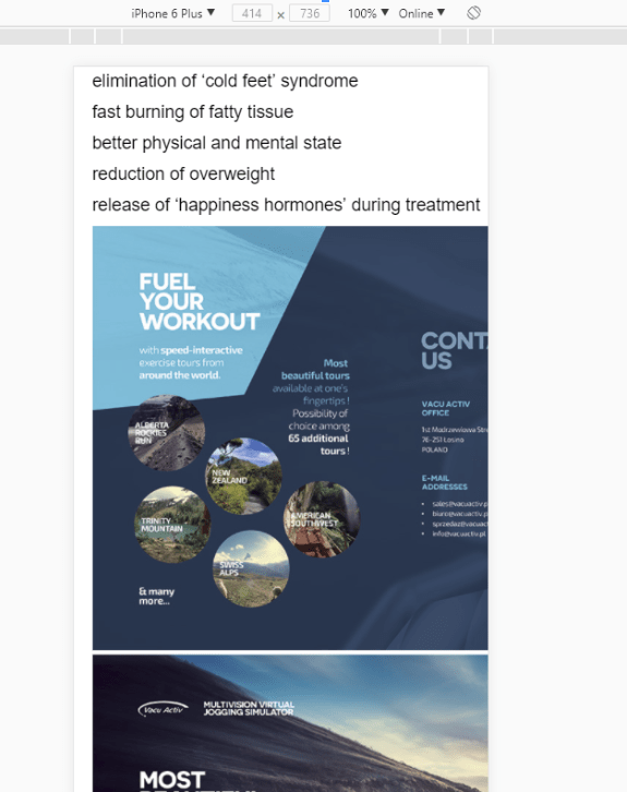
Choose text and background for a responsive layout with particular care. When displayed on mobile devices, any information is more difficult to read. In addition, color issues repel customers more than you think.
Design and usability error – The text in a responsive version is illegible:
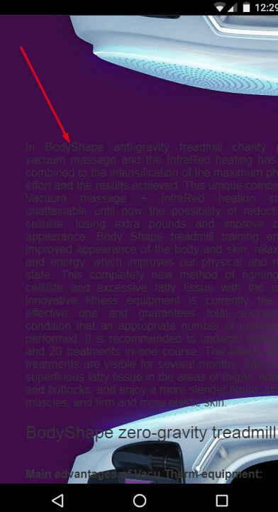
If the white-black classic design doesn’t work for you for whatever reason, you should note one thing. Different gadgets render colors in different ways. So if everything looks good on your computer, this doesn’t mean that a user with a budget Android smartphone will enjoy the same display and quality as you do.
Poor text design and structure on website pages
Nobody likes reading unstructured text without paragraphs, subheadings, lists, images, and separate blocks with important information. Such content cannot hold attention long enough to convey the message. Even if the article is extremely interesting, users probably won’t read it, interrupting their conversion path.
Stuffy unstructured text.

Text design isn’t a magic wand that drives conversion. Yet, it considerably increases your chances of engaging a larger share of the target audience.
Designed and well-structured text:
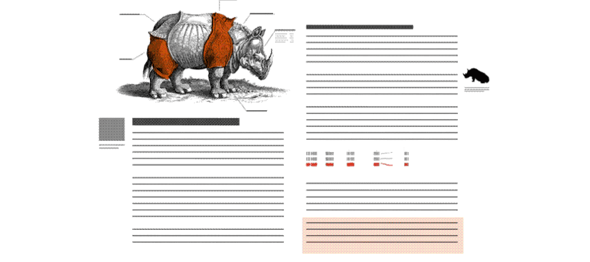
Website design may be less crucial if a website specializes in elaborate articles written by experts and doesn’t have competitors in the selected niche. You are an opinion leader and don’t need to waste time on visuals. In all other cases, quality design is required to improve the conversion rates of each article.
Wrong color selection
Colors are an important component of any design and usability. They affect mood and make users feel comfortable reading your content. Conversely, even high-quality content can get many negative reviews when the color scheme is poorly chosen. And vice versa, visitors will likely forgive you minor mistakes in exchange for a pleasant user experience (UX).
If you want to design an appealing, colorful website on your own, learn the basics of coloristic. Many tips and tricks are hard to put into a few words here. Once you choose the color scheme, engage a focus group to ask what they like or want to improve. This should help you achieve good usability and high conversion rates.
Color design lesson:
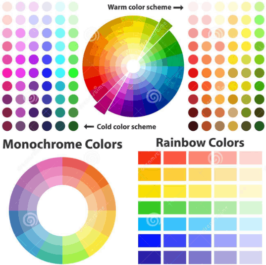
Leave a white background if you don’t want to dive into colorists and spend time picking a color scheme. Sound too trite for you? Well, Apple uses white and has no problems with conversion rates.
Weak call-to-action
A call-to-action summarizes your offer in a few words. It’s like a handshake you exchange after discussing the terms of the deal. Therefore, it’s important to include a call-to-action in every advertisement and choose the right wording or design for conversion rate optimization.
Conversion rate optimization (CRO) issues: The call-to-action is weak since there is no clear offer in the banner or text.

CTA issues are common in subscription forms. As a result, website visitors rarely use forms even if they are in plain sight.
Conversion rate optimization (CRO) issues: A weak CTA in the subscription form.

Sometimes a CTA disappears on the responsive version of a website. It’s a technical flaw you have to detect and fix promptly. Regular website usability analysis should help with that.
A broken CTA in the responsive version of the website:
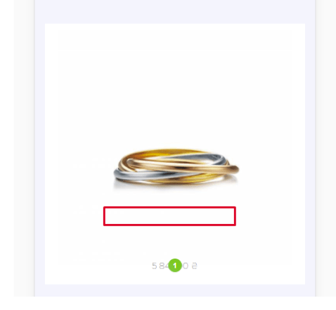
A CTA yields meaningful results only when combined with a banner image. When used separately, both lose effectiveness and go unnoticed.

If you use a CTA, make it convincing and clear. Note that it also should match the design of the banner and look relevant. Otherwise, a part of potential customers will just ignore your offer.
Low-quality images on product pages
The majority of users check images before reading content. Therefore, pictures should always be sharp, polished, and relevant. This helps create the right perception of the product and show it from different angles. As a result, users make decisions more quickly, and conversion rates grow.
Design and UX issues – Example of a low-quality product image:

To quickly solve the issues with image quality, buy a budget portable shooting box (Photobox). It’s an affordable accessory that will add a professional touch to the images in your online store.
Poor layout of social buttons
Many users won’t click on social media buttons if they have a low-quality design or look confusing. As a result, these people won’t continue discovering your content on social media, and conversion rate optimization (CRO) suffers. To save yourself from these conversion issues, be sure to invest in a professional layout.
Design and usability mistakes: Poorly designed social media buttons and the Instagram widget are outdated.
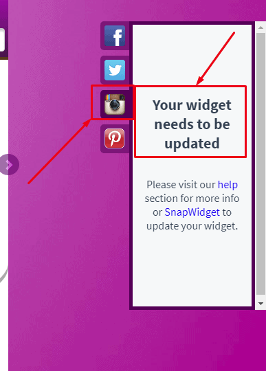
Apart from design issues, two other problems often occur with social media buttons. First, technical glitches can make the buttons unclickable. Since you cannot secure yourself from this, regular usability analyses of all interactive elements is life-critical. The second problem is the wrong social media selection. For example, conversion rates will drop considerably if most of your customers use Telegram, which you don’t support. You can either consider the preferences of your target audience or get ready to lose them.
Bottom line about Bad UX Website Examples
Bad user experience (UX) has a lasting impact on the success of any business. UX design should not be taken lightly and should be given the attention it deserves. Companies need to consider their users when designing, conducting user research, and creating landing pages. Trying to boost conversions is important, but it cannot be done at the expense of every customer’s experience. A good UX will ensure an easy-to-navigate home page that is enjoyable for users. What design and usability mistakes are you dealing with? How much do they impact your conversion rates?
Share your experience in the comments.

Principal Consultant | Daedalus Information Systems