
Navigating the world of UX design can be like walking through a minefield — especially when it comes to UX writing. ? You might have a top-notch design but fall flat on your face with a blunder in your copy. In our article, “5 Bad UX Writing Examples”, we will look hard at the bloopers to avoid.
The mission of this article is two-fold:
- First, we highlight the subtle yet critical UX writing mistakes that can turn a user’s digital journey from enjoyable to exasperating. ?
- Second, we hope to empower you with knowledge, arming you with the understanding needed to avoid these pitfalls. ?
We’ll leverage insights from Plerdy’s UX and SEO analysis to give practical, real-world examples. We pave the way to good UX writing practices by uncovering the bad. So, buckle up and prepare for an eye-opening tour of what not to do in UX writing.
What Is UX Writing?

UX writing isn’t simply slapping words onto a user interface—it’s a meticulous craft that ties the entire user experience together. Bad UX writing leaves users scratching their heads, utterly bewildered.
To nail down UX writing, consider it a tour guide for a software application or website. A good UX writer creates crystal-clear, concise, engaging text that leads users through their journey. They turn complexity into simplicity, eliminate confusion, and add delight to the process.
But when UX writing goes wrong, it’s like stumbling in the dark. Confusing instructions, jargon-filled prompts, and unhelpful error messages—these are classic examples of bad UX writing that muddle the user experience, resulting in frustration.
Let’s dive into the dos and don’ts:
- Do keep it simple and clear—make every word earn its place.
- Don’t overcomplicate with jargon or ambiguous phrases.
- Do adopt a conversational tone—users should feel like they’re chatting with a friend.
- Don’t be robotic or overly formal—it alienates users.
Remember, the essence of good UX writing lies in its invisibility. It’s not there to show off or draw attention to itself; the subtle guide effortlessly ushers users along their digital journey.
Why UX Writing Is Important

Just as a well-structured bridge ensures a smooth ride, top-notch UX writing forms the bedrock of a flawless digital journey. It’s integral to designing an interactive experience that makes sense and feels human and approachable.
Imagine navigating an application filled with confusing prompts, vague instructions, or cold, robotic language—an unnerving journey with uncertainties, isn’t it? This is an example of bad UX writing, a pitfall that deters users and prompts them to jump ship.
Simply put, UX writing is the unsung hero of digital experiences. When done right, it:
- Clears the fog — Good UX writing wipes away any confusion by providing precise, easily digestible instructions, enabling users to interact with the application seamlessly.
- Boosts user confidence — With clear guidance, users can sail smoothly through tasks without second-guessing their actions. They’re more likely to return, forging a bond with your brand.
- Enhances overall satisfaction — Good UX writing adds a spark of delight to the experience, elevating it from usable to enjoyable. It’s like a refreshing breeze on a sweltering day, making the digital journey feel like a breeze.
Every word and every phrase in UX writing plays a crucial role in shaping the user’s experience. It’s the lighthouse guiding users through the sometimes stormy seas of digital interfaces, preventing them from straying off course. Without effective UX writing, users would be left adrift, leading to frustration and potential churn—a scenario every business dreads.
Bad UX Writing Example 1: Ambiguous Instructions

Stepping into the world of bad UX writing is like being tossed into a maze with a blindfold on—every turn is baffling, each step uncertain. A prime example of bad UX writing is the use of ambiguous instructions. This blunder can leave users feeling lost and frustrated, souring their experience.
Consider an online form that instructs users to “Enter valid data.” Without specifying what qualifies as “valid”, the user is left bewildered. Is it a specific format? Does it require certain characters? The lack of clarity leads to a game of guessing—an unnecessary frustration that users should never endure.
Contrast this with a well-crafted, unambiguous instruction: “Enter your phone number in the format: XXX-XXX-XXXX”. Now, that’s UX writing done right!
Here are a few pointers to avoid ambiguity in UX writing:
- Specify the format: Whenever you require specific data, guide your users by providing the desired format.
- Be precise: Vague terms lead to confusion. Be explicit with your instructions.
- User-friendly language: Use common words that are easily understandable by all users.
Remember, ambiguous instructions are like roadblocks in your users’ journey—eliminate them with clear, concise UX writing.
Bad UX Writing Example 2: Overly Technical Jargon
The realm of bad UX writing is like a maze brimming with technical jargon—a scary place that baffles users, leaving them feeling alienated and frustrated. A classic instance of such a pitfall is an overly technical language that goes over the heads of average users.
Consider a scenario where a website prompts users with an error message like: “Failed to instantiate object due to exception in constructor”. This message might as well be in a foreign language for an average user—it provides zero clarity and only amplifies their frustration.
The secret to stellar UX writing lies in using simple, conversational language. Here are a few tips to steer clear of the technical jargon trap:
- Keep it simple: Use everyday language that anyone can understand.
- Be clear and concise: Don’t beat around the bush. Get straight to the point.
- Speak their language: Use terms familiar to your users, keeping their technical understanding in mind.
Using plain language isn’t dumbing down your message—it’s about ensuring your users comprehend it without breaking a sweat. Keep jargon at bay and watch your UX soar to new heights.
Bad UX Writing Example 3: Lack of Context

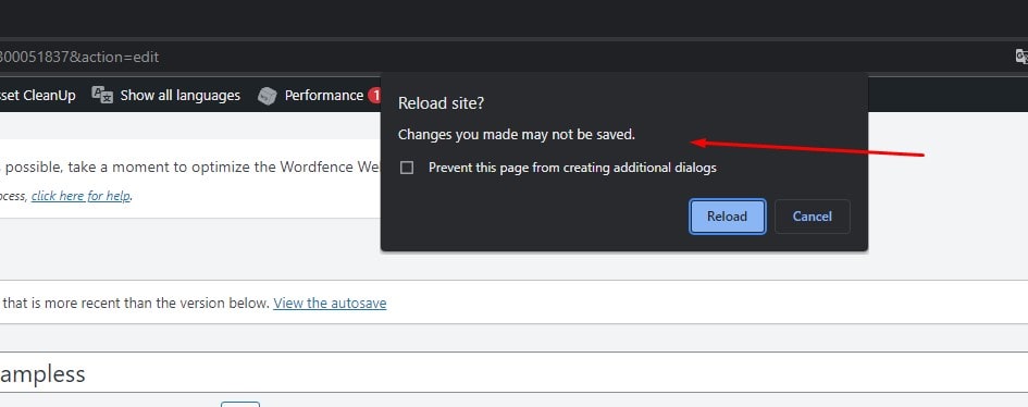
Imagine you’re on a digital platform and encounter a random message that says, “Action successful”. Sounds positive, right? But what action was successful? Where should you go next? This lack of context is another grave pitfall in bad UX writing.
Every user interaction needs a clear response that aligns with their expectations. A message devoid of context is like an unanchored boat drifting aimlessly in the vast ocean of user interfaces. It leaves users puzzled, frustrated, and feeling left in the dark.
The antidote to this problem? Add clear, meaningful context to every message. Here’s how:
- Match user actions: Tailor your messages to correspond with the specific action the user has taken.
- Guide the next step: Every message should point the user to their next move, removing ambiguity.
- Deliver clarity: Avoid generic responses. Be specific and clear in your communication.
With these tips, you can provide a smoother, more intuitive user journey. Good UX writing clears the path, guiding users along their digital voyage. When done right, it turns the complex maze of a user interface into a stroll in the park.
Bad UX Writing Example 4: Long, Unbroken Text Blocks

Peering into a long, unbroken block of text is like attempting to scale a tall, steep wall—intimidating and exhausting. This manifestation of bad UX writing can turn an otherwise enjoyable digital journey into an uphill struggle.
Consider a software installation guide that greets users with a massive wall of text. Reading through it feels like slogging through a swamp, dampening enthusiasm and making the process seem far more complex than it is.
The solution? Break it down. Here are some pointers:
- Short paragraphs: Keep your paragraphs brief. Aim for two to three sentences per paragraph.
- Bulleted lists: Use bullet points to present multiple pieces of information. They’re easier to scan and absorb.
- Subheadings: Break up large chunks of information with subheadings. They serve as signposts guiding the reader’s journey.
Trimming down and breaking up text walls is vital to UX writing. It’s about making the user’s digital journey smoother, faster, and less daunting. When you chop down the tall wall of text into manageable steps, you pave the way for an engaging, user-friendly experience. Remember, in UX writing, less is often more.
Bad UX Writing Example 5: Inconsistent Terminology
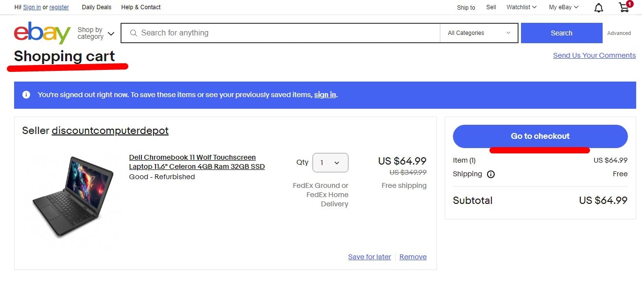
Stumbling across inconsistent terminology while navigating a digital platform is akin to encountering unexpected roadblocks on a well-trodden path—it’s confusing, frustrating, and disrupts the user journey. This embodies another unsightly characteristic of bad UX writing.
For instance, if a website uses ‘Shopping Bag’ on one page and ‘Cart’ on another, users are left guessing if they’re the same thing or different. Inconsistency muddles understanding and shatters the illusion of a seamless experience.
Maintaining consistency in terminology is not rocket science. Here’s a quick guide:
- Create a glossary: Develop a shared vocabulary for your product or service. This ensures everyone speaks the same language.
- Review and align: Regularly check your content. Make sure it aligns with your defined terminology.
- Standardize across platforms: Your language should remain consistent, whether mobile, desktop, or tablet.
Steadfast consistency in UX writing fosters familiarity and builds user confidence. It turns an otherwise bumpy user journey into a smooth sailing adventure. Ultimately, it’s not just about what you say but how consistently you say it. In the end, consistency is the glue that binds a satisfying user experience together.
5 Ways to Improve UX Writing
Just as a masterful storyteller captivates an audience, effective UX writing guides users seamlessly through a product or service. It’s the narrative of the user journey, one that should be clear, concise, and helpful. Unfortunately, bad UX writing often rears its ugly head, confusing users and marring the digital landscape. So, how do you turn bad UX writing around? Here are five ways:
- Understand Your User: The user should be the star of your story. Understand their motivations, needs, and language. Write for them, not at them.
- Be Clear and Concise: Users aren’t interested in deciphering complex sentences. Use simple language and ditch the jargon.
- Maintain Consistency: Whether it’s terminology or tone, keep it consistent. A steady voice reassures users and builds confidence in your product or service.
- Provide Context: Don’t leave users guessing. If you reference something, make sure it’s clear what you’re referring to. Always provide sufficient context.
- Test and Iterate: UX writing isn’t a one-and-done task. Test your content, gather feedback, and make necessary adjustments. Keep refining until you strike the right chord.
Steering clear of these bad UX writing practices can smooth out the wrinkles in the user journey, making for a more enjoyable, less frustrating experience. It is possible that doing so will be challenging, but the rewards will be well worth it. UX writing isn’t simply about choosing the perfect words—it’s about generating lasting connections and user experiences.
Bottom Line
Navigating to the end of our tour on “5 Bad UX Writing Examples”, we’ve traversed through the sometimes-uncharted territory of bad UX. We’ve seen how these writing errors can make a user’s digital experience dreary.
We’ve unraveled common issues like inconsistent microcopy, unclear CTAs, and uncommunicative error messages. We’ve recognized the crucial sign of a user’s increasing frustration — a glaring red flag that something in the UX writing needs a revamp.
The examples we’ve tackled emphasized the power of:
- Clear, concise language in all UX writing elements, from pop-ups to notifications.
- Consistent terminology across all user interfaces, ensuring a smooth onboarding process.
- A warm, welcoming tone greets users and helps build a friendly relationship with them.
- Properly manage user expectations by accurately informing them of waiting times or loading states.
- Avoiding overuse of technical jargon and keeping the user’s language in mind when drafting any piece of microcopy.
As we sign off, remember that bad UX writing can sneak into even the most robust systems. The key is to remain vigilant, stay on-brand, and continuously test and refine your copy to ensure it meets your user’s needs.
Now it’s your time to put these principles into action. Use Plerdy’s tools and fine-tune your UX writing to drive better user engagement and retention rates. Remember, you’re not just working on words, you’re sculpting the user’s journey. So, grab your creative hat, and let’s make digital spaces more user-friendly, one piece of microcopy at a time.