
In the field of digital design, the battle between Good UX (User Experience) and Bad UX is a riveting subject. To thrive in today’s market, businesses must adopt strategies that prioritize both user needs and engaging design techniques.
✅ Good UX embodies simplicity, ease of navigation, and an intuitive interface. Specific industries such as e-commerce, healthcare, or educational technology provide prime examples:
- E-commerce sites: Smooth checkout processes that don’t confuse or frustrate users
- Healthcare apps: Streamlined appointment scheduling and medical record accessibility
- EdTech platforms: User-friendly course navigation and interactive learning materials
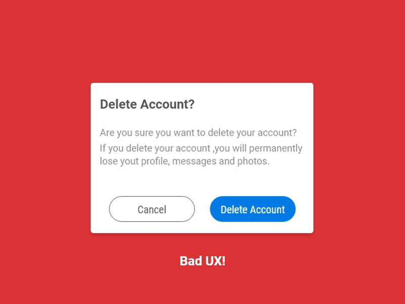
❌ Conversely, Bad UX can create barriers, cause frustration, and drive users away. It’s the stumbling block – unresponsive design elements, slow load times, or convoluted menus – that leads to a broken connection with your audience.
Plerdy tool for CRO & UX comes to the rescue, enabling businesses to understand user behavior and design experiences that engage and convert. With a robust set of features, Plerdy ensures that every user journey is enjoyable and effective.
Invest in a dynamic UX that satisfies your users and your business’s bottom line. Explore Plerdy today, and enhance the user’s journey through intelligent design and functionality. ⚡?
Importance of Good UX
In the landscape of digital interaction, good User Experience (UX) design takes the lead, spearheading successful user engagement, satisfaction, and retention. The crux of good UX design orbits around understanding, anticipating, and meticulously addressing user needs, behaviors, and values. It’s akin to orchestrating a symphony – all elements harmoniously align to create a seamless, intuitive, and pleasurable user journey.
Consider these key components of well-executed UX design:
- User-Centered Design: Tailoring interfaces that resonate with users’ preferences and contexts, akin to a custom-tailored suit fitting perfectly.
- Simplicity and Clarity: Avoiding needless complexity, like a well-written novel, each element serves a purpose, ensuring users glide effortlessly through tasks.
- Consistency: Like a popular restaurant chain, users expect a certain standard; design elements remain familiar and predictable across platforms.
- Interactive Elements: Foster user engagement, mirroring a playground’s charm where the design interacts, reacts and reciprocates user actions.
Take eCommerce as an example – Amazon’s success hinges heavily on good UX. A clutter-free layout, personalized recommendations, easy navigation, and quick checkout process culminate in a user-friendly shopping environment. It’s a testament to how good UX turns visitors into loyal customers and casual browsers into engaged users. Ultimately, good UX design isn’t an option – it’s a necessity, shaping the digital universe one pixel at a time.
Understanding UX: Good vs. Bad

Definition of Good UX
Good User Experience (UX) design is an all-embracing philosophy that lays the foundation for satisfying, efficient, and delightful interactions between users and digital interfaces. A symphony of strategy, psychology, and design, good UX fuels a harmonious journey for the user, rendering every touchpoint intuitive, useful, and enjoyable. It’s an art – mastering which catapults brands into users’ hearts while driving business metrics skywards.
Pillars of good UX include:
- Empathy: The user is the hero of this story, and the design must fit into their narrative. Think of a professional athlete’s custom-fit gear.
- Clarity: Every element should pave the way for users’ objectives, akin to well-placed signposts guiding travelers.
- Consistency: Continuity in design is paramount, just as a beloved television series maintains character traits across episodes.
- Responsiveness: Design must adapt and respond like a skilled dancer adjusting to the rhythm of the music.
Consider a fitness app, where good UX is the difference between a one-time-use and a daily routine. User profiles tailor workouts, clear navigation enables easy discovery, consistency across screens breeds familiarity, and responsive design adjusts to various devices. By marrying science and art, good UX design transforms the mundane into the extraordinary, making each digital interaction a high note in the user’s melody of life.
Definition of Bad UX
In the digital symphony, bad User Experience (UX) design hits a discordant note – it’s an off-key performance that leaves users puzzled, frustrated, or entirely disengaged. Much like an ill-prepared meal leaves a bad taste, bad UX hampers user satisfaction and hurts brand loyalty. It’s a mismatch of strategy, understanding, and execution that turns digital platforms into confusing labyrinths instead of streamlined pathways.
Tell-tale signs of bad UX include:
- Confusing Navigation: Users get lost in the digital maze, akin to wandering in an uncharted forest without a map.
- Inconsistent Elements: As frustrating as a favorite TV series changing actors without explanation, it confuses and disorientates.
- Poor Responsiveness: When design fails to adapt across devices, it’s like a dancer stumbling over their steps.
- Slow Load Times: The impatience of waiting in a long, stagnant line – users will leave for faster alternatives.
For instance, an overly complex banking app can exemplify bad UX. Confusing menu hierarchies make basic tasks arduous, inconsistent icons bewilder users, non-responsive design leads to distorted visuals on different devices, and slow transactions add to the frustration. Such experiences drive users away, akin to diners deserting a restaurant with poor service. Bad UX, therefore, is not just a design mishap but a serious pitfall that can leave a digital platform in the dust.
Components of Good UX
User-Centered Design
User-Centered Design (UCD) is the North Star guiding UX designers towards creating engaging, intuitive, and satisfying experiences. It’s like a custom-tailored suit, fitting the user perfectly and enhancing their journey through the digital landscape.
Key aspects of User-Centered Design include:
- Understanding User Needs: Identifying and addressing users’ desires, akin to a chef crafting a meal based on diners’ tastes.
- Usability Testing: Regular user feedback to refine and polish the design, much like a sculptor chiseling a masterpiece.
- Iterative Design: Continually refining the design based on user feedback, akin to fine-tuning a musical composition.
- Inclusive Design: Ensuring accessibility for all users, comparable to a building equipped with both stairs and ramps.
Imagine a ride-hailing app designed with UCD in mind. User needs dictate features like easy booking, ride tracking, and seamless payments. Regular usability tests uncover pain points – long load times, confusing menus – and help fix them. The design iterates based on these tests, progressively enhancing the experience. And inclusive design ensures the app is accessible to all users, regardless of their physical abilities or technological proficiency. UCD thus transforms a mere functional tool into a delightful experience, turning users into loyal fans.
Simplicity and Clarity
In the realm of UX design, simplicity and clarity are the unsung heroes, smoothing out the user journey and making digital experiences intuitive and enjoyable.
Key facets of simplicity and clarity in UX design include:
- Effortless Navigation: Akin to a well-marked hiking trail, users should easily find their way around the digital landscape.
- Clear Call to Action: Like a compelling movie trailer, users should know what action to take next.
- Minimalist Design: Every element must serve a purpose; unnecessary frills are discarded, much like an architect’s minimalist masterpiece.
- Readable Typography: Fonts and sizes should be easy on the eye, mirroring a best-selling novel’s accessible language.
Simplicity in design makes the buying process straightforward – like picking items from a well-organized store. Clear menus and breadcrumbs guide users, and unambiguous call-to-action buttons nudge them towards checkout. The design stays minimal, focusing on products rather than overwhelming users with flashy banners. And readable typography ensures users easily absorb crucial information like product descriptions and prices. By championing simplicity and clarity, UX design paves the way for satisfying and efficient user experiences, turning a casual visitor into a delighted customer.
Consistency
Consistency in UX design is the linchpin that binds together a user’s digital journey, crafting a seamless and predictable experience. It’s akin to the recurring theme in a symphony, weaving together individual movements into a harmonious whole.
Pivotal aspects of consistency in UX design include:
- Visual Consistency: Uniform color schemes, fonts, and styles across the platform, much like a fashion collection, maintains a cohesive theme.
- Functional Consistency: Interactive elements behave predictably, similar to the predictable sequence of traffic lights.
- Internal Consistency: The design language remains constant within the product, comparable to characters maintaining their traits throughout a novel.
- External Consistency: Keeping the design similar across multiple products of a brand, just as a franchise maintains its distinct feel across various installments.
Consider a suite of apps by a single developer. Visual consistency ensures that all apps share a recognizable design language – like siblings having similar features. Functional consistency implies that buttons, sliders, and other interactive elements behave similarly across these apps, just like the controls in a car. Internal consistency ensures each app remains true to its design language, while external consistency maintains a shared aesthetic across the suite, akin to chapters of a book. By championing consistency, UX design delivers a familiar, user-friendly, and delightful experience, fostering user loyalty and brand love.
Responsive and Interactive Elements
Responsive and interactive elements are the building blocks of engaging UX design, fostering an immersive, dynamic user experience. These elements are like a skilled bartender, responding swiftly and accurately to every customer request, providing a smooth, enjoyable experience.
Key components of responsive and interactive design include:
- Quick Load Time: A speedy response to user input, akin to an athlete’s lightning-fast reflexes.
- Real-time Feedback: Immediate response to user actions, like a GPS system updating directions based on user movement.
- Engaging Animations: Dynamic elements that enliven user interaction, similar to the thrill of a roller coaster ride.
- Intuitive Interactions: Elements that behave as expected, like a well-trained pet responding to its owner’s commands.
Imagine an online education platform. Quick load time ensures users access content without delay, much like a well-organized library. Real-time feedback keeps users informed of their actions, such as a highlighted button indicating a successful click. Engaging animations, like a congratulatory pop-up upon course completion, add excitement to the learning process. Intuitive interactions, like draggable progress bars or clickable quizzes, make the platform easy to use, similar to a friendly tutor guiding the learning journey. By employing responsive and interactive elements, UX design transforms a basic digital interface into an interactive, user-focused environment, enhancing user engagement and satisfaction.
Accessibility and Inclusivity
Embracing accessibility and inclusivity in UX design is like crafting a universal remote – a design that seamlessly integrates with various devices and their users. This approach not only respects diversity but also opens up a product to a wider audience, much like a multilingual guide in a bustling tourist hotspot.
Critical elements of accessible and inclusive UX design include:
- Readable Text: A clear, adjustable font size and contrast, akin to large-print books for the visually impaired.
- Subtitles and Transcripts: Aiding the hearing impaired, much like sign language interpretation at a live event.
- Keyboard Navigation: Accommodating those unable to use a mouse, similar to an elevator serving as an alternative to stairs.
- Color-Blind Friendly Design: Offering color alternatives or patterns to assist color-blind users, like braille for the visually impaired.
Imagine a streaming service embodying these elements. Readable text ensures that descriptions and titles are easily visible, like a book with clear, large print. Subtitles and transcripts provide a textual alternative to audio, similar to a silent film. Keyboard navigation allows users to browse without a mouse, much like a TV remote. A color-blind friendly design ensures that all users can navigate the platform, akin to a well-lit path guiding walkers at night. By embracing accessibility and inclusivity, UX design fosters an empathetic and comprehensive user experience, enriching the digital world for all users.
How to Measure UX Design Effectiveness?
Behavioral KPIs
Unraveling user behavior is akin to decoding a cryptogram, a challenging yet intriguing endeavor. Behavioral KPIs act as your trusted guides in this expedition, offering tangible insight into the intertwined paths of user experience and design.
Let’s dive into some of these indicators:
- Bounce Rate: Imagine a crowded restaurant where customers enter, glance at the menu, and leave without ordering. A similar situation on your site is a flashing warning sign pointing to problematic UX.
- Average Session Duration: Compare this to the time spent by a reader engrossed in a gripping novel. Longer session durations hint at engaging content and an intuitive design that hooks users.
- Pageviews per Visit: Think of this as a museum visitor captivated by every exhibit, eagerly moving from one to another. Multiple pageviews signal compelling content and seamless navigation.
- Conversion Rate: This resembles a shopper making a beeline for their favorite brand in a department store. A high conversion rate indicates that your site is successfully persuading users to take desired actions.
Behavioral KPIs stand at the intersection of data-driven strategy and empathetic design. They weave together a story of user behavior, helping us shape and polish our design, ensuring a UX that is not only aesthetically pleasing but also purposefully constructed to meet user needs and exceed their expectations.
Attitudinal KPIs
Unlocking the puzzle of user sentiment can be as delicate as taming a wild stallion, a challenging task but incredibly rewarding when done right. In this venture, attitudinal KPIs serve as our trusty compass, shedding light on the intricate terrain of user experience and design.
Consider these insightful indicators:
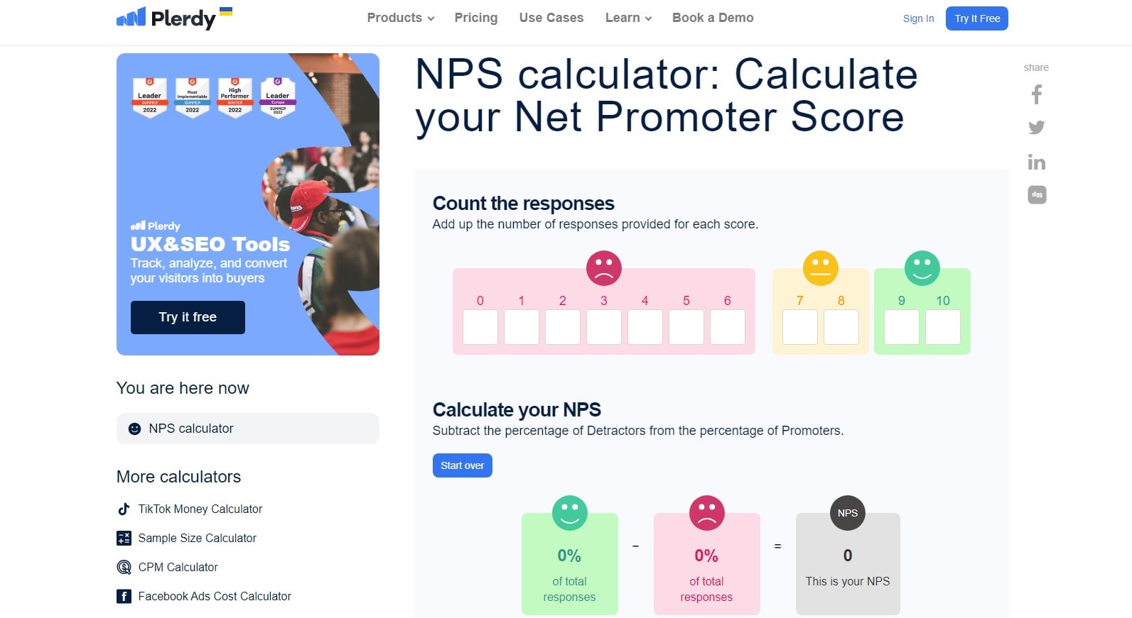
- Net Promoter Score (NPS): Envision a raving fan endorsing their favorite band to everyone. A high NPS signals users so satisfied they’re willing to recommend your product.
- Customer Satisfaction (CSAT): Think of a diner relishing every bite at their beloved eatery. High CSAT scores suggest you’re hitting the sweet spot in satisfying user needs.
- Customer Effort Score (CES): Like assembling a piece of furniture with a clear, easy-to-follow manual. Lower CES means users find your product straightforward to use.
- User Sentiment: Reflects the emotional response of a theater audience at the end of a performance. Positive sentiment indicates users are pleased with their experience.
Through the lens of attitudinal KPIs, we can discern the subtleties of user sentiment, helping shape and refine our design. The goal is a user experience that’s not just functionally robust but emotionally resonant, striking a chord with each user and earning their applause.
Plerdy and UX improvements
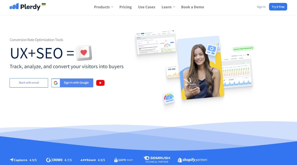
When the mission is to paint a clear picture of user interactions and churn out an enhanced design, Plerdy swoops in like a reliable ally. In the dynamic world of UX, this tool can be the North Star, guiding you to invaluable insights and spotlighting user behavior in high resolution.
Dive into some of Plerdy’s exceptional functionalities:
- Heatmaps: Imagine seeing your user’s mouse movements as glowing trails, akin to a hiker leaving footprints. Heatmaps illuminate these paths, highlighting areas of interest and potential issues.
- SEO Checker: It’s like having a health inspector for your website’s SEO, scrutinizing every detail and pointing out areas for improvement.
- Sales Performance: Visualize a meticulous cashier tallying every transaction. This feature tracks conversions and uncovers trends, shedding light on your most lucrative pathways.
- Pop-up Forms: These are akin to a charismatic salesperson engaging potential customers, capturing users’ attention, and driving engagement.
By integrating Plerdy, you’re not merely investing in a tool; you’re empowering your design strategy, adopting a user-centric approach that lifts your UX to a remarkable level. Each feature is a thread, weaving a deeper understanding of your user’s journey and fueling improvements that resonate with their needs and wants.
Business metrics
Let’s delve into the core – the heartbeats of any business – business metrics. These key indicators are the compass points guiding your decision-making, facilitating tweaks to the design, UX, and user engagement strategies. They turn murky waters clear, spotlighting the state of affairs, allowing for informed choices, and transforming “gut feeling” decisions into data-driven strategies.
Consider these essential business metrics:
- Churn Rate: Imagine a revolving door at your website’s entrance. The Churn Rate quantifies the number of users leaving your platform, and it’s your task to slow down this spinning door.
- Conversion Rate: Picture a bustling bazaar where every passerby is a potential customer. Your Conversion Rate measures the number of passersby transformed into customers.
- Customer Acquisition Cost (CAC): It’s like the ticket price to bring a new customer on board. By reducing CAC, you optimize profitability.
- Lifetime Value (LTV): Visualize a future stream of cash inflows from a customer over their lifetime. Maximizing LTV is the ultimate goal for every business.
As a business, your role is akin to an orchestra conductor, harmonizing these metrics to create a symphony of success. It’s a journey of understanding, with every step backed by tangible data, directing your UX and design strategies towards promising horizons.
Consequences of Good vs Bad UX
Impact of Good UX on Business Metrics
Great UX is a powerful catalyst – it transforms an average business into an industry titan. The trickle-down effect of a well-crafted UX design impacts business metrics in multiple ways.
Think about the influence on these key indicators:
- Churn Rate: With an intuitive and user-friendly UX, you’re ensuring users stick around, reducing your churn rate. It’s like having a welcoming, homely café where customers love to linger over their coffee.
- Conversion Rate: A seamless UX acts as the engaging salesperson that turns visitors into customers. It’s the compelling storytelling that makes the shoppers put products in their carts at a bookstore.
- Customer Acquisition Cost (CAC): A delightful UX lures users to your platform, reducing your customer acquisition costs. It’s the compelling music from a pied piper’s flute that gathers an audience without much effort.
- Lifetime Value (LTV): A satisfying UX experience has users returning, extending their customer lifetime value. It’s the magnetic charm of a favorite resort that entices visitors to return year after year.
Hence, well-executed UX is not just an add-on. It’s a critical ingredient in your recipe for business success, serving as the engine that boosts your core business metrics.
Detriments of Bad UX
Navigating a poorly designed user experience (UX) is like trying to find your way through a labyrinth – it’s confusing, frustrating, and can turn people away for good. Bad UX design sends detrimental shockwaves through your key business metrics, often leading to irreversible damage.
Consider these pivotal factors:
- High Bounce Rates: If users can’t easily understand or interact with your site, they’ll bounce off quicker than a rubber ball hitting concrete. It’s the chaotic clutter in a thrift store driving customers away.
- Reduced Conversion Rates: A cumbersome UX could dampen the spirit of even the most eager customers, deflating your conversion rates. It’s like struggling to make a purchase in an overcrowded marketplace.
- Skyrocketing Customer Acquisition Cost (CAC): When users find your platform challenging, you’ll need to spend more on marketing to attract new ones. It’s akin to organizing extravagant events to draw crowds to a subpar amusement park.
- Decreased Customer Lifetime Value (CLV): Users burned by a terrible UX aren’t likely to return, reducing their CLV. It’s like disappointing service at a restaurant, making customers swear never to return.
Hence, bad UX isn’t just an inconvenience – it’s a business hazard. It’s akin to driving with a flat tire; not only does it slow you down, but it also risks causing lasting damage. Ensuring a positive UX design isn’t just beneficial; it’s absolutely crucial.
How to Improve Bad UX
Implementing User Testing and Feedback
Implementing user testing and feedback is akin to discovering a roadmap guiding you towards stellar UX design. Users are the lifeblood of your platform, and their experience, feedback, and suggestions form the core of your UX development.
Take the case of an online bookstore. Before launching the site, a sample user base is selected to test the system, exploring the interface, adding books to the cart, going through the checkout process – all this while their behaviors, reactions, and experiences are recorded.
Insights from this exercise can be highly revealing, for instance:
- User Flow: You might find users struggle to locate the shopping cart – an indication to rethink its placement or visibility.
- Feedback Forms: A feedback form revealing that users prefer a one-click buy option could lead to its incorporation, simplifying the user journey.
- Heatmaps: Using tools like heatmaps to track user behavior could reveal that the search function isn’t being utilized, perhaps it needs a more intuitive design or prominent placement.
By being responsive to such findings, the bookstore can shape an intuitive, engaging platform, making it a breeze for customers to navigate and find their next favorite read. Remember, with user testing and feedback, your design, UX, and user satisfaction can be ramped up to provide a truly tailored experience.
Iterative Design Process
Iterative design, a cornerstone of UX, thrives on cyclical evaluation and refinement. The cycle begins with identifying user needs, planning the design, creating mockups, and finally, user testing. Feedback is then gathered, analyzed, and fed back into the design process.
A streaming service, for instance, starts with an initial design layout – easy navigation, curated content categories, and a personalized recommendation system. The next steps in this journey could include:
- Prototype Building: The team builds a clickable prototype, replicating the final product as closely as possible.
- User Testing: A select user group interacts with the prototype while the team closely observes their interaction patterns and gathers feedback.
- Analysis and Implementation: The team interprets user feedback and data, making the necessary adjustments in the design.
- Repeat the Process: The newly revised design goes through the same cycle until it meets user satisfaction and business goals.
Remember, it’s a continuous process of learning, adapting, and improving. A carefully executed iterative design process can turn a streaming service into a user’s go-to entertainment hub. With the focus on user feedback and constant tweaking, design and UX seamlessly align to create an exceptional user experience, making the iterative design process the cornerstone of successful UX development.
Utilizing UX Principles and Guidelines
Harnessing the power of UX principles and guidelines optimizes user interaction and fosters engagement, ultimately catapulting digital platforms to their utmost potential. The E-commerce industry serves as a perfect canvas to apply UX principles.
Strategically adopting these guidelines, an e-commerce website can transform from a mere product catalog into a shopping haven that users gravitate towards. Let’s delve into key actions:
- User-Centered Design: Building around user needs, desires, and limitations. For instance, a simplified checkout process boosts user engagement, reduces cart abandonment, and drives sales.
- Consistency and Standards: Maintaining uniformity across the website. Consistent layout and terminologies streamline navigation, making users feel at home.
- Visibility of System Status: Keep users informed about what’s happening. Imagine a well-defined tracking system for orders – it reassures users and fosters trust.
- Recognition Over Recall: Providing readily available information reduces cognitive load. An example is suggestive search that predicts and displays potential products as users type.
- Error Prevention and Recovery: Making sure error messages are easy to understand and solutions are clear. Say, in case of payment failure, guiding users back to the order summary without losing their data.
A keen focus on these UX principles and guidelines crafts an inviting and easy-to-navigate e-commerce platform that users favor – a blueprint for turning one-time shoppers into loyal customers.
Future Trends in UX Design

In the dynamic sphere of UX design, future trends keep evolving, shaping user interaction and fueling business growth. The evolving landscape of Fintech offers intriguing examples of UX trends leading the digital evolution.
Firstly, Voice User Interface (VUI) is set to revolutionize interaction. Fintech applications, such as mobile banking, will employ voice commands, enabling users to make transactions or check balances hands-free.
Secondly, Artificial Intelligence and Machine Learning (AI & ML) will enhance personalization. Financial institutions will predict user behavior, offer personalized advice, and tailor user interfaces – stepping up user engagement and satisfaction.
Thirdly, Augmented Reality (AR) will merge the real and virtual worlds. AR will provide immersive experiences, such as virtual tours of potential property investments or interactive financial education.
Lastly, Microinteractions will gain importance. These small design elements – like the loading animation or the sound of a payment confirmation – can greatly improve the overall UX by making the interface feel alive and responsive.
As we sail through the digital transformation tide, these emerging UX design trends will redefine how users interact with fintech platforms. Embracing these will ensure your design strategy stays on top, creating memorable user experiences and driving digital success.
Conclusion
In the journey through the intricacies of Good UX vs Bad UX, we’ve navigated the vast landscapes of design, user interaction, and comprehensive UX management. We’ve explored innovative examples from companies like Zara, Netflix, and Disney, and delved into the significant impact that UX has on startups, SaaS, and even the dental industry.
Good UX represents everything that’s appealing, intuitive, and user-centric:
- Seamless design: Zara’s UI effortlessly guides customers through its pages
- Personal engagement: Netflix’s algorithms make movie recommendations feel personal
- Innovative creativity: Disney’s apps encapsulate the magic of their brand
Bad UX, on the other hand, complicates the user’s journey, often resulting in the deletion of apps or abandonment of web pages. It’s like cooking with the wrong ingredients; it simply doesn’t taste right.
But fear not, with tools like Plerdy, you can perform thorough SEO & UX analysis, ensuring that your project isn’t another casualty of poor design. From client management to software’s lifecycle, you’ve the ability to create beautiful, usable content that resonates with users.
Embrace the best practices we’ve highlighted and utilize tools like Plerdy to perfect your approach. Make UX work for you – and you’ll see the results in your profits, reviews, and user satisfaction. ?✨?