
Welcome in the territory of tools for data analytics. We are exploring the great show of eighteen brilliant software champions, each master in arranging a complex numerical dance. The terrain of data analysis is no more a one-size-fits-all; niche-specific solutions are like sorting through a variety of spices in a gourmet kitchen.
Let us drop the anchor at Plerdy, a special gem in our brilliant collection, for example. Renowned for its strong mix of UX and SEO analysis, Plerdy deftly breaks out user behavior to eventually support data-driven corporate strategy.
Allow us to unbox the main goals of our master data analytics program:
- These tools expose actionable patterns by slicing through the clutter of unprocessed data, therefore transforming it into insightful narratives.
- Data-driven decisions empower companies to move toward an analytical approach, therefore removing uncertainty.
- Connecting gathered data with strategic planning is accomplished by the instruments bridging the gap between them.
Every instrument opens several analytical doors; it is time to unleash the magic! Discover the potential of data analytics and guide your company toward unprecedented informed success.
How to Choose the Right Data Analytics Software?
Selecting appropriate data analytics tools is a critical business choice, not something to ignore. Here is then how to really nail it:
- Name your objectives: Clearly state the insights from your data that you are seeking. If you work in healthcare, for example, you might need a tool designed for epidemiological research.
- Review attributes: Examine the various instruments’ usefulness. To predict market trends, for instance, you could need programs with strong predictive analytics or data visualization skills.
- Take usability into account. Choose tools that accentuate the abilities of your team. For instance, a basic tool could underwhelm a team of data science experts whereas complex software might overwhelm a team of beginners.
- Think on integration: Choose a tool that complement your IT system. For instance, choose appropriate software if your company mostly depends on cloud storage.
- Consider cost; weigh the pricing schemes. Remember, the most costly programs can be better fit for you.
Consider an e-commerce brand for example. If the main objective is to examine consumer behavior, a tool with great data mining capacity could be a suitable one. Apart from that, the instrument should fit within financial limits, fit the current e-commerce platform, and be easy for the staff to operate.
Basically, the ideal data analytics tool will satisfy your niche and objectives by balancing cost, functionality, usability, and integration.
List Of The Best 18 Data Analytics Software Tools
Moving across the rich tapestry of data analytics tools is like negotiating a maze with priceless jewels. Among the seventeen shining stars in the constellation, each reveals a different aspect of data analysis and provides transforming prism through which to interpret the secret stories buried in the sea of data. Still, even as every program tool works wonders, the real skill is in deftly using the one that fits your particular analytical journey.
1. Plerdy
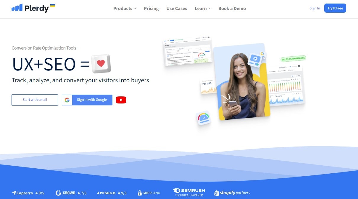
Using Plerdy, a strong, easy-to-use analytics solution meant to maximize the performance of your website, release the potential of data. Available on several platforms: Cloud, SaaS, on-site or portable. Perfect for online analytics, usability, CRO testing and enhancement, Plerdy is flexible in capabilities for internet marketing.
Let’s break out Plerdy’s offerings:
- Behavioral analytics let you delve closely into user interactions.
- Center your data view for fast access on a dashboard.
- Simplify difficult facts with straightforward, understandable graphics.
- Engagement Tracking: Keep updated on user degrees of involvement.
- Get fast insights and react in real time with real-time analytics.
Established in Ukraine in 2017, Plerdy has expanded rapidly to serve 1–1000+ people because to its highly regarded features and great value for money. Plerdy has been praised by users as a consistent tool for raising conversion rates and improving knowledge of website visitors.
Use Plerdy’s potential for data analysis for your website; it’s not only a tool but also a vital ally on your digital road map. See improvements in the performance of your website; Plerdy is more than ready to provide.
2. Tableau
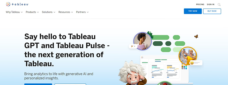
Within the realm of data analytics tools, Tableau is a titan—a tool that best illustrates the capability of data visualization. It lets businesses turn complicated, raw data into aesthetically pleasing, easily comprehensible knowledge.
Think on the sector of renewable energy businesses. They manage enormous volumes of meteorological data that might guide construction projects. Tableau let them examine trends, detect patterns, and make strategic decisions.
Main characteristics of Tableau are:
- Creating interactive dashboards that narrate interesting data stories is dynamic data visualization.
- Syncing easily with several on-site and cloud-based data sources is what we do.
- Providing several levels of data protection guarantees the integrity and confidentiality of information, therefore strengthening robust security.
Tableau also supports a spectrum of user ability. Its simple design lets even novices examine data without effort. Advanced users can do challenging data exploration chores. Tableau therefore provides strong analytics to propel your company ahead regardless of your level of experience in the sector or as a new startup.
3. PowerBI
A flagship data analytics tool from Microsoft, PowerBI marks a radical change in corporate intelligence. It helps companies to negotiate the road to informed decision-making, fish out useful insights, and negotiate oceans of data.
Imagine a logistics firm balancing routes, fleet cars, and data from hundreds of deliveries. On the pertinent data, PowerBI excels in turning abstract numbers into understandable images. It exposes the most effective paths, breaks out trends in delivery times, and even points up ways to save money.
PowerBI’s fundamental capabilities consist in:
- Advanced algorithms for deep-dive study and data-driven decision-making constitute strong analytics.
- Interactive dashboards are aesthetically pleasing, configurable tools for efficiently presenting difficult information.
- Designed for linking to a broad spectrum of local and cloud-based data sources, seamless connectivity
PowerBI puts data to life rather than only numbing statistics. By use of real-time dashboards, it maintains stakeholders in the loop and promotes a data-centric corporate culture. Furthermore, its fit with other Microsoft products improves output, which helps it to be a powerful rival in the field of data analytics. Using PowerBI in their toolkit helps companies to meet the demands of the data-driven era.
4. SAS
Leading data analytics tool SAS sits at the junction of effective analytics with easy-to-use interfaces. In the data wilderness, it is a compass guiding companies to important insights and wise decisions.
Imagine a telecom corporation drowning in countless data points—client turnover rates, use patterns, and service interruptions. They can control this data tsunami, find hidden trends, and create strategies keeping consumers happy and involved by using SAS.
From the feature department, SAS exhibits:
- Advanced statistical techniques in-depth analytics help to expose latent trends and patterns.
- Using past data to project future results and trends helps one to have predictive capacities.
- Robust technologies for data quality assurance, organization, and classification abound in data management.
Still, the SAS narrative transcends mere features. It concerns the change it starts. SAS lets users explore predictive and prescriptive analytics beyond basic data visualization. It helps companies to look ahead, predicting consumer behavior and industry trends. For businesses trying to maximize their data, SAS’s outstanding capacity and easy-to-use interface make it a convincing option. Businesses using SAS are transforming data into their greatest strategic asset rather than only analysing it.
5. QlikView
QlikView is a great weapon in the analytics toolkit for companies eager to use data as a strong friend. Its dynamic character lets users explore the nitty-gritty of their data, uncover ideas that support well-informed decisions.
From sales numbers to inventory levels, their activities produce an ongoing data stream. QlikView threads them into a story. It breaks up inventory needs, analyzes sales patterns, and highlights product performance.
Important QlikView characteristics include in:
- Interactive dashboards provide real-time, customisable views of important corporate data.
- No matter the data volume, fast data retrieval and analysis in-memory processing.
- Cooperative analytics is the sharing of ideas between teams for group decisions.
QlikView helps exploration, not only with data presentation. It enables consumers to probe their records, probe difficult issues, and find striking solutions. Its rapid and agile handling of challenging searches also distinguishes it within the data analytics tool set. Using QlikView, companies are interacting dynamically with their data rather than merely compiling information to find fresh approaches to propel success.
6. Domo
Domo is somewhat well-known within the huge field of data analytics applications. Using data, this innovative solution helps companies to get useful insights and guide the ship toward wise decisions.
Think of a healthcare professional for instance. They are buried in treatment plans, lab findings, and patient records. Domo controls this data tsunami by providing a clear line of sight into operational efficiency, therapeutic success, and patient outcomes.
Important elements giving Domo its edge are:
- Real-time data integration brings data from several sources into one understandable dashboard.
- Promoting data sharing and group insight generation all over the company helps to support cooperative decision-making.
- Allowing access to vital data and insights from anywhere, at any time helps to maximize mobile devices.
But Domo goes beyond features as well. It is about a transforming encounter with data. It provides a uniform real-time platform where users may interact with their data, therefore bridging the gap between raw data and insightful analysis. Its strong features let customers probe their data for difficult inquiries and receive quick responses. Domo is ready to transform your data into a competitive advantage regardless of your field of business—finance, retail, or healthcare. Using Domo’s capabilities will help companies to create a tapestry of actionable intelligence from their data threads.
7. Looker
Leading data analytics solution on the market is Looker, which turns unprocessable data into logical insights with use. This platform simplifies data exploration so that companies may find latent trends and base their decisions on the results.
Consider an online marketing company. From client site visits to conversion rates, they struggle with enormous amounts of data. Entering the fray, Looker calms this anarchy and offers the agency ideas to maximize its plans and increase client success.
Among Looker’s unique qualities are:
- Allowing people to interact with their data, ask questions, and get answers, self-service analytics lets them participate.
- Customizable Dashboards: Matching visuals to particular corporate objectives and demands.
- Data collaboration is the sharing of ideas throughout the company for group decisions.
But Looker is about enabling users, not only about tools. It democratizes data so that everyone, regardless of technical knowledge, may access important insights. This original strategy promotes data-driven innovation, informed decision-making, and breakdown of silos. Looker’s mastery resides in its scalability and adaptability, which serve firms of all kinds—from startups to Fortune 500 companies. Using Looker helps companies to transform their data into a strong motivator, hence improving performance and competitive edge.
8. Zoho Analytics
Strong data analytics tool Zoho Analytics presents a whole view of your company’s activities, thereby leading you towards wiser judgments. Using its advanced toolkit, Zoho Analytics transforms unprocessed data into insightful analysis that drives your company forward.
Imagine a manufacturing facility trying to best allocate its resources. Steering the company toward improved resource management, Zoho Analytics enters the picture sorting through production data and spotting obstacles.
Key characteristics of Zoho Analytics consist in:
- Data blending involves combining information from many sources to provide a whole picture.
- Delivering predictive insights to support corporate development, AI-powered assistant
- Interactive dashboards help to quickly make decisions by visualizing facts for simple understanding.
Zoho Analytics promotes a culture of data literacy, in which each member is enabled to use data in their own responsibilities, therefore transcending mere tools. From data collecting automation to in-depth report offering, it serves as a catalyst, guiding the course of expansion of your company. Rising to meet the data needs of many industries—from healthcare to logistics—Zoho Analytics stands tall with its emphasis on scalable solutions and user-friendly interfaces. Including Zoho Analytics into your company’s processes prepares you for outstanding performance and ongoing expansion.
9. Sisense
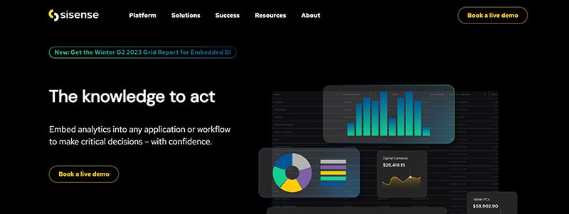
By means of its creative analytics tool, Sisense enables companies to make data-driven decisions By using this technology, companies may maximize data’s actual value and uncover insightful information to guide strategic planning.
Consider a retail company here. Using Sisense, they can essentially keep on top of their game by delving into the specifics of their sales performance, identifying effective marketing methods, and pointing up areas that need work.
Important characteristics that set Sisense apart from others are:
- Custom report creation is made simple by drag-and- drop interface.
- Combining data from several sources offers a whole picture in data fusion.
- Delivers insights right away for quick decisions.
Using Sisense, companies not only examine data but also transform it into a weapon to propel forward in the cutthroat environment. Sisense helps companies to understand the subtleties of their operations by naturally turning unprocessed data into useful insights. From a sophisticated awareness of consumer behaviors to assessing the effectiveness of marketing initiatives, this analytics solution meets several data needs in different fields. Therefore, Sisense can be your reliable partner in the road to corporate development and operational excellence if you want to boost your decision-making process.
10. Alteryx
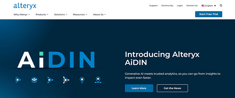
Alteryx marks a strong development in analytics software, therefore ushering a new period of data-driven decision-making. Using this ground-breaking tool, companies can untangle and investigate the depths of their data, therefore emphasizing important insights for strategic use.
Alteryx allows healthcare professionals, for instance, to examine patient data. They can thus separate important elements influencing medical outcomes and then apply exact interventions to enhance patient treatment.
Alteryx distinguishes itself as follows:
- Predictive analytics projects trends using statistical models.
- Geographical analysis made possible by spatial analytics allows location-based insights.
Leading the analytics frontier, Alteryx lets consumers simplify difficult tasks. Using a dynamic approach to predictive analytics and data mixing provides a means for actionable intelligence. This allows businesses to quickly comprehend their whole picture, from analyzing operational effectiveness to knowing customer behaviors. Alteryx therefore holds the secret to wise decision-making, opening the path for success and expansion of companies. In the end, this advanced solution provides analytics’ power right at your hands so your company may fully use its data and fulfill its future goal.
11. RapidMiner
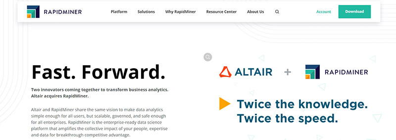
RapidMiner, a potent program that improves the game for companies all around, has transformed data analytics. Acting as a sophisticated tool for analysis, it helps users to derive practical insights from their data, therefore changing their operations and competitiveness in their particular sectors.
Consider yourself a big-box business seeking to find which items appeal most to your consumers. RapidMiner lets you quickly sort purchase data, identifying precisely which items aren’t selling as well as others.
Important RapidMiner characteristics are:
- Data Preparation: Organize and clean data for correct study.
- Using artificial intelligence, machine learning forecasts patterns and outcomes.
- Tests and improvements of predictive models for dependability help to validate them.
RapidMiner is a shining example of creativity in analytics tools by using machine learning powers. It simplifies data analysis so users may turn around fast and make wise selections. This instrument helps companies to utilize resources, refine their plans, and get outstanding performance. Beyond mere data processing, the program brings data to life and turns it into a useful tool guiding and informing success. Adopting RapidMiner marks your acceptance of a data-driven future in which your company may flourish.
12. Talend
Taking front stage in data analytics is Talend, a toolhouse known for its mastery of data integration and management. As a strong tool, Talend simplifies complicated data settings so that companies may use their data and turn it into a starting point for expansion and success.
Think of a healthcare provider juggling medical histories, patient records, and treatment plans. Talend organizes this data tsunami so that important information is easily available and used for best patient treatment.
Important aspects of Talend consist:
- Connects and aggregates data from several sources so that it may be analyzed.
- Data quality improves data consistency and accuracy, therefore guaranteeing dependable insights.
- Master data management produces a single, all-encompassing perspective of important corporate data.
Talend is an ally in the process of learning data analytics, not only software. By means of this instrument, companies may take charge of their data, maximize its possibilities, and create conditions for strategic planning and wise decisions. Talend is a secret to opening the door to a more efficient, data-driven future in the hands of astute users. Data with Talend sings, directing companies toward their objectives with hitherto unheard-of accuracy rather than just speaks.
13. KNIME
KNIME lays a high standard for data management and analysis. Leading analytics program KNIME guides companies in reaching their objectives using data.
Consider an online shop negotiating a labyrinth of consumer data, buying patterns, and product trends. Like discovering a secret treasure map in a sea of data, KNIME deciphers the data and surfaces ideas.
Among KNIME’s main strengths are:
- Cleans and prepares data for analysis thereby guaranteeing accuracy and relevance.
- Data analysis reveals latent trends and insights, therefore transforming data into a strategic resource.
- Forecasts of future patterns based on present data enable predictive modeling, hence guiding companies toward proactive solutions.
KNIME turns data from an imposing mountain into a manageable road so that companies may boldly plot their course. It is a trustworthy guide in the data desert, not only a tool. Businesses can go forward with KNIME, sure they can use data to create strategic advantage. KNIME is therefore a luxury and need in a competitive market. KNIME, though, shines for businesses trying to harness their data potential.
14. Yellowfin BI
Yellowfin BI will help you to maximize your data. This strong analytics tool helps to clear complicated data and expose the jewels of insight capable of driving a company ahead. Yellowfin BI is a friend in the search of wise decisions, not only a tool.
Consider a doctor juggling patient information, treatment results, and budget allocation. Yellowfin BI delivers actionable insights, data streamlines, and helps. This increases patient care by means of resource optimization.
These are some main Yellowfin BI capabilities:
- Navigate your data to more easily spot trends and patterns.
- Interactive dashboards let you see your data in real-time, so enabling rapid decisions.
- Share knowledge with your team to promote a data-driven culture by means of cooperative BI.
Yellowfin BI approaches data analysis like having a first-rate investigator on your team searching the data for hints and then assembling a whole picture. It removes the guesswork from decision-making so companies may act exactly and boldly. Yellowfin BI guarantees you’re not left behind but rather standing tall ready to transform data into a strategic advantage in a time when data is king. Use Ye’s force.
15. Google Analytics
Using Google Analytics, the top data analysis tool available that delves deeply into your digital analytics, change your company strategy. This strong instrument closes the curtains on the actions of your audience, thereby providing a clear glimpse of what requires a review and what works.
Consider an online retail store. Above all, one must understand client journeys—from first site visits until checkout. Google Analytics highlights this route and points up areas of conflict and chances for improvement.
Important Google Analytics capabilities that transform the tool into a game-changing tool include:
- Analyze user behavior on your website to spot both high- and low-performance locations.
- Track user behavior in real time for instantaneous information and response.
- Audience Demographics: Learn all there is to know about your audience: their geography, gadget use, and more.
Data no longer sits in a black box but rather becomes an open book every page bursting with insightful information thanks to Google Analytics. It lets you take control of your company’s strategy and guide it with evidence-based choices toward success. Google Analytics offers data, but it also gives you the tools to securely negotiate the competitive corporate scene going forward.
16. Oracle Business Intelligence
Using Oracle Business Intelligence, a top program offering advanced analytics and thorough data insights, empower your company. This powerful application enables you to convert unprocessed data into relevant information, therefore supporting your company decisions with practical knowledge.
Imagine a logistics business. Without precise data insights, it must simplify processes, reduce costs, and guarantee timely delivery—a difficult chore. Oracle Business Intelligence provides a thorough investigation revealing latent inefficiencies and clarifying prospects.
Main advantages of Oracle Business Intelligence include in:
- Using thorough data analysis will help you make smart judgments using strong analytics.
- Interactive dashboards let you quickly comprehend difficult data and easily visualize your own.
- Create perceptive reports delving deeply into your data using advanced reporting techniques.
Oracle Business Intelligence is about turning data into insightful analysis that will propel your company ahead, not only about data processing. It lets companies explore the core of their operations, therefore exposing a clearer road to success and efficiency. Oracle Business Intelligence helps you to use raw data rather than only observe it, therefore transforming it into a dynamic tool for progress. Work with Oracle Business Intelligence to maximize your data and create success from inside.
17. TIBCO Spotfire
Using TIBCO Spotfire, a remarkable analytics tool available on the digital scene, empower your data discovery. For companies hungry for data-driven insights, this innovative technology is priceless since it turns unprocessed data into strategic plans.
Imagine a chain of retailers trying to maximize its inventory among hundreds of locations. Although the sheer volume of data may seem overwhelming, TIBCO Spotfire is up to the task in sorting through the complexity to expose significant insights and pragmatic advice.
With TIBCO Spotfire’s:
- Real-time analytics allow you to grab every chance with instantaneous insights derived from live data.
- See your data like never before with simple pictures that help to grasp it.
- Using strong artificial intelligence algorithms will help you to predict the direction of your company.
By acting as a tireless advocate for your data, TIBCO Spotfire shines a road to success hitherto hidden in the shadows of big data. It goes beyond the function of a tool to become a trusted guide navigating the complex data maze. Whether you are fixing inefficiencies or finding fresh prospects, TIBCO Spotfire drives your path and offers the insight you need to get at your goal. Discover the Spotfire difference right now and rethink your company analytics.
18. MicroStrategy
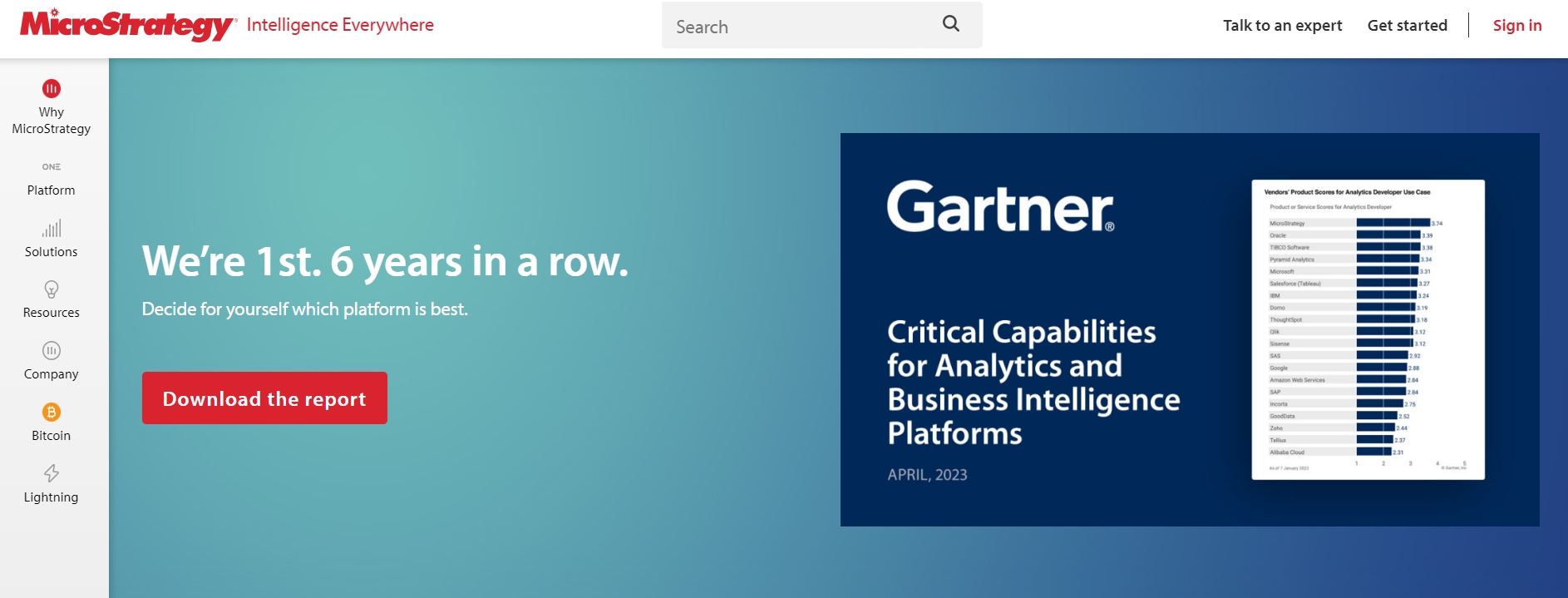
Using MicroStrategy, a sophisticated analytics tool designed to turn your company into a data-driven powerhouse, maximize the potential of data. This modern instrument transforms complexity into possibilities by simplifying your path from raw data to great insights.
Consider a healthcare company using thorough data analysis to try to raise patient outcomes. Of course, for most people the difficulties of sorting through enormous amounts of data would be intolerable. Still, with MicroStrategy it’s like walking in the park: every diagnosis, treatment, and patient comment becomes a priceless component in the analytics jigsaw puzzle.
The features of MicroStrategy shine in several spheres:
| Capabilities | Impact |
| Real-time Analytics | Allows quick decision-making with live data insights |
| Advanced Visualization | Facilitates easy understanding through intuitive graphical representations |
| Predictive Analysis | Empowers you to foresee future trends and take proactive measures |
MicroStrategy becomes a window into your company’s potential, transcending conventional wisdom of data. It demystifies big data and guides you from raw numbers to workable strategies. MicroStrategy gives you the confidence to explore data analysis under direction of a tool meant to highlight the path. From obfuscation to clarity, from doubt to assurance, Leap MicroStrategy will help you change your analytics path. MicroStrategy will help you enter the new analytics age.
Overall Bottom Line
Entering data analytics, we have traveled an amazing eighteen-year tour via a cavalcade of innovative software tools. Each excels and presents a unique combination of data analysis ability. They remove data barriers, turning convoluted numerical labyrinths into crystal-clear stories driving corporate strategy.
Plerdy is a lighthouse in this digital universe that closes the distance between consumer behavior and corporate strategy. Nice starting a trip with Plerdy? Start deciphering your data by registering now for a free tutorial.
From Python’s advanced programming powers to SQL’s strong database administration, our carefully chosen selection provides several analytical approaches. These tools open a world of opportunities regardless of your level of experience as a data scientist—established, new professional, or just putting your toes into the data lake.
These gadgets are not just elegant accessories but also essential tools in every data scientist’s toolkit in this era of accelerating data growth. Choosing wisely and using these data analytics tools with skill helps insights to show the way forward.
Explore Plerdy’s extensive toolkit if you’re ready to challenge yourself in your data analysis career. Deciphering the descriptive stories in your data is much overdue. Start with Plerdy; now it’s time to use data analytics’ brush to create a vivid painting.