
Designing an eye-catching interface is just half the battle – the true mark of a successful design lies in its usability. That’s where the “10 Usability Heuristics for Designers” come into play. These invaluable principles will empower you to create amazing designs and provide a seamless user experience.
Let’s take a sneak peek at the heuristics we’ll explore in this article:
- Keeping users informed with visibility of system status
- Aligning designs with real-world concepts
- Ensuring user control and freedom of navigation
- Upholding consistency and established standards
- Focusing on error prevention and recovery
By mastering these usability heuristics, you’ll have the tools to create designs that truly resonate with users, leading to increased engagement and satisfaction. Your designs will stand out in a crowded marketplace, attracting users who appreciate the perfect marriage of beauty and functionality.
So, let’s jump in and discover how these heuristics can transform your design process, enabling you to create beautiful interfaces that users can’t resist. Your journey to design excellence starts here!
What usability heuristics and why are they important for designers
Usability heuristics, the guiding principles of user-centered design, are a designer’s best friend. These tried-and-true principles help designers create user-friendly interfaces, ensuring their creations are visually appealing, intuitive, and easy to navigate. In a nutshell, usability heuristics are the building blocks of an exceptional user experience (UX).
Consider this personal experience: I once tried a fantastic new app but was quickly frustrated because I couldn’t figure out how to navigate it. It turned out that the designer had prioritized aesthetics over usability, leaving me lost in a sea of options. To avoid such situations, designers must always keep usability heuristics in mind.
Here are some key usability heuristics to consider:
- Consistency and standards
- Error prevention
- Flexibility and efficiency
- Aesthetic and minimalist design
- Help and documentation
By incorporating these principles, designers can strike the perfect balance between form and function. For instance, a well-designed app should have clear, easy-to-understand labels, ensuring users don’t need to rack their brains to find what they want. Moreover, providing error messages that are informative and helpful can save users from frustration and keep them engaged.
In conclusion, usability heuristics are essential for designers as they help create user-friendly interfaces that cater to users’ needs. By adhering to these principles, designers can deliver an enjoyable and intuitive user experience, which ultimately translates to satisfied customers and a successful product.
Visibility of System Status
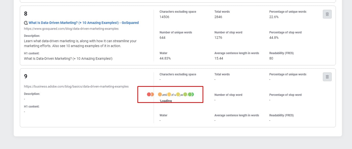
Visibility of System Status is the backbone of a seamless user experience. It’s the backbone of a seamless user experience. Designers must provide clear, timely feedback to users, ensuring they understand the system’s current state.
Take loading bars or progress indicators, for example. These visual cues keep users in the loop, letting them know the system works as intended. They’re like a reassuring pat on the back, saying, “Don’t worry – we’ve got this under control.”
Here are some ways designers can improve the Visibility of System Status:
- Use progress bars or spinners for time-consuming tasks
- Display clear and concise error messages
- Highlight the active navigation element
- Show real-time changes in data or content
- Provide feedback on user interactions, like button clicks or form submissions
Incorporating these elements in a design will make users feel informed and in control. For example, when downloading a large file, a progress bar shows users how much time remains, reducing uncertainty and anxiety.
To summarize, the Visibility of System Status is a game-changer for user experience. By clearly communicating the system’s status, designers can alleviate users’ concerns and create an environment where users feel empowered and confident. This principle is the secret sauce for turning a decent design into a top-notch, user-friendly masterpiece.
Match between the System and the Real World
A crucial usability heuristic designers must consider is the Match between the System and the Real World. This principle ensures that digital interfaces mirror the familiar environment, making them intuitive and user-friendly. When users can relate a system to their everyday experiences, they feel right at home – it’s like slipping into a comfortable pair of shoes.
Imagine trying to use a website with unfamiliar icons and cryptic language. You’d likely feel bewildered and frustrated. However, when designers use familiar symbols and terminology, users can easily navigate and interact with the system.
Here are some practical ways to achieve a match between the system and the real world:
- Use common icons, such as a house for the homepage or a magnifying glass for the search
- Stick to everyday language instead of technical jargon
- Organize information in a logical, familiar manner
- Implement recognizable design patterns and interactions
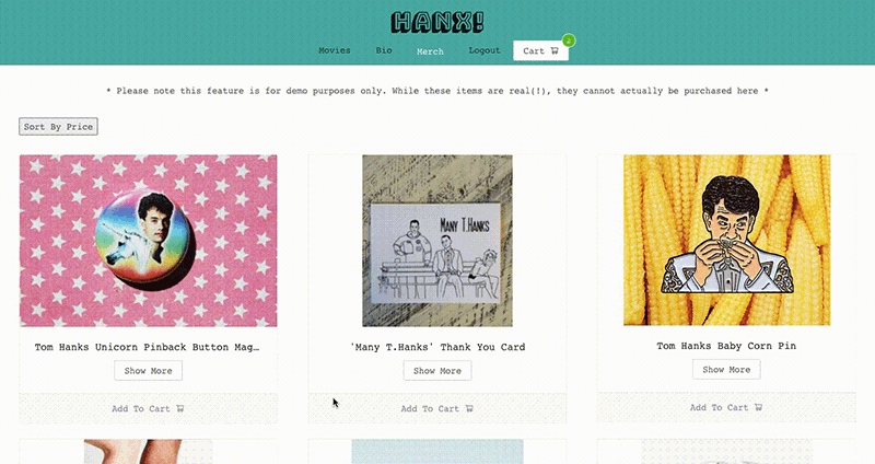
For example, a shopping cart icon on an e-commerce website perfectly represents the real-world shopping experience. As a result, users instantly understand its purpose, streamlining their online shopping journey.
The Match between the System and the Real World is a critical usability aspect. Designers can create natural and inviting interfaces by incorporating familiar elements. It’s all about bridging the gap between the digital world and users’ everyday experiences, making technology more accessible and enjoyable for everyone.
User Control and Freedom
User Control and Freedom is a heuristic that empowers users to navigate and interact with a system on their terms. Users can sigh in relief when given the flexibility to undo or redo actions, knowing they’re in the driver’s seat. Designers prioritizing user control and freedom create an environment where users feel confident, at ease, and ready to explore.
Remember that time you accidentally deleted an important email? Thanks to the “Undo” option, you can quickly recover it and avoid a potential headache. That’s User Control and Freedom in action!
To foster user control and freedom, designers should consider the following strategies:
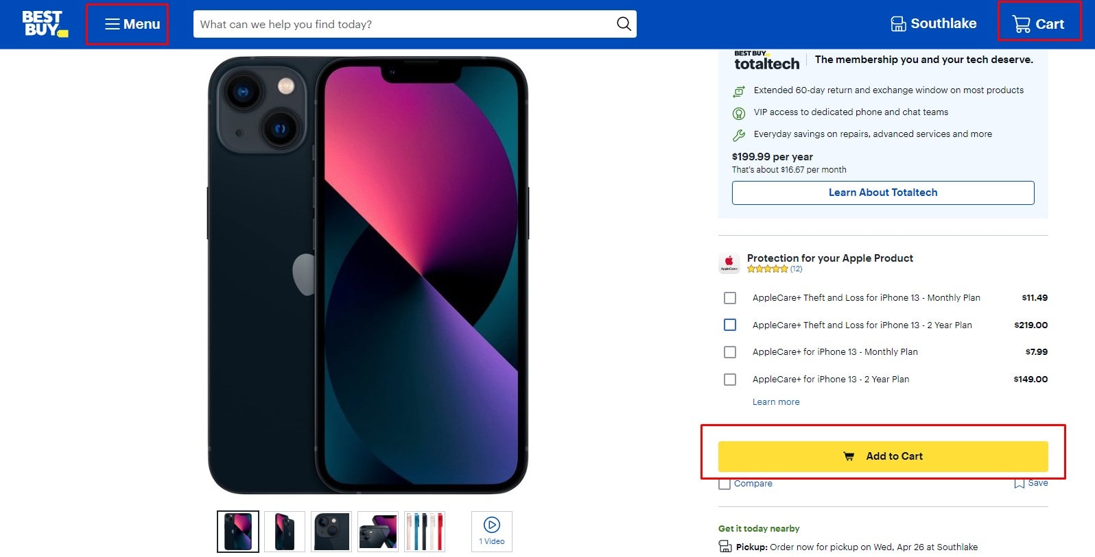
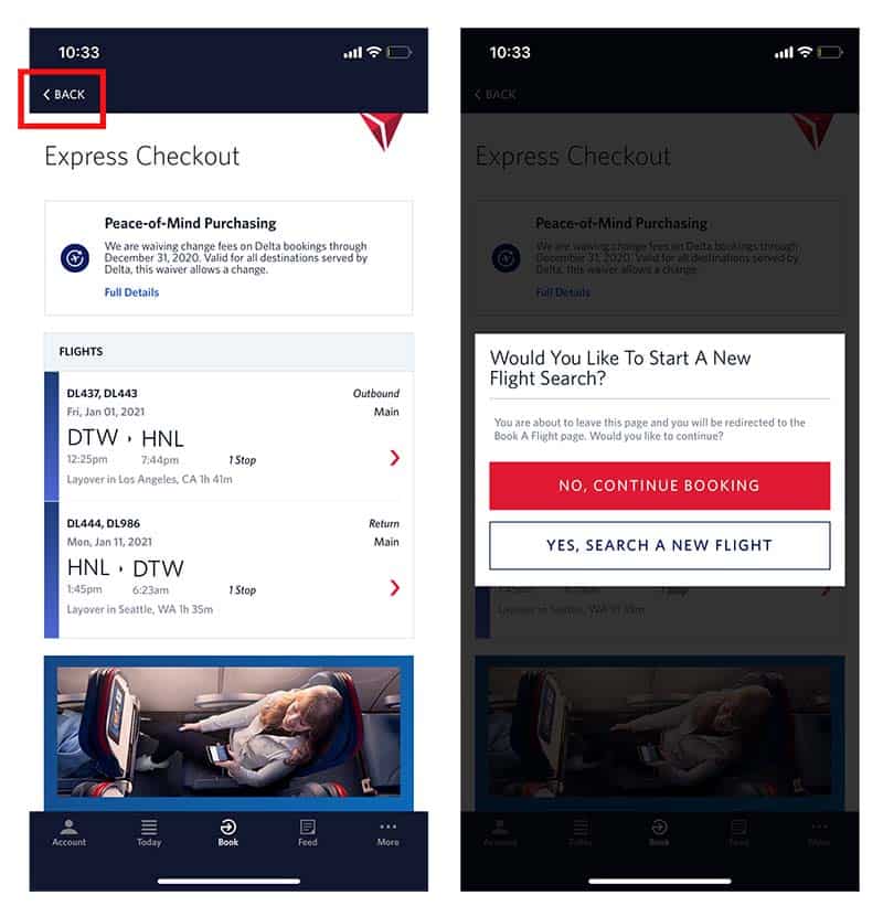
- Include “Undo” and “Redo” functionality for key actions
- Offer clear and easy-to-find navigation options
- Provide user-customizable settings and preferences
- Ensure users can exit or close features without the hassle
Take a photo editing app, for example. By allowing users to undo edits or revert to the original image, designers allow users to experiment without fear of making irreversible changes. Moreover, a customizable interface enables users to tailor the app to their preferences, enhancing their sense of control.
In a nutshell, User Control and Freedom are all about putting users in charge of their digital experience. Designers who embrace this heuristic create empowering and enjoyable interfaces, setting the stage for a delightful user experience that keeps people returning for more.
Consistency and Standards
Consistency and Standards are the unsung heroes of usability heuristics, often overlooked but essential for a user-friendly experience. When designers maintain consistency throughout their creations, users can quickly adapt to the interface, making it a breeze to navigate. It’s like learning a new dance – once you’ve mastered the basic steps, you can easily glide across the floor.
Think about your favorite social media platform. The design remains consistent across different devices, making switching between your phone and computer easy without missing a beat. That’s the power of Consistency and Standards at work.
To achieve consistency and adhere to established standards, designers can:
- Use a uniform color scheme and typography throughout the interface
- Maintain consistent placement of navigation elements
- Follow platform-specific guidelines, like Material Design for Android or Human Interface Guidelines for iOS
- Apply familiar design patterns and interactions
For example, a designer might consistently use a hamburger menu icon across an app to indicate the main navigation menu. This recognizable symbol helps users quickly locate the menu, streamlining their experience.
In conclusion, Consistency and standards are vital in creating intuitive, user-friendly designs. By adhering to these principles, designers can craft interfaces that feel familiar and effortless to navigate, leading to a smooth and enjoyable user experience that keeps people returning for more.
Error Prevention
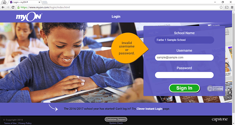
Error Prevention is a powerful usability heuristic that helps users avoid mistakes, making their digital experience smooth and satisfying. We’ve all been there – typing in a password only to realize we’ve hit the dreaded caps lock key. Designers focusing on error prevention can save users from these minor hiccups, turning potential frustrations into seamless interactions.
Remember the last time you filled out an online form and the website alerted you to an incorrect email address format? That’s error prevention in action, nipping potential issues in the bud.
To successfully incorporate error prevention in their designs, designers can:
- Use input validation to catch errors before submission
- Offer helpful suggestions, like password strength indicators
- Implement confirmations for critical actions, such as deletions
- Include clear and concise instructions to guide users
For instance, an e-commerce checkout process might feature real-time input validation for credit card numbers. Then, as users type, the system checks the input, alerting them to any discrepancies before they hit the “Submit” button. This saves users from frustrating error messages after submission and streamlines the purchasing.
In a nutshell, Error Prevention is all about anticipating and mitigating potential user errors. By employing thoughtful design strategies that help users avoid mistakes, designers can create a more enjoyable and frustration-free experience. Ultimately, error prevention leads to happier users and a better overall experience, and that’s a win-win for everyone involved.
Recognition rather than Recall

Recognition rather than Recall is a usability heuristic that helps users easily navigate interfaces, like a well-organized kitchen where you instinctively reach for the right utensil. By emphasizing recognition, designers make it simpler for users to find what they need without relying on memory, ensuring a smooth and enjoyable experience.
Think of your favorite streaming platform – you can quickly identify movies and shows thanks to their recognizable cover images, saving you from recalling every title in their vast library.
To promote Recognition rather than Recall, designers can:
- Use familiar icons and symbols
- Display relevant information in context
- Implement visual cues, such as thumbnails or color-coding
- Group related items together for easy access
For example, consider a music app that groups your favorite songs, artists, and albums in one accessible location. The designer makes it easy for users to recognize and select their desired content without remembering specific titles or names.
In a nutshell, Recognition rather than Recall is all about minimizing cognitive load and making interactions as intuitive as possible. By focusing on familiar visual cues and smart organization, designers can create interfaces that feel like second nature to users, ensuring a delightful and hassle-free experience. So, next time you effortlessly find what you’re looking for on an app or website, you can thank the designer for embracing this essential usability heuristic.
Flexibility and Efficiency of Use
Flexibility and Efficiency of Use is a usability heuristic that caters to users with diverse skill levels and preferences, like a versatile Swiss Army knife that serves both casual campers and seasoned adventurers. By accommodating varying levels of expertise, designers ensure that users can interact with interfaces effectively and efficiently, creating a positive and personalized experience.
Imagine your go-to photo editing app – it likely offers both basic tools for quick fixes and advanced options for more experienced editors, allowing everyone to achieve their desired results.
Designers can promote Flexibility and Efficiency of Use by:
- Including shortcuts for power users
- Providing multiple ways to complete tasks
- Customizing settings to suit individual needs
- Offering comprehensive help documentation
A well-designed word processor may offer users several ways to format text, from simple toolbar buttons to keyboard shortcuts and context menus. This flexibility empowers users to find the most efficient method for their unique preferences and skill levels.
In a nutshell, Flexibility and Efficiency of Use is about tailoring interfaces to accommodate a wide range of users, ensuring that everyone can easily navigate and interact. By offering options that cater to different abilities and preferences, designers create a more inclusive and enjoyable experience for all. So, the next time you breeze through an app or website thanks to well-thought-out design choices, remember that the principle of Flexibility and Efficiency of Use played a crucial role in making that possible.
Aesthetic and Minimalist Design

Aesthetic and Minimalist Design, in the world of usability, is like the art of creating a masterpiece with a few powerful brushstrokes. The idea is to design visually pleasing and clutter-free interfaces, making it easier for users to focus on essential tasks without distractions. The “less is more” principle leads to an intuitive and delightful user experience.
Think of a sleek, modern kitchen – every appliance and utensil has its place, giving you the space to create culinary delights without feeling overwhelmed. Similarly, a well-designed interface offers a clean, organized layout that allows users to accomplish their goals easily and efficiently.
To achieve an Aesthetic and Minimalist Design, consider the following:
- First, streamline the interface: Remove unnecessary elements or condense them into logical groups.
- Emphasize important content: Direct users’ attention to essential tasks and information.
- Choose a harmonious color palette: Select complementary colors that evoke a sense of balance and unity.
- Use whitespace effectively: Give elements room to breathe, making the interface more approachable.
Imagine a weather app that’s the epitome of Aesthetic and Minimalist Design. It showcases the current temperature and forecast at a glance, uses subtle colors and icons, and leaves ample whitespace between elements. The result is an easy-to-use app that conveys essential information without overwhelming users.
In summary, Aesthetic and Minimalist Design is about cutting through the noise and presenting a clean, visually engaging interface. By embracing simplicity, designers create user experiences that are not only enjoyable to look at and effortless to navigate – it’s like clearing away the fog to reveal a breathtaking view.
Help Users Recognize, Diagnose, and Recover from Errors
Imagine assembling a puzzle without a reference image – frustrating, right? The same goes for users navigating through an interface riddled with errors. As a designer, you aim to help users recognize, diagnose, and recover from errors as smoothly as possible like a lighthouse guiding a ship through stormy waters.
To create an empathetic error recovery experience, consider the following best practices:
- Use clear, concise error messages: Avoid technical jargon and explain the issue in plain language.
- Offer constructive guidance: Suggest actionable steps users can take to resolve the problem.
- Maintain a friendly tone: Reassure users that errors are a natural part of the process and they can easily overcome them.
An e-commerce website detects an incorrect credit card number during checkout. Instead of displaying a cryptic error code, the message could read, “Oops! Your credit card number is incorrect. Please double-check and try again.”
Following these guidelines will provide a seamless user experience even when things go awry. After all, it’s not about making every journey error-free but empowering users to course-correct when they veer off track. Moreover, by offering a helping hand, you’ll turn potential frustration into a moment of triumph – because nothing beats the satisfaction of solving a puzzle on your own.
Help and Documentation
Picture yourself in a foreign city, lost without a map or GPS. It’s a helpless feeling that no one wants to experience, especially when using a new software or website. As a designer, your mission is to ensure users have a well-crafted “compass” in the form of help and documentation to guide them through any challenges they encounter.
Effective help and documentation can be a real lifesaver for users. By adhering to these principles, you’ll create a useful resource that’s easy to navigate:
- Organize content logically: Group related topics together and use descriptive headings to make information easy to find.
- Write in plain language: Keep explanations straightforward and jargon-free to ensure users of all skill levels can understand.
- Include visuals: Enhance understanding with screenshots, diagrams, or videos to illustrate complex concepts.
- Provide real-world examples: Offer practical, step-by-step examples that users can apply to their own situations.
- Ensure searchability: Make your documentation searchable so users can find answers quickly.
Remember the time you were assembling furniture and were baffled by the cryptic instructions? Now think about how much easier it would have been with a well-written, comprehensive guide. That’s the kind of experience you want to deliver to your users.
An adage says, “Give a man a fish, and you feed him for a day; teach a man to fish, and you feed him for a lifetime.” So likewise, by providing top-notch help and documentation, you’re helping users solve their immediate problems and empowering them to become self-sufficient in the long run. In the end, a well-prepared user is happy – and that’s what great design is all about.
Conclusion
As we wrap up our journey through the “10 Usability Heuristics for Designers,” it’s time to reflect on the insights we’ve gained. By embracing these usability heuristics, you, as a designer, can create captivating websites and applications that truly resonate with users.
These principles will empower you to craft visually stunning and user-friendly designs, setting you apart in a highly competitive market. Design success requires balancing beauty and usefulness. These heuristics will transform how consumers engage with your designs, increasing user satisfaction and engagement.
In summary, incorporating usability heuristics will enable you to:
- Enhance the user experience (UX) of your products
- Create intuitive and user-friendly designs
- Stand out in a crowded marketplace
If you’re eager to learn more and advance your design career, consider signing up for Plerdy’s comprehensive courses and analytics programs. You’ll gain valuable insights, tips, and resources to help you become a master of usability and UI design.
So, take advantage of this opportunity to elevate your design skills and make a lasting impact in digital design. Join Plerdy today and watch your designs flourish like never before! ⚡