
? Welcome to the digital age! Here, we explore the fascinating universe of responsive web design, a critical player in today’s connected world. In the heart of the bustling Internet landscape, responsive design takes center stage – and rightfully so! It provides a seamless user experience (UX) across all devices. ⚡
In this engaging read, we’re going to:
- Dive deep into the essence of responsive web design
- Understand the impact it has on user experience
- Grasp the core elements that shape its foundation
- Discuss the difference between responsive and adaptive design
- Walk you through the creation of your own responsive design
- Take a sneak peek into its future trends
To enrich our discussion, we’ll bring in insights from Plerdy’s UX & SEO analysis, highlighting its crucial role in understanding user behavior and optimizing website design. Fasten your seatbelts, and let’s begin this insightful journey into the riveting world of responsive web design!
What is Responsive Design? And Definition
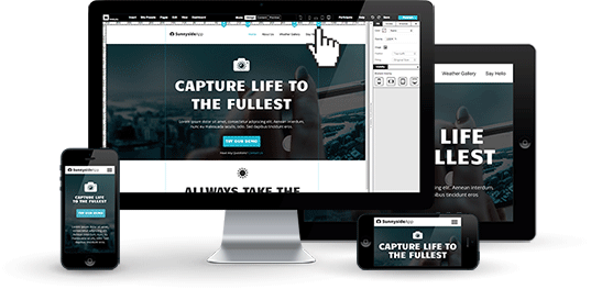
Definition and enter the landscape of web design, a dynamic and ever-evolving domain. Here, one concept towers above the rest – responsive web design. It’s the buzzword of the decade and for a good reason. Responsive web design is a design approach that enables websites to function seamlessly across various devices, from desktop monitors to handheld smartphones. The brilliance of this concept lies in its simple yet powerful mantra – create a design that responds to the user’s behavior and environment.
The Importance of Responsive Web Design
In this fast-paced digital age, where every second count, a website’s ability to deliver content swiftly and efficiently across all platforms is vital. Here’s why responsive web design isn’t just an option anymore—it’s necessary.
Adaptability is Key
With the diversity of devices used for browsing, adaptability is crucial. From a smart TV’s expansive display to a smartphone’s compact screen, responsive web design ensures that your website molds itself to the device’s screen size, orientation, and platform. This adaptability ensures a flawless and consistent user experience, no matter the device used.
Boosting Traffic
An overwhelmingly high percentage of web traffic is mobile. This trend highlights the importance of a mobile-friendly web design strategy. By prioritizing responsive web design, you can tap into this vast reservoir of mobile traffic and lead potential users to your website.
Enhancing User Experience
Good user experience is more than just about delivering great content. It’s also about how that content is presented. Responsive design enhances user experience by delivering a smooth, navigable website that holds onto its aesthetic appeal across different devices.
Core Elements of Responsive Web Design
Now that we understand the significance of responsive web design, let’s dive into its key elements. Three critical aspects lie at the heart of every responsive design:
Fluid Grids
Gone are the days of pixel-based designs. Enter fluid grids—a system that uses relative units like percentages rather than fixed units like pixels. This technique allows layouts to adjust to a device’s screen size. Imagine pouring water into containers of various shapes and sizes – the water adapts to the container’s shape, similar to a responsive web design on different devices.
Flexible Images
Images are a crucial part of any website. But, they can also be a stumbling block when designing for multiple devices. The solution? Flexible images. This concept ensures images resize to fit the screen without distortion or quality loss.
Media Queries
Last but certainly not least is media queries. These checkpoints apply different styles based on the characteristics of a device. They work hand-in-hand with fluid grids and flexible images to create a harmonious and seamless responsive design.
In the landscape of web design, it’s clear that responsiveness is not just a trend – it’s a paradigm shift that is here to stay. By prioritizing adaptability, maximizing web traffic, and enhancing user experience, responsive web design sets the foundation for a versatile and future-proof website. With its key elements – fluid grids, flexible images, and media queries – a responsive design navigates the ebb and flow of an ever-changing digital landscape, delivering a seamless UX across all devices.
Responsive vs. Adaptive Web Design

In web design, responsive and adaptive design contend for the spotlight. As previously established, responsive web design adjusts fluidly to fit any screen. On the flip side, adaptive design takes a more tailored approach—it uses static layouts that snap into place for specific screen sizes.
Consider the difference as similar to clothing options. Responsive design is the stretchable fabric that adjusts to any body shape. In contrast, adaptive design is akin to tailored suits—each custom-fitted for specific measurements.
While both designs aim to enhance user experience across different devices, their methodology varies significantly:
- Responsive Design — It uses fluid grids reacting to the user’s screen size to display the website optimally. The website design responds and adapts to the user’s device, maintaining a consistent feel.
- Adaptive Design — It utilizes multiple fixed layout sizes. The site selects the most suitable layout when it detects the available space. It’s like having several versions of the website ready to display.
Responsive design typically offers more flexibility, as it can cater to a wide array of devices. On the other hand, an adaptive design might provide a more controlled and optimized design for specific devices. Still, it can fall short with the myriad of screen sizes in the market.
How to Create a Responsive Web Design
Creating a responsive web design doesn’t happen by chance—it’s a deliberate and meticulous process. Follow these key steps to ensure your design shines across all platforms:
- Understand User Behavior and Environment — Before diving into design, comprehend your audience’s habits. What devices are they using? Which platform do they prefer? These insights are critical in shaping your design strategy.
- Choose the Right Framework — There’s a host of frameworks available to kick-start your responsive design—Bootstrap, Foundation, Bulma, to name a few. These frameworks come packed with pre-defined classes and components that make responsive design a breeze.
- Implement Fluid Grids, Flexible Images, and Media Queries — These are the building blocks of your responsive design. Embrace fluid grids for flexible layouts, use flexible images to ensure visual consistency, and employ media queries to fine-tune the design for various devices.
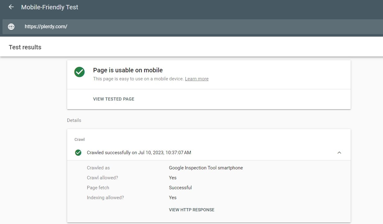
- Test Your Design — After implementing the design, put it to the test. Use different devices and browsers to ensure your design lives up to its responsive nature.
The Future of Responsive Web Design

Peering into the crystal ball, one thing is clear—responsive web design isn’t a fading trend. It’s the cornerstone of modern web design, and it’s here to stay. As technology advances and screen sizes evolve, the importance of a flexible, user-friendly design will only amplify.
In the future, we expect to see more advancements in responsive design, such as:
- More AI in Web Design — Artificial intelligence is already making inroads into web design. AI-powered tools could make the creation of responsive design even more intuitive and automated.
- Varied Input Types — As voice search and gesture controls gain traction, responsive designs will need to account for these varied input types.
- Emergence of Innovative Technologies — With the rise of AR, VR, and other immersive technologies, web designers must consider these innovative platforms in creating an engaging user experience.
In conclusion, responsive web design is crucial in our multi-screen world. Whether choosing between responsive or adaptive design, crafting your own responsive design, or anticipating future trends—responsive web design sits at the heart of it all. Its importance stretches beyond mere aesthetics, influencing traffic, user experience, and your website’s success.
Bottom Line
? Wrapping up our enlightening journey into responsive web design, we’ve unlocked a richer understanding of this powerful tool in our digital toolbelt. Creating a responsive website allows the magic of HTML5 to fit your content – like a liquid filling a container – into a myriad of screen sizes.
The art of responsive design enhances usability by using CSS3 to adjust layout widths and column structures flexibly. It switches your content layout from multi-columns on large screens to single-column on smartphones, making every pixel count. Remember the viewport? Our friend is adjusting content widths and ensuring your website stays user-friendly, irrespective of device type.
Dive into tutorials or engage in exercises to master this art. Plerdy offers an array of tools to assist in perfecting your website’s responsiveness. With their tools, navigating through the sea of HTML, CSS, and viewport settings becomes a breeze.
Get your hands on the free resources Plerdy provides – from video tutorials, and quizzes to certificate courses, everything you need is at your fingertips. A well-designed, responsive website is within reach – the sky is the limit. ?
Keep pushing for progress. Stay current, stay responsive, and harness the power of web design to move your business forward. The code is your canvas, and the world is your audience. Ready to zoom into action? Visit Plerdy today and let your website take center stage in the user’s journey.⚡