Get ready to be inspired! The world of eCommerce is constantly evolving, and the bar for website design is set higher every year. Our article “40 Best eCommerce Website Design Examples in 2023” showcases the crème de la crème of online shopping experiences. These websites can get your creative juices flowing from sleek and minimalistic designs to bold and eye-catching aesthetics. Whether your goal is to improve customer experience or drive sales, this article is a must-read for any eCommerce professional looking to stay ahead of the ⚡ game.
What Makes a Good eCommerce Website Design?
Designing an effective eCommerce website can make all the difference in attracting and retaining customers and boosting sales for your business. With the rise of online shopping, retailers must ensure their website is user-friendly, mobile-responsive, and showcases their products in the best possible light. Here are 10 suggestions to assist you in creating a successful eCommerce website that attracts more visitors and increases conversions.

- Mobile Responsiveness: Many online shoppers use their mobile devices to browse and purchase products, so it’s essential to have a mobile-responsive website. A good website builder can automatically convert your website into mobile templates to ensure optimal viewing on all devices.
- Highlight Top Products: Showcase your most popular or profitable products by highlighting them with contrasting colors, tweaking the layout, or using banners to promote them.
- Pop-Up Sign-Up Sheet: Successful eCommerce websites often use a pop-up sign-up sheet to collect email addresses for remarketing purposes. Just make sure you offer something in return for signing up. You can try the excellent Plerdy app for Shopify to create form popups and website analytics.
- SEO Best Practices: Search Engine Optimization (SEO) is crucial for eCommerce websites to increase visibility and reach a wider audience. Use relevant keywords, write compelling product descriptions, and utilize built-in SEO tools.
- User-Friendly Navigation: Make it easy for customers to find what they’re looking for with intuitive navigation, organized categories, and a clear search bar.
- Quality Product Images: High-quality product images are essential for showcasing your products and enticing customers to purchase.
- Fast Load Times: Slow load times can be a dealbreaker for potential customers, so optimizing your website for fast performance is essential.
- Secure Checkout: Provide a secure process to instill confidence in your customers and protect their personal and financial information.
- Customer Reviews: Display customer reviews and ratings to build trust and credibility with potential buyers.
- A/B Testing: Regularly, A/B tests different elements of your website, such as the layout, product descriptions, and call-to-action buttons, to continually improve the user experience and increase conversions.

There are various eCommerce platforms like Shopify, WooCommerce, Magento, and Bigcommerce, each offering different features and customization options to fit your specific business needs. No matter the platform, using these guidelines will enable you to create an effective eCommerce website that expands your consumer base and increases revenue.
eCommerce Website Design Trends in 2023: Embracing Flexibility
As commerce continues to evolve, businesses must adapt and respond to changes with agility. With the challenges posed by the global pandemic, economic instability, and increased consumer awareness, eCommerce brands need to be resilient and prepared to meet the demands of their customers. To succeed in 2023, eCommerce businesses should embrace the concept of Flexible Commerce.
Flexible Commerce emphasizes the need for tools that can be customized to a brand’s specific needs and customer base, allowing merchants to respond to changes in the commerce landscape quickly. Gavin Ballard, CEO of Disco Labs and Shopify app Submarine, advocates investing in “best-in-class” solutions rather than trying to cover all bases with a single tool. Shopify’s vibrant ecosystem offers a solid foundation for merchants to plug in specialized apps, making it easier for larger businesses to customize their tech stack.
To thrive in the eCommerce world, businesses must adopt a culture of iterate-and-test. This means quickly testing and adapting new products or markets without sacrificing efficiency or productivity. By embracing Flexible Commerce, eCommerce brands can set themselves up for success in 2023 and beyond.
For a deeper understanding of the global developments shaping the eCommerce landscape in 2023, check out Shopify’s Commerce Trends 2023 report. With these insights and best practices, businesses can confidently navigate the ever-changing commerce landscape and drive their growth.
eCommerce Website Design: Making Your Online Store Stand Out
A well-designed eCommerce website is crucial for the success of your online store. With the rise of eCommerce, competition is fierce and standing out is more important than ever. As a result, the design of your website can impact customer experience, trust, and conversions. Examples of popular eCommerce platforms include Shopify or Magento, each offering various design options and customization capabilities.
We’ve compiled a comprehensive checklist for optimizing your Shopify store to help you create a website that effectively showcases your brand and products. This guide covers all the essential elements of a successful eCommerce website design, from optimizing website speed and product pages to using marketing and email strategies. So whether you’re a seasoned pro or just starting out, use this guide to make your Shopify store shine and drive more sales!
List of 45 Examples eCommerce Website Design
If you look through this list, you might decide to use some of the techniques that the jury used to design eCommerce websites.
Carineroitfeld.com
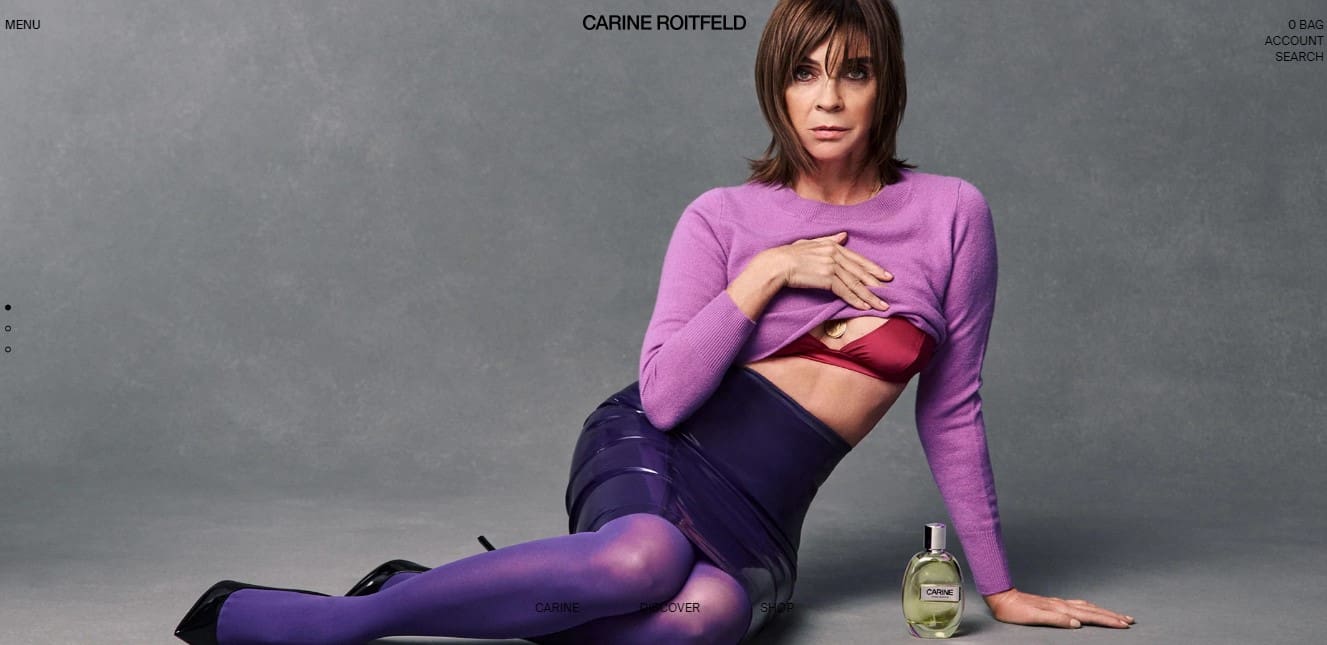
Dutch perfume eCommerce project by Karin Reutfeld. In 2019, a new collection called 7 Lovers was released – this is the inscription we see on the home page.
The design uses dynamic elements, black and white colors. Only perfume bottles in color. Minimum text – a brief description of each bottle and the “Add to cart” button.
Getwelly.com
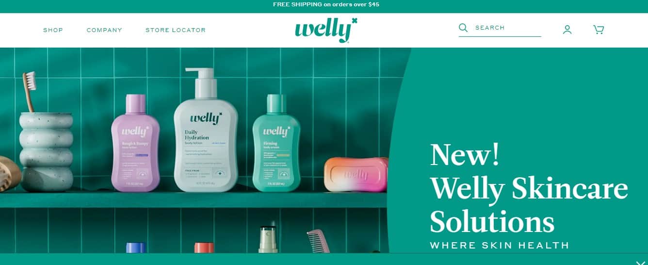
The eCommerce project was launched in Minneapolis (USA). In 2017, Eric Ryan and Doug Stakenborg joined everyone in choosing their own personal first-aid kit. Such a first-aid kit can include strips and simple tools.
The design uses dynamic elements. The first-aid kits are bright and attract attention, the same applies to the strips themselves. Kit builder is available. The Mobile version is well-developed.
Google Stadia
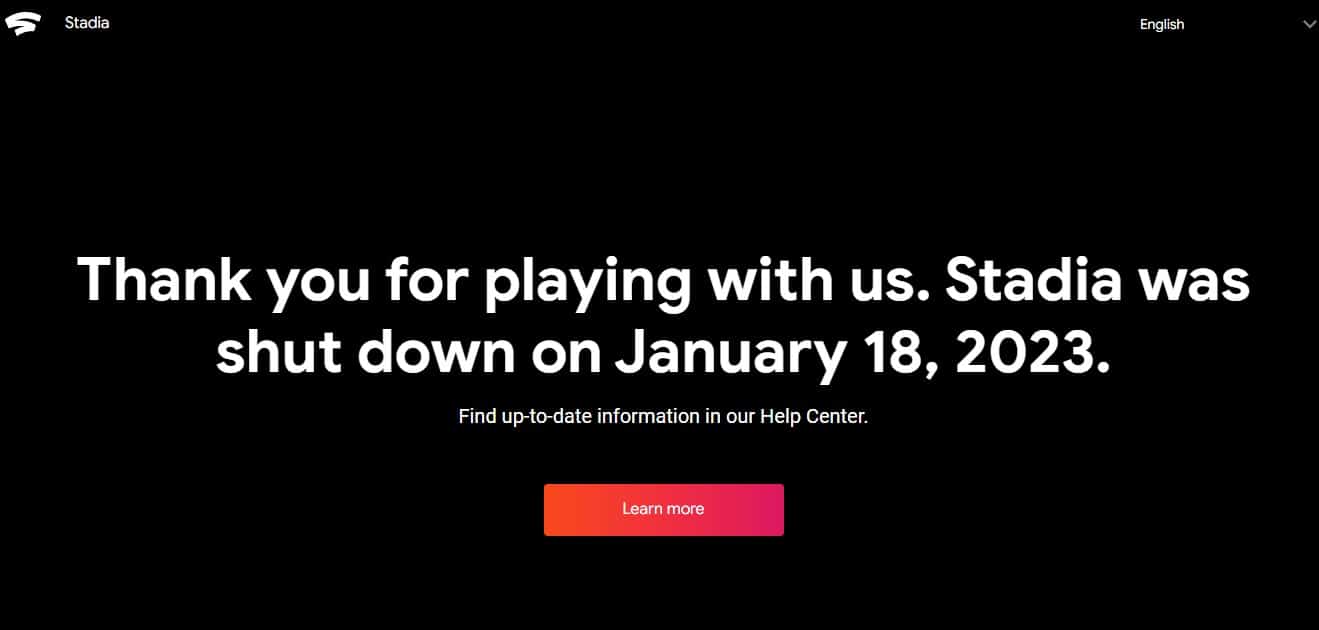
Google does not need to be introduced. The awwwards.com jury highlighted their page on a new project of cloud gaming.
Clear presentation of information – specifics only. Even someone who knows nothing about cloud gaming will understand the Google Stadia concept in 20–30 seconds. This level of information should be sought. The eCommerce website uses dynamic blocks – everything is colorful, clear, and looks spectacular.
Adidas Futurecraft
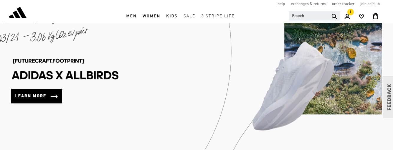
The German manufacturer of sportswear, footwear, and equipment drew attention to environmental issues. They launched a line made from 100% recyclable materials. This eCommerce website is dedicated to this line of Adidas products.
It is worth highlighting the following interesting design solutions: interactivity, endless scroll, and footwear presentation in 3D. The website design is focused on the visual component. There is a minimum of text, only basic information on the new line.
Closer.game
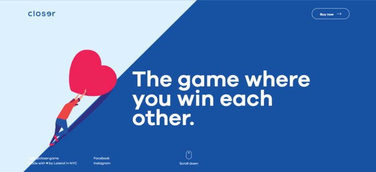
The eCommerce project was launched by the American design studio Lateral. The website is dedicated to the new card game, plus you can buy the corresponding cards here. The game is intended for several people – this is not a competition, but a way to have a good time with friends.
The design is marked by horizontal and vertical scroll, and interactivity – what is happening on the website depends on the visitor’s actions. Familiar design and a good color scheme. The information content is not damaged.
Thisissleep.co.uk
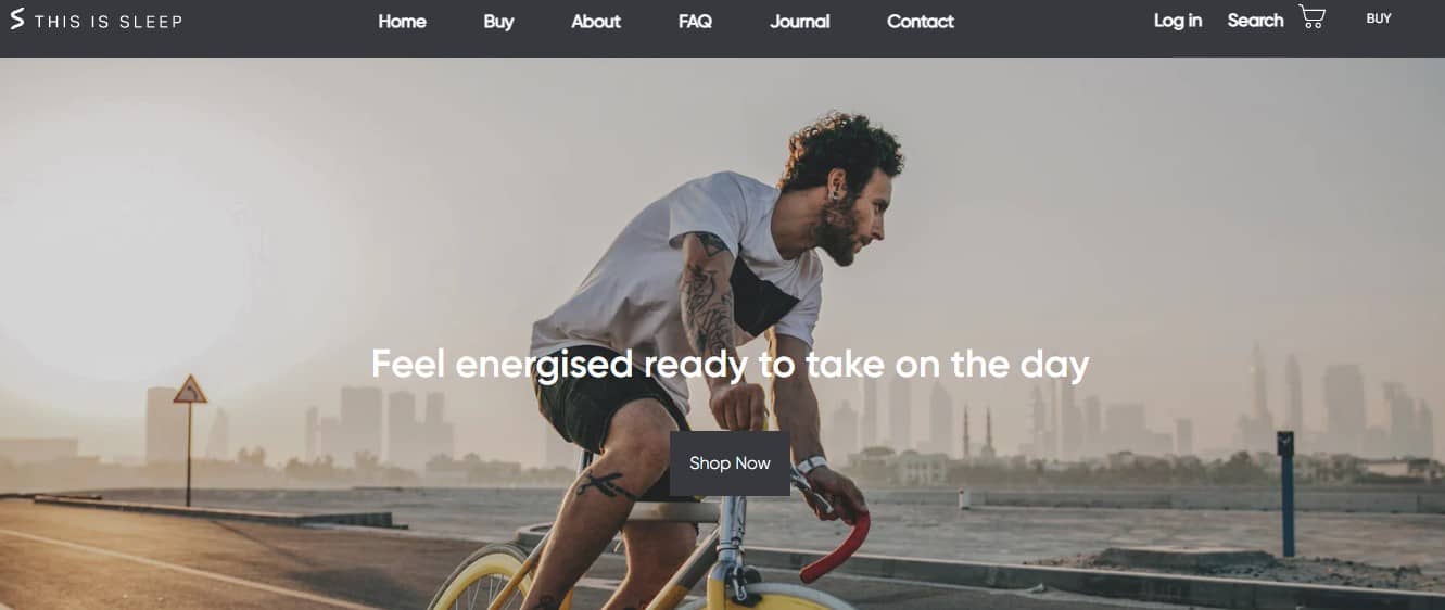
The eCommerce website was created by the British company Loaf. Brand Belongs to Charlie Marshall. The website offers to take a survey about your sleep and gives recommendations for improving it. Also, you can buy pillows, blankets, mattresses, and other products for healthy sleep.
The eCommerce website uses several dynamic elements. It is worth noting a well-chosen color scheme. Since the website is about sleep, no sharp colors are used, the scroll is smooth, and the design sets in a calm mood.
Jorik.askphill.com

Ask Phill created the eCommerce website. This is a Dutch studio creating online platforms for new European brands. This resource was created for the brand of the Dutch musician and actor Yorick Scholten (known as Lil ’Kleine). The website sells original printed clothes.
The web resource is interactive, using the original pixel font. The description of the goods is unusually designed – when hovering, a meaningless set of characters turns into text.
Wonhundred.com
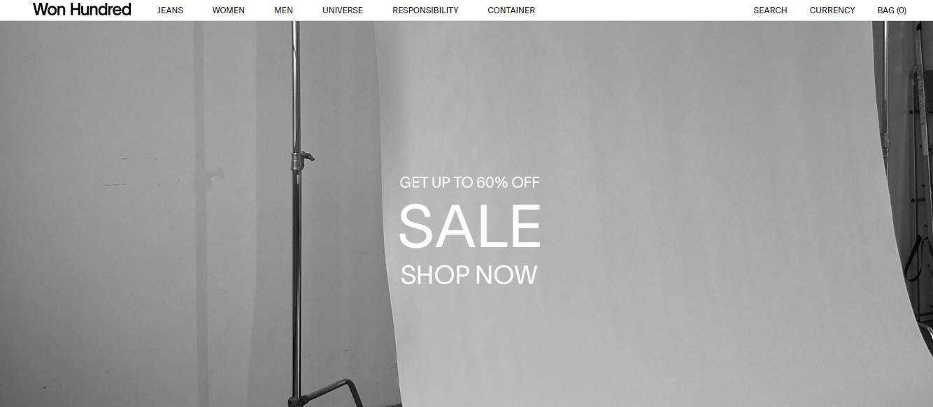
Won Hundred has been a Danish fashion company since 2004. The eCommerce website was launched for the sale of clothing.
The website is primarily an online store, hence the maximum information content and clear, concise presentation. Each item has a description. When you hover over the text, it disappears, and information on the available sizes appears – this is very convenient and saves time. In addition to informativeness, it is worth noting a clear, structured menu.
Hinderer-wolff.fr
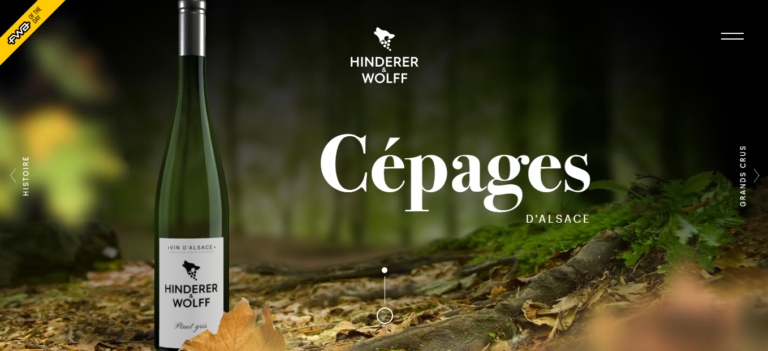
The Internet resource was created by the Paris agency Adelines. The eCommerce website is dedicated to a new brand of Alsatian wines. It presents the wine and acts as a trading platform at the same time. 4 types of wines are available.
The visual component is worked out superbly. Highly detailed 3D background changes completely when moving between sections. The awwwards.com judges also liked the technical part and how the mobile version was put together.
Getobachan.com
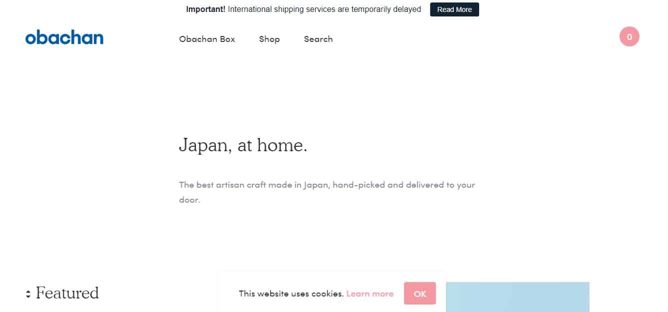
This Japanese online store sells Japanese-style household items. Launched in 2017
The creators promise to “bring Zen to every home.” The eCommerce website is designed in this style. There are no sharp transitions, bright colors, smooth scroll, or laconic (but full) descriptions. The design immediately sets the right mood.
66nord.com
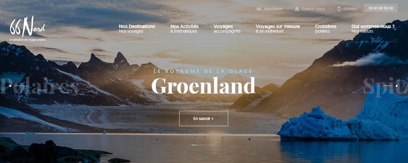
The French project has been launched in 2003. A team of experienced specialists organizes expeditions to the Far North. eCommerce website offers to book such a trip and check the already organized tours.
The design involved large images of expeditions, animated elements, user interaction, and information content.
Whitetailgin.com

The English eCommerce website is owned by a Scottish alcohol company. It is based on Mall island. Its symbol is a white-tailed eagle, hence the name.
The jury noted that the website was made on WordPress. All elements are in the same style, no alien elements. There are animations, but storytelling does not suffer. Using suitable images in the background sets the visitor in the right mood.
Seaharvest.net.au
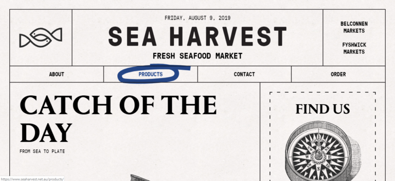
The website is owned by Sea Harvest. This is a family-owned Australian business. A classic eCommerce website that sells seafood at competitive prices.
The website was created on WordPress in a retro style. The eCommerce web resource follows the design of an old newspaper. It looks stylish and attracts attention.
Studio-job.com

The Dutch project Studio Job is a team of designers calling themselves pioneers of modern applied art. The eCommerce project brings together designers and specialists in the field of art and modern technology. A website is a portfolio, a way to contact the team and order their services.
Among the original design solutions, it is worth highlighting the colorfulness, the use of original fonts, and convenient navigation. The awwwards jury gave the website a maximum mark for creativity.
Maradji.com
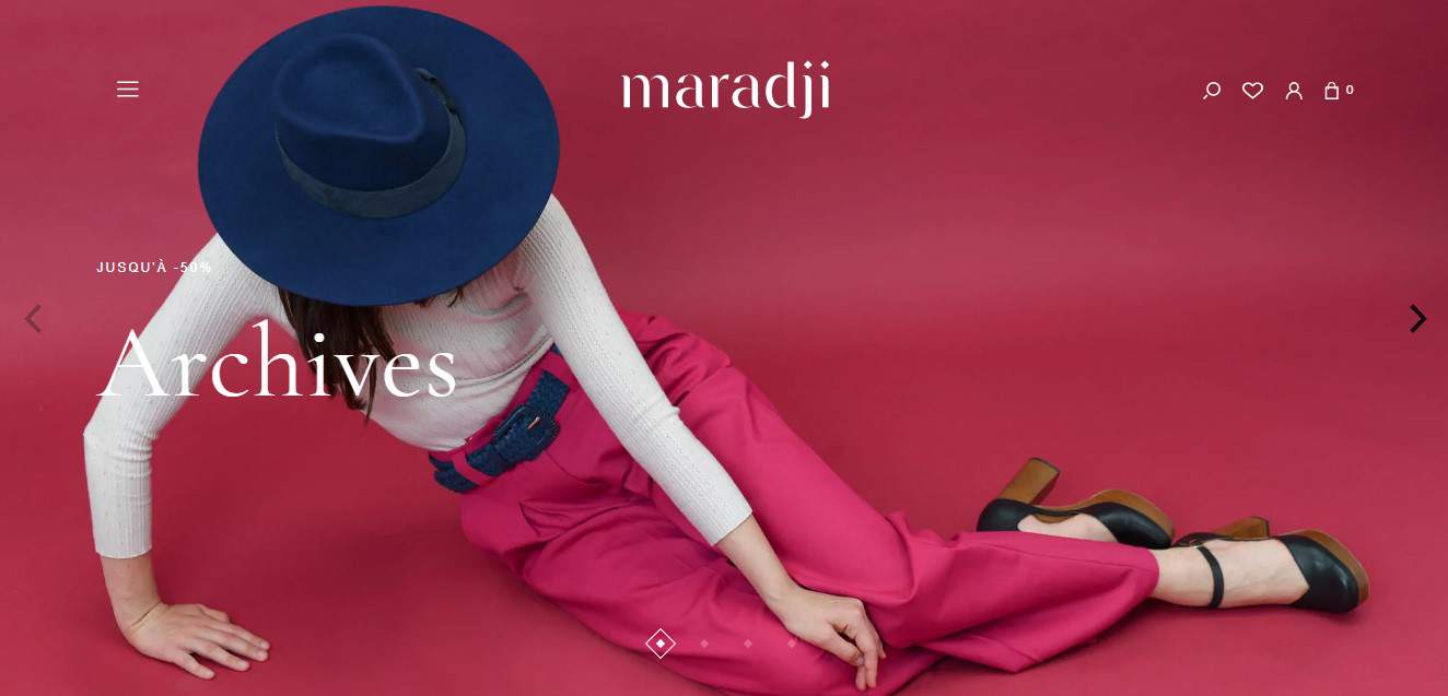
The website was created to promote the French brand engaged in the design and creation of women’s clothing, handbags, and other accessories. There is an eCommerce store where you can buy these goods.
The visitor’s micro-interaction with the website elements is at a good level. The high quality of the photo and the color scheme of the web resource are worth noting. There is little animation, but this does not affect quality.
Hopdeco.ca
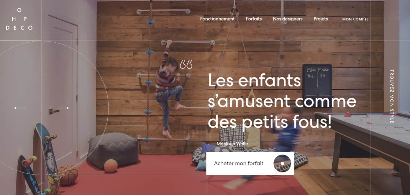
Hop Deco – Canadian design studio engaged in interior design. The eCommerce website acquaints visitors with the designers and their work, and you can also order a room design selection service.
It is worth noting a well-organized architecture: the content is clear and logically structured, and the user will stay aware of the situation. A lot of animation, high-quality photos, and striking examples of room design.
Kopke1638.com
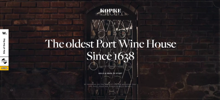
The website was created for the oldest wine house in Portugal, one of the world leaders in port production. This is not only an eCommerce website but also a guide to the company’s history and its products.
It is worth noting the abundance of relevant animation, pleasant soundtrack, and interactivity. Storytelling is top-notch.
Seedlipdrinks.com
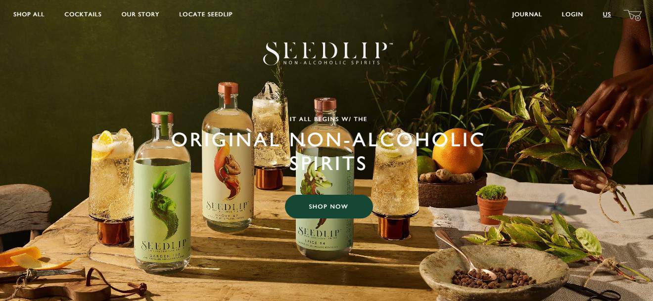
The website was created for a UK company specializing in soft drinks. Seedlip says he creates drinks for those who “want to drink but don’t want to drink alcohol.” They partially use recipes from work “The Art of Distillation” of 1651. In addition, there is an eCommerce section. Note a minimalist style, high-quality animations, and videos. Navigation is top-notch.
Bang-olufsen.com
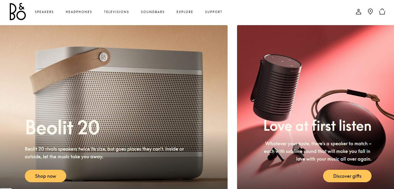
The eCommerce website was created for a Danish company manufacturing premium video and audio systems. Awwwards has highlighted the page of a new line of “bronze” devices. The familiar style has been preserved, and pages automatically resize images while scrolling. The colors correspond to the “bronze” design.
Femmeandfierce.nl
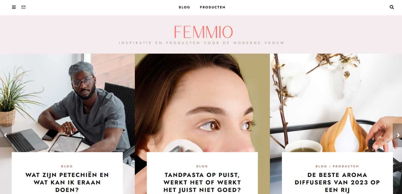
This is an eCommerce website by Wonderland Design Studio. The architecture is standard: the goods are divided into categories, there is a cart, the user selects clothes and shoes, pays for the order, and waits for the parcel.
The color scheme is nice, micro interaction with the user is available, and animation allows you to find out about the product without any clicks. Convenient cart.
Wonderlandams.com
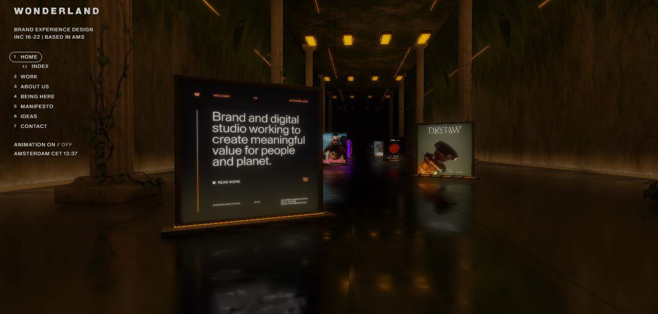
Wonderland is a Dutch design studio. They created a website to advertise and promote their services. They are engaged in the creation of websites and promise an individual approach to customers.
The website’s design involves animation: animated background and non-static presentation of the work of the design studio. The colors and overall style are well-matched.
Alafut.qc.ca
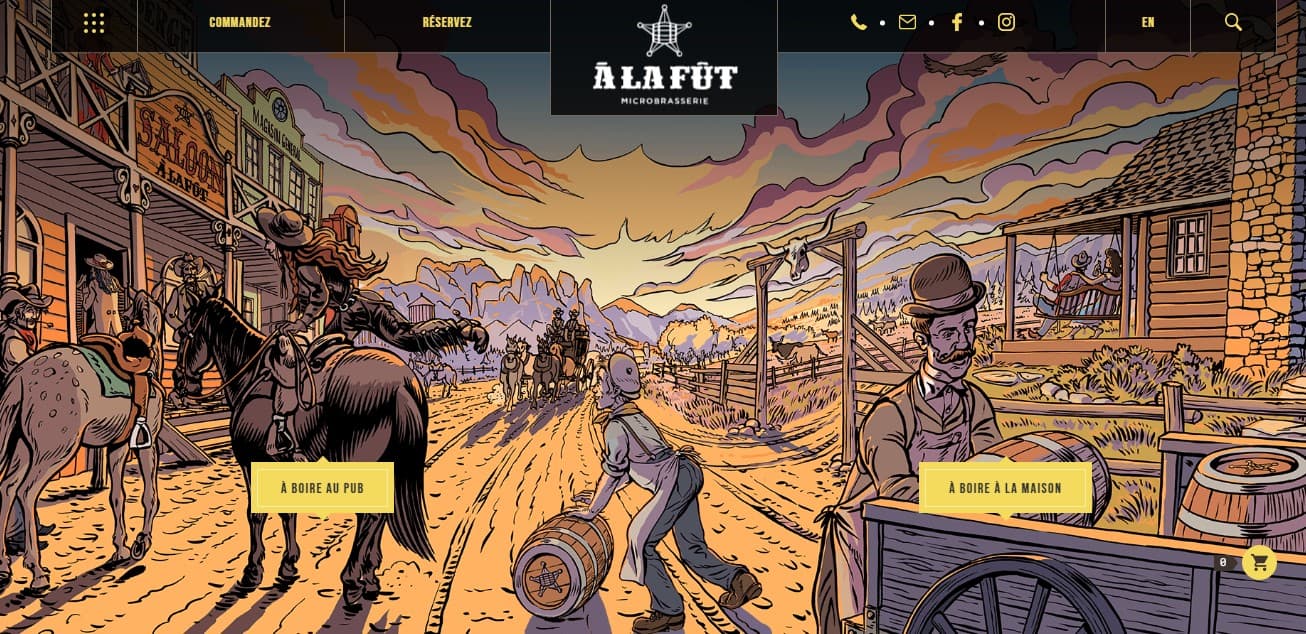
Stereo created the eCommerce website of a Canadian brewing company. This craft beer is sold in some places. The website provides an opportunity to order and learn more about the goods. Here you can find a menu of restaurants serving this beer.
Awwwards.com experts appreciated usability and design in general. There are animation, colorful photos in the background, and horizontal and vertical scrolling. Informational content is worth noting.
ETQ-Amsterdam.com
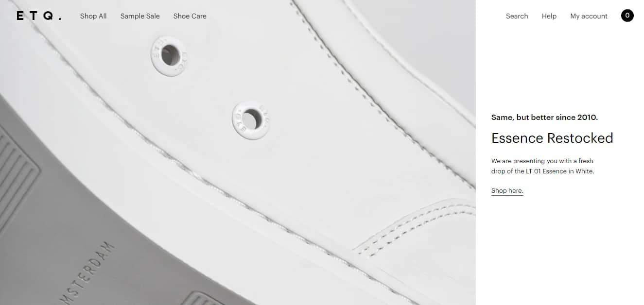
Another Dutch project dedicated to the new women’s and men’s shoes from the famous ETQ brand. This is an eCommerce website and you can buy your favorite shoes. The design stands out for its simplicity and calm colors. The animation is small, but the website looks modern.
Charles-simon.com
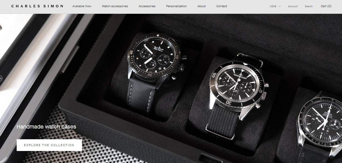
This eCommerce website sells handmade suitcases and bags by Charles Simon. The design was developed by the Phoenix studio. Charles Simon makes simple but stylish things. Designers adhered to this principle when creating an online resource. The “vertical menu”, animation and a suitable palette of colors are worth noting.
Cowboy.com
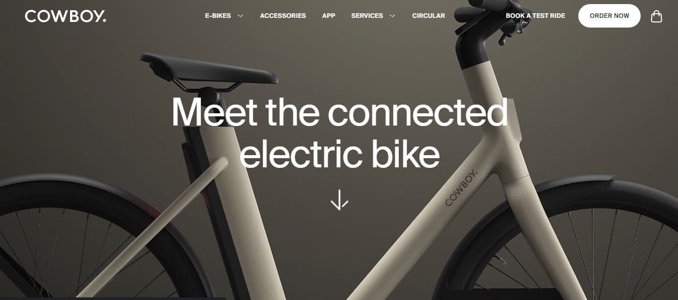
American e-bike eCommerce website. The website combines the presentation of new products and the classic trading platform where you can order a bike.
The website is modern and high-tech. The design uses animation, 3D elements, high-quality photos in the background, bright font color and large labels.
Mowellens.com
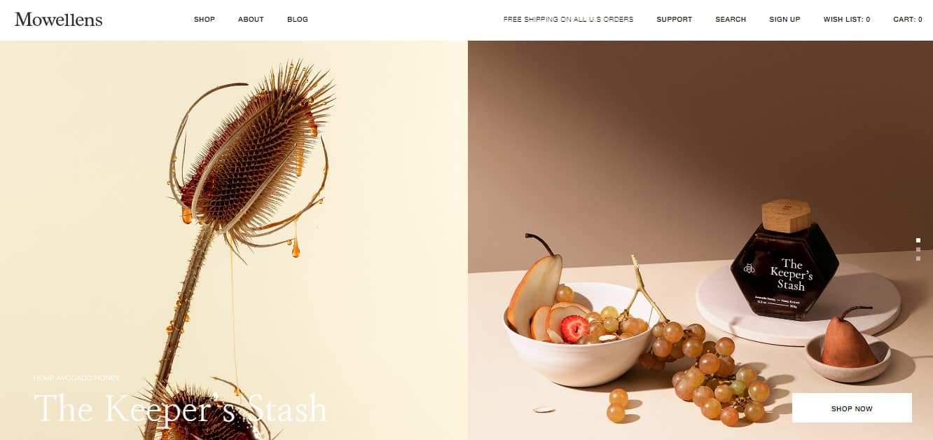
The Canadian eCommerce website was launched in 2016. Various cannabis preparations are sold here. This is not a medicine but a means to normalize the emotional background and relieve stress. Deliveries to different countries are not restricted.
It is worth highlighting non-standard navigation, smooth animation, and horizontal scroll. The color scheme is nice – calm colors set the right mood.
Keus-store.com
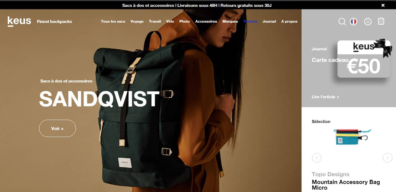
The French eCommerce website where you can order backpacks was launched in 2018. Horizontal scroll and generally convenient navigation catches the eye. Animated elements, well-organized presentation of information, everything important is easy to find on the page. Top storytelling.
Thecoolclub.co
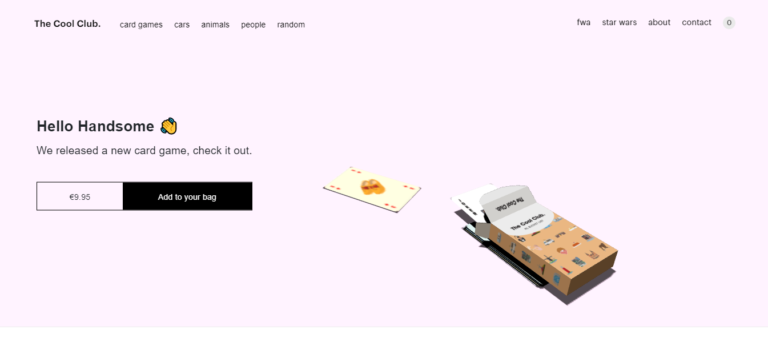
The cool club is an eCommerce website that brings together like-minded people passionate about creating card games. In addition to odd decks, you can also buy posters and other printed materials here.
The design was created to emphasize the level of team creativity. Animation and sound background are used in several sections of the website. A simple design style is selected on purpose.
Jacquemus.com
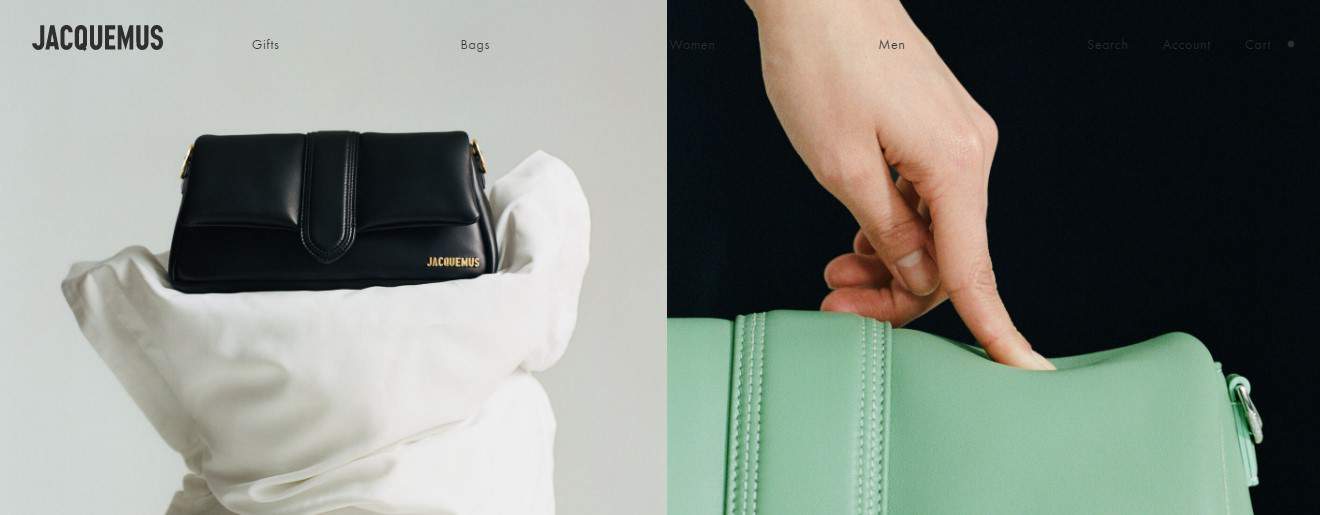
This is the official website of the French brand. This is an eCommerce website and travel guide in the fashion world.
Note informative photos, design in bright colors, convenient navigation, and videos.
Myfood.eu
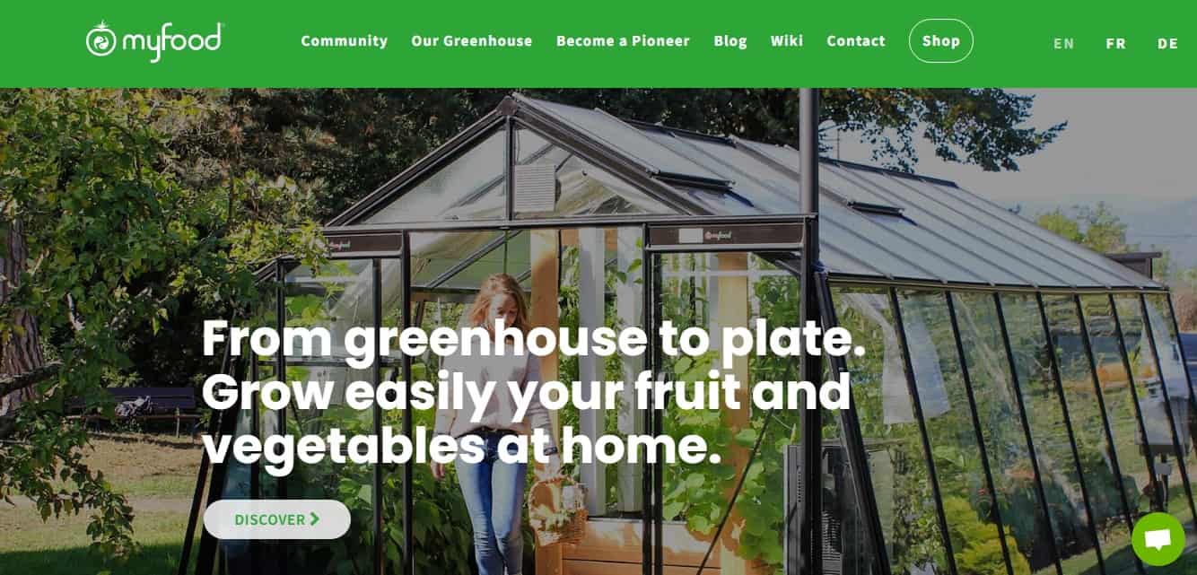
The French project is dedicated to growing vegetables at home. The website offers various designs of greenhouses for country houses, the cities and describes the technology. On the eCommerce website, you can buy greenhouses ready for assembly and installation.
In the website’s design, we highlight many photos, videos, and helpful photos of greenhouses. There is animation, and website navigation is simple and convenient.
Notanotherbill.com
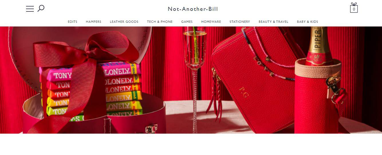
The British eCommerce website sells gifts: gift sets, jewelry, household items, and others. Since this is an eCommerce website, the main attention was paid to classifying goods and navigation. The convenience of orientation on the website is worth noting: products are divided by category, price, age of the target audience—lots of high-quality photos.
Ceremonycoffee.com
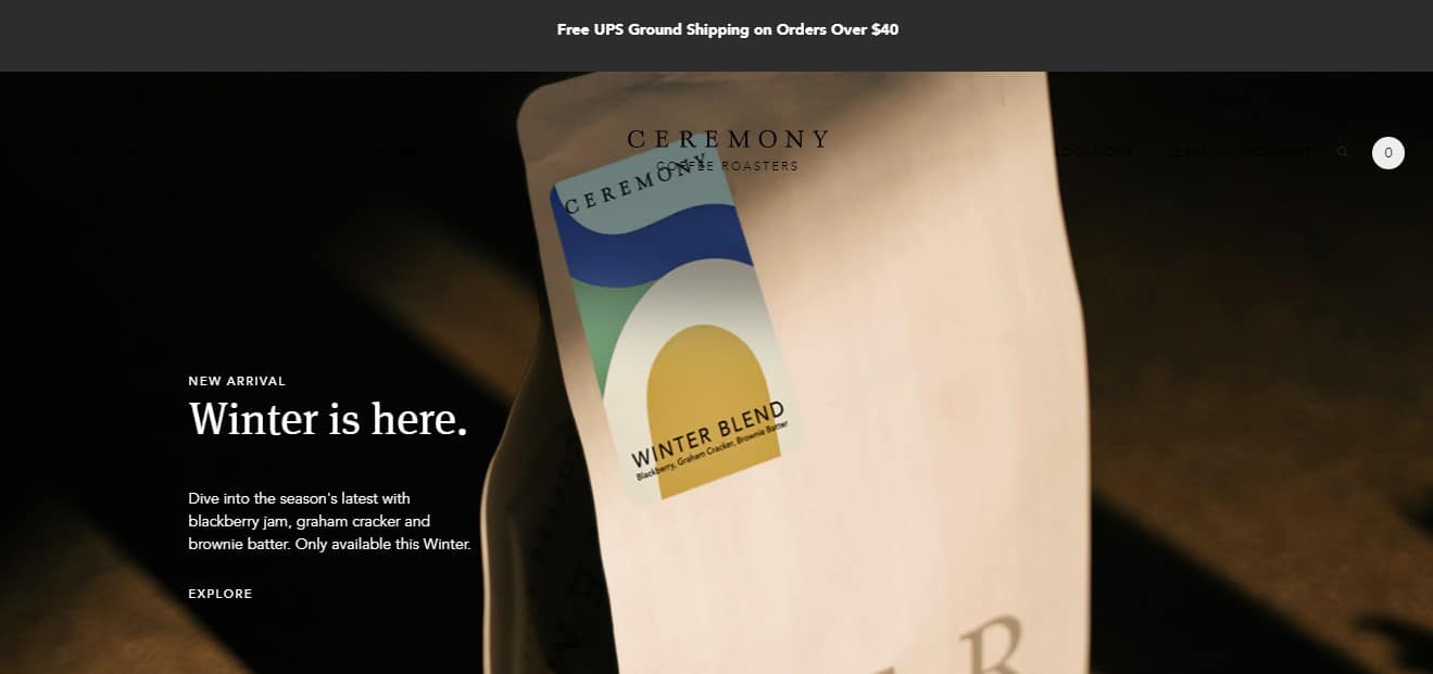
American website created by Drexler. Ceremony Coffee was founded in 2002. It specializes in coffee only, offering classic and exotic recipes. The website has a regular eCommerce section where you can order various options for your favorite drink.
The design is minimalist. There are animations, and interactive elements. The awwwards.com jury scored the highest for adapting to mobile devices.
Nomos-glashuette.com
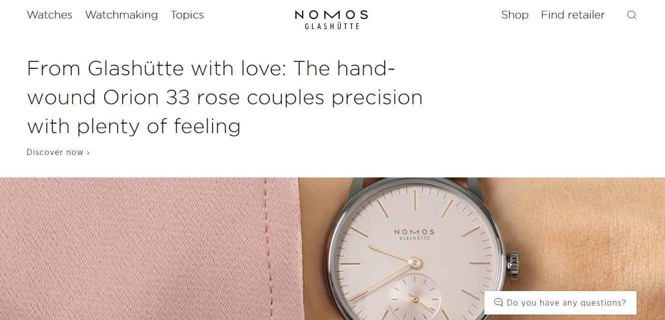
Nomos Glashütte is a German mechanical watch brand. This year marks the 20th anniversary of the domain registration date. The eCommerce website offers to get acquainted with the company and watch models.
The website is technologically advanced, it looks modern, although it is made in a minimalist style. No abundance of animation and video. It is worth noting convenient navigation and correctly selected colors.
Contiducco.it
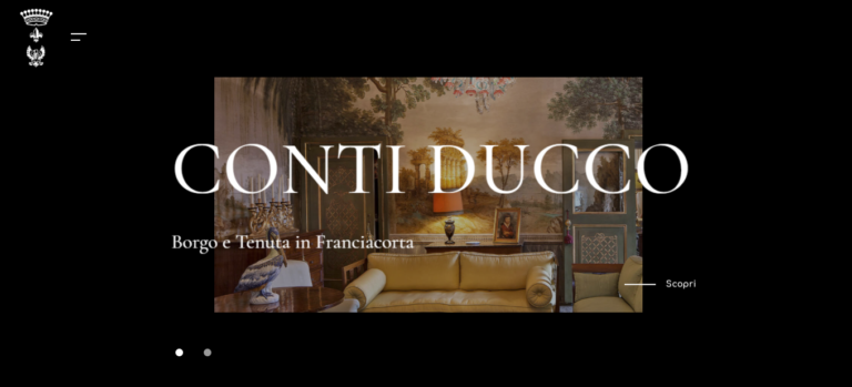
The Italian project is owned by Conti Ducco – one of the best wineries in Franciacorta. This is an eCommerce website with a catalog of wines. Much attention is paid to storytelling: you can learn more about the winery and its products.
The design contains plenty of photos, smooth animation, and horizontal scrolling instead of the usual vertical. Perfectly selected fonts.
Huru.rocks
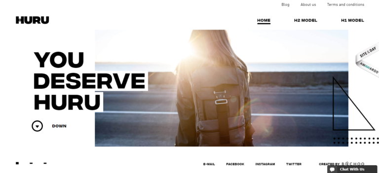
One of the few Ukrainian projects that got into the TOP, according to Awwwards. The eCommerce resource sells comfortable and functional backpacks.
The design is quite simple. It is worth noting the use of animation, informative photos (although only 2 models of backpacks are available so far), and video.
Crypton.trading
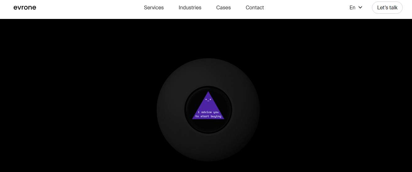
An American eCommerce website that allows you to join the development of the cryptocurrency trading bot. It predicts the behavior of cryptocurrencies based on completed transactions and can be trained independently.
The design is simple, but the website looks stylish. Everything is tied to scrolling: when moving down the page, the picture on the background updates and the text changes.
Everyday-needs.com
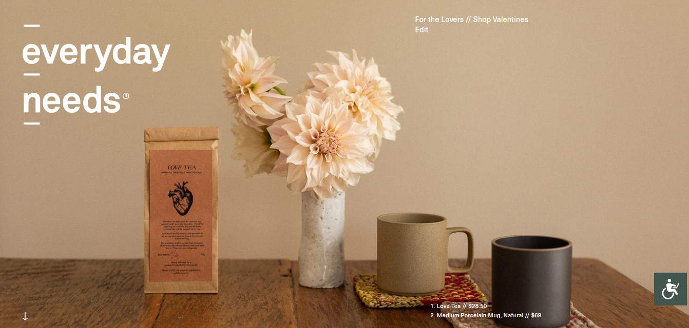
This is a New Zealand eCommerce website that sells household items: coffee grinders, woven coasters for dishes, serving items, cups, glasses, etc. Some of them are standard, and others are exclusive.
The awwwards.com jury highlighted the approach to the information presentation, the color scheme, and the content. The highest rating was given for the design.
Webflow.com

Webflow is an American platform for building your own eCommerce website. The Webflow team promises that it is possible to create a full website without writing a single line of code.
Note original scrolling, interactive elements, fonts. The main thing is that the visitor immediately understands what he is dealing with. Familiar design is preserved.
Mrleight.com
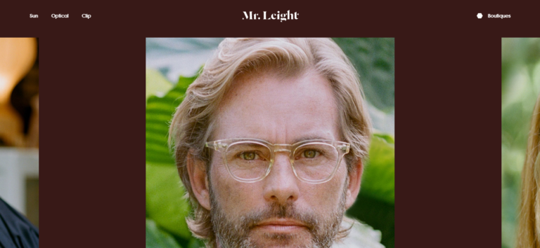
Another American eCommerce project. Brothers Garrett and Larry Leyte created a brand of sunglasses and ordinary glasses. The website is designed to promote a new line of women’s and men’s glasses. There is also a list of stores where they are available for sale. The design is colorful. The main emphasis is on the photo. Animation and interactive elements are used.
Conclusion
The 45 Best eCommerce Website Design Examples in 2023 offer a comprehensive overview of the latest and greatest in retail website design. From using responsive design to showcase products in a unique and visually appealing way to incorporating social media and the latest fulfillment strategies, these examples highlight the necessary ingredients for a successful online store. So whether you’re looking for inspiration for your own eCommerce site or simply want to explore the power of great design in digital retail, this guide provides valuable resources and showcases the beauty of great photography. So take a trial of the Plerdy Shopify app, and keep the retail digital game strong with these super eCommerce website designs!
